-(3).jpg)
15 Apr Tahoe Twist
If the home at Martis Camp Lot 351 looks familiar, you may have seen it on a billboard on Interstate 80, accompanied by one word: Gorgeous.
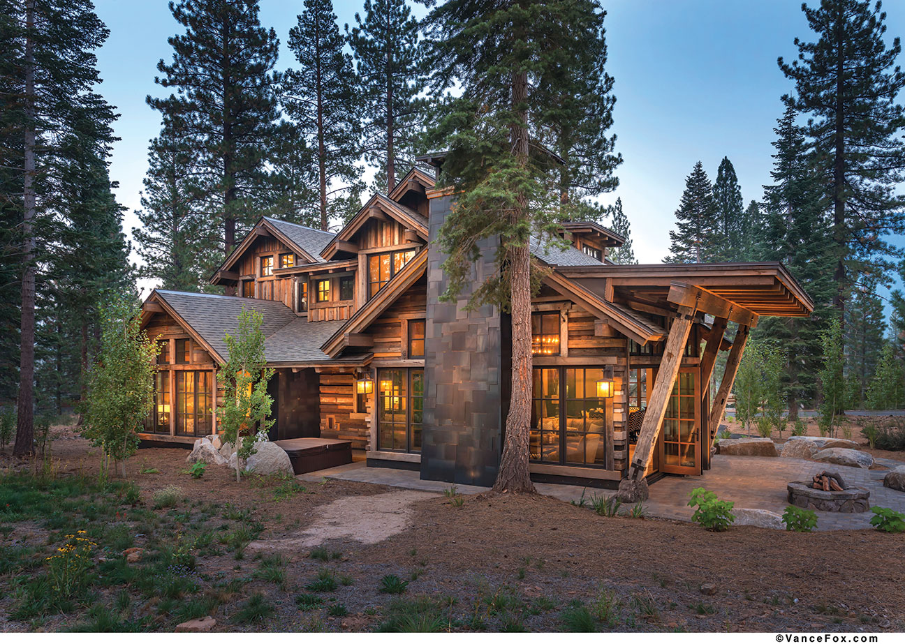
Indeed, that may be the first thought that comes to mind upon arriving at the site. The house is Tahoe with a twist—old-style forms and materials, used in unconventional ways.
“I wanted a home that felt somewhat traditional in architecture yet more transitional in look and feel,” says builder Mark Neave of NSM Construction.
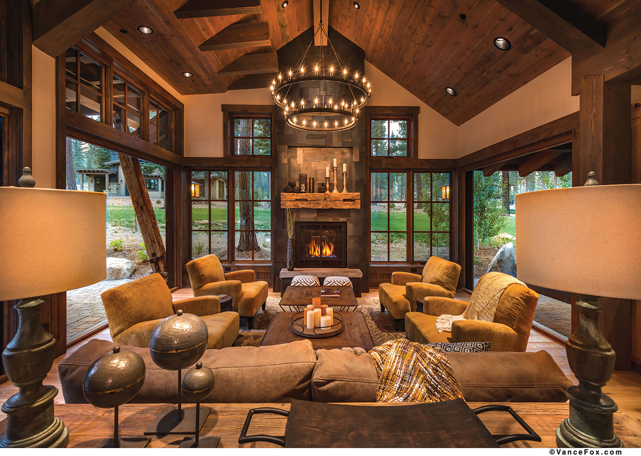
For example, on the exterior, the gabled rooflines hark to an Old Tahoe style, yet the somewhat random, organic use of materials—reclaimed wood siding used both vertically and horizontally, the fireplace’s patchwork of layered hot-rolled steel and natural boulders that were core-drilled to allow for structural connections—add depth and texture, a theme carried into the interior.

The exterior picklewood siding is used vertically and horizontally, adding to the home’s organic and somewhat random nature.
“I think this project was interesting for many different folks since it crossed from more traditional Tahoe style architecture to a more contemporary piece of mountain modern architecture,” says architect Dennis Zirbel.
Sited on one of Martis Camp’s cabin lots, the home is small by Martis standards at 3,200 square feet, yet it lives large and—with a master suite, complete with fireplace and outdoor access, an upstairs junior master with fireplace, a guest suite and a bunk room—accommodates more than one family.
An open great room includes the kitchen, dining room, entertaining area and a loft/media room space, as well as three bifold doors and a slider door that open to three outdoor living spaces, all of which include some covered areas.

Bifold and slider doors allow the home to open to its impressive exterior setting.
“I wanted to create a very adaptable home that could expand with entertaining needs,” says Neave, noting the home lives more like 4,500 square feet in summer.
“It’s a lot to offer in less than 3,250 square feet,” agrees Zirbel.
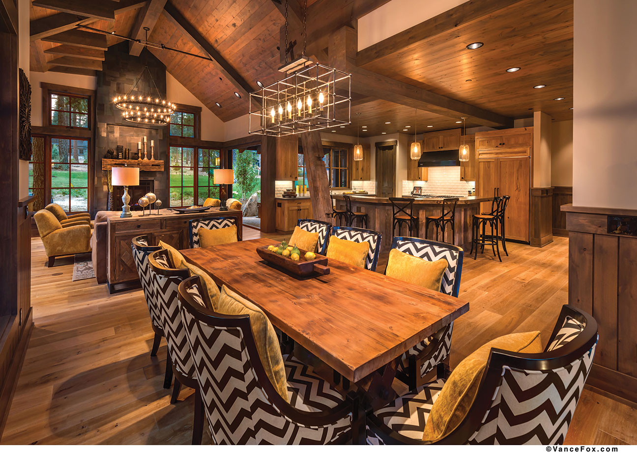
The heart of the home is the open public spaces on the main floor. Here, the theme of texture can be seen in the fireplace’s metal overlay design complemented by the reclaimed wood mantle, the wire-brushed interior oak doors and a granite boulder that supports a large structural beam and visually separates the kitchen, dining area and great room.

Yellow pillows on the kitchen’s chevron chairs visually tie with the yellow chairs of the great room.
Julie Johnson-Holland, of Interior Design by JJH, says the goal was to make the home unique while adding “farmhouse chic” details, such as the interior door paneling, the exposed beams and the kitchen’s apron sinks. There’s a sense of harmony throughout. Each of the bathrooms use a different material palette, yet it is all in the same genre. In the kitchen, oak cabinets play off a beveled subway tile backsplash for a warm, inviting feel, while the yellow pillows sitting on the dining room’s black-and-white chevron chairs match the comfy chairs flanking the fireplace. “Everyone loves the color palette,” says Johnson-Holland.
The continuity of materials, the indoor-outdoor connection, the scaling of the spaces, the textures and colors—all these add up to a home that is, indeed, gorgeous.
Merit Award: Mountain Cabin
Architect: Dennis E. Zirbel, Architect
Builder: Mark Neave, NSM Construction
Interior Design: Julie Johnson-Holland, Interior Design by JJH
Square Feet: 3,200
Year Remodeled: 2015


No Comments