27 May Setting the Stage
Geometric massings and inspired interior elements create an efficient and contemporary home
Premiering in the early decades of the newly industrialized twentieth century, the very basic ideas of the International Style of architecture included a simplification of form, the exclusion of ornament and the adoption of glass, steel and concrete as preferred materials.
Without hesitation, architect David Horan, a Ryan Group Architects (RGA) partner, refers to the roughly 6,000 square foot assembly of horizontal roof planes, simple geometric massings and bountiful amounts of glass and stone as a prime example of the International Style. “It’s just geometry and materials. That’s it.”
General contractor Jim Morrison agrees. “It was clear from the beginning that the continuity of lines is what the house was all about.”
The Modesto-based owners (who prefer anonymity) live full time in a home that is unquestionably modern but placed no specific parameters on the design direction of their Martis Camp house. “We didn’t go into this project with any preconceived ideas because we wanted to allow the architect to be creative,” says the owner, whose overarching vision for the house was that it be equally comfortable for two people inhabiting minimal square footage, or 20 people filling every available space.
“They were very clear that they wanted a house that felt like a mountain house. They didn’t want to come here from Modesto and drive up to the same house,” says Horan. “But they love everything about [the Modesto] house. They want all the modern elements and features. And we knew we were interested in finding a fresh approach; we knew we were going for next.’”
“Next” for Horan and the Jim Morrison Construction (JMC) team meant pursuing a simple and exceptionally clean aesthetic detailed by select horizontal datum allowed to run continuously through material transitions. The line along the bottom of an exposed steel flange travels on to line up with the top of a window to then align with the steel inset going through the fireplace. The result represents what Horan refers to as “intent-ful rigor.”
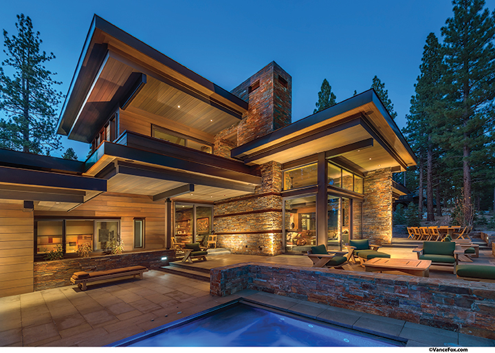
The family wanted a more modern home that still felt like a ‘mountain home,’ so material choices tended
toward the sturdy—rock, timber and steel finishes adorn the exterior
Creating “intent-ful rigor” on a piece of paper is difficult enough, but the task of turning it into a rather large three-dimensional object becomes a near David and Goliath contest.
“The majority of the details in the house were challenging,” says JMC project manager Bryan Bertsch. The atypical approach to achieve something as benign as detailing base trim meeting a sheetrock wall was, in reality, an intense surgical exercise. “Because it’s a reverse sequence from how you’d typically install base trim, you have a lot of ‘start-stop-start-stop’ between numerous trades; there’s no easy flow from one thing to the next,” says Bertsch. “A lot of the detailing was like this.”
Of Bertsch’s ability to orchestrate the many circuitous chores and all associated factions of manpower, the primary reason the house turned out so well “is because Bryan figured out how to put all this together,” Horan says
Originally from Southern California, Bertsch hired on with JMC five years ago, but has spent two decades in the house-building business.
Ledgestone walls, perceived as blocks of mass, intersect and support horizontal roof slabs. The stepping and shifting roof planes cascade down with grade to quietly tuck the house into the property. The courtyard hosts a somewhat processional descent to the covered entry area, where the threshold between the front terrace and internal foyer is unbroken as flamed granite tiles run uninterrupted between the two. The relatively low ceiling of the entry experience actually creates a sense of sheltering compression through keen use of scale. Here, the team really counted on Horan’s pitch-perfect sense of spacial volume.
“When the sheetrock went up, I freaked out. I thought it was too low and too dark. But David said, ‘just wait… just wait.’ And he was right. He has a great sense of scale,” Bertsch says.
The living room, dining room and kitchen, all visible and accessible from the entry, employ a variety of thoughtfully placed artwork woven into and among a multitude of custom, built-in furniture pieces. Indeed, what gives this house its unique personality are the layers of color, texture and light surprisingly collaged through the International Style zeitgeist. Architecturally, the entry is basic geometry, well scaled and finely detailed. But, open the front door and a whimsical chandelier made of suspended, asymmetrical candelabra bits float among dollops of clear glass. This strong stylistic contrast is both delightful and elegant, and epitomizes the personality of the entire house.
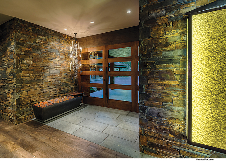
The home’s main entrance
The owner picked out that particular light fixture before the floor plan was even finalized, says RGA interior designer Annie MacFadyen.
When asked about the selection of the fixture, the owner just smiles. “I was walking around somewhere with Craig Leavitt, saw this fixture and just loved it.”
Leavitt, a founding member of the interior, furniture and product design team of Modesto’s LeavittWeaver, worked with partner Stephen Weaver on the owner’s Central Valley home and was on the Martis Camp project team from the beginning.
“Everyone knew this house was going to be really special because of LeavittWeaver,” says Morrison.
In a 2010 SFGate.com article, Leavitt said the firm’s hallmark is creating items that don’t look like what they are. A perfect example of this transformer-esque design approach is the home’s bar area. Upon walking through the front door, guests are immediately presented with the built-in bar. As a means to create a more fitting focal point, a rail system was integrated into the bar casework and a large painting functions as a sliding screen, which moves back and forth to tuck the bar away until cocktail hour. “They’re great about coming up with things that you don’t expect,” says the owner. Leavitt’s youthful interest in set design may be the germination for such transformative pieces. He has been quoted as saying his interest in stagecraft carries on through his work today, and that “any home can be a stage.”
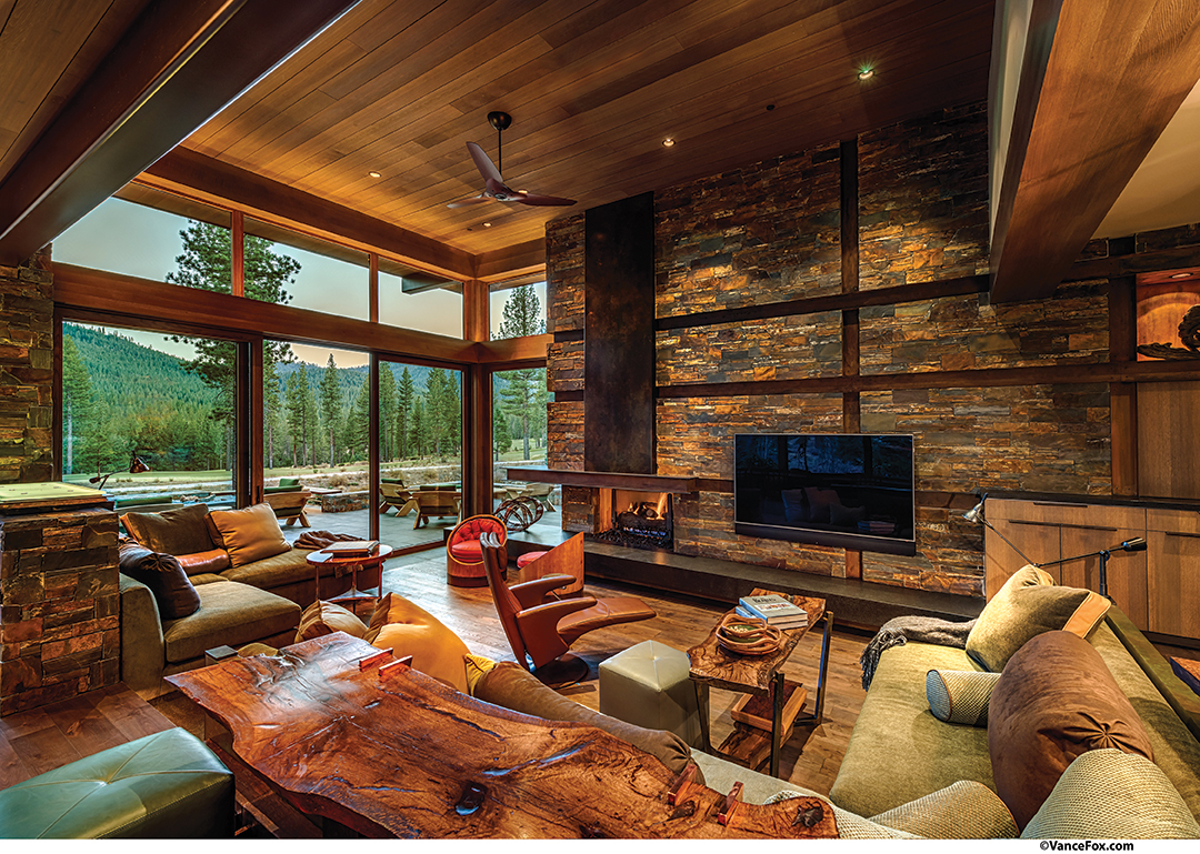
The great room as a whole could be perceived as a collection of stage sets offering intimate pods for people to gather. The bar area seats guests along a live-edged chunk of old-growth walnut; the sunken living room with extensive built-in sofa breaks down into two seating areas—one focused on TV and media, the other turned to the fireplace and views of Lookout Mountain. Built-in casework everywhere creates boundaries but remains low enough to not interrupt the room’s openness. “Everyone can be part of the conversation, no matter where they’re sitting,” says the owner.
The formal dining area utilizes a built-in banquette of umber colored leather against a wall of windows with custom tables lined up in front. For smaller dinners, one table does the job, but for meals seating 16, the “transformer” tables are designed to slide together like puzzle pieces rolling on large, wooden wheels to become a long, singular king’s table.
The zoning and flow of the great room is really just a scaled version of the home’s very intentional overall massing. A simple but powerful staple of the RGA architectural pantry—the link—both connects and closes off the public portions of the house from the spacious guest wing. A private office and wine cellar are pocketed in along the way, floor-to-ceiling glass fill this element with light and nature, and a massive, wall-like slab of white oak quietly rolls in and out of a stealth pocket in the wall, depending upon the occupancy level of the house.
A separate entry in the guest wing allows visitors, including the owner’s grown children—ages 25 and 26—to come and go with friends in tow at all hours without creating a disturbance. Three moderately sized guest suites (plus a bunk room) feature LeavittWeaver-designed beds that are as much architecture as furniture. Upholstered headboards wrap the full length of the bed wall; side tables and light fixtures are brilliantly incorporated to swivel and move on a stationary vertical support. The media/game room anchoring one end of the axial guest wing hall (an atrium door out to the stepping spa terrace is at the other) is generous enough to host any game day viewing event for a slew of guests or cozy enough for a movie night date.
The service portions of the home—family entry and mudroom, a desk/office area, laundry and butler’s pantry—maintain the same high levels of detail, finish and function found in the public spaces. A staircase leading to the upper level is tucked in among the home’s service core and gives a tree house–like ascension via windows on all sides. The master suite claims the entire upper level; it is neither sprawling nor constrained, but is a perfectly sized nest perched among the surrounding roof planes. A sheltered balcony, reminiscent of a fairytale terrace, is accessed via ten-foot sliding glass doors.
MacFadyen says a house such as this one with a “shtick”—a clear vision and strong design intent—starts to draw itself. Her place in the project was unique. Functioning as a liaison between different design “tribes,” MacFadyen was crucial in transforming the language of one profession into the language of another. “I was in between the ‘vision’ and the construction,” she says. “I could get creative with LeavittWeaver, who are 100 percent interior design and soft furnishings, and then go look at it from a construction standpoint. It was a lot of fun.”
“She wove LeavittWeaver with JMC and helped find the build-ability when it needed it. And ultimately, made the owner feel really comfortable,” says Horan.
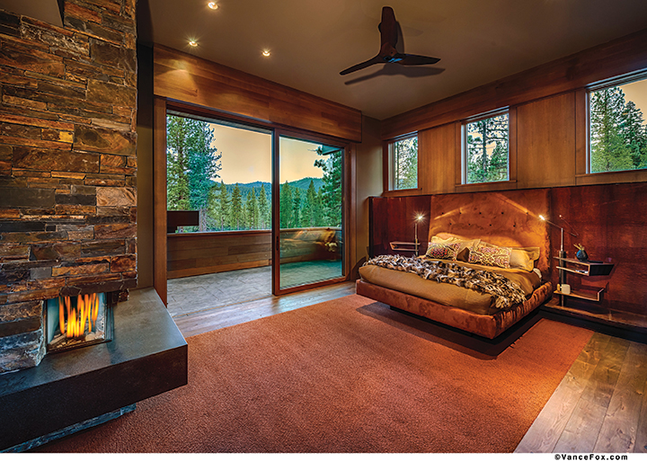
The master bedroom opens out onto a private deck
Overall, the flow and floor plan of this house represent the people who live here, Horan says.
“Who these people are and what their relationship is like is captured in the architecture. And they are aware of the ebbs and flows in life—their children are now adults and, one day, there will be grandchildren—and the architecture encapsulates that and also envelopes out to capture the whole family and their friends.”
The idea that the architecture so personally represents who these owners are and what this home means to them was poetically manifested through the use of a simple red ribbon. At the culmination of every meeting with RGA or JMC, the owner would thoughtfully roll up the plans and tie them with a ribbon. “I asked her once if she needed a rubber band,” says MacFadyen. “She said ‘Oh no… I’ve got my ribbon.’”
In further expansion of the ribbon’s significance, the owner is reflective.
“This house always felt like a present and those plans were so special to me that I didn’t want to just throw a rubber band around them. I wanted to imagine myself living in this house and not just see it as a bunch of decisions I had to make. The ribbon helped me take the time to make every decision special instead of feeling exasperated. I wanted to be reminded that this was my home. Our kids will be here, our grandkids will be here, we’ll make memories here, and it’s a lot of money and a lot of time. There are no do-overs.”
Casting a glance around spaces that are consistently warm, inviting and beautiful, it is clear that no do-overs will be necessary. The combination of unlikely bedfellows—an alpine-based interpretation of rigid architectural theory with smart, lyrical furnishings physically woven through it—was successfully brought about by the melding of numerous parties, all bringing their best efforts, every day, to each decision. “Everybody on the team played a really important role… no one person did this, everyone fed off the ideas of others, worked together and had input,” says the owner. “And every time we walk through the front door, we’re still so excited. We almost have to pinch ourselves.”
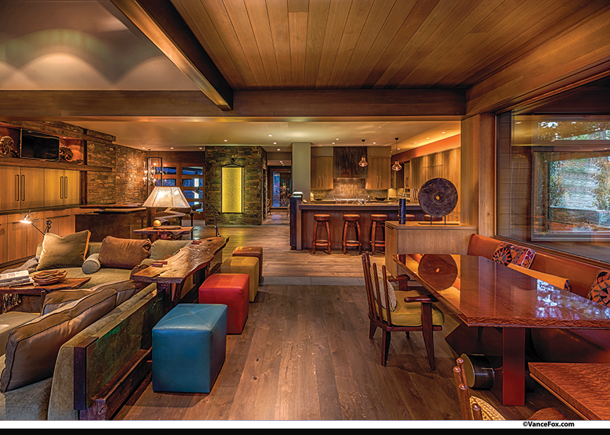
Steel, wood and stone create a warm, inviting pallette inside this Martis Camp home. During warm weather,
Weiland doors open to a patio and fire pit area for the family to enjoy
Award: Contemporary
Building Design: David Horan, Ryan Group Architects
Builder: Jim Morrison Construction
Interior Design: Craig Levitt, LeavittWeaver; Annie MacFadyen, Ryan Group Architects
Square Feet: 5,990
Year Completed: 2014


No Comments