23 Feb Concrete Bonds
A client’s rough rendering comes to life in spectacular fashion with help from a talented team
Like most architects, Clare Walton of Tahoe City’s Walton AE uses numerous tools and methods when starting a new design—sketches, photos, 3-D modeling software—but when a client opted to demonstrate her wishes for a future project with carefully composed shoeboxes, it was a first.
“The owner sent me a picture of stacked shoeboxes when we were starting adjacency diagrams, and I was captivated,” says Walton. “She used the boxes to communicate how she saw the volumes relating to each other and to say: ‘This is what I like.’”
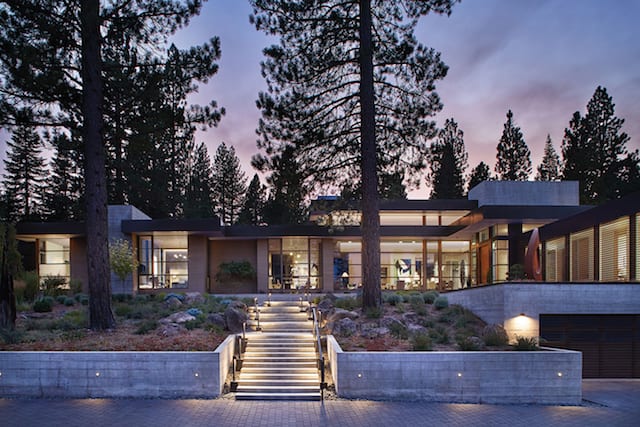
The entry walkway up a set of concrete stairs passes between two Jeffrey pines, while Eric Schaefer of Tahoe Landscaping installed 2,500 individual plants of 30 species on the 3-acre parcel
The project then took an amazing journey for the next three-plus years, from an assembly of shoeboxes on a closet floor to a phenomenal 8,400-square-foot residence that both folds into and elegantly defines a 3-acre parcel on the edge of Martis Camp’s fifth fairway.
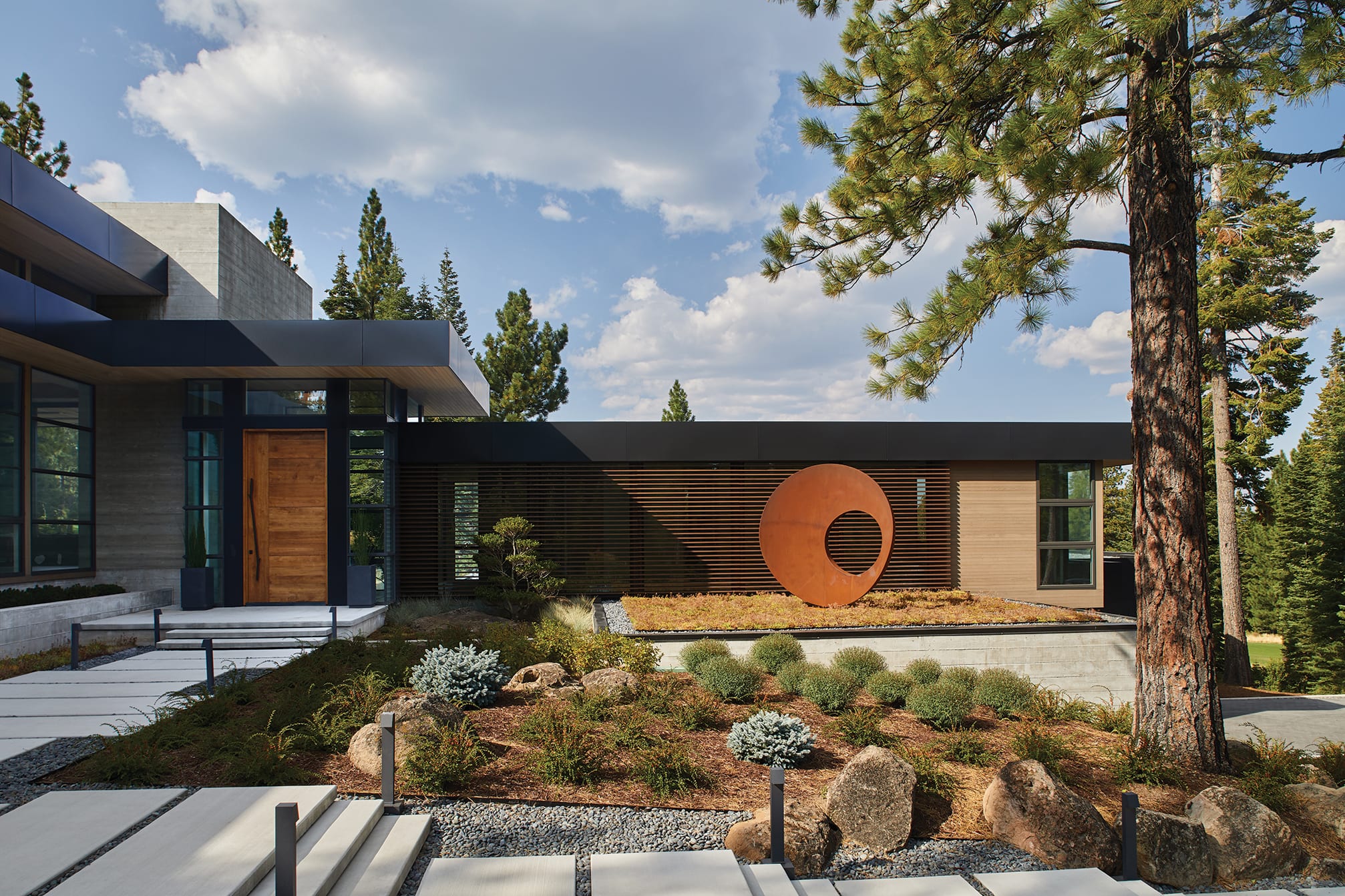
The home’s processional experience begins with the slow rise from the cul-de-sac, traveling along a rockery retaining wall to move through a wooded wonderland. The simple shapes of the house slowly come into view until a set of concrete site stairs—some cantilevered to appear as if they are floating—bring a more formal structure to the journey. Rising up the organically manicured slope, the steps thread between two sentinel-like Jeffrey pines, culminating with a sense of arrival at the 12-foot-tall front door.
“The entry walkway was one of my favorite pieces of the home from the very beginning,” says Walton. “It was exciting to see it come to fruition.”
The composition of finish materials renders the front door elevation an exercise in collage. Framed in glass, the large pivot entry door is anchored asymmetrically by floor-to-ceiling concrete on one side and set adjacent to a longer, lower horizontal mass fronted by metal slats on the other. Fortina aluminum louvers mask the wall of glass behind them, giving texture to the facade while keeping the interior space private and filled with ever-changing natural light. A circular COR-TEN steel sculpture by Portland artist Ivan McClean creates a notable contrast with the rhythm of the linear louvers, as it rests in a garden of hearty succulents—which is actually a living roof atop the discretely located garage.
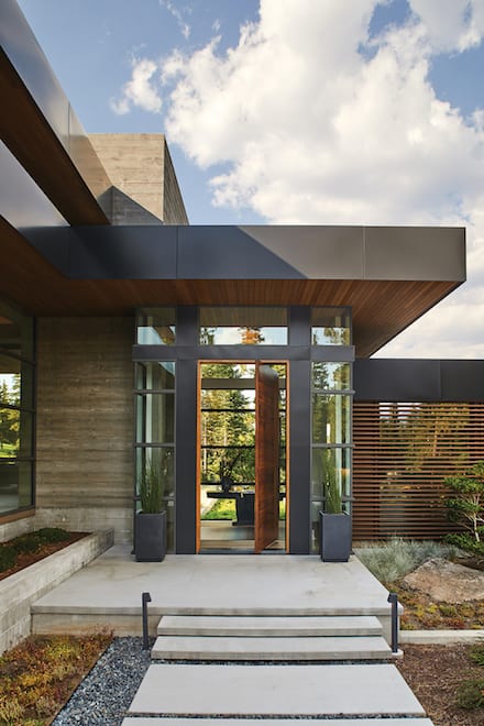
Beyond the 12-foot-tall walnut front door designed by Walton AE, the entry node is a glassy crossroads in the zoning of the house, with public spaces in one direction and guest spaces in the other
Clear cedar siding, board-formed concrete, bronze sheet metal panels, oak soffit boards and plentiful walls of Western windows define the exterior of the geometric masses, which in the end remained similar in form to the inspired shoebox sculpture.
“There were very few changes made during construction,” says the owner. “And the profile of the house really ended up looking like the shape of the original concept.”
Responding to topography and client requests, the house has two separate zones on either side of the entry node. One captures the public spaces (living, dining, kitchen) and the master suite (office, bedroom, bath and exercise). The other piece, organizationally situated at a 90-degree angle to the main living areas, houses three en suite guest rooms, two mattress-laden bunk suites, a multi-purpose media room and various support spaces.
To say concrete plays a major role in the project may be something of an understatement. Walton says that while she loves the qualities and character of concrete, she also says it was the element that brought the most surprise during construction.
“You have sculptural opportunities with concrete that you just don’t have with stone, but it’s also limiting in the respect that you can’t take it down and redo it without significant impacts,” she says. “Since you really only have one chance to achieve your vision, success in working with concrete heavily depends on a talented building team, which we were lucky to have.”
Randy Voorhees, project manager with Crestwood Construction, says there wasn’t a single week between August 2015 and June 2016 when a truck wasn’t pouring concrete somewhere on the huge jobsite.
“There’s more than 1,500 cubic yards of concrete in the project. We were pouring concrete all the time for 10 months,” Voorhees says.
“I had a file of images and homes and elements that I liked and everything I seemed to like had a lot of concrete,” says the owner.
A particular image found on interior designer Denise Kuriger’s website captured the essence of what the owner was continuously drawn to, so she reached out to Kuriger’s office and started what became a successful working relationship. “I had a great designer in Denise. I give a lot of credit to her for the success of the interiors.”
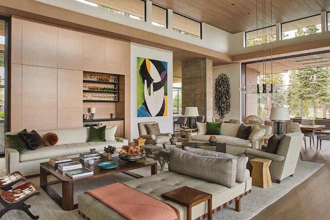
Within the oak-paneled wall of the living room, a bar is discretely hidden away behind well-concealed sliding doors set next to a large painting by San Francisco artist Charley Brown
A five-minute glance through Kuriger’s work makes obvious the designer’s exceptional grasp of mass and scale, a major contributor to the home’s success. Furnishings and art were carefully scaled up to complement the home’s volumes, creating a comfortable balance of proportion throughout.
Broad strokes of neutral tones establish the quiet backdrop of the interior palette, upon which a select handful of accent colors are artfully layered to mirror and pull in the colors of the natural surroundings seen through the home’s extensive window walls. The greens, golds and blues specifically chosen to accent interior finishes and furnishings parallel the tones of forest, foreground and sky right outside, helping to blur the line between structure and site.
“This house could have been a very modern house that was sterile and cold,” says the owner. “That’s where the materials and colors really helped warm the spaces up. The house is big and the scale is big, but I never felt overwhelmed with it. There are cozy places to sit and a lot of different views to choose from.”
The sophisticated, high-ceilinged living and dining area is voluminous yet not overwhelming, thanks to deliberate architectural moves and the next-level interior design response. A full-surround ribbon of glass hovers at the top of the room, sandwiched between an intermediate soffit and the uninterrupted oak roof deck floating above. While the interior soffit scales the room, the approximately 875 square feet of floor space is further compartmentalized by the creation of two intimate seating areas and a formal dining space. A massive board-formed concrete fireplace also anchors one end of the room (and divides it from the office area) while a 3,500-pound piece of granite helps in counter-balancing the other.
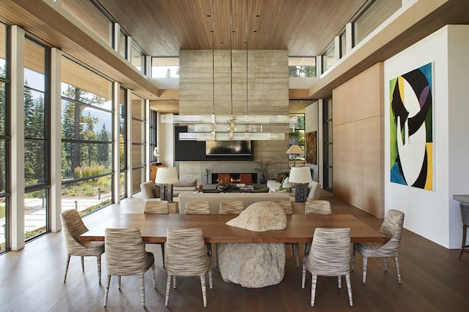
A board-formed concrete fireplace anchors one end of the living and dining space, where a 12-foot-long walnut table by Blackman Cruz balances on a 3,500-pound boulder surrounded by Febo chairs, and set under a Grand Cielo light fixture by Lianne Gold for Ralph Pucci
The boulder serves as the base for a 12-foot-long walnut dining table, selected after construction had started. While this piece of furniture required additional reinforcing for the unanticipated concentration of weight, Voorhees explained that actually getting the boulder inside and properly located after the fact was an adventure in itself.
“We craned the boulder over the house into the backyard with a 350-ton crane. It was a 115-foot reach to get it there,” he says. “Then we moved it inside, ancient Egyptian-style, with two rolling sections of scaffolding, suspending it in the air with chain hoists.” With a smile, he adds, “Almost every single one of Crestwood’s finish carpenters were there that day. Placing it required a lot of help.”
Beyond the main space, the entire home is littered with nooks and coves and cozy seating areas to ensure that no matter the number of people in the house, a spot is available to comfortably accommodate. Walton took great care in nestling the uphill side of the house into the site to not only enhance a sense of snugness, but to also better balance the massing.
“The nook and kitchen windows are flush with the ground outside, which creates a space that feels cozy and integrated with the surrounding landscape,” says Walton. “On the opposite side of the main wing where you are elevated a few feet out of the ground, you see the hillside drop away and you take in the distant mountain views. The contrast of feeling grounded on one side and lofty on the other creates balance and interest in the space.”
This mix of nestled and airy applies to the various outdoor spaces as well. Through no fewer than a half dozen access points, one can saunter out to the many inviting outdoor living areas available around the home, each providing an individual vantage and vibe. Enhancing the bonds between land, architecture and function, all exterior living areas are stitched together via pathways and site stairs, strengthening the connective thread.
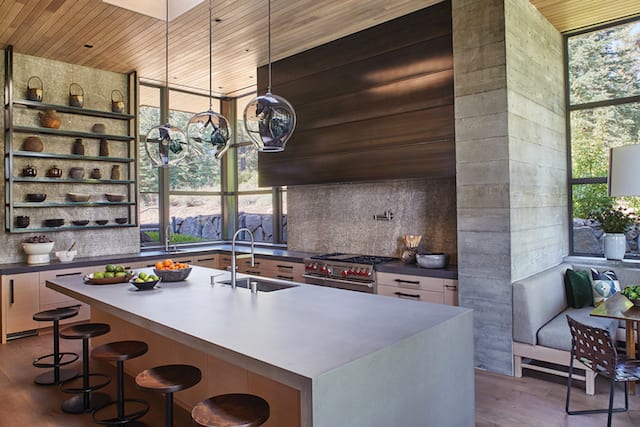
Board-formed concrete divides the gourmet kitchen from a snug table nook adjacent to a waterfall-edged concrete island
“It’s the most site-intensive project I’ve worked on,” says Walton. “The cross-sloping topography and multiple view angles presented many opportunities for interesting outdoor living spaces. It was exciting that our clients were interested in having such a strong connection with the landscape.”
Additionally, aiding to weave each extended terrace with every site boulder and native pine, the extensive landscaping uses considerable quantities of native plants and strategically placed ornamentals.
Designed and installed by Eric Schaefer, owner of Tahoe Landscaping, the plant list includes more than 2,500 individual plants of 30 different species. The landscaping does for the exterior what the interior design does within: eases the edges, creates scale, celebrates the architecture and enhances spaces that people cannot resist being in.
“The house is beautiful, but the landscaping takes it to another level because it softens everything,” says the owner. “In the summertime, it just feels like heaven. And I so enjoyed working with Eric. He was meticulous in everything he did.”
“Landscaping is a piece that’s often forgotten,” says Walton. “But it plays a powerful role in strengthening the connection between building and site. This was especially important for our project given the multiple outdoor living spaces and the prominent entry sequence. If the landscaping had fallen short, our project would have suffered.”
The luxury of the expansive interior and exterior spaces, the thoughtful mix of select furnishings and art, and the perfectly enchanted landscaping all contribute to the goal of melding the architecture with the conifer-covered slope. However, the motivation behind it all had nothing to do with statement making, keeping up with the Joneses or hosting lavish parties: This is a house built solely in the name of family.
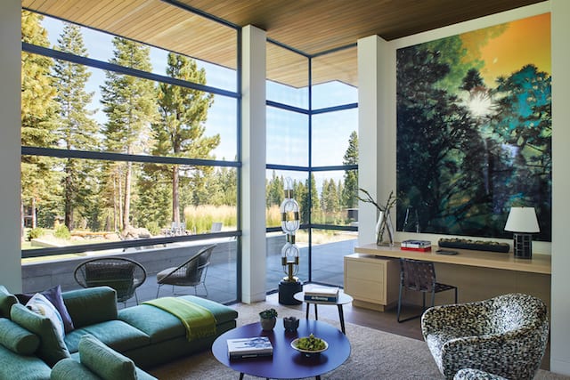
Photographer J Paxton’s Torrey Pines 2077 is a reflection of the forested exterior beyond the cozy sitting room
“Yes, this house was designed and built with the family in mind,” says the owner, whose family includes five children, 15 grandchildren and two great-grandchildren. “We previously had a smaller house in Martis Camp that Clare designed, but after four years we said, ‘We’re going to need a little more space with all these kids and grandkids.’ And that’s what sent us off to where we ended up.”
Asked if the house has ever been put to the test with the entire extended family in residence, the owner thoughtfully recalls a particularly defining and all-time favorite moment.
“On one evening, we were sitting around the outdoor fire pit and I had all 15 grandchildren there. I just looked around and it was such a wonderful feeling. They were all having such a good time and the house was working so well and we were enjoying ourselves and as I was looking around, I just thought how blessed I am to have a place that we can all come and spend time together.”
Award: Outstanding
Building Design: Walton AE
Builder: Crestwood Construction
Interior Design: Denise Kuriger Design Ltd
Square Feet: 8,407
Year Complete: 2017


No Comments