19 Feb Shared Sensibilities
A Reno builder and architect team up to turn a tired spec into a stunning remodel
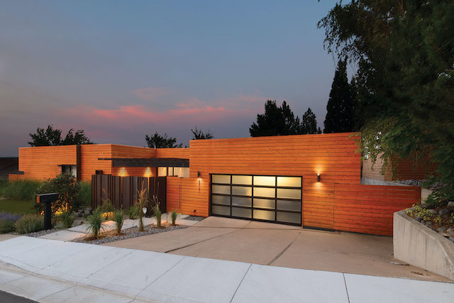
The exterior of the home is clad in horizontal western red cedar siding
Jack Hawkins and Darin Murphy share a few things.
Hawkins is the principal architect at Hawkins & Associates. Murphy is a builder who owns Murphy Built Construction. Both are based out of Reno.
One thing they share is a desire to do any job but a home remodel.
“The first thing I do [when a homeowner approaches me about a remodel] is to try to talk them out of it,” Hawkins says. “They’re hard on the design team, hard on the owners, hard on the generals, and hard on the subs. I tell them it’ll take twice as long as we think and it’s gonna cost twice as much as we think.”
Murphy is even less thrilled about remodels in general.
“I’d only do them as a favor to Jack,” Murphy says with a chuckle. You get the sense he’s not kidding.

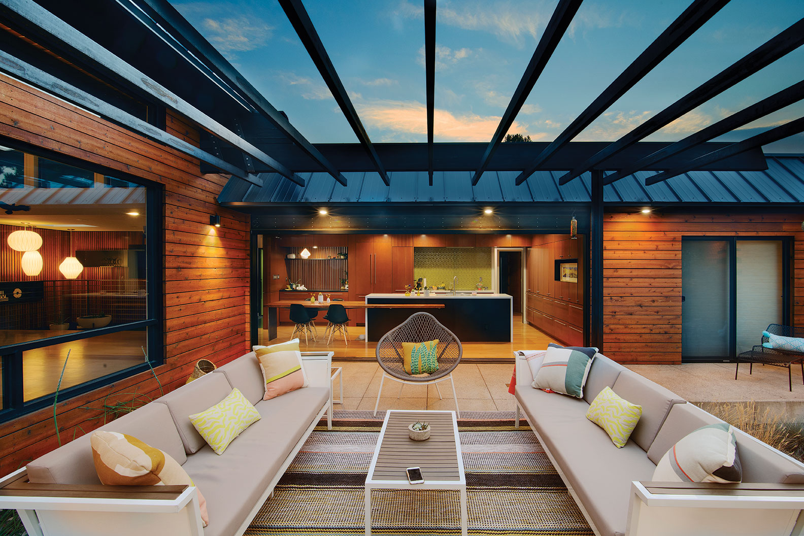
The open living room features clerestory windows and dark-stained wood beams
Which brings us to the second thing they share: they’re actually really, really good at remodeling homes.
That ability led them to totally transform a home in southwest Reno.
It started as a sleepy 1970s relic, a spec home with a mansard roof, a collection of odd decks and some good bones.
By the time work finished on the property in 2018, it sang with midcentury modern style.
The remodel created a coherent flow inside, opening up a kitchen that was closed off from the rest of the shared spaces. It added eye-catching features like a reimagined entry courtyard and back patio that took advantage of the outdoors and views out to the surrounding mountains.
The house, owned by a couple who bought it in 2006, is 2,613 square feet. The remodel updated about 60 percent of the home’s interior and 80 percent of the exterior with a budget of about $350,000.
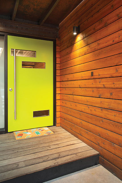
The original entry was livened up with a bright green door that fits the midcentury modern theme of the remodel
One of the first items on Hawkins’ to-do list was that mansard roof.
A bit of a rage in the ’70s, the false roofs create a second slope, or visible shingles, that plunge toward the ground while a main roof is hidden behind it. A product of French countryside homes, it’s out of place most everywhere else.
“It wasn’t a great aesthetic,” Hawkins says. “We got rid of it where we could. And where we couldn’t, we took it from a nasty compositional shingle—which is the lowest common denominator in roofing—and elevated it with some modern materials (standing seam metal roofing).”
The effect isn’t hard to spot from the street. The home presents as a flat-roofed building from the front, with warm, horizontal western red cedar siding stretching from the ground floor to the top.
“Getting rid of that roof changed the whole house,” Murphy says.
An old paneled garage door was replaced by a bright frosted glass door that livens up the view from the street.
Next up was an entry sequence. Previously, the front door was accessed from a paved walkway to an empty courtyard Hawkins calls “godawful.”
To liven it up, Murphy’s team installed pavers, a metal gate and roof to create an enclosure where the homeowners take their coffee on summer mornings while their two small dogs play. A bright green door adds a splash of color and fun.
“I saw that space as an opportunity,” Hawkins says. “Now it’s a multipurpose space—it screens the street and everything around you so all you see is the sky and the mountains in the distance.”
Walk through that green door and you’re treated to Hawkins’ take on midcentury modern design.
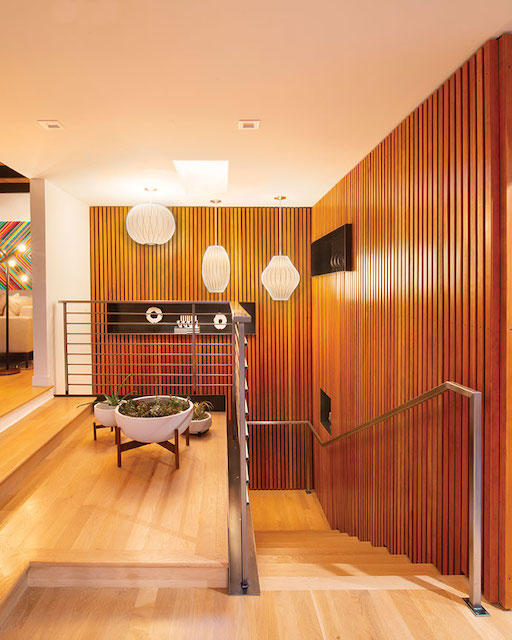
Vertical 2-by-2 Douglas fir slats form the walls in the entryway as well as a staircase leading to a basement
Vertical 2-by-2 Douglas fir slats form the walls on two sides of the entryway. It invites visitors into a space that used to be a confused jumble, with a staircase leading to a basement on the right. Steel alcoves cut into the walls shelve art and catch the eye.
“Before, there wasn’t a real entry to say, ‘Here I am.’ There is now,” Murphy says.
Visitors next step into the living room. It’s one of the spaces that sold Hawkins on the project, he says, a big space with clerestory windows that’s an example of fine architecture.
“From a sustainability standpoint, if you can take an existing structure and update it, that’s the way to go,” Hawkins says.
Features like new energy-efficient windows, earth-friendly paints and stains, and Forest Service Council-approved woods were used to create a greener building.
Heavy wood beams in the living room were stained darker to make the space pop. A sliding door leading to the patio—which is a step down from the living room—was removed to make way for a stunning window to the outdoors.
A dated slump-block fireplace was sheathed with a sleek steel wrapping and a new concrete hearth, creating a more modern space, while a wall that closed the kitchen off from the living room was removed.
Finishes and lighting were updated to make the room more welcoming. A long granite island, with an attached wood-top table, created a second eating spot aside from the formal dining room and cemented the kitchen as a family gathering space.
Hawkins repositioned the entry from the kitchen to the patio, where it’s accessed by a 20-foot-wide triple-sliding glass door by PRL Glass Systems.
Architect Jack Hawkins and team spruced up the front entry courtyard by adding pavers, a metal gate and a roof to create a private enclosure
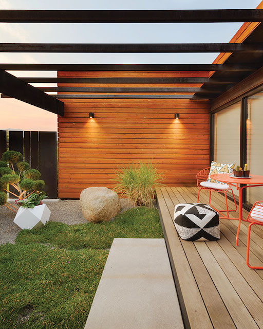
A new concrete patio replaces old wood decking off the kitchen, which is on the same level, to create an indoor-outdoor entertaining space. A remnant of the mansard roof is visible here, though now it’s metal-cladded to take on a more modern look.
Topping the patio is a steel trellis to shelter the space and the kitchen beyond from the morning sun.
A small courtyard separates the entertaining patio from a smaller one off the main bedroom, creating an intimate space for the owners to enjoy their small backyard, which is made up of turf, native grasses and rock, and existing trees.
The overall effect is exceptional for a pair of guys who shy away from remodels. But the last thing they share is an admiration for each other’s work.
“Jack is pure. He draws contemporary homes and has never deviated from that,” Murphy says.
“I couldn’t have pulled this off without him,” Hawkins says of Murphy. “[Noted modernist architect] Ludwig Mies van der Rohe had a quote that said, ‘Less is more.’ We have a joke that less is more expensive and more difficult. To pull off a look like this, you really need a builder who is perfect, because there isn’t any crown molding to hide mistakes.”
Award: Urban Remodel
Building Design: Hawkins & Associates
Builder: Murphy Built Construction
Interior Design: Hawkins & Associates
Square Feet: 2,613
Year Complete: 2018


No Comments