22 Feb Urban Appeal
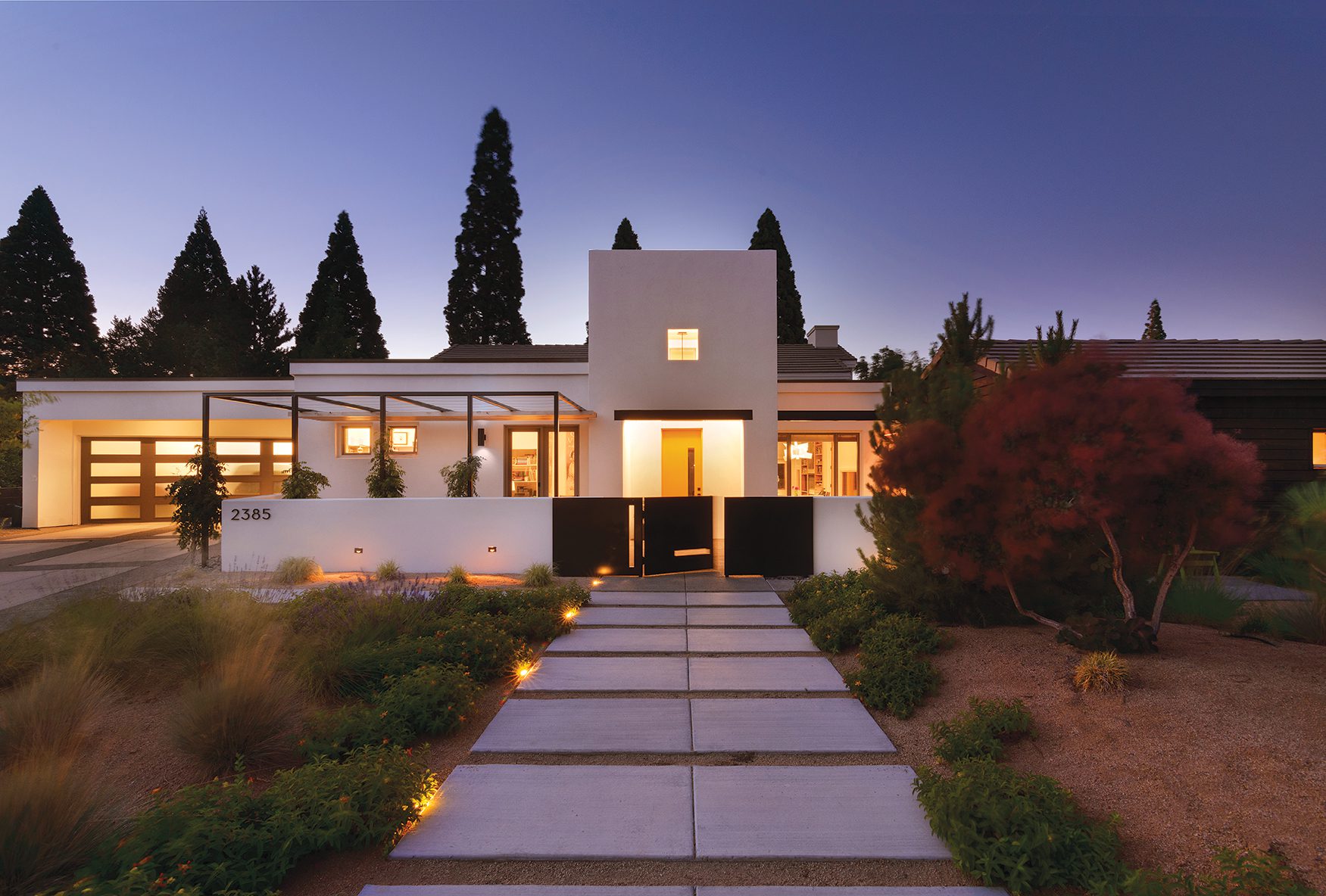
A contemporary Reno home receives a modernized makeover

The original front entry featured fake rock and a tile-clad tower roof
When David Walker became CEO of the Nevada Museum of Art in 2007, he and his wife Darby set out to find their new permanent residence. They soon fell in love with a contemporary home designed by architect Carlin Williams. Built in 2005, the 2,495-square-foot house had two bedrooms, two baths and a detached guest suite. “It had many of the same qualities and features as our previous home in Southern California with a beautiful mountain view to boot,” David says. “The southwest neighborhood provided a convenient location—only a six-minute commute to work.”
Eventually, however, the couple decided to make some key upgrades. As art lovers with an eye for modern design, David and Darby wanted to renovate their home to fit their current needs while ensuring that it still fit into the context of the neighborhood.
“We felt certain traditional aspects needed updating to fully realize the many contemporary qualities inherent in the architecture,” Darby says. “Our aesthetics definitely lean towards minimalism and light, so we began considering a phased plan during the pandemic.”

The new outdoor living and entertaining space, with its western red cedar screen wall and non-glare linear lighting, can accommodate a couple having a cozy drink in a private outdoor space or a large group of guests. Eventually, the new trellis will be covered in wisteria
They began by updating the kitchen. Simple changes—such as adding new fixtures, lights and appliances, as well as replacing the granite counters with white Neolith—instantly transformed the feel of the space. Excited by the possibility to reimagine the rest of the home, the couple hired Jack Hawkins, an award-winning Reno-based architect who specializes in modern designs.
“We encouraged Jack to surprise us, to challenge us and to know that we would be fully supportive of his ideas,” David says. “It was a treat to work with such a talented architect.”
First, the couple wanted to renovate their outdoor patio.
“For years, the space had functioned as an outdoor living room where the couple could entertain friends,” says Hawkins. “Having an extended living space was important to them, and the goal was to make it feel like a more modern and natural extension of their interior living space.”

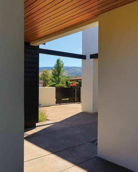
A vignette from the new outdoor living space highlights the framed view of the Sierra as well as the new wood ceiling and steel gate beyond
Hawkins’ team expanded the footprint by 250 square feet and added pavers and planters to give the area a more functional and aesthetic feel. Next, they used steel to create a trellis overhead, which provides structure for the growing wisteria canopy.
“The trellis makes the space feel more like an enclosure and provides additional privacy and sunshade,” Hawkins says. His team then added a custom concrete bench around the living area. The top of the bench was seeded with recycled blue glass and hand-polished for a striking finish. “There’s an LED light under the bench, so it glows when you’re entertaining,” Hawkins says. “It’s the little details that make the space pop.”
Landscaping was the final piece of the puzzle. Hawkins worked with Carrie Cowan from Legends Landscaping to envision a minimalist palette for the extended living area. Drought-resistant plants and drip irrigation were used to help save water, and groups of plants were structured together to give the space a more cohesive look. Wood-screened slatted walls and landscaping helped provide privacy and seclusion from neighboring houses.
Once the outdoor upgrade was complete, the couple asked Hawkins to work his magic on their primary bathroom. Clocking in at 166 square feet, it was smaller than many primary bathrooms and felt dated because of its dark interiors.
“We wanted the bathroom to make the couple feel like they were stepping into a spa-like bathroom at a really nice resort,” Hawkins says. In addition to lightening up the space and replacing old fixtures and features with more modern alternatives, Hawkins envisioned a Japanese spa concept that would feel private, secluded and larger than its original footprint.

The renovated primary bathroom exemplifies a simple palette of beautiful materials, exquisitely detailed to help make a small space feel larger and more luxurious. “More square footage is rarely the right solution,” says architect Jack Hawkins
“We really opened the bathroom up to make it more relaxing,” says general contractor Ryan Shmyr of S&H Builders. “I think the modernization and attention to detail really sets this remodel apart and makes the bathroom more functional.”
The wood slat ceiling and siding, which unfurls in one corner of the bathroom, stands out as one of the most distinctive features of the remodel. Each piece of wood had to be cut differently and scribed to match the curve of the space.
“There’s no trim around the bathroom, which makes the space look more elevated but requires much more precision when designing it. With good modern interiors, it’s all about the detailing, and the cleaner the detailing, the more powerful it becomes,” says Hawkins, adding, “These details are not possible without a really talented and conscientious general contractor.”
Hawkins also added beautiful handmade tile from Heath Ceramics, which was founded in 1948 and still operates out of Sausalito. He ran the tile up higher than the ceiling and did a half-inch reveal where the wood stops to make the ceiling look cleaner. He kept the toilet in the same spot but replaced the original walled-off area with opaque glass that is clear at the floor and ceiling.

The new bathroom features handmade tile from Heath Ceramics and wood slat ceiling and siding. Each piece of cedar had to be fabricated to match the curve and angle of the shower
“It makes the space feel larger but also provides a layer of privacy,” Hawkins says. Since there was a large window that overlooked the driveway, he took the wood ceiling down vertically to help draw attention to what’s inside the room instead of what’s outside it.
Two LED strips between the wood slats add more visual variety. “When the lights aren’t on you don’t know they’re there, but if you need the light at night, you get slots of light between the slats. It’s a clever way to light the toilet, and everything is on a dimmer so the lighting can be adjusted from bright to dim,” Hawkins says.
The pièce de résistance is undoubtedly a traditional Japanese soaking tub made of wood. “It’s like a work of art,” Hawkins says of the tub. Polished beach rocks fill an oversized shower pan, acting as an overflow for the tub. A sand-blasted stainless steel bath and towel niche was designed around the soaking tub and houses the plumbing for the Dornbracht tub filler. The tub is surrounded by walls of glass that float down from the ceiling and into the rocks.
“You can’t see where the glass is connected to the floor, so it basically just floats there,” Hawkins says. “We wanted the interiors to feel minimalist and very clean.”
A George Nelson pendant is centered above the soaking tub, making the space feel modern yet approachable. The end result is a space that is sleek, striking and made for the modern era.
David and Darby were delighted with how the spaces turned out and look forward to enjoying it in the years to come. “We have no regrets,” David says. “[The renovation provided] tons of value and joy in the end.”
Award: Urban Remodel
Building Design: Hawkins & Associates
Builder: S&H Builders LLC
Interior Design: Hawkins & Associates
Landscape Design: Legends Landscaping
Square Feet: 2,495


No Comments