26 Feb Arc de Triumph
Pond-side modern home breaks the mold with bold touches
While perusing Martis Camp marketing material in 2010, general contractor Joan Jones found herself captivated by a rendering of the unique, modern home proposed for Dick and Connie Good, owners of Cabin Site 300. “I just said, ‘I want to build that house!’” says Jones. One year later, Jones—one half of Tahoe City’s Jones Corda Construction—got the chance. “I thought it was an exquisite design and I’ve always thought highly of Joel’s work; he’s done some really interesting houses.”
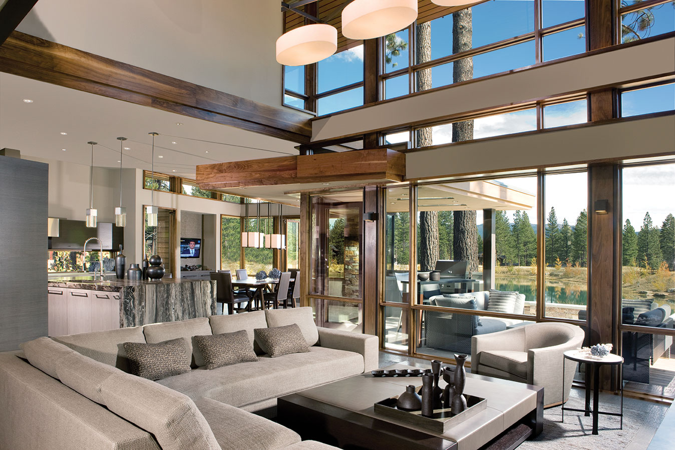
The dining room provides views out to the pond
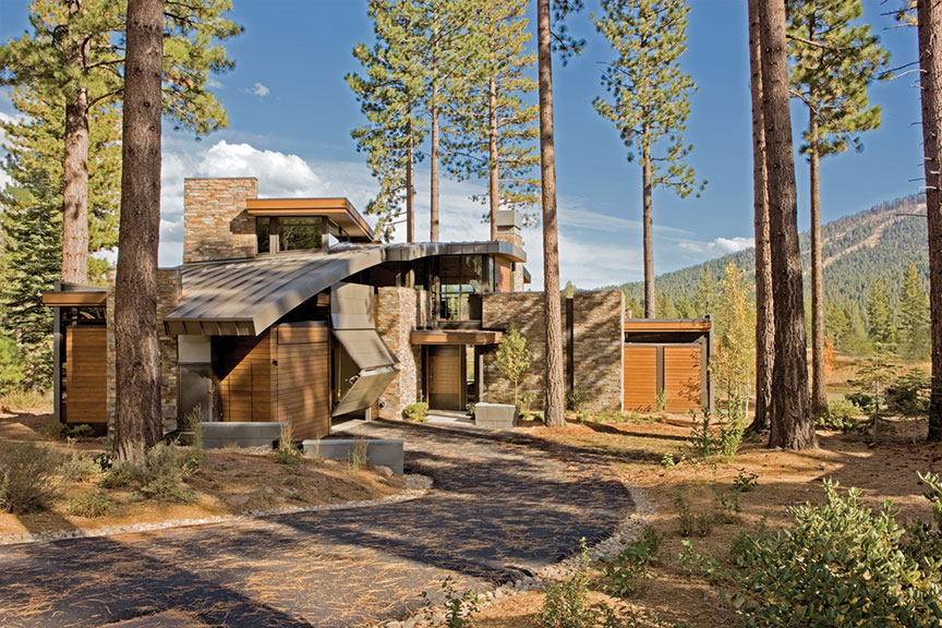
Jones is referring to Truckee architect Joel Sherman of JLS Design. His design for the Good residence, completed in August 2012, makes it an outlier of twenty-first century alpine architecture, resting in Martis Camp’s landscape as much sculptural installation as residence. Emphasizing a play of form and materiality, geometric volumes of ledgestone, metal, cedar and plaster are layered and lapped. The subtle but dominant curving roofline arcing through the structure gives the house its indisputable fingerprint of authenticity while accomplishing both aesthetic and functional tasks alike.
“Everything is linked to the curve, and no matter where you are in the house, you can feel it,” says Sherman. “It humanizes and scales the volumes, going from one story up to a story-and-a-half and back down. It works as an anchor.” Sherman is quick to note the juxtaposition of the curved roofline with more angular forms is a perfect representation of the home’s owners and their design program. Described as full of life and in love with Tahoe, the Goods wanted a house that equally balanced public and private sensibilities, something both sophisticated and that could be lived in with uncompromised comfort: a house satisfying potentially conflicting demands with seamless grace.
They got it.
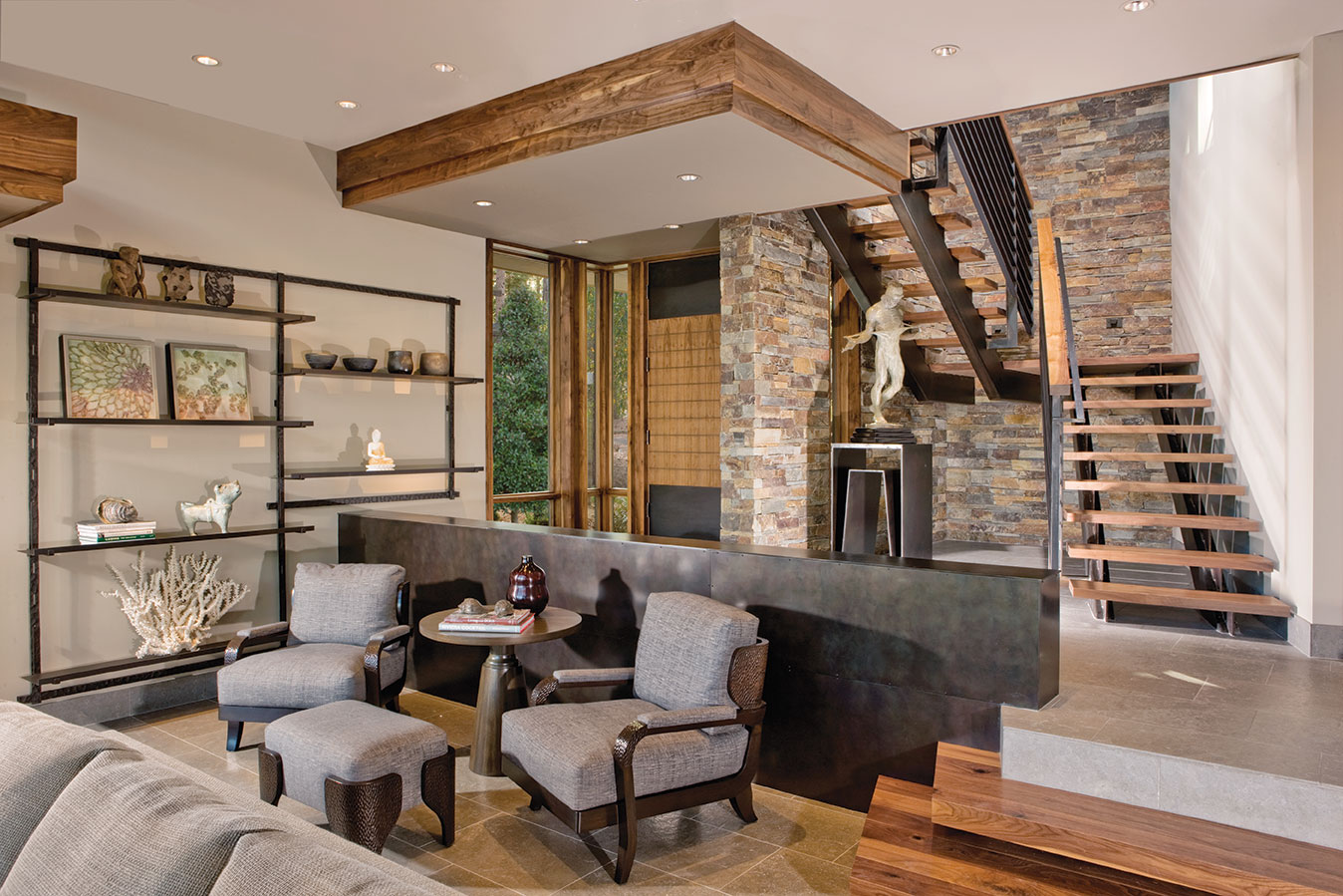
Looking back toward the main entrance
Married in 2008, the Goods (along with dogs Lucy Lu, a Doberman pinscher, and Frankie Doodles, a miniature pinscher, naturally) spend May through October in Martis Camp and head back to Scottsdale for the winter with frequent return visits as ski conditions dictate. With architectural tastes leaning toward modernism’s clean lines, they took one look at Sherman’s website while shopping for potential designers and said, ‘bingo, this could be our architect.’
Parked on the edge of Martis Camp’s Concert Park Lake, the Goods own a dreamy little slice of Sierra. The site is wide open to the east, drowning in copious amounts of year-round sun, directly accesses a development-wide trail system and enjoys an outrageous show of nature throughout the seasons—vast species of birds (including eagles), bears and coyotes viewed from the site make for a private showing of “Wild Kingdom.”
The masterful placement of the home on the property and use of a courtyard-type floor plan deftly balance the public and private, leaving the inhabitants of the house feeling like they are in the middle of the forest, even though community amenities lie mere feet from their living areas. “The house was designed to just wrap its arms around the pond,” says Sherman. And the view of Lookout Mountain is immediate and completely uncompromised. “The view is omni-present,” says Dick Good. “No matter where you are in the house, you’ve got it.”
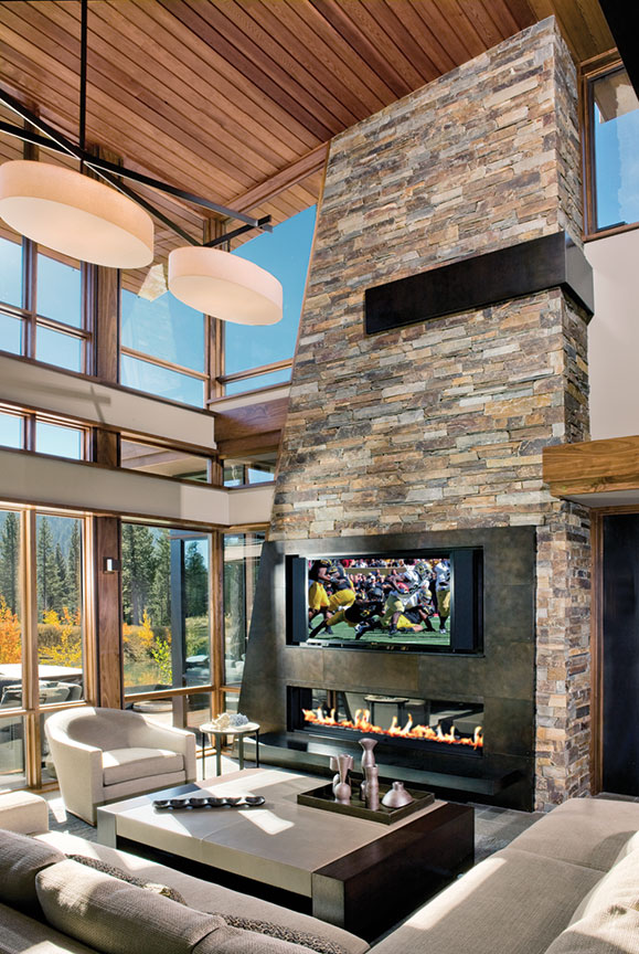
Steel accents create vibrancy in the fireplace
Sherman set the house up as though it were a sundial, to track daylight and cause an ever-evolving ambiance throughout the interior. The purposeful manipulation of flat roofs provide opportunities for sun and light to sneak through deliberately placed slices of glass, pulling daylight into the far reaches of the home no matter the time of day or year. Artfully composed walls of glazing and the continuation of exterior elements to the inside not only accomplish the goal of bringing the outside in, but blur that interior/exterior line so completely that the structure is perceived as much more cohesive in nature. “Joel designs the inside as well as the outside,” says Jones.
Woven seamlessly within architectural elements, the finishes, colors and textures combine to flavor the interiors in unassuming but sophisticated warmth. However, with great verve, the occasional perfectly placed flair grabs all the attention and also becomes an expression of the people living here. The thick, dropped panel island slab is one such punctuation that draws anyone walking into the house over to touch its earthy, cool surface.
“I love my kitchen countertop,” Connie Good says with undisputable enthusiasm. “I think it looks like melted chocolate.” Indeed, the thick slab of Antolini Luigi stone, with its ‘Frapachino’ leather finish, injects a sense of high fashion (kitchen couture?) into the otherwise clean, crisp room. “I could tell Connie was a ‘texture’ person from the first time I met her,” says Vivian Soliemani, creative director and senior designer at Bay Area interior design firm Bethe Cohen Design Associates. “But she also knows quality and appreciates good design, so we had to find unique things for the house.”
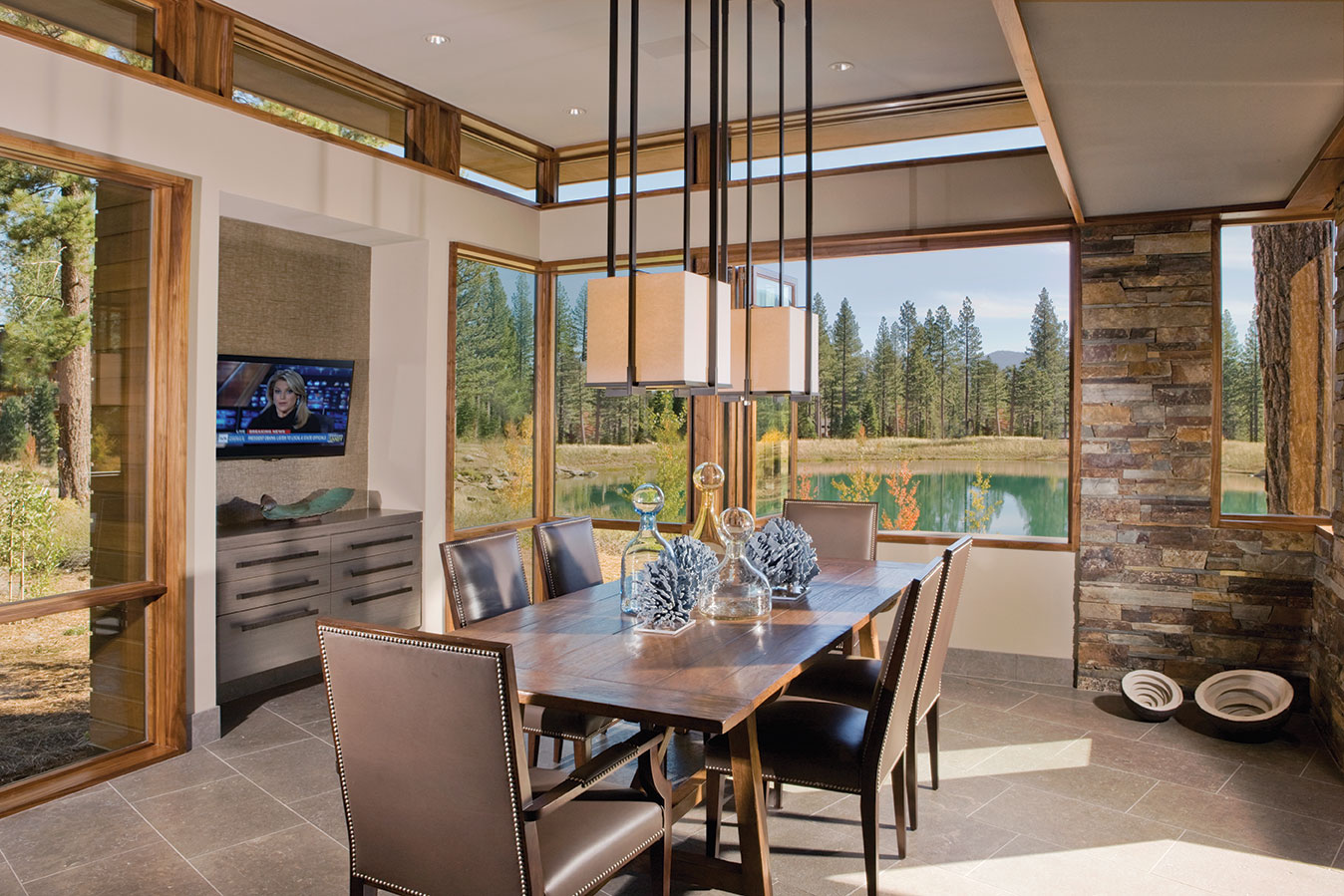
Views over the dining room table toward the Martis Camp pond
The vibrant “Zebrana” marble wall in the spacious master bathroom shower is another element that reaches out with dramatic visual texture and announces the arrival into the room. “Bringing Vivian and Kate (Kate Blizzard, Bethe Cohen senior designer) in was the best thing I could have done—they understood us 100 percent,” Connie laughs. “I said I wanted the interiors to be sexy. We are still newlyweds after all.”
Even though select, exclusive material gestures become the headliners of the interior show (so to speak), the surrounding cast of finishes and surfaces are far from ordinary—creamy limestone floor tiles, steel accents with a silk-like finish, rich walnut flooring, stair treads and interior fascia and an assortment of cosmopolitan wallpapers create a consistent, livable tapestry within which the more flamboyant finish selections become both balanced and celebrated while working in tandem with the architecture. “Vivian and Kate’s ability to assimilate into the design was incredible,” says Sherman.
Precision of details and canvassing of high-quality materials throughout the project are found even in the most typically neglected of residential spaces: the garage. The two, flush-mounted garage doors on the Good Residence—an overhead door finished with cedar siding and a Schweiss hydraulic, hangar-style door clad with metal panels—are so architecturally integrated that Jones has had to get in touch with the snow removal service and tell them where the garage is to facilitate effective snow removal. Sherman, who makes great efforts to inject a human scale to the garage component on all of his residential projects, considers this the ultimate compliment.
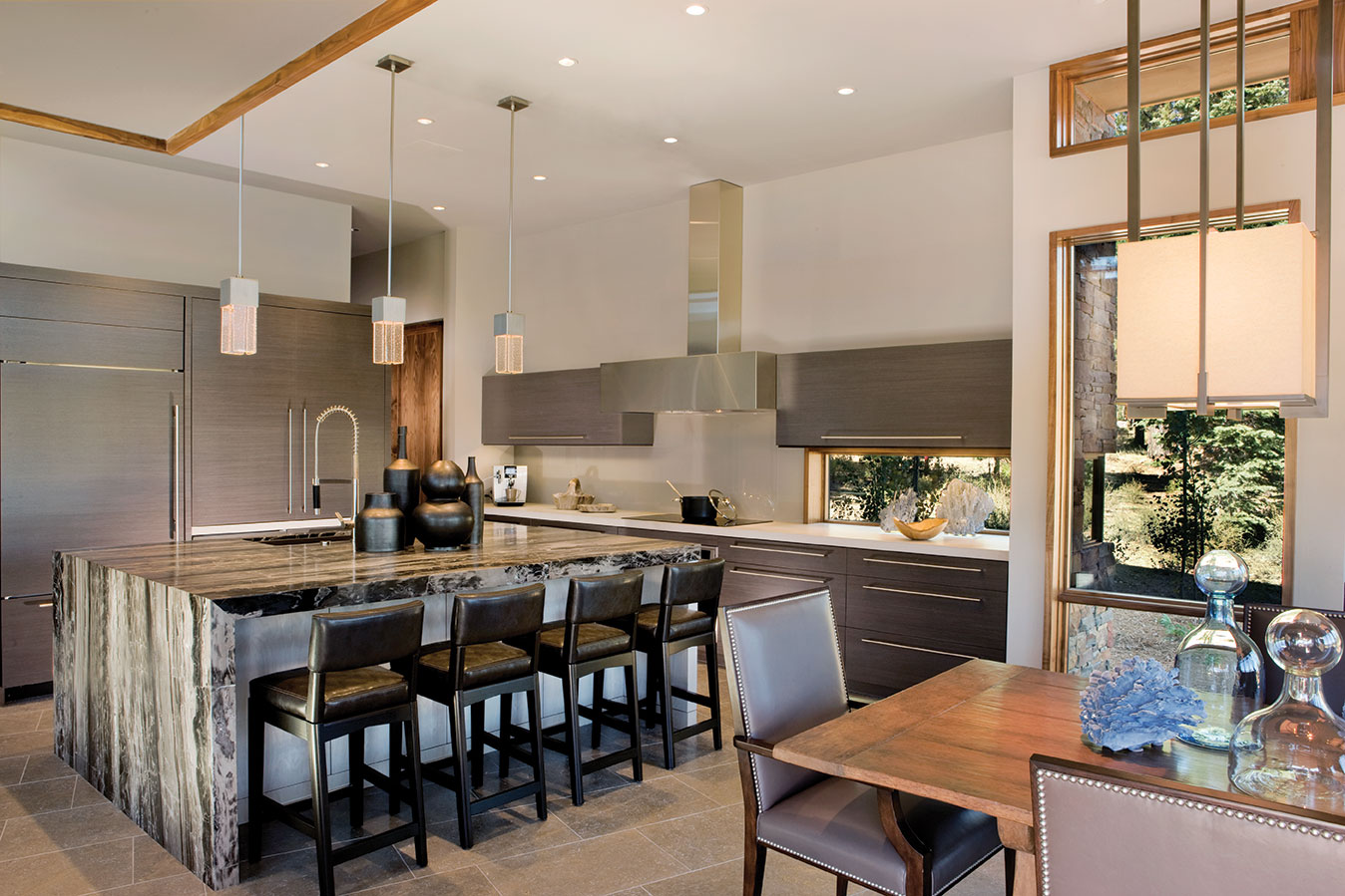
Antolini Luigi stone creates a lively kitchen scene in the island
The camouflaged nature of the doors and surprising operation of the hangar-style door also makes the garage something of a sideshow feature. “Guys really like that door—it’s like watching football,” laughs Connie. “They say, ‘Can you open that door again, Dick? Is your helicopter in there?’” Dick Good spent his professional life as a pilot, flying myriad aircraft throughout his career; the selection of a hangar-style door was no accident and becomes yet another personalizing component of the residence.
Installing the slick, “simple” hangar door was the toughest thing on the project, Jones says. Given the immense challenge of building a house of this caliber, to consider the installation of a custom garage door “the hard part” is a testament to the considerable skill and experience of everyone on the Jones Corda crew. “Joan and John (Corda) and Mike (Roberts, project superintendent) were amazing.” Connie says. “They aren’t ‘practicing’ on your house… they know what they are doing and they just take care of you.”
Materials and ideas exist in infinite combinations, many leaving us with no inspiration or worse, asking nothing of us. But every so often, an image or idea is so good that it captures the attention of anyone who happens to be wandering by. The house with the curved roof on the west side of Martis Camp’s pond is just such a creature. Joan Jones knew it when she first saw it and certainly so did everyone lucky enough to be involved.
“It was so amazing working with everyone on the project. It all evolved effortlessly—a nice, easy flowing process,” says a reflective Connie. “And I think it was so easy because everyone cared so much.”
Outstanding Achievement Award
Architect: Joel Sherman, JLS Design
Builder: Jones Corda Construction
Interior Design: Vivian Soliemani, Bethe Cohen Design Associates
Year Completed: 2012
Square Feet: 3,221


No Comments