25 Feb Redesigning a Remodel
A century-old West Shore cabin gets a much-needed facelift
Over the past century, the lakefront home on Lake Tahoe’s West Shore had been subjected to a series of sporadic and disjointed additions. A laundry closet was squeezed into the kitchen, the original hearth was abandoned in the den and the views of The Lake from the master bedroom were cut off by descending eaves. Field measurements and investigations of the property concluded that the original 20-by-30 foot cabin was built in the early 1900s, and possibly used as a cattle ranch.

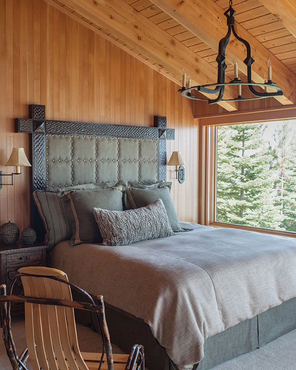
The bedroom opens to a stunning view of Lake Tahoe from the West Shore
“Over time, it appears to have been through several functional but insensitive remodels,” says Truckee-based interior designer Catherine Macfee, noting a major remodel in the 1980s added a dining room, entry porch, dormers and a “bland, poorly proportioned two-story shed” housing the master suite and living room. “We wanted the new work to tie all the previous remodels together.”
The homeowners, who live fulltime in the San Francisco Bay Area, contacted Macfee to transform the cabin, with a request for more sleeping spaces, an improved flow between rooms and to update the old home while maintaining a form and scale appropriate to the Rubicon Bay neighborhood.
“We explored the possibility of new construction, but in the end decided to try to preserve as much of the existing cabin as possible,” says Macfee. “The clients did not want to build a larger home as they appreciated the scale and feel of the existing home and were sensitive to the character of the neighborhood. Remodeling an older home, especially one that has been through so many prior remodels, presents challenges for everyone, from engineering to mechanical and other systems.”
Macfee worked with Ward-Young Architecture to design the basis for the remodel. Peter Koenig of Loverde Builders, who Macfee notes has a “sensitivity for solving the problems inherent in this type of remodeling work,” was tapped for construction, which began in October 2010; the home was finished in spring 2012 and the garage and site work completed later that summer.

Remodeled throughout the years, this lakefront cabin was in need of a serious update and
got it with all new finishes and furnishings
The interior was gutted. On the lower level, a new hallway leads to the powder room, den and bedroom. The laundry room was relocated from its spot in the kitchen to the site of the original lower bathroom. A new entry porch and mudroom were added to allow for a proper sense of arrival and while the kitchen retains its location at the heart of the home, the front entry no longer opens directly into the room. The dining room was extended and glazing was increased to bring in more natural light. Upstairs, the bunk room was enlarged while the master bedroom was redesigned to allow for improved views.
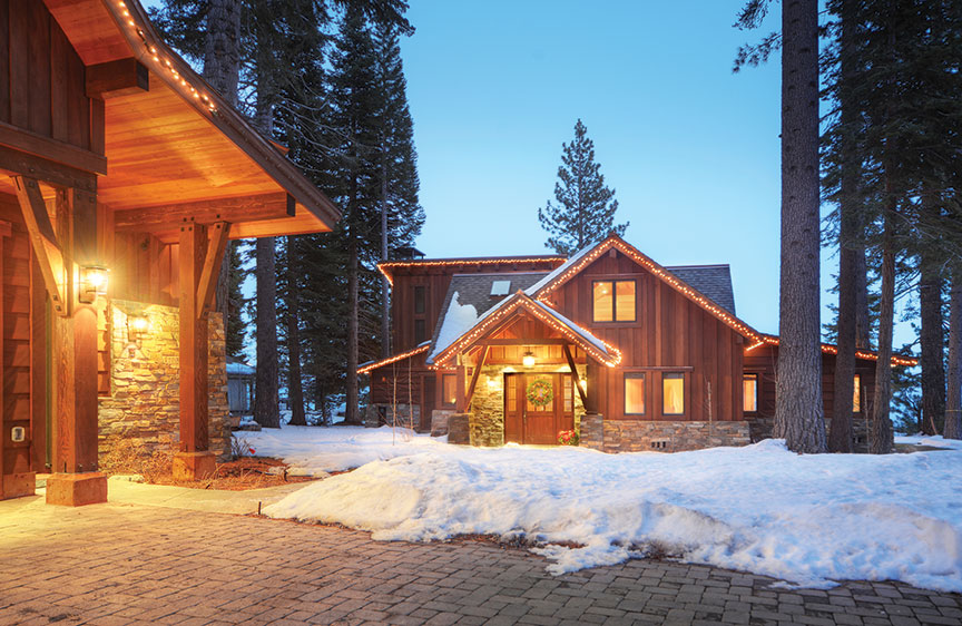
On the exterior, a stepped gable form and covered porch were added to the front of the home; a shed roof pitches to the south. “The way these forms meet the existing cabin maintains the original scale while providing some much needed continuity to the architecture,” says Macfee.
Siding was replaced with vertical board-and-batten, horizontal boards and basalt ledgestone accents and wainscoting. New terraces and large sliding panel doors enhance indoor/outdoor living space. The two-car garage was demolished and a new structure—complete with living space above—sited closer to the home.
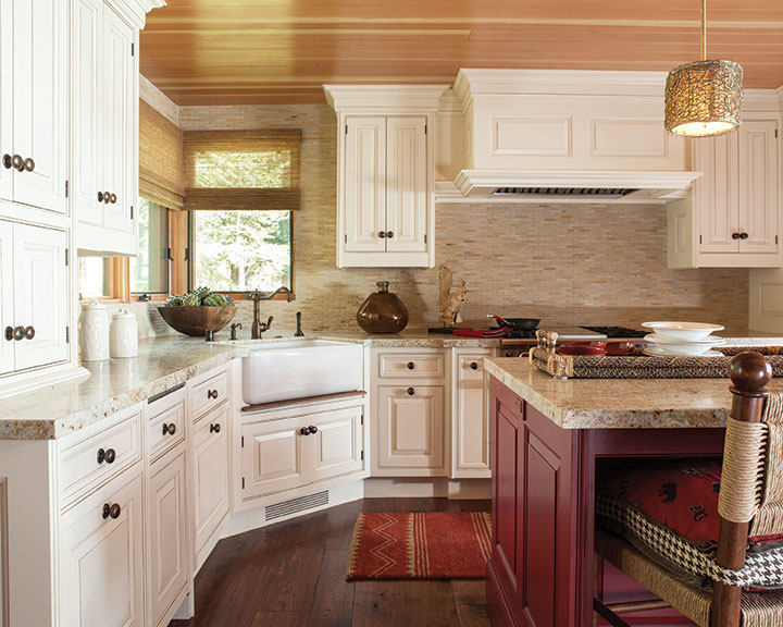
Though every room in the house was remodeled, it was important to the homeowners to retain the sense of an alpine cabin. “They wanted to keep the cabin feel but add a crisp, contemporary edge,” says Macfee. In the kitchen, this manifests through a rustic, traditional design with hints of modern charm. Hickory flooring sets the stage for painted cabinetry by Christopher Peacock Home, which adds a contemporary flair, with additional cabinets designed by Steve MacDonald of Nevada’s Woodmasters, Inc. Split-face mini-brick limestone is used for a simple yet compelling backsplash, while custom-woven rattan barstools add a casual, lake house feel. A center island offers a pop of red color, an accent echoing throughout the home.
This mix of crisp and classic continues in the home’s three bedrooms and three-and-a-half baths. The wood-paneled master bedroom is highlighted by a dramatic headboard, the green matching the forest outside. Greens and reds add a splash of color in the rustic bunk room, where four bunks each top a trundle bed for overflow guests.
While much is new, the sense of a mountain cabin is retained in the Douglas fir paneling that lined the original cabin and which the owners wanted to reuse in the remodel. “The effort to salvage, resurface and reinstall this paneling is a testament to the level of care and craftsmanship of Peter Koenig and his team,” says Macfee.
Artisan touches continue through the home. Custom-forged metalwork is by Hunter Metal and the majority of the decorative lighting is by Macfee’s in-house line, CM Cartouche. The bathrooms each have their own personality: The kids’ bathroom hints at a French-country style, with handmade red and cream ceramic tiles and a trough sink; the master bath is particularly outstanding with its combination of marble mosaic floors and rough-textured split-face walls.
The result is a sophisticated, timeless design appropriate for the homeowners’ modern lifestyle, while retaining the West Shore warmth and authenticity of the cabin’s past.
Remodel Award
Architect: Ward-Young Architecture
Builder: Loverde Construction
Interior Design: Catherine Macfee Interior Design
Year Completed: 2012
Square Feet: 2,946


No Comments