24 May Fresh Curves
Curved rooflines and a 12-foot-high concrete wall define this modern cabin
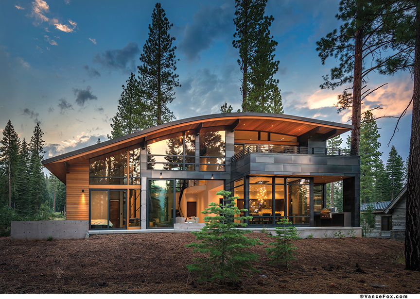
At Lot 337, a cabin parcel in Truckee’s Martis Camp, the profile of the home is low—two curving rooflines, much like twin waves rolling through the forest—though its impact is dramatic.
Designed by Ted Brobst of Truckee’s Ward-Young Architecture and built by Tahoe City’s Jones Corda Construction, the home was conceived as a vacation retreat for the Tiburon-based homeowner, who prefers to remain anonymous, and his wife and two young daughters.
The homeowner, who grew up in the metropolis of Taipei, Taiwan, wanted to be an
architect as a child. “I knew at some point in my lifetime I’d like to ‘build’ my own house,” he says. “Thus, I’ve amalgamated a lifetime portfolio of inspirations.”
While he originally eyed an estate lot on the first tee, the homeowner’s wife sold him on a cabin lot by the Family Barn for the kids, he says. “Our challenge was to design a house that could comfortably fit two other families without us feeling like we were living on top of each other.”
As cabin parcels are capped at 3,250 square feet, Brobst found it essential to streamline the home. “It’s a tight footprint,” he says of the home, which measures exactly 3,250 square feet. “There’s not a lot of wasted space.”
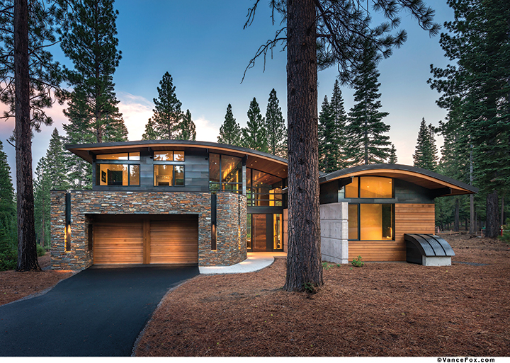
On the exterior, rustic materials blend with a modern design at this Martis Camp home
Brobst situated the garage to face front, which is unusual for Martis Camp houses. “It freed up the footprint so we weren’t wasting it on a driveway,” says Brobst, “and it makes for more of a grand entryway. To me, it makes it a little more welcoming.”
The homeowner saw Brobst’s work in other Martis Camp homes. As he’s spent the majority of his life living in cities, he was drawn to the modern style. “Given that this house is located in the mountains, we wanted to maintain a semblance of warmth that you do not typically get with a contemporary city look. When we saw Ted’s portfolio of ‘mountain modern’ architecture, we knew this was a perfect fit for us.”
The home took 13 months to build and was completed in 2014. The defining feature is the 12-foot exposed concrete wall, which runs through the home and sequesters the downstairs bedroom wing from the public spaces.
A curving ledgestone entryway welcomes visitors to the glass and steel entrance, where a heavy steel-and-walnut pivot door opens to the great room. A fireplace, suspended off the concrete, is formed by walls of precast concrete. In the middle, a giant, textured porcelain tile called tidewater creates a ripple effect. “We thought it would be nice—especially at night—to get that ripple,” says Brobst. A zebrawood surround holds a large flat-screen TV.
Massive Wyland sliding doors open the great room to the terrace, where the same bright porcelain tiles used on the interior flooring carry outside to the back deck and its barbecue, fire pit, hot tub and views of a summertime creek. The kitchen is open to the great room, but separate dining spaces are created via barstool seating, a breakfast nook and large dining table. Gray-brown tiles under the dining room table contrast with lighter tiles to further define the dining area.
“I’ve noticed that, even in our house in Tiburon, people tend to congregate in the kitchen/dining area. It’s where you socialize, dine and play games. Thus, we spent considerable time and resources making sure we got this area right, from flow to aesthetics to comfort,” says the homeowner. “As an example of the detail in the dining room, we added the tiled inlay rather than an area rug as we noticed that area rugs tend to get caught in chairs and, with kids, tend to look like dirt rags over time.”
Alameda’s Studio Roeper designed a durable table fitting the mountain modern theme, while the 16-light fixture hanging above was made by John Pomp, a glassblower out of Philadelphia. Large windows and doors on three sides of the table give the feel of dining in the trees.
Kitchen cabinetry is made of walnut and the counters are a Caesarstone with a leathered finish. Outlets are tucked under cabinets so as not to interrupt the tiled backsplash. The floating waterfall countertop was a design challenge, says Joan Jones, of Jones Corda Construction. Giant steel panels in the cabinet hold up the bulk of the countertop’s weight.
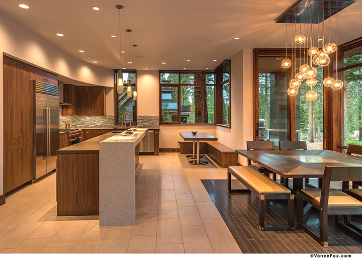
Simple, clean lines dominate the kitchen and dining areas
Off the kitchen, a small mudroom houses four lockers and leads to the garage. On the opposite end of the first floor, behind the great room’s concrete wall, lies the master suite, fronted by a 12-foot door that aligns with the top of the concrete wall.
The room evokes simplicity, with a door leading outdoors to the terrace and hot tub. In the bathroom, a wet-style tub is a freestanding modern element, while in the shower a mustard-colored tile adds a splash of a color to the home’s modest palette of warm cedar, gray concrete, white drywall and light tiles.
These pops of color reappear in the home like welcome surprises. The first floor powder room is unexpectedly bold and contemporary with bright red cabinetry, a sparkly black quartz integral sink, a black, textured wall and a rectangular, three-light fixture.
Across from the master, stairs lead up to the guest suite, the door of which also aligns with the concrete wall. “It’s nice how it all lines up,” says Jones.
Upstairs, a curved landing echoes the curve in the roofline and the curve in the entry wall. A rec room, complete with card table, large TV and a deck boasting views of Northstar California, acts as a family room and can double as a bedroom for overflow guests. The flooring is a porcelain tile with a wood grain pattern that resembles tree rings. A kitchenette demonstrates another burst of color, using a red tile with gray tones that matches the gray in the Caesarstone countertops. “It pulls it all together and gives it a nice accent,” says Jones.
A bunk room, the beds made with pink and blue floral comforters, sleeps four, while another guest suite completes the top floor. The home adheres to a growing trend to allocate more footage to public spaces than private spaces, says Brobst.
“It doesn’t have huge bedrooms,” he says. “We had to pick and choose where to put square footage. They didn’t try to cram too much.”
The home certainly doesn’t lack for cutting-edge amenities, either. Neutron shades, which recess into pockets, are almost totally silent. Cameras allow the homeowner to monitor snow conditions, and the smart home design means that he can control the heat remotely. Transom windows and skylights ensure that even north-facing spaces receive natural light.
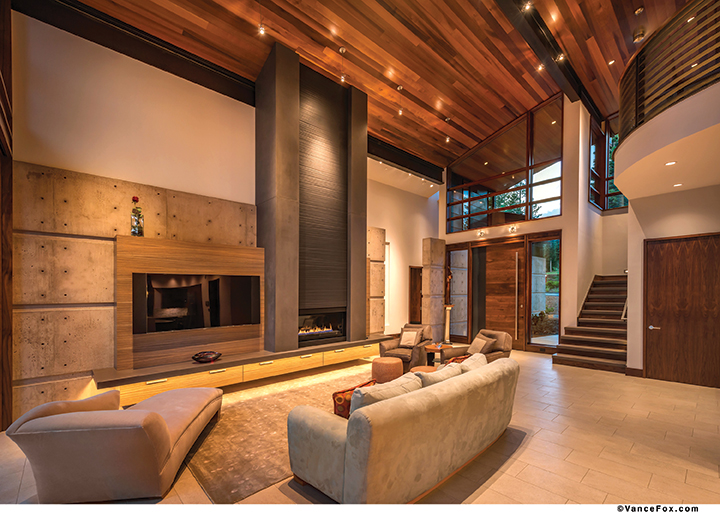
Inside, a 12-foot tall concrete wall separates the public spaces from the private wing of the home
Brobst and Jones are quick to praise those who contributed the home’s success—Hazel Concrete Countertops, Quality Tile & Marble Co. and Sierra Stone Fabrication, all out of Sparks, Nevada, among them—as well as the collaborative efforts between owner and contractors.
“It was wonderful,” says Jones. “We want clients like this. He was engaged and quick. We met about once a month and every meeting was productive.”
“He’d heard horror stories about building a house,” adds Brobst. “He kept saying, ‘I’m still waiting.’”
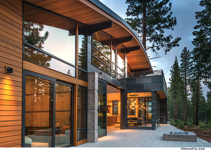
An arcing roofline, designed by Ted Brobst of Truckee’s Ward-Young Architecture, evokes a wave in the forest
Award: Modern
Building Design: Ted Brobst, Ward-Young Architecture
Builder: Jones Corda Construction
Interior Design: Owner, Ted Brobst and Joan Jones
Landscape Design: Betty Anderson Fulda
Square Feet: 3,250
Year Completed: 2014


No Comments