22 May Inspired by the Trees
Northstar Mountainside community building brings the outside in
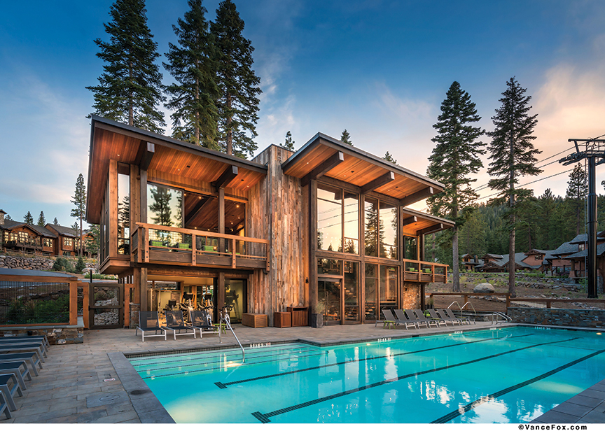
It all started with a celebration of place. The “Tree House” is Northstar Mountainside’s community building, a 3,874 square foot gathering place for the private residential enclave at Northstar California with amenities like a bar, pool and exercise room.
“The name Tree House sums up the inspiration,” says lead architect Clare Walton, of Walton Architecture + Engineering. “It’s about connection to the outdoors and celebrating who we are as a mountain community. We are here because we love the mountain lifestyle and we want our structures to reflect that.”
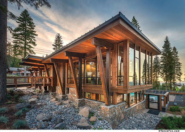
The building is simple, rectangular and modern, though small, deliberate details hint at its organic theme. For instance, the timbers of the knee bracing detail on the façade reference tree branches reaching and opening out to the sky. Playfully sized windows cover the entire upper level and much of the lower, and beams continue the entire depth of the building to emphasize the indoor-outdoor aesthetic.
“We were asked to create a space that gave visitors the feeling of arriving at a residence rather than at a public facility,” says Walton. “The concept of home informed our design decisions and is integral to how we wanted the building to be perceived.”

A bridge invites guests inside, where they can enjoy seating areas, a bar, excercise room and changing areas
for the community’s pool
The Tree House does feel like home. Cross a bridge walkway to the entrance and the structure’s great room, which offers a view down the ski slope of the Carson Range, framed neatly by Tahoe’s ubiquitous forest, and below the branches, an inviting pool deck. A beautiful open staircase allows guests to easily transition down to the pool, the building’s focal piece.
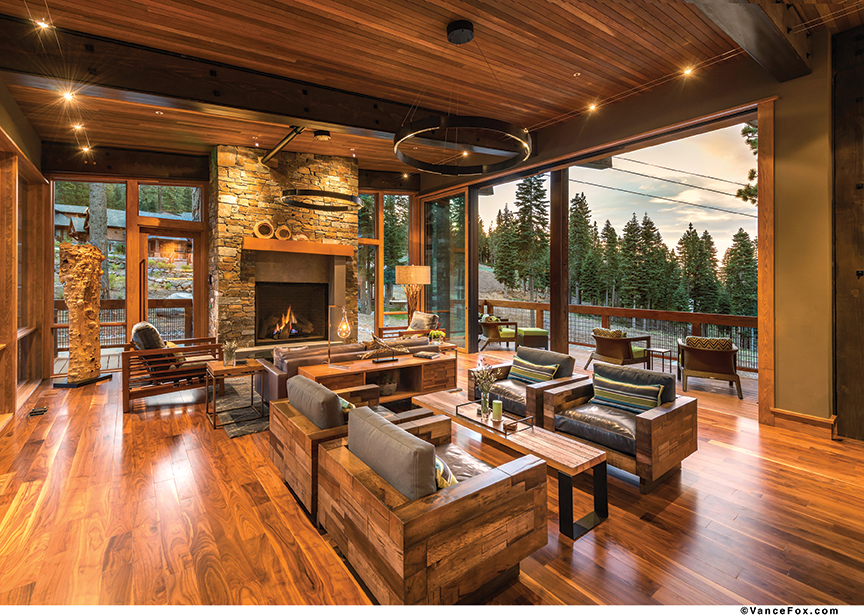
The great room feels warm and welcoming, almost like a living room. “The ceiling is just tall enough that it feels grand but it doesn’t lose the cozy sense of human scale,” says Walton.
Long lines create a sense of expansiveness in a less-than-expansive room, while an elegant fireplace is comfortable and inviting. Material choices evoke a residential space with the warm tones of walnut floors, wood trim and cedar ceilings.
Modern furniture combines clean lines with the organic softness of wood grain and texture, and is grouped into several tasteful areas so guests can gather and relax without the overwhelming size of a typical commercial space. The bar area, opposite the fireplace, is reminiscent of a kitchen, complete with ash cabinetry and wood block detail highlighting the grain of the tree rings in a contemporary and geometric way.
Steel beams with wood infill incorporate the natural appearance of timber with the cleaner lines and strength of the steel. Foldaway doors of frosted glass leading to the game room allow for transparency and texture, while keeping some element of separation. Throughout the building, from the upholstery and rugs down to the very ledgestone that covers so many walls, a blue and green motif evokes the colors of the water and trees.
“The interior concept was to flow the natural landscapes and features of the property into the interior space,” says Jennifer Loving, Walton’s lead interior designer and project manager on the Tree House. “We wanted to continue to effortlessly blend Clare’s architectural design of the building by bringing the essence of the exterior environment throughout the interiors.”
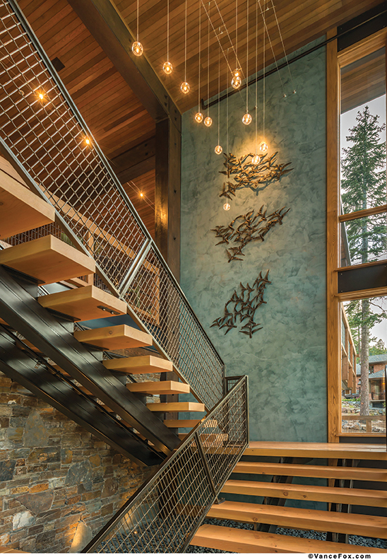
The Tree House’s centerpiece is an open staircase with individual treads, which Walton calls the heart of the design. Framed by a wall of windows, it creates an elegant transition, drawing guests down through the building and outside again. Venetian plaster walls in a softly textured blue-green allude to the water of the pool, once again amplifying and pulling the exterior inside.
“The grand staircase invites visitors to travel down to the pool and provides them with the sense of arriving at a special place,” says Walton.
Cable lights with floating pendants are suspended over the stairwell at various heights, soft pinpricks of light like snowflakes falling gently to earth. The upper level light fixtures are light and airy, taking up minimal space in order not to obstruct or distract from the picturesque view. The viewer feels as if he or she is up in the trees, surrounded by air and branches.
“As an amenities building, the focus was to deliver the guests a colorful, inviting experience amongst the trees, which we achieved through various yet subtle expressions of our concept,” Loving says.

Cable lights with floating pendants are suspended over the stairwell at various
heights, inviting guests to the building’s lower level, which opens up to the pool deck
Although much of the building is covered in the same blue-gray ledgestone used inside, Walton chose picklewood for the elevator tower adjacent to the stairs. The patina of the reclaimed wood from century-old pickling vats conjures the feel and look of tree bark.
The steel deck railings are a woven mesh/welded wire with a rugged quality that is clean-lined but still mountain appropriate. Downstairs, custom concrete countertops and granite sinks grace the locker rooms, as do porcelain floor tiles (with warm neutral colors added in a pleasing, painterly pattern reminiscent of wood grain) and limestone walls. Wooden lockers and upholstered benches cozy up the changing area, along with some soft linear paintings of birch tree forests. The outside doors fold away in the exercise room, creating a larger space and allowing the inside-outside concept to happen at a literal level, as guests can use some of the machines in the fresh air on the pool deck.
Sprinklers, traditionally not an element in residential properties, are tucked under stairs or behind beams to keep the aesthetics clean. Walton and her team concealed vents and air transfers inside some of the wall paneling. Even the accessibility signs fit the theme with some organic texture.
“It was an honor to be working on a project that allowed us to really pull inside and outside together. That’s an integral part of the way that we work, that the inside and outside are one and the same, and decisions that you make on the exterior affect the interior, and vice versa,” says Walton. “That enables you to have a building that reads as clean and strong as this when you have that interaction at the start and you’re really thinking about it as a whole, not just an exterior that you put interiors into.”
For Mountainside’s guests, the building is a stylish, seamless playground.

The home is equipped with Weiland foldaway doors to open the building up to views of Northstar
Award: Commercial
Building Design: Clare Walton, Walton Architecture + Engineering
Builder: SMC Contracting
Interior Design: Jennifer Loving, Walton Architecture + Engineering
Square Feet: 3,874
Year Completed: 2014


Sharon Pommer-Jones
Posted at 12:59h, 15 FebruaryThis is a beautiful design.