27 Apr Serendipitous Style
The European Alps influence the interior remodel of a Sugar Bowl retreat
Martha Ehmann Conte loved the location of her recently purchased three-story Sugar Bowl townhouse, in a ski-in ski-out area where several friends also owned property. “It’s a wonderful community,” she says.
However, the townhouse itself was dated and the space not used efficiently.
“The rooms were so cramped and the colors were overwhelming; it felt small,” says Conte. “I wanted to take a small space and make it feel bigger.”
Conte, who lives full-time in San Francisco, started searching for Tahoe-based interior designers specializing in a contemporary mountain lodge style. She landed on the website for Truckee’s Catherine Macfee Interior Design. As she browsed, she realized that this was the same firm that had remodeled her previous vacation home in Squaw Valley. And not only that, but as she viewed the company’s past projects online, she clicked on one titled “Fish Lip Lodge” and saw her old home.
“I recognized it,” Conte says. “They had just redone the house that I had sold in Squaw Valley. They had been the original group that redid my house, and redid the house that I had sold.”
It seemed serendipitous, so Conte contacted Catherine Macfee Interior Design.
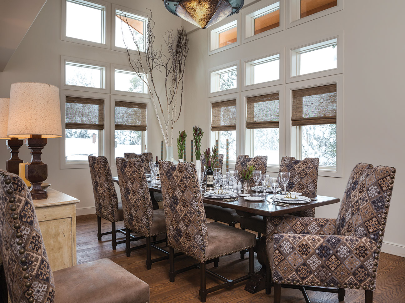
The chandelier above the dining room table came from Conte’s old Tahoe vacation home and, coincidentally, was chosen by Catherine Macfee for a previous owner, photo by David Duncan Livingston
Justine Macfee took the lead on the project. “She called in mid-June and wanted a Thanksgiving move-in,” says Macfee. But the short timeframe wasn’t the only difficulty. With a large extended family, including eight children, ages 11 to college-aged, between Conte and her partner, the house needed to be able to host and sleep a crowd. “She asked, ‘can we sleep 20?’” Macfee says.
Macfee immediately began reimagining the home in a European Alps style. “Contemporary design in the Alps is incredibly inspiring because it is influenced not just by the European ski culture and how the new generations work with historical spaces, but also by the visitors the resorts cater to from all over the world,” she says. “The design is refined, sometimes over the top, but always pushes the boundaries and not only looks great, but feels great.”
The style is clean and efficient, with a cool, calming palette of neutral tones and warm woods balanced by the occasional burst of color or design.
Macfee worked with Trevor Glidden of TJ Glidden Construction to draw up plans, problem solve and choose materials. They spent about two months on the design plans and another two months in construction. “Every piece of the job was a matter of me procuring materials ASAP for everything,” says Glidden.
“They [Macfee and Glidden] were both really easy to work with. I didn’t want to have to do a lot of selecting and Justine was really amenable to that,” says Conte. “She would put out a palette of fabrics and I would pick what I liked or more likely take out what I didn’t like and she would create from that. I wasn’t overwhelmed by options.”
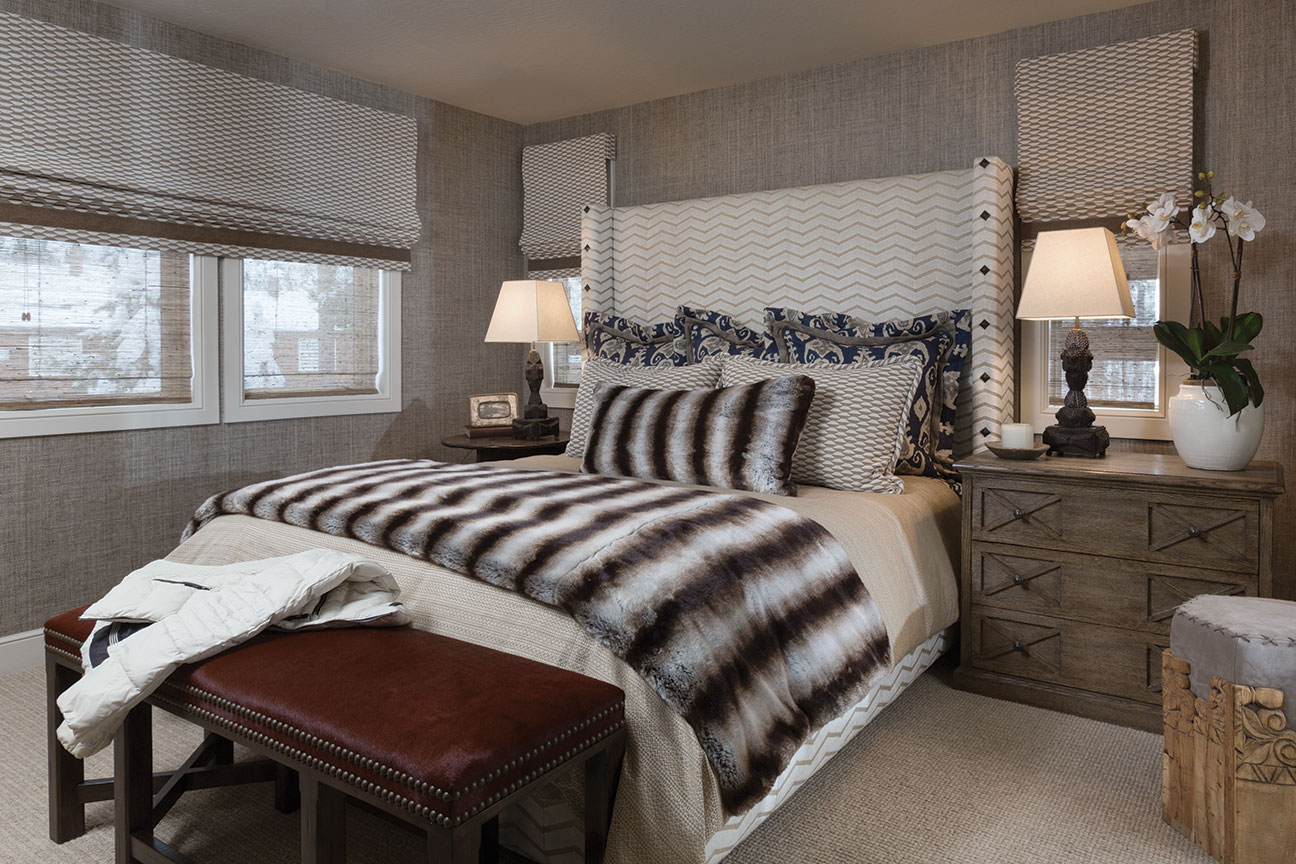
The master bedroom was relocated from the top floor to the bottom to maximize sleeping capacity, photo by David Duncan Livingston
The team got permits secured in August and began working at a furious pace. “The final days of the project there were 35 guys working in that 2,500 square foot townhouse,” says Glidden. “There were several cranes, which is funny to imagine for an interior remodel of a townhouse, however, you can’t get things from floor to floor without finished staircases.”
Parts of the home, such as some of the bathrooms or stairwells, were in decent shape and left relatively untouched. The ceiling was simply darkened, while the oak flooring throughout was wire-brushed for texture and refinished. But the majority of the home underwent a much more intense remodel.
The townhome’s master bedroom was originally located on the top floor, an open space with fabulous views. However, in order to maximize efficiency, Macfee relocated the master to the entry level, into a smaller space that compensates in luxury for what it lost in views. The master suite mixes new and traditional furnishings, while adding a twist on contemporary style. Grasscloth wall coverings soften the sound of people coming and going. Neutral tones are complemented by an upholstered bed and matching headboard, custom-made by Macfee’s design shop in Los Angeles.
The travertine-tiled en suite bathroom is similarly luxurious, a space Macfee carved out by taking the laundry room and popping it across the hall from its original location. Also downstairs is a guestroom featuring an extra-long twin loft bed, which Glidden built, over a queen bed, and another guestroom with two custom-imagined twin beds and unique touches such as a vintage trunk turned into a nightstand.
“We literally made everything for the space,” says Macfee.
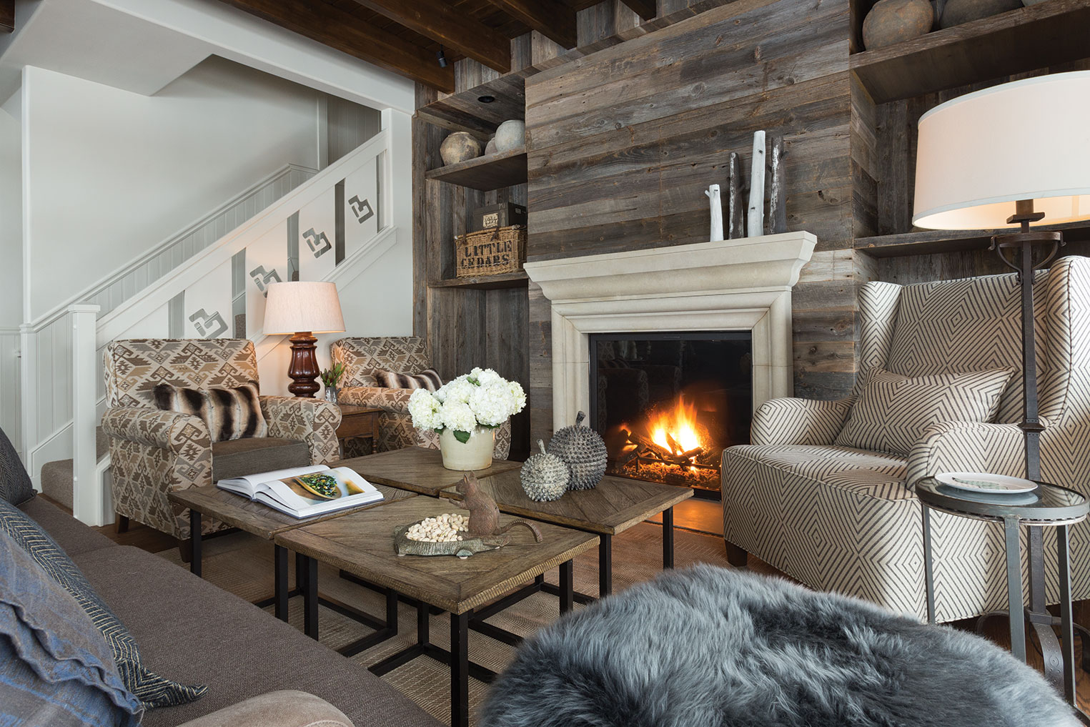
Upstairs, the main entertaining level comprises the open kitchen, dining room and great room. Macfee and Glidden gained an important 13 inches by gutting the original river rock fireplace and replacing it with a custom limestone gas fireplace. A modern application of barn wood creates the fireplace surround as well as shelving; panels above the mantle slide open to reveal a flat-screen TV.
In the mostly neutral-toned home, the kitchen features bright painted cabinets in a custom-created color Macfee calls “Sugar Bowl blue” but alternatively refers to as the “Goldilocks” shade the team decided on after debating a dozen other colors.
“Our ‘Sugar Bowl blue’ kitchen was really fun to see come to life,” she says. “The narrative of the home as a whole was about mixing cool-toned neutrals with warm pops of texture and surprise color moments with textiles and paint. The playful burst of color [in the kitchen] is what we needed to break up the more sophisticated neutral palette—we are in Tahoe after all, fun needed to be a part of the narrative.”
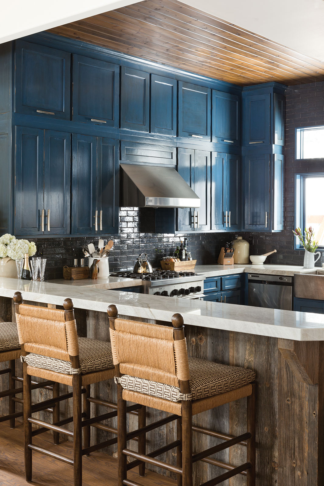
The “Sugar Bowl blue” kitchen adds a pop of color to the home’s mostly neutral palette,
photo by David Duncan Livingston
Glidden added another row of cabinets on top of the home’s original, which increased storage and brought the cabinets in line with the ceiling, and installed Rocky Mountain Hardware. An apron sink matches the stainless steel appliances, while a blue tiled backsplash and the white quartzite slab countertops create a play of dark and lightness.
The long alder dining table seats ten, and the comfy custom chairs and couches surrounding the fireplace are great for settling in for an après-ski cocktail or gathering for an Oscar night viewing party. A small TV room off this main space holds a sectional sofa that doubles as two twin-sized beds when the cushions are removed.
The third floor was redesigned as the bunkroom. Because the original architecture had included a plant shelf that couldn’t easily be removed, designing bedding was a challenge, which Macfee and Glidden eventually solved with an innovative tiered bunk system.
“The bunk room was really fun to dream up and figure out how to execute,” says Macfee. “With so many kids to sleep, a bunk room was mandatory, and the existing master bedroom had fantastically tall ceilings on the third level, perfect for building up a treehouse-style bunk structure. That was one of those ‘first impression’ design ideas that you can’t let go until it is achieved.”
“The bunk design was a long brainstorm between Justine and myself,” Glidden says. “There were desires from the client such as the cubbies for iPods, iPads, iPhones, an overhead light for each bunk and also a reading light for each. Then there are the practical necessities, running all that electrical legally. Then there were the full-size single beds desired and the extra room necessary for tucking bedding in. All in all, the beds barely fit in the area we had, but it turned out to be a great use of space.”
The main bunkroom sleeps four, and also includes a chalkboard wall, shelving for books and games, and furry beanbag chairs. A second bunkroom holds two more bunks and a barn door to allow for privacy, while an upstairs bathroom includes a double trough sink and a separate shower space.
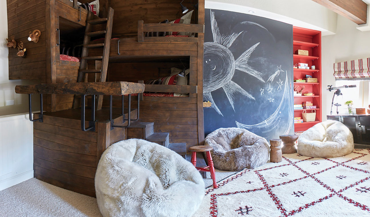
The innovative, tiered bunk system made use of a plant shelf leftover from the townhouse’s original architecture, photo by David Duncan Livingston
During the roughly two months of construction, the townhouse was a flurry of action, with work in progress on all three stories. A crane was used on about six occasions to get heavy furnishings in and out. The house was completed on time, the day before Thanksgiving, and not only was the project full turnkey, but Macfee ensured the kitchen was stocked. “It was one of the most intensive installs we’ve ever had,” she says.
“I love it,” says Conte. “It’s fresh and light, but also has a warm, family feel. It’s a great combination of the two.”
As Conte and her family congregated for that first Thanksgiving, they gathered at the dining room table under a whimsical chandelier featuring a forest animal motif. It came from Conte’s Squaw Valley house and was one of the few belongings she’d wanted to incorporate into the Sugar Bowl townhouse.
The chandelier had been chosen for that home 20 years earlier—long before Conte owned it—by Macfee’s mother and company founder Catherine in her first Tahoe interior design project.
“She [Conte] brought the chandelier not knowing the connection,” says Macfee.
For this Sugar Bowl retreat, it appears fitting, a serendipitous touch exemplifying the wonderful results that can come from the perfect match of client and designer.
Award: Interior Design
Building Design: Gary Davis Group
Builder: Trevor Glidden, TJ Glidden Construction
Interior Design: Justine Macfee, Catherine Macfee Interior Design
Square Feet: 2,662
Year Completed: 2014


No Comments