
27 Apr Expansion by Compression
A modestly sized Martis Camp home focuses on what its owners actually need
The architectural concept of compression and expansion works like this: By piping foot traffic or even someone’s eyes through a tight space then unveiling a large, airy room, you can capture the viewer’s attention and hopefully their admiration for a thoughtfully created reveal.
A Martis Camp home, designed by Brendan Riley of Truckee’s Ryan Group Architects, built by Truckee Custom Homes and occupied full-time by a couple (who prefer anonymity) and their young son, broadens the compress and expand concept beyond its roots in architecture.
There is, of course, the concept’s literal base. The 1,718 square foot home (notably modest size-wise for Martis Camp), compresses expectations. How much can you fit in such a relatively tight envelope? The answer: a lot. By minimizing the use of hallways and wasted space, the design-build team and homeowners created generous common areas and bedrooms where elbow room doesn’t feel like it’s at a premium.
Then there’s the reach of the compress and expand concept into other facets of the homeowners’ lives. Tight bedroom closets cause the lady of the home—an educator who home-schools—to take care when she’s picking up new clothing items. By limiting the space allotted for stuff, the home amplifies the impact of everything the family does keep.
“It’s a neat way to focus your life,” she says. “It makes you consider what is necessary. What is beautiful. I ask myself, ‘Do I need it, and do I love it?’”
The emphasis on smart use of space began at the outset of the project, says Riley.
“They are a tightly-knit threesome,” Riley says of the family. “Designing a home where the family was sort of concentrated was appealing from a social perspective. They came in and told me ‘We’re together. We’re not the sort of family that separates as soon as we get home.’”
One of the most important design criteria for Riley was to make the home feel big while successfully having some private spaces, he says.
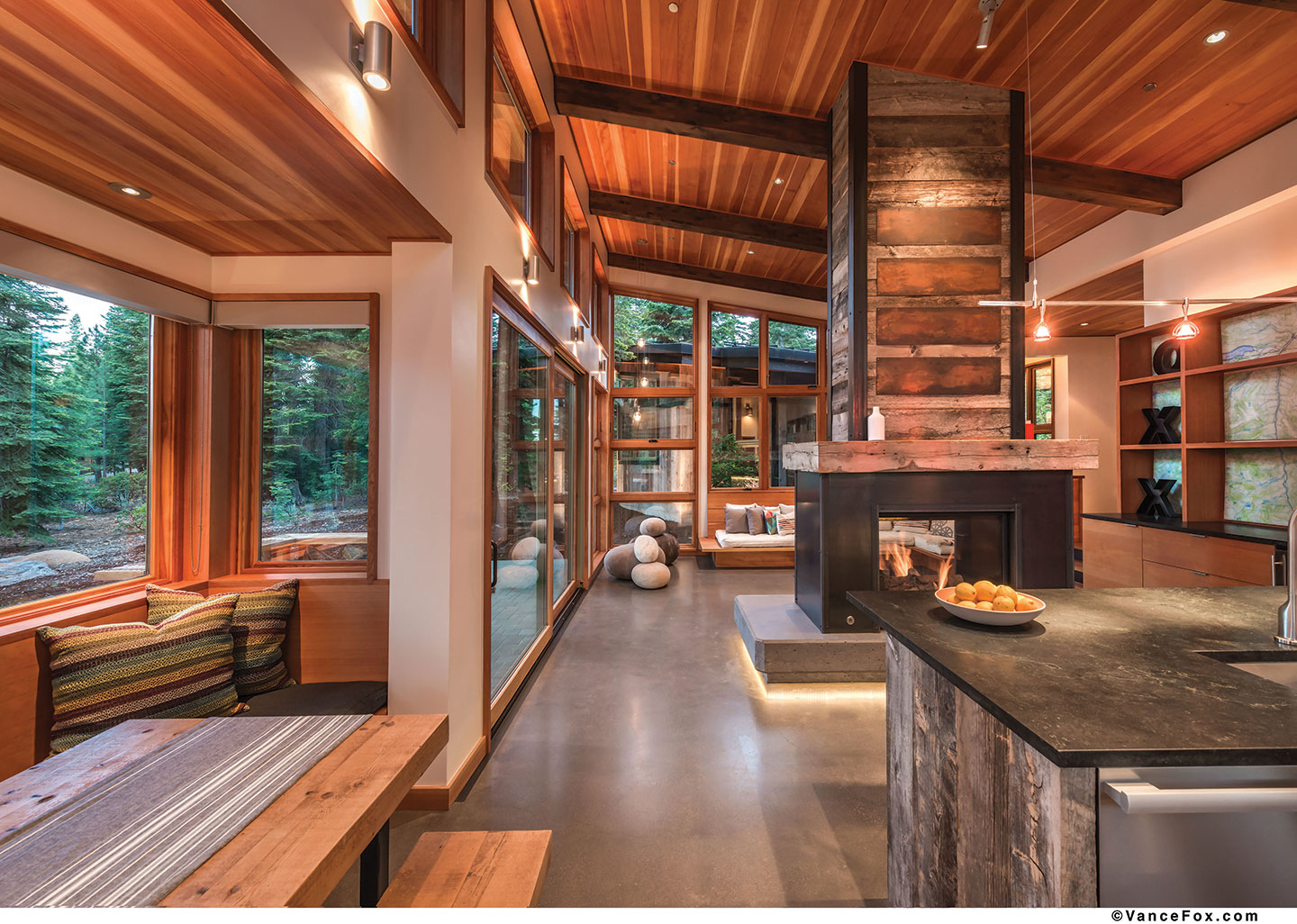
To that end, visitors enter the front door and step down into a voluminous communal space—compression and expansion at play again—which houses the great room, dining room and kitchen. The room rotates around a hot-rolled steel fireplace with a reclaimed wood chimney rising toward the ceiling.
“Your sense of the space unfolds as you walk in,” Riley says. “You don’t know the home’s entire story as soon as you walk in. Sometimes homes feel smaller because you understand it all as soon as you’re in the door. That’s not the case here.”
Indeed, a hallway (the home’s only circulation space) extends away from the great room toward the bedrooms on the right, though the view doesn’t make that immediately apparent, while a ladder climbing up to a crow’s nest on the left inspires curiosity.
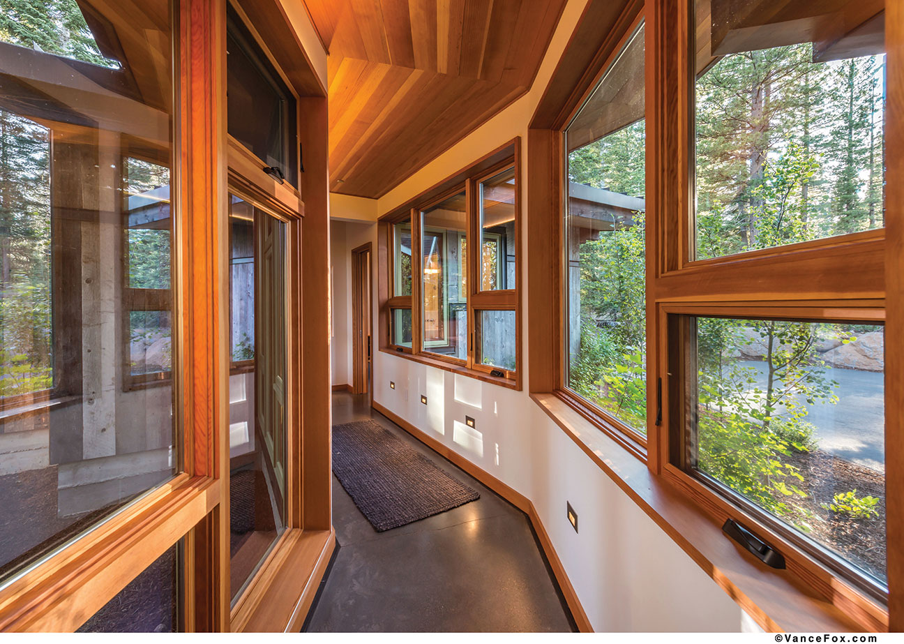
“There’s no wasted floor area,” says Jim Riley (No relation to Brendan Riley) of Truckee Custom Homes. “Some of those very large homes have floor area you never walk across. I think this is the direction that home building is going—building a smarter, tighter, more efficient space.”
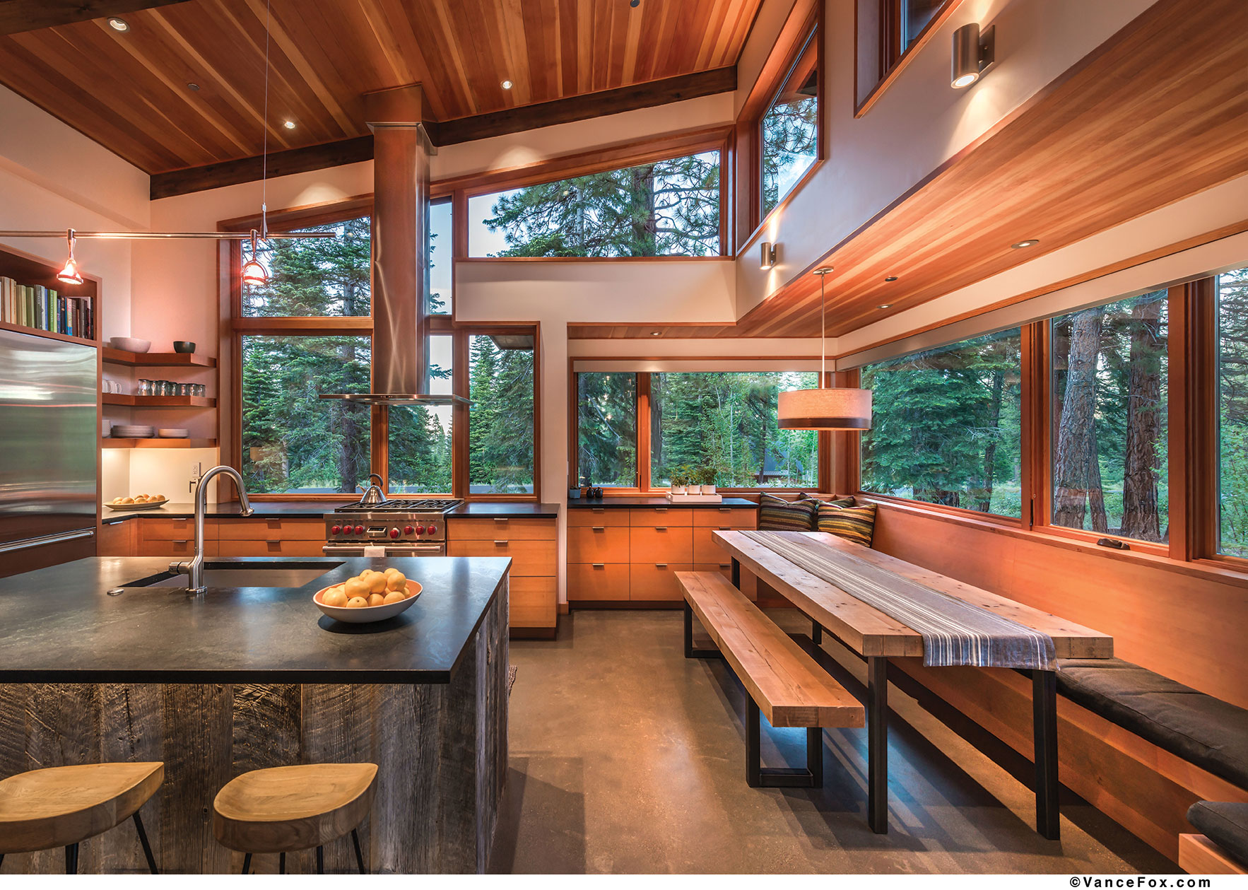
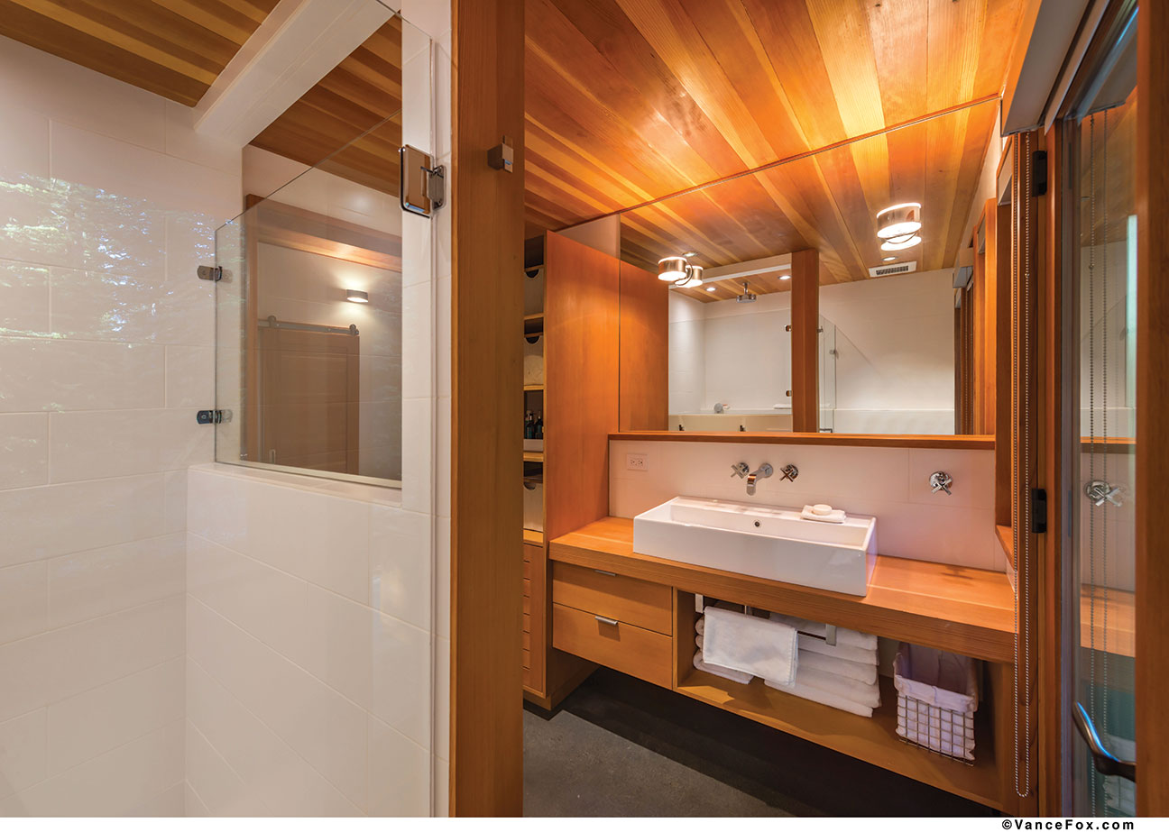
Though the home is built in the mountain modern style, which can sometimes read as sterile or cold, it retains warmth with a vertical grain Douglas fir ceiling that extends outside for the soffit. The exterior is mainly reclaimed barn wood—which is brought inside in places like the kitchen island and fireplace—sourced from Idaho’s Trestlewood and featuring a natural patina that’s full of character.
“There’s no playbook of modern architecture that says ‘this is what you get when you sign up for modern,’” Brendan Riley says. The uncluttered modern look also serves to bring the outside in without a lot of distraction, which is a plus since the couple selected the lot for its seclusion in the trees.
“We wanted to find something where you felt like you were completely surrounded by the forest,” says the husband. “This lot was one of the few places we found that was sunny, beautiful and treed with lots of privacy.”
The home’s bedroom wing extends into that forest over a hallway bridge, allowing some separation from the main space. The trade of valuable floor space in the form of a hall to the bedroom mass was worth it for the payoff of seclusion, Brendan Riley says.
“We wanted to create the sense that you can go down the hallway toward the bedrooms and leave the party behind,” he says. “They didn’t want that cliché cabin fever—that there’s no place to go.”
The bedrooms feel bigger than they are with their views out into the forest. The two share a wall with staggered closets—the son’s closet extends into the middle of the wall with the parents’ two closets interlocking with it on either side in a bit of interior engineering not unlike a yin-yang, Brendan Riley says.
“It’s a way to save quite a bit of square footage and restrain the size of storage,” Brendan Riley says. Though, he and homeowner are quick to point out that the home does have ample storage elsewhere, such as under a window seat in a small sitting room leading to the bedrooms and the home’s garage.
Another place where storage was thoughtfully planned was in the kitchen. A pull-out pantry allows the homeowners to see exactly what’s inside so items aren’t shuffled to the back to await their expiration dates. Drawers are right-sized for a family of three.
The home’s finishes maintain its simplicity. The concrete floor was treated with a pigment before it was poured and polished to the lowest sheen possible—to as matte a finish polished concrete will allow, Jim Riley says. Wood is used throughout the house in the form of Douglas fir trim and cabinetry, and drywall only sparingly in the common areas. Steel is incorporated in the fireplace, on a ladder leading to the crow’s nest and on the exterior around windows and encasing the dining area.
“We wanted to limit the quantity of finishes and materials and keep it simple,” Brendan Riley says. “Using a few different material finishes instead of many lets you relax because there’s not all this stuff competing for your attention.”
On the exterior a pleasing lime-green pop is administered by the trim on the Kolbe windows to create a parallel with the wolf lichen found naturally in the Sierra. The windows were a special labor of love for Jim Riley.
“One thing I’m really proud of on that house is that the window casings and jamb extensions are one solid piece,” he says. “Those are usually a two-piece build-out.”
One of the home’s most “fun” elements is the aforementioned crow’s nest, a ladder-accessible room that serves as a classroom for the couple’s son and an office for both parents as needed. Steel treads are staggered to make climbing easier and the space was designed as a “ventilation loft” as it draws up summer heat and sheds it through easy-to-open windows.
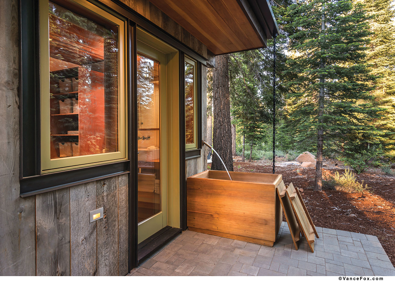
For solitude, the couple can retire outside (one at a time) to a small, Japanese-inspired wooden tub off the master bath on a private deck in the back of the home.
“That took a lot of work to have a tub outside where everything is prone to freezing,” Jim Riley says. To solve the problems of icy weather and water, the valve to turn the tub on and off is located inside the master vanity, and the line leading to the water spout is angled downhill to make sure everything drains when the water is shut off and nothing freezable stays in the line. Heat cable threaded down through a rain chain immediately adjacent to the tub continues from the bottom of the chain underground to the tub drain to eliminate any ice from forming.
Beyond the tinkering to get the mechanics correct, though, there’s a simple beauty to the space that’s indicative of the whole home. While sitting inside the compressed space of the tub, the forest expands outward, seemingly endlessly, for the bather to enjoy.
Award: Smart Design
Building Design: Brendan Riley, Ryan Group Architects
Builder: Jim Riley, Truckee Custom Homes
Interior Design: Owners with Ryan Group Architects
Square Feet: 1,718
Year Completed: 2012


No Comments