19 Feb PRE-tty FAB-ulous
Factory-built house uses a series of pavilions to create grand yet intimate spaces
In late May of 2016, five trucks arrived at a secluded, treed spot at the far end of Martis Camp after making the 800-mile trip from Bellingham, Washington, near the Canadian border.
The site was only partially built—a garage standing on one end of the project and a shell that would become a squash court on the other—with the foundation and several other half-built sections in between.
But as a crane unloaded the first module, the home suddenly had a kitchen and a breakfast nook. With the second, a laundry room, mechanical room, powder bathroom and guest suite appeared. By the end of that day, all five trucks had unloaded their modules and the home had grown to almost 7,000 square feet, to include five bedrooms and six bathrooms.
This pre-fabricated home was designed by San Francisco’s sagemodern, a partnership between Blair Porteous and architects Paul Warner and Joseph Remick. The firm combines pre-fab units with site-built elements, allowing portions of the house to be built in the Washington factory, saving time and money and improving quality.
“You’re building in a controlled environment,” says project manager Jon Somich. “It’s a better product in some ways.”
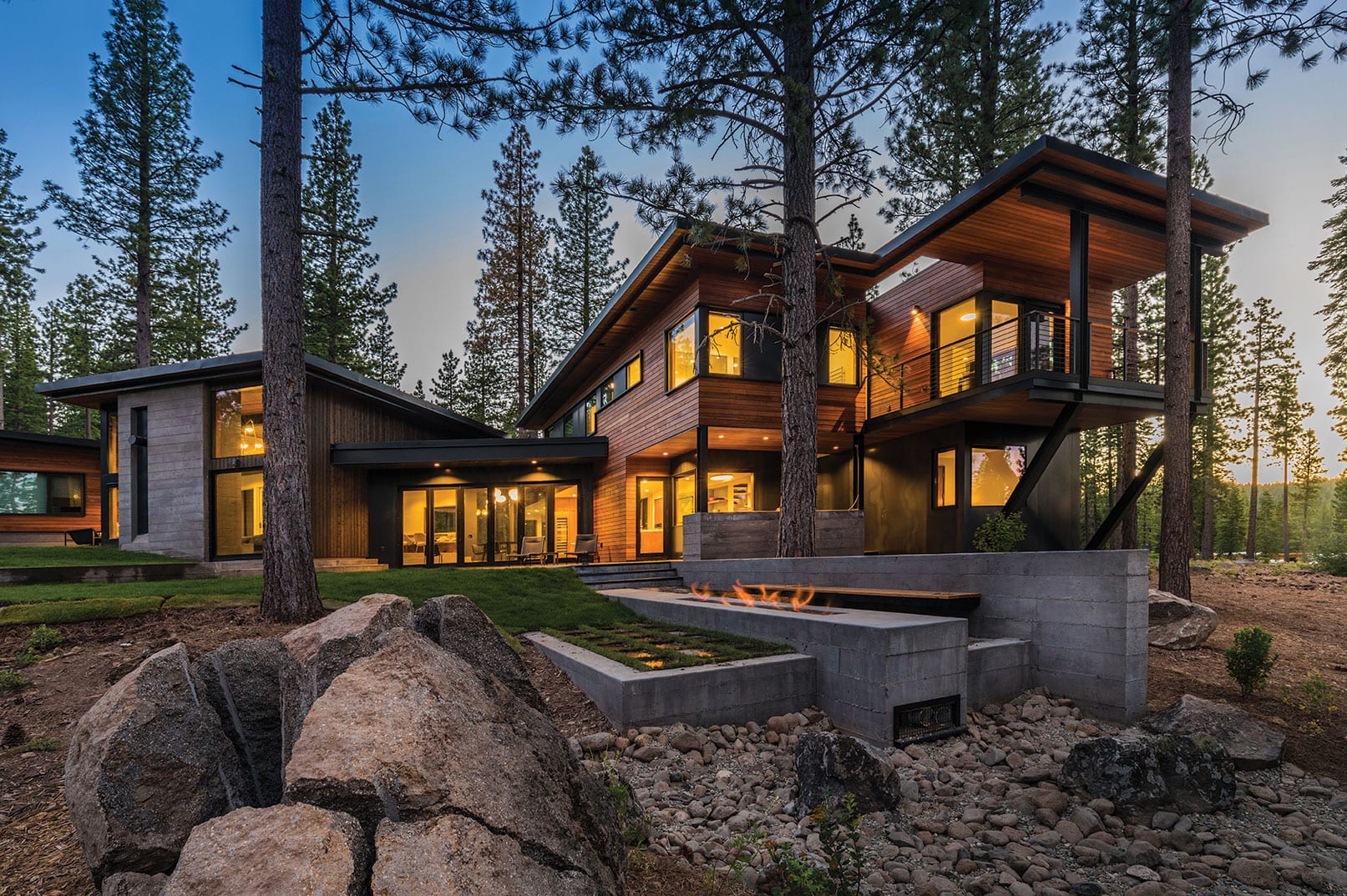
Building pre-fab doesn’t mean that anything is lost in the architecture. The house consists of a series of pavilions, each linked by a glass portal. Anchored by the garage on one side and the squash court on the other, the rest of the home fans out in a semi-circle, the living area, dining area, great room and media area each forming separate pavilions.
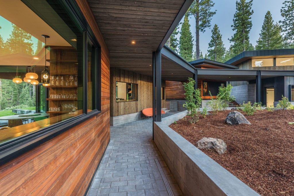 A radial design means that each of the pavilions align with the group of trees in the center of the roundabout, photo by Paul Hamill/Martis Camp Realty
Warner describes the building’s design as “spokes that radiate out,” the intersection of which is a group of trees that now stands in the center of the driveway’s roundabout.
“Each building kind of aligned with a spoke,” says Porteous. “In the home, there’s actual physical lines of concrete, or some material, where you stand on that line and it goes through the house to the tree island.”
The homeowners first contacted sagemodern in fall 2014; the company began design work early the next year. The pre-fab process—with parts of the home built in the factory while other parts were constructed in Tahoe—means that it’s necessary to spend extra time in the design process. In the case of this Martis Camp home, design took about six months.
“We model every pipe, the radiant tubing, every single stick of lumber that’s in the house,” says Porteous.
The firm created three-dimensional models to send to both the factory manager in Washington and to Somich on-site. “We’re building in two different geographies; everything has to be exact,” Porteous says. “When you bring two pieces together that were built in different areas, you need to have them match—we don’t have tolerance for any errors.”
About 60 percent of the home’s living area was built in Washington. Warner and Porteous say they try to incorporate the most expensive aspects of the home—kitchens, bathrooms, mechanical rooms—into the module side.
Large rooms, such as the great room, consist mostly of framing, roof and glass. As there is less to them on the technical side, it is more economical to build those spaces on site.
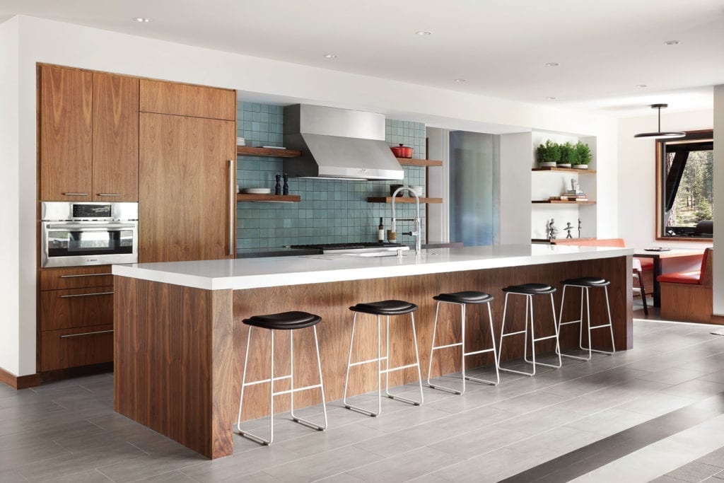 In the kitchen, everything but the flooring was installed in the Bellingham, Washington, factory, photo by Lisa Petrole
The more intricate spaces, however, are delivered in a near-complete state. “So, the kitchen was done the way you see it in Washington,” Somich says. “The faucet was installed there; the refrigerator was installed there.” Everything, he says, but the flooring, which is done last to ensure consistency throughout the project.
Because of the process, the design details, such as finish materials, appliances and any smart-home systems, must be chosen earlier in the process than with traditional building, where elements like light fixtures and cabinet hardware may not be decided until after building is complete. “The positive thing is you know your budget and you’re moving forward and that doesn’t give you the opportunity to change,” Porteous says. “The negative is you don’t have that opportunity to change.”
For Kris Foss, principal of the Lafayette, California, interior design firm Hills & Grant, the goal of the project was to create a vacation home that was relaxed yet sophisticated. “It was designed to accommodate a crowd when necessary, but could also be comfortable for a family,” she says.
As for the pre-fab process, Foss says, “I love it. It is such a smart way to build a home, and we are always so happy when we get to work with sagemodern.”
While she has now worked on several pre-fab houses, she says that it was initially overwhelming to make so many critical decisions while still in the design process.
“Now, we thrive on the quicker pace of modular building and find it to be great fun,” she says. “For new construction, it is so fabulous to have your materials installed inside of a controlled environment, rather than being exposed to the elements during the construction phase.”
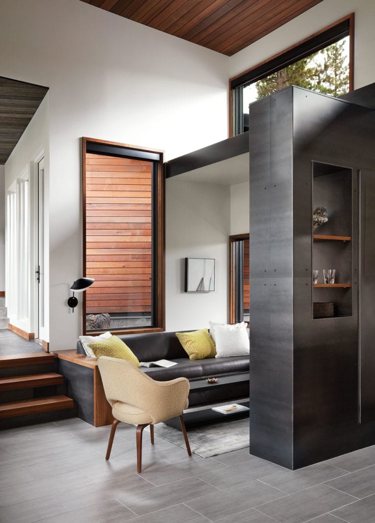
A steel divider separates seating areas in the great room, photo by Lisa Petrole
The house is distinctly modern. Heavy steel on the exterior creates linear rooflines that separate the home into its distinct areas. From the garage, a glass portal doubles as a mudroom, with a low bench and cubbies running the length of one glass wall, while the other opens to stunning panoramas of Northstar.
The way the architecture frames the views, Warner says, is one of the special aspects of the design. “As you walk through the interior, the breadth of the views is revealed,” he says.
Beyond the mudroom are the main entryway and foyer. Floating walnut stairs inlaid in a steel tread rise to the upstairs living quarters, which includes the master suite, guest room and bunk room. “We built ‘tables’ in between the individual beds in the bunks so the kids could have a spot to play or do a puzzle,” Foss says.
Walnut is used throughout the home, including in the kitchen cabinetry, the base of the long kitchen island and the wet bar, adding a sense of warmth. Globular, diffused glass light pendants by Marset overhang the custom, live-edge walnut dining room table with a Lazy Susan, created by Sacramento’s blankblank. “We try to support local vendors whenever possible,” Foss says. The dining room is set in another glass portal, this one separating the kitchen from the great room. Glass doors open, making the backyard and its living spaces easily accessible. “The linear fire pit off that side leads you to the exterior and the space beyond,” Warner says.
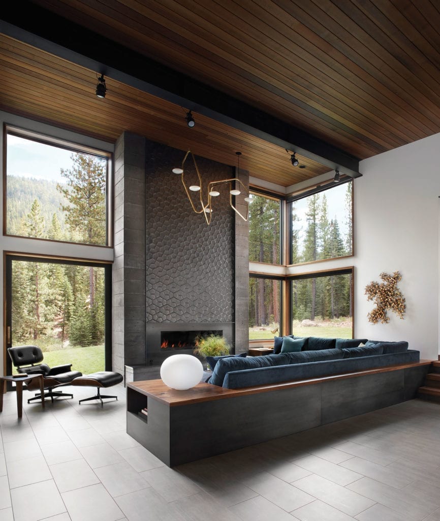
The great room features several distinct seating areas: a casual reading area (the room is free of televisions) and, on the other side of the room, a puzzle area for the children visually separated by a hot-rolled steel divider from the adult area where, Porteous says, the owner likes to drink his scotch.
The focal point, however, is the linear and contemporary fireplace, which doubles as an art piece. Foss chose a black, geometric tile by artist Daniel Ogassian for the face of the two-story-high fireplace, which is banded on either side with board-formed concrete. It’s complemented with a sculptural lighting fixture from New York–based company Rich Brilliant Willing. “It’s a privilege to install such artisanal products from vendors who put a great deal of heart into their work,” says Foss.
Geometric tiles by artist Daniel Ogassian face the fireplace, which is overhung by a sculptural light fixture from Rich Brilliant Willing, photo by Lisa Petrole
She points to the orange leather banquet in the kitchen, as well as the aubergine-painted media room that is paired with ceiling-mounted wrap-around patterned drapes. “The clients are wonderful in that they have good taste and sophistication, yet also have a sense of playfulness in their aesthetic,” Foss says.
That sense of playfulness can be seen in the regulation-size squash court and viewing area, which occupies a pavilion detached from the house. Topped with clerestory windows to let in light, and complete with a viewing area, the squash court doubles as an all-purpose playroom for the homeowners and their young children. A retractable basketball hoop, movie projector and space to set up bounce houses or have Nerf gun wars mean plenty of opportunities for fun for all members of the family.
“The homeowner asked for it as a squash court, but the utility of it is much greater than they originally thought,” says Porteous.
In the pre-fab spirit, even the squash court came from a kit, says Porteous. “We built the shell of that big structure but then we had a company out of Tennessee send a crew in—it was all prepackaged and paneled—and they installed it all in a week.”
Though the topography of the site rises, the layout is cleverly designed to keep the home’s profile low from the front, even with the bigger masses. “[The owners] didn’t want a massive looking house,” says Porteous. “When you come up to the home, it doesn’t feel like a 7,000-square-foot structure. From the front, it’s all on the low side, and feels smaller in scale.”
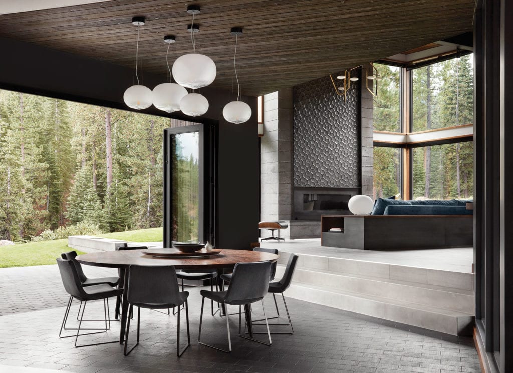 Above the dining table are five “Hazy Day” pendants by Marset, photos by Lisa Petrole
From the back, the massing is more obvious, as upsloping rooflines further define the home’s separate pavilions. Double gas fire pits in the backyard, designed by Truckee’s High West Landscape Architects, provide additional spots to admire the home’s stunning surroundings. Near the bottom of the landscaping is a large boulder, which was unearthed from the site, cracked and slated for removal. “But we, myself and the owners, loved the sculptural element of it,” Warner says. “It anchors that end of the fire pit and the dry creek bed beyond.”
The principals at sagemodern warn that not all building projects are suited for pre-fab construction. This house, and its ability to be broken into a series of smaller units, worked perfectly, resulting in a quality project that saved time and money—the ultimate in home delivery service.
Award: Unique Vision
Building Design: sagemodern, inc.
Builder: sagemodern, inc.
Interior Design: Hills & Grant
Square Feet: 6,944
Year Complete: 2017


No Comments