26 Apr GNAR Points by Design
Former Squaw Valley lift operator packs his new home full of quirky personal features
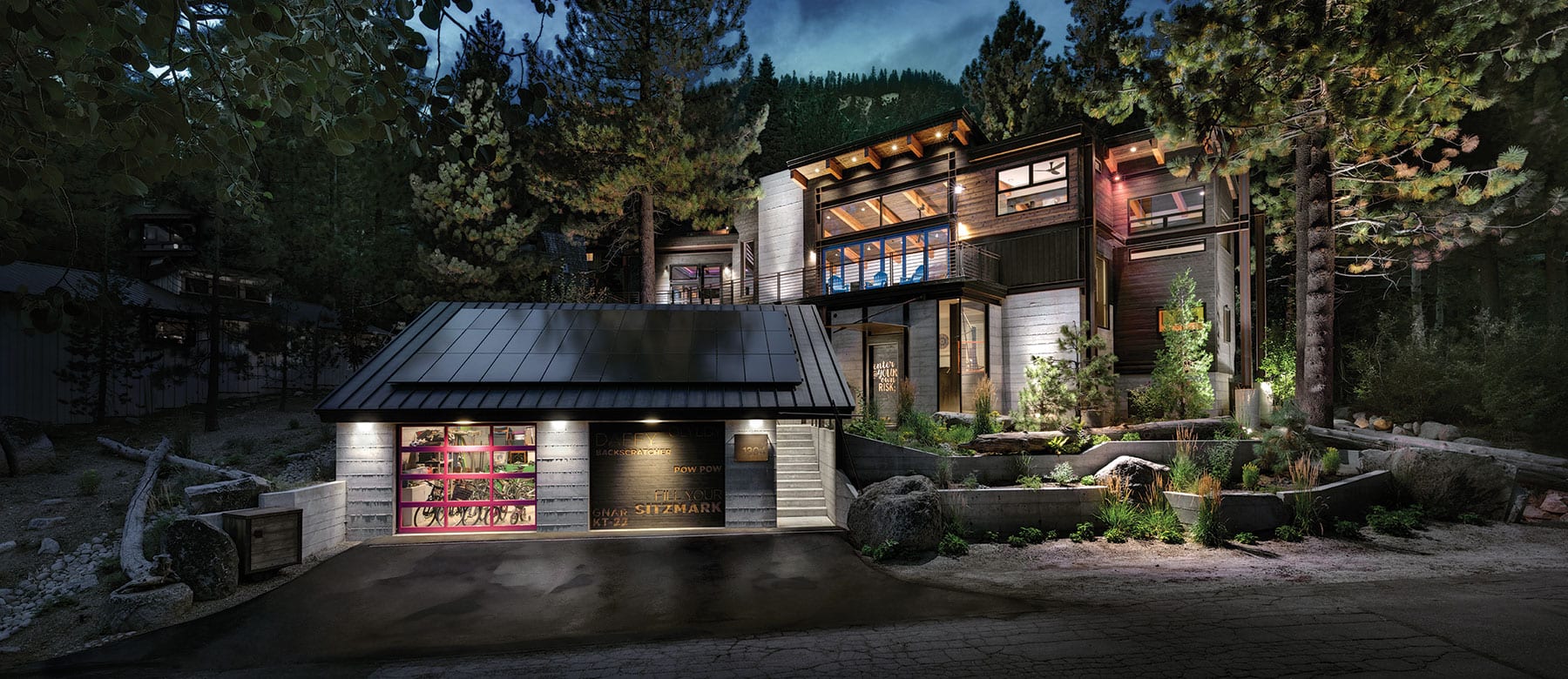
With the first glimpse of the double garage doors, you know something potentially outrageous is going on. The door on the left: full glass panels framed in hot pink. The door on the right: charred cedar planks with ski-related phrases artfully blocked out in bold graphic fonts.
“KT-22.”
“GNAR.”
“DAFFY.”
“If you grew up skiing, you know what a daffy is,” says Rob Wells, force of nature, owner and creator of a Squaw Valley home composed from his many-layered life, Squaw folklore and the magic of skiing.
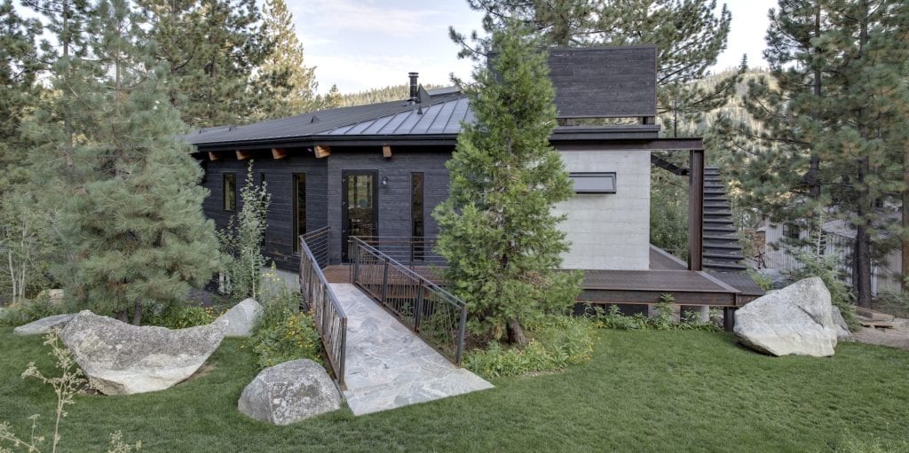 An exterior staircase leads to a high perch with views to Squaw Valley, photo by Jonathan Rouse
If Jeff Spicoli—the epitome of Southern California surfer dude in the quintessential ’80s film Fast Times at Ridgemont High—grew up, got married, became a family man, and stood at the helm of a visionary design and branding firm that he founded, he might be Rob Wells.
The full-time La Jolla resident originates from San Mateo, but a fateful jaunt up to Tahoe with buddies in 1986 sealed his fate. “Someone’s parents had a house at Donner Lake, so we all said, ‘Let’s be lift ops!’ and we stayed on for the winter. But they all went back to school after ski season and I just stayed here,” says Wells.
The impact of the following 12 years Wells spent in and around Squaw Valley is evidenced throughout the 2,600-square-foot home he recently completed—a house shaped by his youthful adventures (chairlift op, snowboard instructor, board shop entrepreneur) but undeniably inspired by the youth presently in his life: his three young daughters.
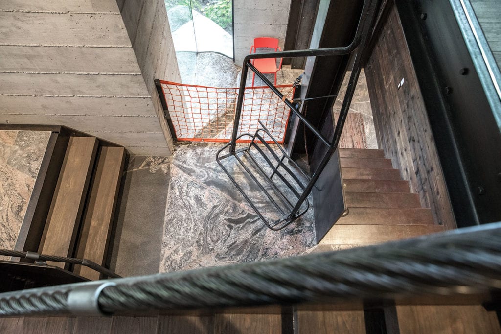 Evidence abounds of the owner’s Squaw Valley lift op past, photo by Jonathan Rouse
“It was always in the back of my head, ‘I need to be back in Squaw!’ But at the end of the day, this is a house that the girls can have forever,” says Wells. “This is the place they’ll get their memories of growing up.”
Partially bound by the footprint of the original house that sat on the hillside, which was torn down early in construction, the board-formed concrete base marches up the hill in horizontal ribbons. Scorched cedar siding, personally done by Wells via the Shou Sugi Ban process, is surprisingly punctuated with pops of fuchsia and cyan—bold colors daring those who enter to cast aside formalities and have some fun.
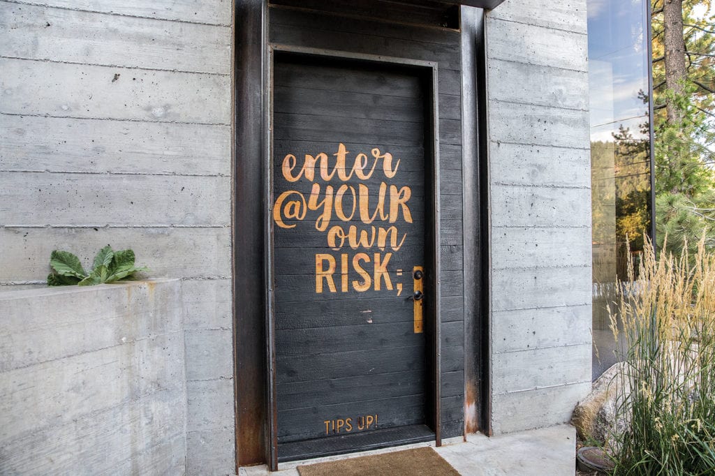 The blackened front door issues warnings and advice to visitors, photo by Jonathan Rouse
Still marked up with the cryptic language of fabrication, thick steel slabs and exposed structure are everywhere. The charred front door is sheltered by a meaty chunk of steel plate, pierced and suspended by a heavy threaded rod. Bracketed within its industrial steel frame, the blackened door issues warnings and advice:
“Enter @ your own risk.”
Also: “Tips up,” as you metaphorically slide off the chairlift of the regular world outside, poised for the great experience awaiting through the door.
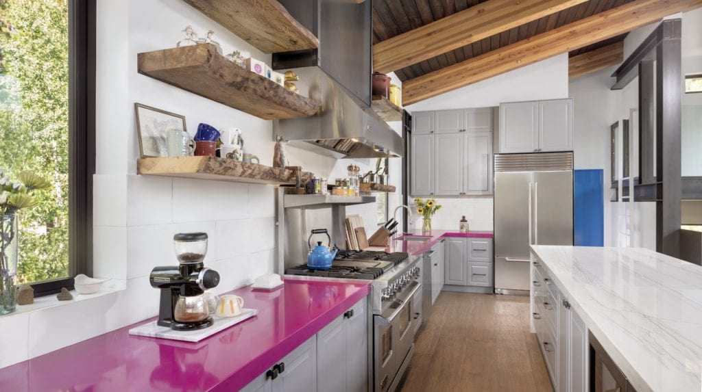
Pink Caesarstone countertops add pop to the kitchen and master bath, photo by Jonathan Rouse
The marriage of whimsical visuals with rough-and-ready building materials introduced on the exterior continues unapologetically and uninterrupted on the inside. Zingy pink and bright blue are selectively splashed in sophisticated strokes. Wells snapped up the last pink quartz slab that Caesarstone ever made for installation in the kitchen and master bath. Interior doors borrow the cyan blue of the six-panel NanaWall bi-fold door in the great room, the color selected by Wells because it’s the “old Squaw Valley blue.”
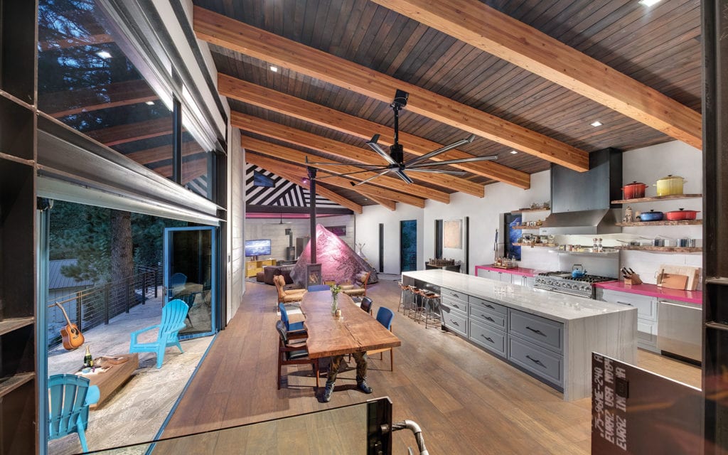 A large section of the great room opens widely through a six-panel NanaWall bi-fold door. The door is cyan in color to match the old Squaw Valley blue, the owner says, photo by Jonathan Rouse
Granite flooring sourced from Toronto swirls with slightly audacious mauve tones and accent walls of bold metallic wallpaper punch up the spaces that call for it. Repurposed chairlift cables from Squaw’s Siberia lift live a second life as beautifully crafted handrails, while an orange chairlift catch net functions as a guardrail at the stair landing.
“They’re just little hints from my lift op past,” says Wells.
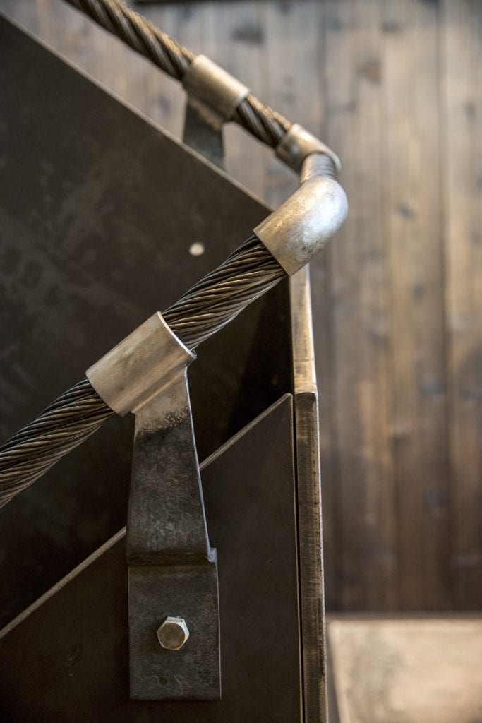
Repurposed chairlift cables from Squaw’s Siberia lift serve as handrails, photo by Jonathan Rouse
And then there are the rocks. Sprinkled through the house as though an enormous, geologically minded stone fairy has visited, dishwasher-sized granite boulders encroach into several lower-level spaces, often as part of a perfectly crafted material composition. But the rock in the living room needs no accessories.
A 39,000-pound pyramid of granite was craned into the main living space—after construction had started, to the chagrin of the structural engineer—and is fitted with climbing holds that Wells says his kids don’t need anymore to scramble up for an elevated perspective. “It breaks up the room and the girls love climbing on it, but I’m stuck with that boulder no matter what,” he says, completely untroubled.
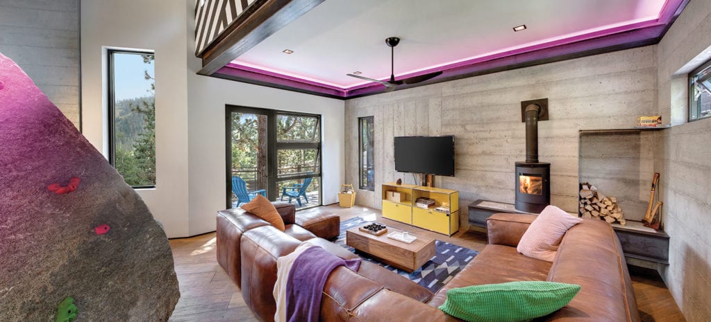 A 39,000-pound pyramid of granite was craned into the main living space and fitted with climbing holds, photo by Jonathan Rouse
The theme of simple materiality is found everywhere. Full-size bunks and storage areas are crafted out of basic plywood sheets. Multi-diameter lengths of rebar are welded into a vertical assembly of pick-up-sticks disguised as a guardrail in the backyard. Reclaimed teak flooring runs throughout the upper level, and steel grate walkways outside are yet another ode to ski area functionality.
Colorful, clever pieces of art are perfectly at home, contributing another layer of personality to the house. Bronze “table legs” support a live-edged walnut slab dining table and prints from British artist Damien Hirst line the downstairs hall. A Slim Aarons print of post-Olympics Squaw royalty gathered around a snow bar on top of KT-22 in 1961 nostalgically graces the stairwell.
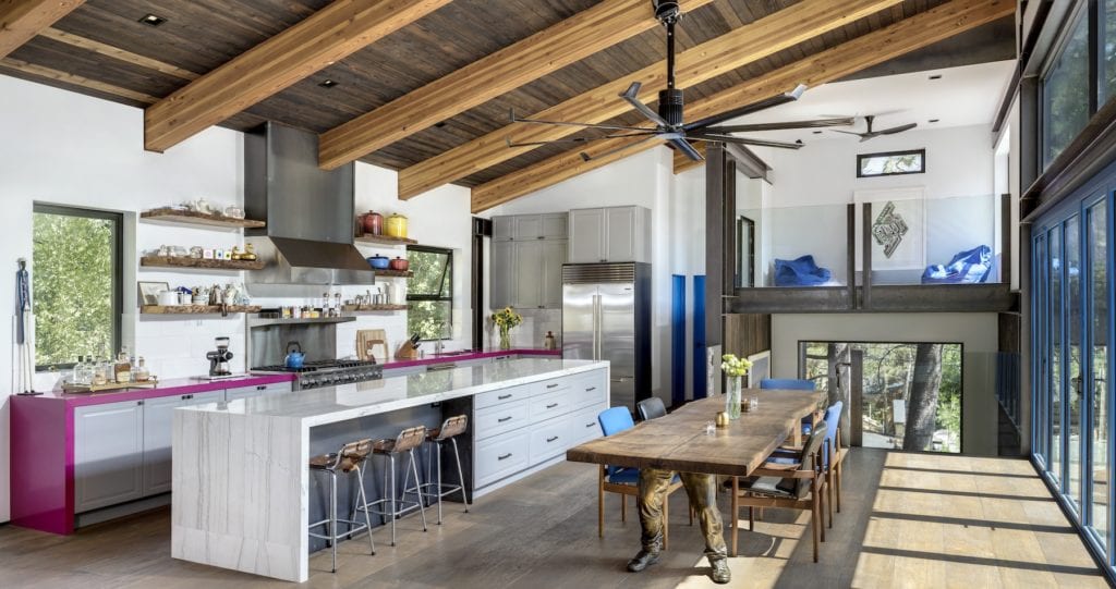
A live-edged walnut slab dining table is supported quite literally by table legs, photo by Jonathan Rouse
Inspired by the work of architects Tom Kundig and Arthur Erickson, Wells was the designer-on-the-fly for the project as well as the general contractor. He assembled a group of local carpenters and craftsmen, most of whom he’s known since his late teens and early 20s. They are among the most high-end and sought-after subcontractors in the area, and Wells remains without pretense when pointing out and admiring the quality of their work—“paint master” John Read, “concrete master” John Peterson, “framing kingpin” Bob Morken, Mike Johnson (steelwork) and Matt Norris (plumbing and hydronics), among others.
“All these different personalities were poured into the process. They all left their mark. But really, we’re just derelict lift operators who got to build this house,” he says with a big smile, labeling his crew the “Bad News Bears.”
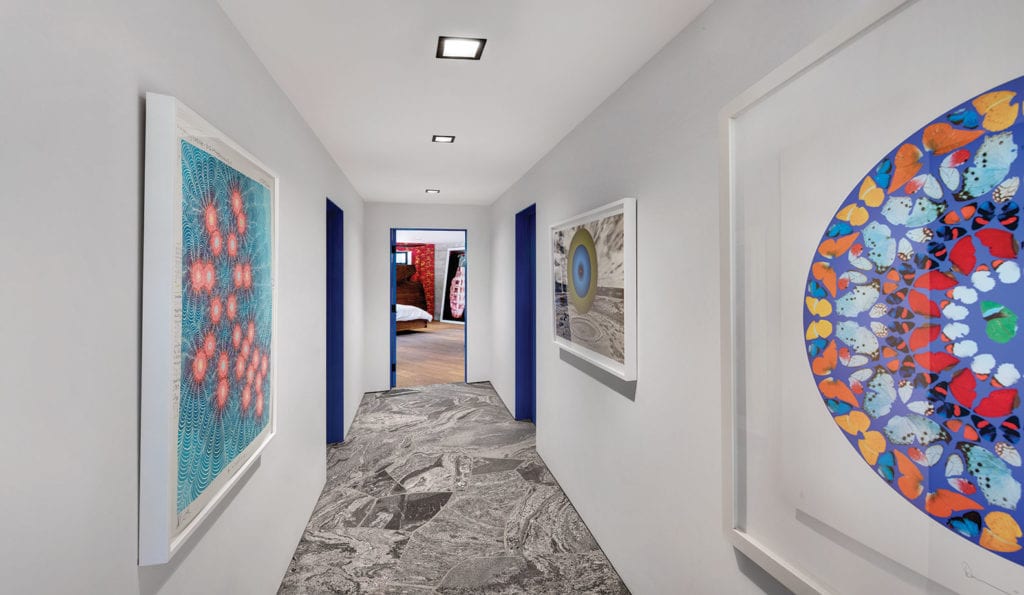 Colorful prints by British artist Damien Hirst line the downstairs hall, photo by Jonathan Rouse
Wells runs a creative and branding firm called Sixteenfifty Creative Intelligence with his wife, Amy. Amy’s background in graphic design coupled with her husband’s go-for-it joie de vivre has built a successful firm of 30 people, their work involving casino, hospitality and restaurant clientele, some on a global stage.
“I’ve got clients that I do this for and they’ve all got rules,” say Wells. “But with this house, we could just go for it. This house is one massive art project and we were lucky to be able to just do it.”
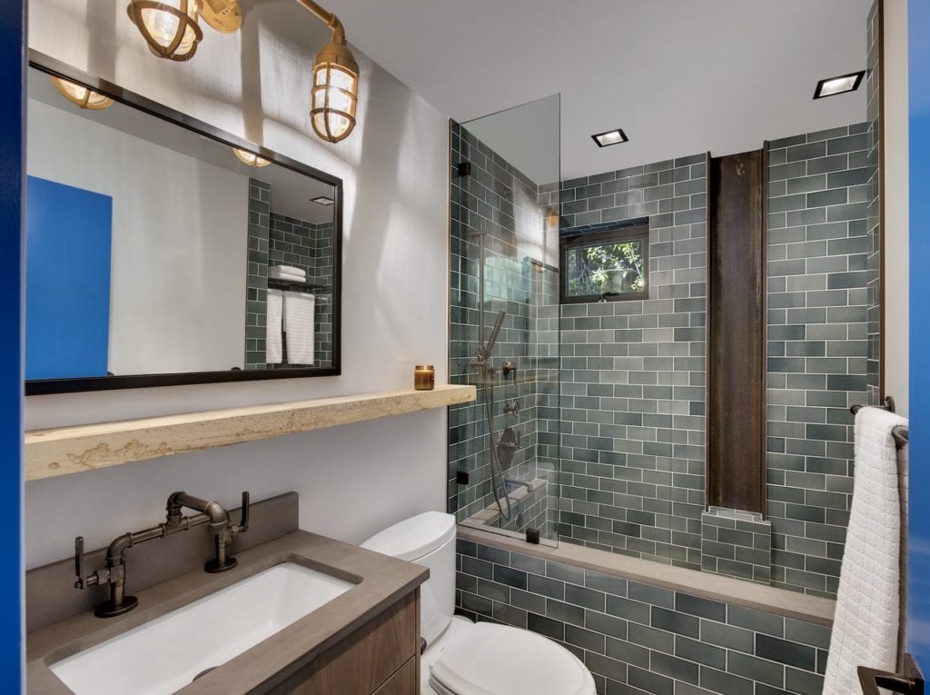 The guest bathroom, photo by Jonathan Rouse
Walking through the house with no one home allows for contemplative appreciation of its rich personality and the inspired, crafted detailing. But the chaos of kids, dogs and friends brings it fully to life. Laughter, noise, the harassment of a confident pre-teen assuring her father that she will easily whoop him on a given ski run, the multi-voiced celebratory cheer in recalling how the clan’s youngest successfully skied Red Dog for the first time: The house absorbs the stimulation and sparkles even brighter because of it.
This residential casserole of colors and raw materials with plenty of joviality thrown in is essentially the result of Wells believing the house should be an honest representation of the people living in it.
“Everyone is so scared to do stuff. If you like purple, use purple. Let the house speak,” he says enthusiastically. “You’ve got to go with what you like. You’ve got to just do it.”
Truckee-based writer Vangela Wightman knows exactly what a daffy is and wishes she could still execute one.
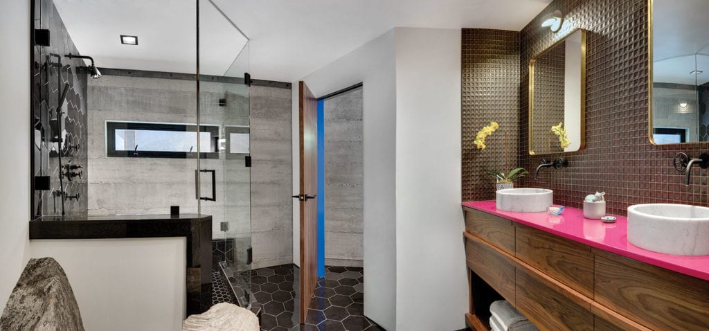 The master bathroom features the same hot pink quartz countertop as the kitchen, photo by Jonathan Rouse


Sally Gardner
Posted at 16:43h, 22 MayRobb, you did an amazing job! Cheer, Sally Gardner