24 Feb All in the Family
A 1980s vacation home gets a facelift that’s both fun-loving and functional
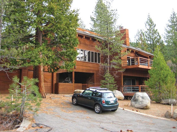
The original exterior of the home, which was built in 1981
When an aging Incline Village vacation home was ready for a long overdue update, its Bay Area owners set out to give the generations-old extended family gathering spot a makeover that both preserved its cherished past and created a refreshed retreat firmly focused on the future.
The original 4,755-square-foot house was built in 1981 and had been in the family for 35 years. But over time the three-bedroom, two-and-a-half-bath layout could no longer comfortably accommodate the growing multi-generational brood. Also growing was a long list of deferred maintenance after decades of heavy use.
“It had lived through all of us kids coming up to Tahoe with friends, throughout college and in our 20s,” says one of the homeowners, who lives with her husband and two daughters in Marin County. “The family decided it was time to remodel. As the middle child with a huge passion for architecture and design, and so many great memories of our family in this home and Lake Tahoe, I signed up to lead the project.” As the chief operating officer of a business process outsourcing company, she was well suited for the job. She adds, “It was important to me to keep the original character and soul of the house.”
As a first step, the owner approached Kevin Hanna after a stay with friends at a vacation rental built by his Incline Village–based Greenwood Homes. Hanna hooked her up with Keith Kelly and Ryan Marsden of Kelly & Stone Architects (KSA), which has offices in Truckee and Steamboat Springs, Colorado; the two firms have collaborated on many projects over the past decade, a relationship that certainly helped streamline the entire venture. The design process, which went from a midrange remodel to a full-blown renovation and expansion, lasted a little over a year, with the owner making frequent visits and taking time to think through critical forks in the road.
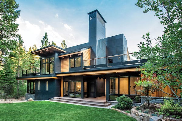
The metal, wood and glass exterior from the backyard, photo by Joy Strotz
“As with many of our projects, we endeavor to build a project team early,” says Kelly. “It was extremely beneficial to have the builder engaged early in the design process, and it was great to have a passionate client highly involved in multiple meetings at the site and virtual meetings from start to finish. It was a very collaborative approach and all parties—builder, architect, interior designer and owner—brought insight and inspiration to the table.”
The owner agrees, crediting the teamwork of KSA and Greenwood along with Hills & Grant, the Bay Area residential interior design firm that pulled together the home’s new unique style.
“Managing the remodel of a family home with a lot of stakeholders and strong opinions was a challenge,” she says. “But the Greenwood–KSA–Hills & Grant team was truly responsive, smart and transparent the whole way through.”
The result is a “new” seven-bedroom contemporary mountain home that truly subscribes to “something old, something new.”
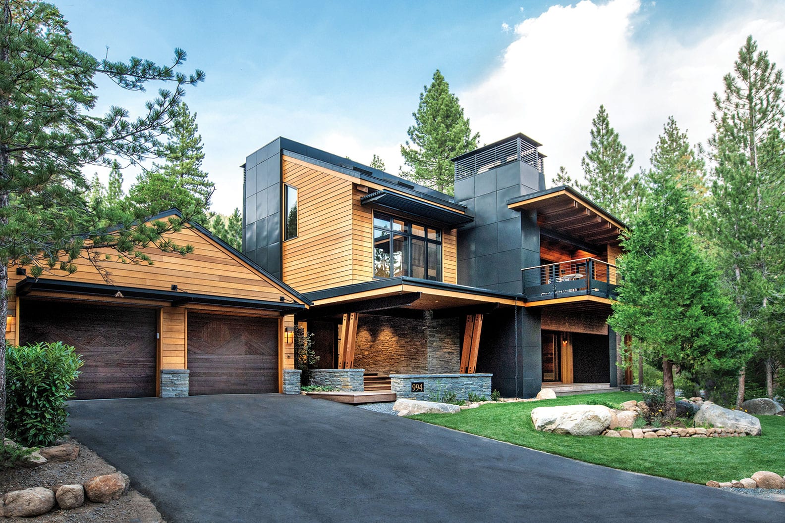
Wood, steel and stone—elements and textures that create a strong indoor-outdoor connection—set the tone on the redesigned exterior, with towers clad in dark metal panels, clear cedar siding and expansive window walls that fill the interior with natural light. The original wood garage doors, with a relief carving of the Sierra Nevada (about which there were many lively discussions) remain in place, as does the heavy bronze front door, which now welcomes guests through a large-scale sheltered walkway.
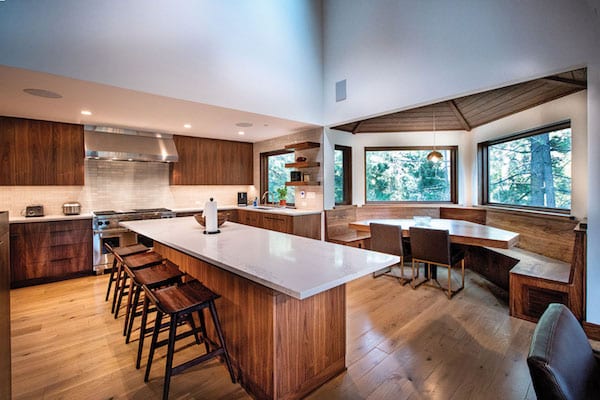
A large island and a spacious built-in dining nook are among the highlights of the updated kitchen, photo by Joy Strotz
Stepping inside, an immediate reconnection with the outside is established via a large sliding glass door located directly across the foyer’s parquet floor. Tucked around the corner, a highly functional mudroom is outfitted with cabinets, cubbies, hooks and bench for gearing up and down, as well as garage access. From here an entire new wing includes a fitness room with deck access, sauna, full bath with steam shower and long porcelain trough sink, and beyond, a bunk room with a pair of stacked sleeping spaces plus a daybed. Built-in cubbies and shelves lining the corridor serve as storage and drop spots; barn doors provide privacy, close off clutter and help create separation of spaces.
Across the foyer, the hallway clad in European white oak from Butler Flooring, which was sanded and finished in place, leads to a step-down recreation room where a three-panel sliding glass door provides natural daylight and deck access. The fireplace features ribbed metallic bronze tiles from the Ann Sacks Savoy collection, which, for continuity, were used in three different locations in the home; Clastic Designs created the black concrete hearth. The small powder room features a blue, black and gray full-tiled wall punctuated by a richly grained wood counter with undulating edge crafted by Western Woodworking in Minden, Nevada.
Last but not least, above the room’s low, curvy, tan leather couches hangs a disco ball.
“The family that dances together stays together, right?” says Kris Foss of Hills & Grant. “So why not have a disco ball in your rec room?”
The mirrored twirling orb, one of many quirky and unique details throughout the house, is a shining example of finding the right balance between the client’s desire to completely modernize the house yet keep the retro vibe of the original.

The master suite includes a low-profile fireplace and sitting area with a view, photo by Joy Strotz
“I think we had the most fun choosing tile and decorative light fixtures,” says Foss, whose office does a lot of work in Tahoe. “We were able to find some really beautiful new modern products that also have a fun, funky aesthetic. The client and I both live in 1950s-era modern homes and are mid-century enthusiasts, so we both were pretty excited about some of the selections.”
The owner also wanted to stay true to the color palette of the home’s original furniture and finishes. Many of the tile selections and palette were informed by the legacy house, especially the penny tiles in the bathrooms.
“The original house had a fabulous copper penny–tiled wet bar with a brass sink and fixtures,” the owner says. She also confesses that her color inspiration was in part based on a set of plastic plates from the kitchen. “I was so intent on keeping the physical memories. We packed away about 80 percent of the original kitchen plates, serving dishes, et cetera. and moved them back into the house.”
Beyond the rec room, the hallway, complete with a full-sized shuffleboard table, continues to a laundry room tucked behind another barn door. Two short sets of steps proceed to three en-suite king-size bedrooms, each with its own vintage flair.
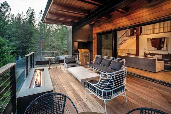
Weiland lift-and-slide doors open from the living room to a deck with a covered seating area, fire pit and barbecue grill station, photo by Joy Strotz

The original deck before the remodel
Back toward the front door, a staircase constructed from the same Euro white oak leads up to the main living area, where beams were wrapped, ceilings sanded and re-stained to match the rest of the house, and new railings installed. The original two-story, earth-toned rough granite fireplace was preserved as the room’s focal point; Weiland lift-and-slide doors installed by nvision Glass open to the deck, where a covered seating area, low-slung fire pit and barbecue grill station await.
On the opposite side of the hearth, the expansive kitchen can now easily cope with a crowd. Removing a cabinet that blocked a passageway between the two spaces and replacing it with a low-profile version that wraps around the hearth retained storage, provided display and a serving surface, and allowed for improved circulation. Commercial-grade appliances, a large island with bar stools, an airy built-in dining nook and a dining table that can accomodate 10 ensures that no one will go hungry—or without a seat. Light-hued, marble-inspired Caesarstone countertops blend elegantly with a backsplash tiled with a field-ribbed selection from Ann Sacks Savoy collection. Generous storage, including stylish floating shelves, are custom crafted from walnut.
A corridor off the living room leads to the spacious master suite, whose sturdy support beams were also wrapped and refinished. Tiles, also from Ann Sacks Savoy collection, surround the low-slung fireplace; a sitting area in front of floor-to-ceiling windows is framed by a pair of vertical posts, with access to a private deck just beyond. Luxurious bathroom features include a cloud motif wallpaper from Phillip Jeffries called Beyond, its color aptly described as Heaven, and an oval freestanding soaking tub from Canada’s Wetstyle with a Watermark Sense floor-mounted tub filler in aged brass. Gold tones rule throughout the house, including the walk-in shower lined with a snakeskin-like tile named Micro Diamond Oro from Ann Sacks Rythme Mosaics.
“We briefly considered keeping some of the faucets and hardware in the bathrooms, but for practicality’s sake went with Kohler gold fixtures,” says the owner. “It recalled the brass/gold fixtures we grew up with in the house.”
Below the trough sink is a cool towel storage shelf; the highly automated toilet in the separate water closet does just about everything one would need to get the job done.
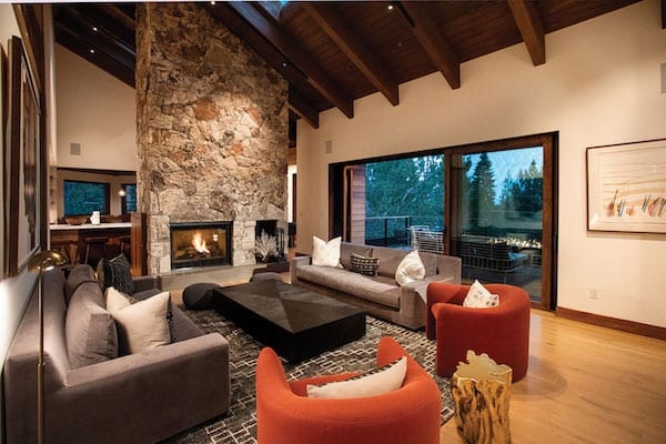
The original two-story granite fireplace was preserved in the main living area, which was modernized with furnishings by interior designer Kris Foss of Hills & Grant, photo by Joy Strotz
Back in the main living room, past the family’s much loved game table and chandelier, steps continue up to a landing that accesses an open deck, its section of see-through floor panels providing a novel visual connection with the lower level.
Continuing up to the wood- and steel-clad loft, a pair of bamboo chair swings suspended from the ceiling encourages lingering a little longer. From here an open walkway overlooking the living room below leads to another bunk room that sleeps four, as well as a small bedroom tucked beneath the sky-lit sloped ceiling. A full bath serves occupants of those rooms.
Fresh, functional and fun, this project is exemplary of what can be achieved in a thoughtful reimagining of old and new forms and materials, a home that enters its second act with enough room and amenities to carry the family and its collective memories into the next generation and beyond.
Award: Legacy Home
Building Design: Kelly & Stone Architects
Builder: Greenwood Homes
Interior Design: Kris Foss of Hills & Grant
Square Feet: 5,499
Year Complete: 2018


No Comments