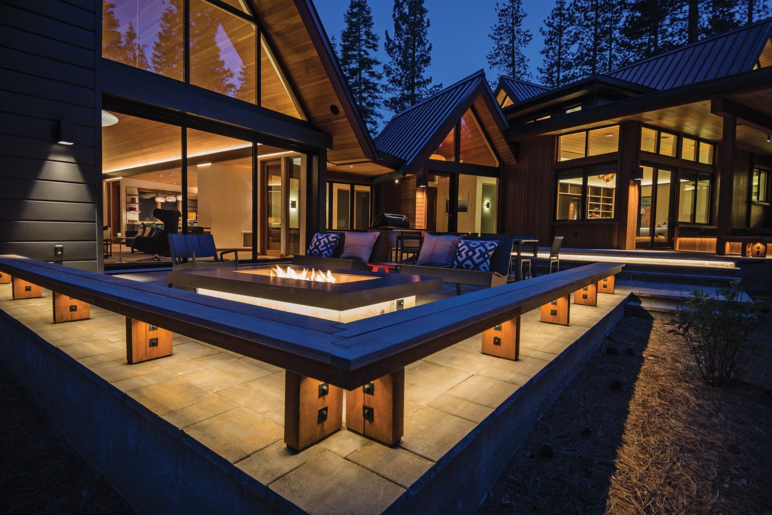
24 Feb What Would Sven Do?
A unique camaraderie between owner, architect and contractor leads to an immaculate Martis Camp creation
On a gently sloping, 3-plus-acre piece of forested property at the northeast edge of Martis Camp, Scandinavian design principles of function and simplicity were folded into Sierra materiality and lifestyle with a heaping tablespoon of family retreat added on top. The outcome is a quiet conglomeration of gables and glass, a house that seems both completely familiar yet doesn’t quite look like anything anyone has seen before.
“When you go through your mental Rolodex of homes, you haven’t seen this,” says general contractor and Crestwood Construction owner Marshall Williams. “People will have a hard time trying to emulate it. It’s really one of a kind.”
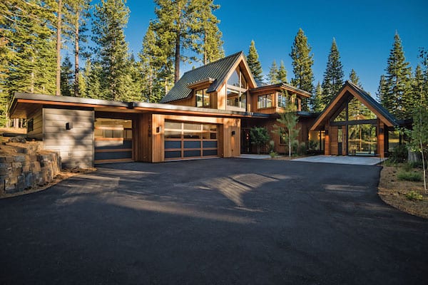
An assembly of basic forms and materials—cedar and zinc siding, glass, metal roofing—define the auto court, entry pavilion and upper-level bunk rooms, photo by Jeffrey Freeman
The steeply pitched gable roof forms with asymmetrical infill glass panels are the defining feature of the 5,400-square-foot home. Distinct gabled pods, arranged on the site for functionality, views and environmental directives (sunlight, weather patterns, etc.) are linked with low-sloping roofs, wrapped in cedar siding and defined by a board-formed concrete base. Dark zinc panels finish select forms to give appropriate visual weight, allowing the house to stealthily settle into the site.
However, perhaps one of the most important ingredients in the design isn’t a tangible component at all, but, rather, a sort of muse, as architect Brendan Riley of Truckee’s Ryan Group Architects (RGA) describes it.
“We tried to tease out what the owner’s architectural interests were,” Riley says. “Modern? Traditional? Somewhere in between? For this project, ‘Sven’ became this fantasy person that I conjured up; his background was Scandinavian and he moved to the Sierra and brought a lighter, brighter, cleaner design sense with some warmth and injected it into the Martis Valley and this environment. He became a little bit of a foil.”
Adds the owner: “We wanted a clean, modern look that kept with the Tahoe setting, a home that was maybe even a little timeless. Brendan came up with Sven as a kind of rubric for making design decisions.”
A family of five with three boys between the ages of 6 and 11, the owners live full time on the San Mateo peninsula. They identified Martis Camp as not only a beautiful setting but as “a safe place for people like us who have no idea how to live in the mountains.” Laughing, they explain. “Our kids are still on the younger side, but in Martis Camp we feel like we can open the door for them. They can have the experience of roaming free and we don’t have to worry.”
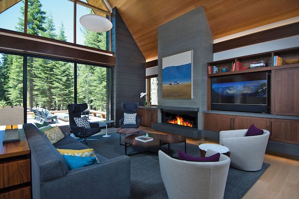
Lift-and-slide doors off the great room pocket completely away into the zinc-finished side wall, while a concrete fireplace and chimney are centered between built-in casework, photo by Jeffrey Freeman
The owners contacted RGA principal Scott Ryan in 2015 after purchasing the property and were under contract with the firm only months later. Early in the design process, they selected Crestwood Construction as their general contractor. Partnering in 22 projects together to date, the RGA–Crestwood teams have developed a trust and chemistry that brings an invaluable dimension to their work.
“During the design and construction process, people would ask us how crazy it was to build a house in Tahoe,” says the owner. “We think the best thing we did was to choose RGA and Crestwood. Those were the best choices we made. We felt their collective goal was to deliver the house we wanted and we appreciated how supportive and patient and creative they were. They have really great chemistry amongst themselves.”
“What Ryan Group and Crestwood do really well is establish a ‘no surprises’ mentality,” says Riley. “We don’t want to walk on the project and be surprised by a question that wasn’t asked, and they don’t want to be surprised by a design concept out of left field that they didn’t plan or prepare for. And after 22 projects together, we have a high level of familiarity on day one. These owners were gracious and willing and were the perfect part of the project triangle. It was arm-in-arm from the beginning.”
In addition to the spaciousness of the property and privacy of its forested slope, all the surrounding properties had been developed, allowing RGA to be strategic in siting the house so it seems like it’s sitting on a 40-acre parcel with no other homes nearby.

The dining room, open to a south-facing terrace, is kept light and bright with maple flooring and smooth white walls; Bocce chandeliers are suspended above the walnut dining table, photo by Jeffrey Freeman
“The characteristics of the property checked a lot of boxes for us in what we were looking for,” says the owner. “It’s a quick trip to [Martis Camp’s] Family Barn, it’s close to the park and every house around it had been built. You knew how all the neighboring homes were oriented. We really appreciated having that information.”
The approach into the auto court from a quiet street travels through a rockery-retained cut, introducing an immediate sense of park-like procession and a subtle sense of privacy. The simple, small gable of the welcoming entry is actually a four-way intersection between entry terrace, a back terrace area and interior window-lined links heading off in opposite directions—to guest/service areas or to the main public living spaces. It is the crossroads for the whole home and also introduces the basic gestalt of the design.
“It’s gabled architecture, it’s got wood siding, it’s got ridgelines, but is reduced to some sort of essence,” says Riley. “The essential forms were brought down to the iconic shape of the gable, but we tried to undo some of the nostalgia and create a fresh take by keeping everything clean.”
The home steps discretely with the contours of the site, from the guest suites to entry level to great room and, finally, to the master wing of the house. The distance between floor levels is minimal but adds just enough vertical separation to bring a strong definition to the various zones in the house. Two bunk room suites sit atop the garage and every space throughout enjoys massive amounts of natural light. Material detailing is exquisitely executed inside and out.
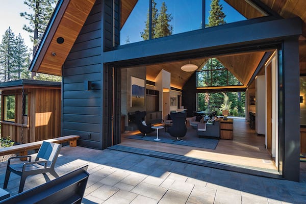
With sliding doors open, the great room and rear terrace become extensions of one another, photo by Jeffrey Freeman
The airy volume of the great room sits beneath a singular 53-foot-long gable. The glass-filled end walls bring sun and light deep into the space, which, as a result, infuses the room with an ever-changing character.
“I love the open feel of this room,” says Shawn Rodriguez, Crestwood project manager. “I love the light in here. I’d take this room any day.”
With the end sliders fully opened and pocketed into their zinc-clad housing, the entire room essentially becomes an open-air pavilion, effortlessly extending out onto bookending terraces, each curtained by firs and pines. Even with the sliders closed, separation from the outside is minimally perceived.
“We wanted a bright home with a lot of light,” says the owner. “I guess I associate that with Sven.”
Carefully selected maple flooring runs through most of the home, enhancing the desired light and brightness of the interiors with its perfect sheen. Walnut trim and vertical-grain Douglas fir decking and windows bring warmth and hint at a more familiar Tahoe finish palette, and only one color of paint is found on the walls: a creamy but crisp white.
“Sven was part of the material editing process,” says RGA interior designer Annie MacFadyen. “We wanted to maintain simplicity and take away what we could to keep it clean and uncluttered.”
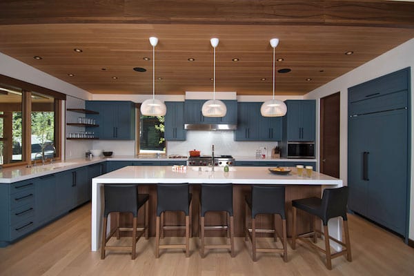
A Silestone waterfall-edged island with three birch Secto light pendants above anchors the kitchen; the Heath tile backsplash and open walnut shelves play off the rich color of the painted casework, photo by Jeffrey Freeman
The flock of curvy black Masters chairs by Phillipe Starck is a playful contrast to the 12-foot-long walnut dining table, all sitting beneath custom mounted Bocce chandeliers. The abstract art at the dining room’s built-in buffet pops with color above a snowy Silestone countertop and smoked indigo painted casework that mirrors the kitchen finishes.
The spacious U-shaped kitchen is tucked beneath a low-sloped shed roof, giving the space a different scale. The simplicity of Sven is manifested even in the routed-out faces of the casework. While the boxed-out cuts reference a typical Shaker cabinet door, the “design eraser” (an RGA design philosophy of sorts) was applied to simplify that familiar look by merely suggesting Shaker detailing without actually layering the door face and frame. The Heath tile backsplash adds subtle texture and walnut finishes at the open shelves and island face tie into the home’s rich but clean palette.
“We kept the cabinetry finishes to a trifecta of three and mixed and matched throughout the house to keep it simple,” says MacFadyen. For example, there is walnut, maple and painted cabinetry in the home, but placement was thoughtfully considered and these three flavors of casework are woven carefully with complementary materials in an overall consistent fashion.
MacFadyen’s ability to keep interior spaces interesting while maintaining flawless cohesion between finishes, colors and materials is exemplary. “Ultimately, I think success is found in the dance between simple and unique,” she says.
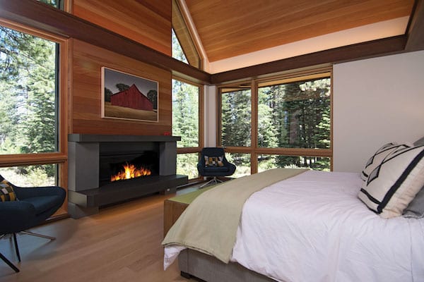
A gas fireplace with smooth concrete surround is centered on the gabled window wall of the master bedroom. Horizontal redwood boards finish the chimney, photo by Jeffrey Freeman
“There is an effortlessness that you can feel in the spaces,” adds Riley. “It’s relaxing and warm and light and bright—and Annie brings that feeling in spades.”
MacFadyen majored in art history and in addition to providing a full interior design package, she’s always game to help clients select artwork, admitting it can be intensive to find that perfect piece. “With the clean lines of the architecture, it was clear where the pops of color would go,” she says.
“When I can pick up on an owner’s shtick, I can get on board to pick the art,” she says. “I’m game if they’re game, but because art is so personal, it can be a struggle too.”
From the rural landscapes of artist Michael Gregory to friendly black cartoon bears framed at the top of the stairs to a photo of the Expedition 42 Soyus spacecraft heading back to earth, the art found throughout the home runs an artistic gamut of sorts, but the owners feel that it also poetically captures the varying shades of their family’s character.
The overall forms of the privately situated master bedroom wing and office follow the clearly established architectural pattern: an unfettered gable houses the bedroom while the bathroom, office and closet rest beneath lower pitched, subordinate roofs. A redwood-finished chimney above a concrete-surrounded fireplace anchors the bedroom space and with full-height windows on either side, the room feels wide open and connected to the forest beyond. Marble countertops, limestone flooring and yet more forest views make the master bath a spa-like haven for escape and solitude.
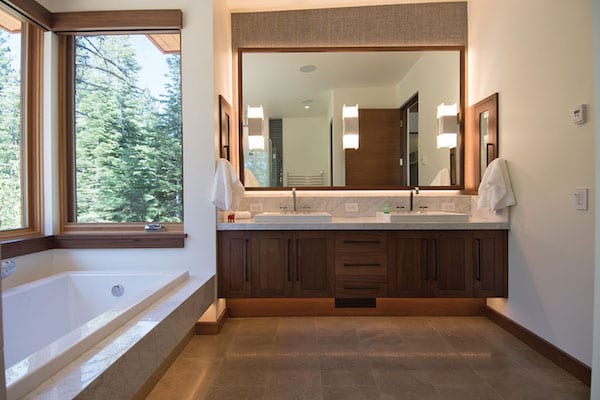
A floating, walnut-faced vanity with marble countertop and a marble-wrapped tub edge include stealth accent lighting, expanding the sense of space in the master bathroom, photo by Jeffrey Freeman
On the west side of the entry gable, a cozy, colorful media room waits behind a large pocket door with contrasting forms and patterns, making the space simultaneously animated and sophisticated. White Tulip chairs, a Minimikado light fixture that looks like it might be suspended sea life and a California-themed print with a bear hugging the entirety of the state all bring notes of whimsy.
Farther down the hall, two guest suites are hidden away for extended family and friends, while generous service spaces (laundry, mudroom) are thoughtfully and practically appointed yet still lux in finishes and full of natural light. At the top of a window-filled, dog-legged stair, two en suite bunk rooms await the youngsters.
The overall color and material palette were skillfully managed with little zips of bright color put into play, adding interest and fun. Orange, in particular, appears as an accent color in the kid spaces specifically because it is the favorite color of the family’s youngest son, who, as a 4-year-old at the beginning of the project, referenced his love of the color “orange-inge.”
“‘Orange-inge’ became the color pop in the media room and the bunk room, but it was also personal,” says Riley. “Those little bits of fun and folly come out of a good client relationship and we were very lucky that this client was comfortable enough to share these kinds of details with us.”

Wall-mounted hooks maintain order in the light-flooded public entry area that sits a few steps above the passage leading to the great room, photo by Jeffrey Freeman
The positive chemistry between owner, architect and contractor is evident in personal touches throughout the house and in the incredible execution of challenging details. However, it was also found in moments of genuine connection throughout the process. As a means to engage the owners’ children and to have a little fun, Riley placed an AT-AT Walker, from Star Wars, in the 3-D sketchup model of the home. Knowing the kids are huge Star Wars fans, he gave the kids a virtual tour, letting them delightedly stumble upon the giant space transporter in their backyard.
“These owners gave us some rope to get things right, and we used that rope to get to something magical,” says Riley.
Unfortunately, there is not an actual AT-AT Walker sauntering through the backyard, and Sven continues his residency in spirit only. But the owners and their children relish being in their mountain home and continue to delight in the commitment of the team that helped make it happen.
“There’s something great about knowing your house is well built,” says the owner. “I felt like Kurt [Schoemeg, Crestwood site superintendent] cared more about certain aspects of the house than I even knew I should, and it’s wonderful to know the people who designed and built your house are confident and that they totally care about it. It gives me reassurance knowing this house was built with love and care and attention.”
Award: Outstanding
Building Design: Brendan Riley of Ryan Group Architects
Builder: Crestwood Construction
Interior Design: Annie MacFadyen of Ryan Group Architects
Square Feet: 5,400
Year Complete: 2017


No Comments