01 Mar A Notch Above
Buckled into four-wheel-drive Jeeps and cruising through forested land that would become Martis Camp, the owners of the home receiving this year’s Mountain Modem award had “drawings of a couple of [amenity] buildings and a promise” from the developer when they purchased one of the first parcels available in 2007. Based in the Los Angeles area, the owners (who have requested to remain anonymous) had a dear, long-term vision of exactly what they wanted in a vaca tion home. After planning for an active, outdoor-based future and with two now-teenage sons on the cusp of moving into adult life, the owners considered every possible programmatic variable, leaving them armed with a two-inch-thick binder of specifics on every space in the house.
To ensure an appropriate response to the specific demands of an alpine environment, the owners were determined to hire a local architect and one with leanings toward a “Tahoe Modern” aesthetic. The search led them to Greg Faulkner.
“We saw his website, loved his work and he just resonated with us as a person,” the owner recalls. Faulkner reciprocates the sentiment.
“They were real stars-in-their-eyes kind of clients, really fun,” he says, “and with the kind of openness that releases you as an architect.”
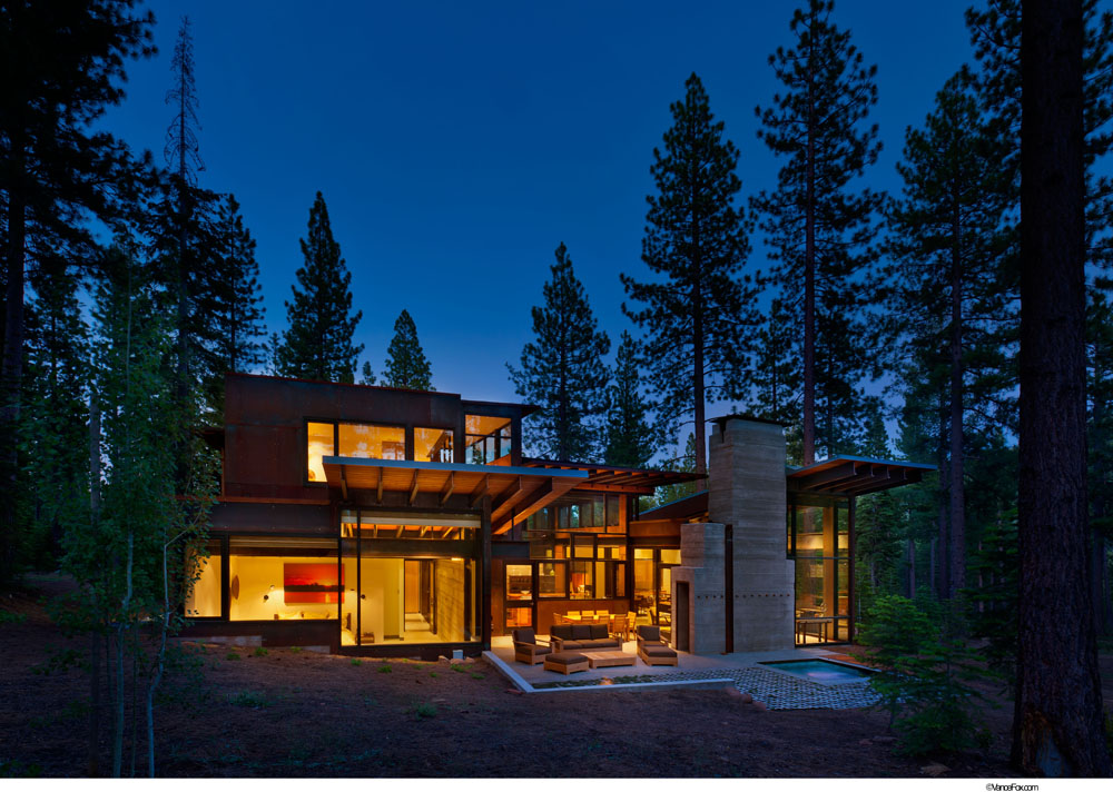
Considering available view corridors and the necessity of maximizing protection against wildfire on the Forest Service–adjacent parcel, Faulkner employed two “pavilions”: one houses the private and utilitarian portions of the residence, the other contains its public spaces. Cloaked in sheets of pre-rusted steel with “saddlebags” of reclaimed redwood siding, the house sits on a slight rise, creating a sense of drama on approach. The pavilions share a fully glazed connecter occupied by the kitchen and entry, and the story-and-a-half-high entry wall offers inviting glimpses of transparency beyond, ushering visitors forward with the invisible force of anticipation.
The journey into the home’s interior has an abstract quality enhanced by elements thoughtfully placed to delay the full revelation of open- ness beyond. A partial height, board-formed concrete screen between the entry and kitchen creates subtle separation between the two, then, a change in ceiling height while moving farther into the dining/living area accentuates the feeling that you’re walking right back outside into the woods.
“On a stormy winter day, sitting in the living room is like being in a snow-globe,” says the owner.
To gain optimal afternoon sun exposure in the living areas and better access views, Faulkner angled the southern pavilion, creating what becomes a vehicle for subtle yet dramatic expression in detailing. “The notch in the house gestures to something larger than itself,” says Faulkner. “Then, it just rattles through the detailing.”
The slight angle is reflected in the stair layout, a few pieces of built-in casework and a stainless steel, saw-toothed threshold inlaid between wide planks of mesquite. “The jigsaw threshold explains the angle in a seemingly simple detail, but really was anything but simple,” says general contractor Ethan Allen, on
this, his sixth project with Faulkner. “The thing with Greg’s stuff is that none of it has really been done before so we have to research and source material and figure it out. That’s also what makes his work so cool.” Then as an aside, he adds: “Most mesquite gets used for barbecuing.”
The basic material palette of glass, steel, concrete and wood is stitched together via honest and well-considered detailing, and keeps any fussy static from interfering with the purity of the spaces, which seem to be created magically out of the pine-scented air.
“We took the detailing to the max,” says Faulkner. Rough, board-formed concrete walls run from interior to exterior, contrasted by rich, warm mesquite flooring and clean apple ply casework. Steel is present everywhere, from large, structural shapes to brushed stainless counter tops to cantilevered plate steel shelving.
“There was a lot of welding,” says Allen. “Most projects have trim carpenters… we had trim welders.”
The most notable chunk of steel in the project is the approximately 16-ton car screen. Part privacy fence, part sculpture, the architect, owner and contractor refer to it as the it thing on the house—pure groovy—and the hardest part of the project. In the interest of generating additional privacy for the all-glass entry, rows of
3/8” x 12” x 7’ steel plates were installed vertically along the perimeter of the auto court. “The power of it was a surprise to me,” says Faulkner, as the perception of the screen changes with the movement of the viewer.
Five years after that bumpy Jeep ride, the owners find that their initial vacation home vision has come to full fruition and reflect on the experience with undiminished enthusiasm. “Ethan was a dream to work with, and we loved working with Greg. He is a true artist. I cannot express how much joy that place brings us. The house does exactly what we wanted it to do, and there isn’t one thing I would change.”
Builder: Ethan Allen Construction, interior: Judy Weinck Interiors, Square Feet: 4,391 ft


No Comments