01 Mar Light of the Party
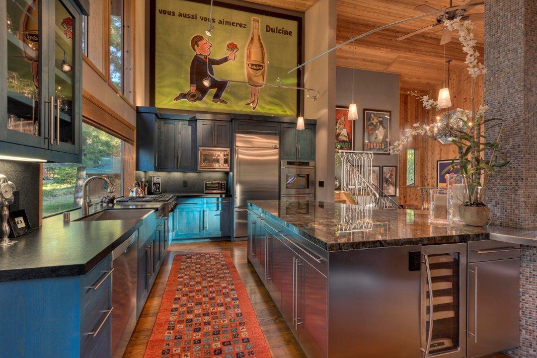
But when DiNallo and Noel came to Rick with a sample of the bright blue stain they planned for the kitchen cabinets, he thought it was a terrible idea. “I immediately said, ‘No!”‘ Stubblefield recalls, laughing. But the stain carried the day, and when Rick saw the finished product, he spun 180 degrees. “I went in with a biased attitude, but at the end of the first day I said, ‘This looks perfect.”‘
The kitchen was part of a larger remod el of the Stubblefield home, but it was singled out by our panel for being an exquisite Merit Award winner. DiNallo teamed with Noel, an artist, to create designs and elements that are both func tional and fun. To open the space, the tall bar has been replaced by a kitchen island with stainless steel storage below and bar stool seating on the living-room end. The island is topped with a solid sheet of Glamorian granite that wraps around an existing post. It’s a massive, beautiful stone, full of gold, grey and blue accents.
“That piece of granite is so spectacular, so big, and I really love the curve around the post,” DiNallo says. To accent the granite and keep it from needing to have seams, the bar side is edged with stain less steel. DiNallo accented and aug mented the post with earthy, IA-inch tile mosaics.
The whole kitchen is now bathed in daylight through a 100-inch picture win dow positioned above the kitchen’s sink. “With the trees and the beautiful back yard, it’s made it feel like an outdoor kitchen,” says Rick. At night, there’s plentiful track lighting running above the island.
The more he’s lived with the cabinets, the more they remind Rick of a prominent local color. “I call them Tahoe blue,” he says. DiNallo, who comes from a background in the textile industry, landed on the color while looking back through her library of fabrics, finding it in a dyed cowhide.
“I saw this blue and it just struck me,” she says. “I knew I didn’t want painted cabinets. Because this color’s a stain, it’s transparent. You can see the grain of the wood, but it’s still contemporary and fun.” Like Tahoe blue, this recreated kitchen now sings of openness, light and color, a “dark hole” transformed into the lively heart of the home.
Architect: Jared Polsky, Builder: Larry Smith, interior: DiNallo Designs, Landscaping: Perennial Landscape & Nursery, Square Feet: 2,665 ft


No Comments