26 Feb Honest Architecture
Geometric shapes craft a fresh, welcoming Martis Camp retreat
Considered by some as America’s first truly modern architect, Louis Sullivan argued that because a building has no means of locomotion, it cannot hide and remains in place to tell “truths” about all the people who designed it, built it and contributed to its physical manifestation.
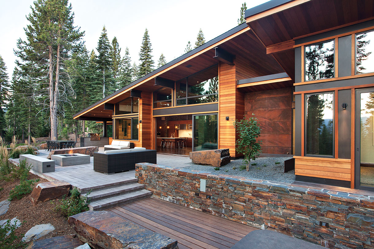
The “truths” told by this 4,600 square foot Martis Camp residence, sitting in the forest as a stunning example of modern alpine architecture, is that it was designed, crafted and built by the best of the best.
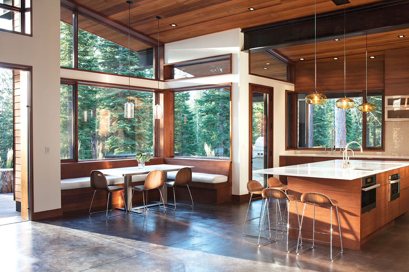
The open kitchen and dinning room
Architect Ted Brobst, general contractor Gabe Shacter and interior designer Martine Paquin began the “manifestation” of this Tahoe retreat for a San Francisco Bay Area family in 2011. Brobst, marking 21 years with Truckee’s Ward-Young Architecture, set out to create an unquestionably modern, but also comfortable, warm and private home. The overall composition of geometric shapes are dressed in mountain appropriate materials—Cisco Grove ledgestone, clear cedar boards, COR-TEN panels—all running unbounded from exterior to interior to maintain a pure expression of form. Shed roofs rise up from mostly flat roofed volumes to rest on walls of glass, allowing sun and natural light to wash in and expand the open sense of the spaces.
Bracketed between stone-clad cubes acting as sentries, a simple wood bridge leads to the entry door in a protective alcove topped with a COR-TEN-faced roof slab. The transparency of the great room window wall and east terrace lie beyond, with the great room bathing in generous amounts of daylight aided by blue sky shots from windows on three sides. A silky-smooth, board-formed concrete fireplace surround and cantilevered hearth is the simple, elegant centerpiece of the room and one of many spectacular concrete pieces in the home produced by Oakland’s Concreteworks. “There is so much possibility with that one material,” says San Francisco–based designer Paquin, noting the chameleon-like malleability of concrete. “So many different textures, patinas and finishes are possible.”
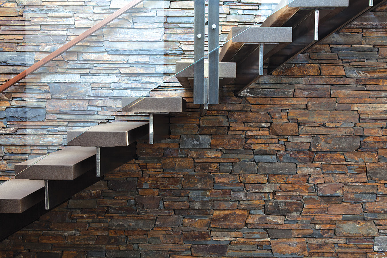
Cantilevered off the stone wall, the treads on this concrete-and-glass stairway float to the upper floor
Throughout the interior, Paquin balanced an earthy palette of wood, stone, metal and glass against very refined, clean surfaces, textures and materials. The chocolatey-hued concrete floor running throughout the lower level quietly complements the home’s elemental material palette. An open kitchen sits at the south end of the great room with thin, gleaming white Caesarstone countertops floating atop crisply assembled rift-sawn oak casework; a generous built-in banquet accompanies the kitchen, dressed in supple white leather sitting snug against tall walls of east- and south-facing windows.
The interior materials work to brighten and harmonize with the architecture, eliminating the often jarring distinction between the two disciplines. Brobst and Shacter laud Paquin’s creativity and overall contribution to the project.
“Martine brought a lot to the table and she is definitely passionate about what she does,” says Shacter. “And to her credit, she’s very open to new ideas.”
One of the home’s most compelling elements is the concrete, steel and glass staircase: concrete treads suspended to magically cantilever off a massive stone wall.
“The stair is awesome,” says Brobst. “Aren [Saltiel, an architectural intern at Ward-Young] and I did all the detailing of that stair and it was a real pleasure.”
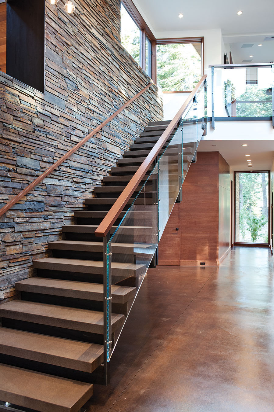
The staircase in detail
Given that each individual steel riser support weighs approximately 260 pounds (before the concrete tread is put on top), Shacter maintained a cautious and vigilant approach to the construction and installation. “You walk in the front door and the stairs are right there, one of the first things you see, so we spent a lot of time on it.”
At the top of the stairs, big angular windows in the rec room cash in on Carson Range views, and the lofty, light-filled sense of the space results from the two-story wall of glazing shared with the mudroom passage below. Curtains magically appear from a recess in the wall, turning the rec room into a movie theater, and three of the home’s guest suites await mere steps from this instant cinema.
If there is one room in the house that strays ever so slightly from the expected mountain vernacular, it is the dreamy, spa-like master bathroom.
“It’s such a rich space,” says Shacter. “There is nothing sharp about the room. Every time I walk in there, I think ‘this is mind blowing.’” Frosty white glass doors, a complementary selection of tiles and ample amounts of discretely built-in casework live in a space served by high, horizontal windows and a skylight that allows daylight to pour onto the creamy white concrete sink area. But without question, the show stealer of this empyreal room is the soaking tub: a solid concrete cube that has the inviting visual softness and color of a huge, plump (and certainly geometric) marshmallow.
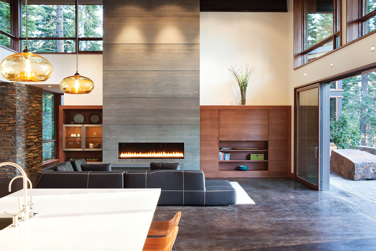
A board-formed concrete hearth stands out against the interior’s earth tones
The fantastic result of the project team’s synergy was born of mutual respect, successful and bountiful communication, and in the case of Brobst and Shacter, history. This is Shacter’s fifth project with Brobst, a working relationship the contractor describes as “awesome.”
“I have a lot of respect for what Ted does,” says Shacter. “It’s hard to find someone who can visualize the details like he does.”
Of Shacter, the characteristically reserved Brobst is candid. “Gabe builds a phenomenal house. The quality is unbelievable. Everything is thought about and cared about and the craftsmanship is top of the line.”
There is nothing fussy in this spectacular demonstration of modern architecture, and yet, clearly every aspect was spectacularly fussed over. Linear relationships of detailing and materials are flawless and magnificent. “You want to build it so that in the end, no one notices anything,” says Shacter, “because if they do notice, it’s going to be something that went wrong. We wanted there to be nothing to talk about except to walk in and say, ‘Wow.’” Mission accomplished. Wow, indeed.
Award: Contemporary
Building Design: Ward-Young Architecture & Planning
Builder: Gabe Shacter, Mountain Craft
Interior Design: Martine Paquin Design and Consulting
Square Feet: 4,600
Year Completed: 2013


No Comments