
28 Feb Lucky Strike
A Tahoe Donner home combines a utilitarian aesthetic with mountain-inspired design
When longtime Berkeley resident Dana Welch walked onto nine acres of rocky, boulder-strewn property in Tahoe Donner—one of a handful of estate-sized parcels within the 40-plus-year-old development—she knew she happened upon a very rare opportunity.
“I saw the boulder outcroppings and fell in love,” says Welch. Scott Adams, Welch’s husband, was also quick to swoon, comparing the feeling of discovery in this case to one any lucky backpacker can identify with. “It’s like when you go camping and you come across a really great campsite—you know where you are going to set everything up and it just feels right. Finding this property was a lot like that feeling. The lot is just perfect.”
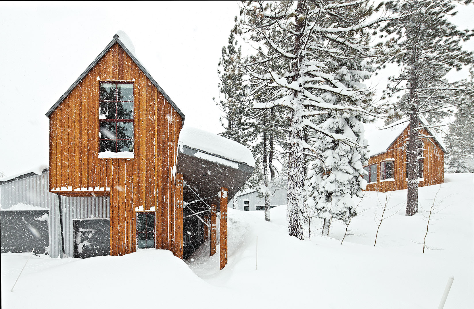
The home was situated on one of the last estate-sized parcels in Tahoe Donner
Owning a spatially-challenged home in Tahoe Donner since 2001, Welch and Adams went looking for property in 2007 to build a vacation house that would more graciously and comfortably accommodate their merged families. The five adult children they have between them range in age from 34 to 37, and when the house fills with family, it fills to the rafters. “We know there are going to be grandchildren (the first is expected in June 2014) and we wanted a real family compound where everyone would be comfortable, but to also be able to have separation,” says Welch.
The nine acres of land offer spectacular natural amenities. Long, screened views of the Carson Range and Mt. Rose are available to the east, a sight line to Castle Peak is served to the northwest, and the east face of the Sierra Crest, Anderson Peak and Tinker’s Knob seem almost touchable. The highest point of the property is capped with a sculptural granite crown. The dramatic rock outcroppings define site access, open spaces and pause points, all of which gave significant direction to the home’s design.
To fully capture the opportunity and extensive layers of beauty the property afforded, Welch and Adams turned to David Stark Wilson and his partner, Chris Parlette, of WA Design, a Berkeley architecture firm the couple previously worked with to design their Bay Area home. Wilson and Parlette are not strangers to repeat clients and find the elevated level of trust established in the architect-owner relationship makes the process even more enjoyable the second time around.
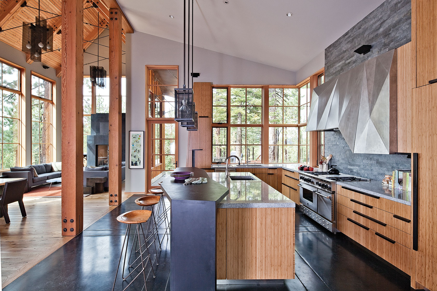
Custom mesh-covered light fixtures continue the mill theme above the kitchen island
Adams and Welch describe Wilson, a native Californian and graduate of UC Berkeley, as a “naturalist” with a particularly acute affinity for alpine environments. A book featuring the work of WA Design mentions Wilson climbed Mt. Shasta at the age 9, scaled Half Dome’s vertical face at 17 and went on to climb some of the world’s loftiest peaks. This deep influence of natural patterns, forms and elemental relationships found in the great outdoors seems to have gradually manifested itself in Wilson’s work. “I hope the binding thread (found in my projects) is the simple spirit of exploration guided by awareness of the myriad factors that allow good architecture to happen,” Wilson writes in the forward of his book House + Origins.
This embodiment of nature can be experienced throughout WA Design’s work: stamped patterns in a metal screen wall perfectly mimic the play of light and shadow found in an aspen grove, the gentle bend of a river informs the organic curve of a home’s feature wall and, in the Welch-Adams home, the sculptural treatment of specific details in the kitchen and master bedroom abstractly hint at the crystalline form of glaciers.
Wilson also developed an interest in what he describes as the rapidly disappearing utilitarian buildings of the Mother Lode found throughout the Sierra Nevada foothills; these Gold Rush–era structures began to influence his own architectural endeavors. “I labored for the very qualities they embodied effortlessly—purity and lack of pretense.” A particular source of inspiration for the Welch-Adams home was the Kentucky Stamp mill. Sitting above Sattley, California, the Kentucky mill came into service in the early 1850s, as the quest for gold raged throughout Northern California’s foothills. The process of extracting gold in this manner—repeatedly crushing rock into progressively finer bits—calls for a structure extending vertically to fully harness gravity’s power to move material through the machinery. These building forms tend to be linear and directly respond to the steep topography with which they are associated; the general aesthetic is simple, using materials both native to the area and able to withstand the demands of the work and climate. “This vernacular was the perfect language for the design of the site,” says Wilson. “This house fell right onto the page.”
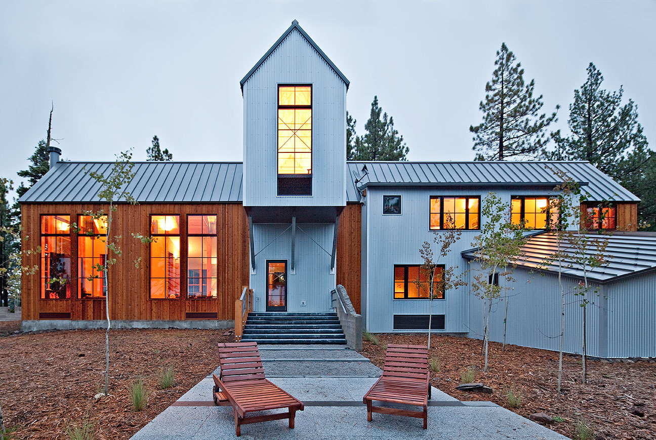
The Tahoe Donner home was modeled on the circa-1850s Sattley, California, Kentucky Stamp mill
Laid out on strong perpendicular axes, nestled among and below rock outcrops, the house rests on naturally occurring flat spots on an otherwise topographically active property.
“The building pad was relatively obvious,” says Wilson of the two mostly flat areas separately holding the home’s main living and master bedroom masses. The spaces in the home stretched along these lines, not only to join two major parts of the house but to also accomplish additional goals. “We pointed the house right at Tinker’s Knob to clearly connect it with the mountains; we spread the house out for solar gain and also to get the views to the Carson Range. This all lead to the house getting pulled apart.”
Each axis terminates at an exterior terrace. The habitable space of the interior simply continues outside and begins to blend, expand and encompass the forest and distant views. The alpine environment virtually reaches its arms into the four doorways and along the corridors, “wearing” the house and blurring boundaries that exist between “in here” and “out there.” Wilson’s favorite spot in the house is at the intersection of the two axes.
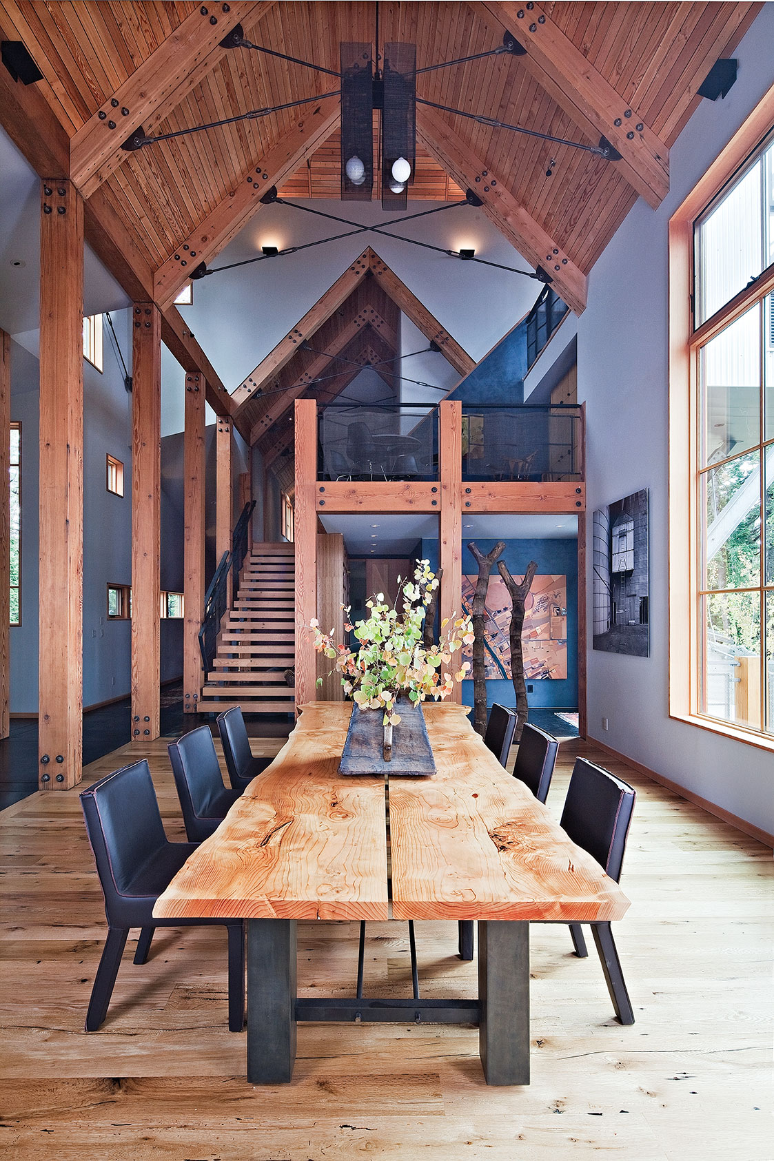
A custom dining table brings nature inside
“The crossroads is where you can look in four directions,” he says. “The exterior pathways and trellis enhance this continuation and reinforce the relationship with the exterior spaces.”
Most of the simple gable forms are clad with character-worn recycled cedar, laid up in a vertical board and batten. The amply sized rectangular windows in the gables are scaled to balance out the almost elementary school simplicity of these forms, with their modest roof overhangs and absence of trim and decorative detailing. The linear connector links and loft gable forms are clad with corrugated Galvalume, a corrosion-resistant metal combining aluminum and zinc, and hearkening to the project’s industrial inspiration.
The clean composition of gable forms and shed-capped connectors is alpine simplicity at its most basic. Even though the architectural inspiration for the project stems from a 150-plus-year-old structure, the appropriateness and genuine nature of the application assures it will remain both timeless and a fresh creation of the twenty-first century. “We knew David would not design a house that was nostalgic,” says Welch. “We knew he would specify materials appropriate to the area but the house would have a contemporary feel.”
The sizeable divided-light windows in the gable forms have a traditional feel with an expected placement. However, in the connector pieces, window location becomes less formulated.
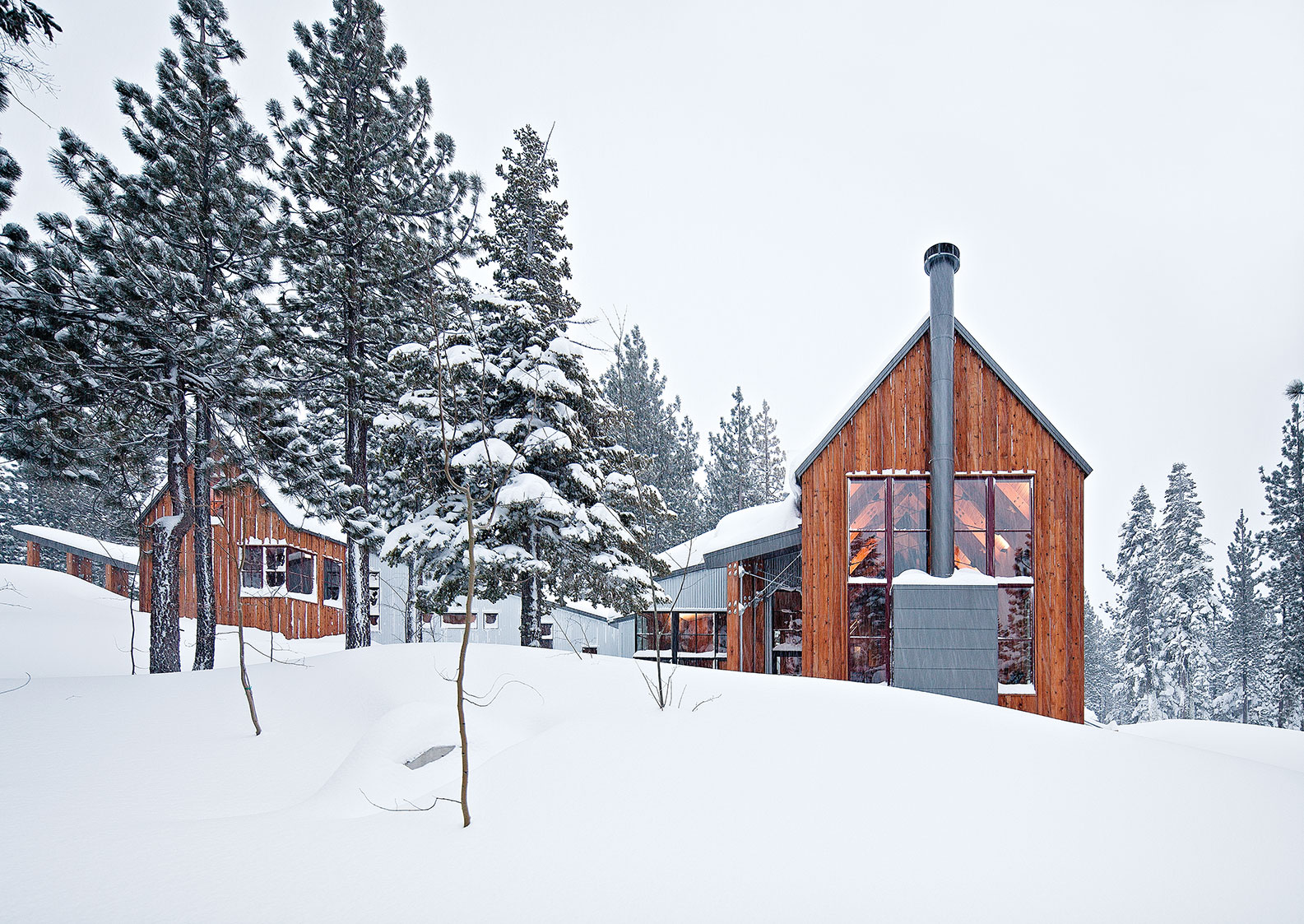
Corrugated steel and vertical boards hark to the home’s utilitarian origins
“It’s very organized under the gables,” says Wilson, but in the connector links, “we let it go more. In the mining buildings, a window would be plopped in where light was needed on the inside so we referenced that example.” Windows in the links are sized and placed much more organically, framing vignettes of the landscape, playfully rising and sliding along the wall plane to wash the interior with ever-changing light and sun. This treatment alters the nature of the space, turning what could have been just another long hallway into a portal of surprise and drawing visitors up with the promise of discovery.
The pleasure of arrival begins on the approach to the front door. The entry area’s sheltering shed roof nudges up against a dominant gable form and reaches out in a gesture of welcome. Sets of crisscrossed steel tension rods span overhead and attach to the wood structure with half exposed knife plates, creating simple architectural ornament through function. These rods continue in the interior volumes of the home, contributing to the feel of industrial elegance.
Once through the custom front door, rich plaster walls fill the spaces between exposed, reclaimed ten-inch-by-ten-inch timber posts that travel in pairs down each axis, defining a cadence for this almost east-west trajectory. Access from the garage and utility/storage areas of the home eddy into the foyer, and then ascension to the main public spaces begins.
A black concrete floor, polished and detailed with organized joints borne from timber post placement, runs up two small flights of steps generating subtle pause points and amplifying the sense of procession. Long horizontal slot windows on one side of the corridor give a sense of expansion to the space with natural light and views out to other masses of the home.
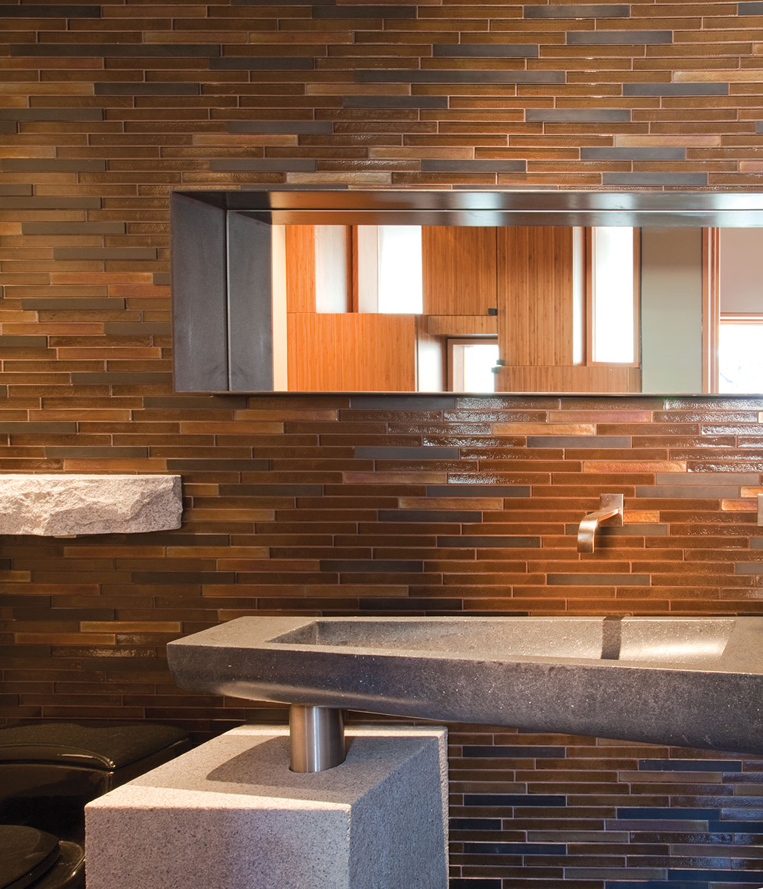
The master bathroom
Atop the entry corridor, the living and dining areas rest within a lofty timber-framed volume. The steep gable roof is composed of reclaimed wood decking supported by pairs of beefy rafters, each stitched together with knife plate connected steel rods. Huge gridded windows open the space while soaking it with natural light; the volume and the simple formality and symmetry of the living room gives it the ethereal essence of a cathedral. The large wood-burning fireplace anchors the mostly glazed west wall with a steel plate surround and massive white granite hearth. (A circular hole drilled whimsically in the hearth will house a vase of flowers, much like wildflowers burst to life via cracks on granite faces throughout the Sierra.) The geometry of the fireplace’s layered steel face is collage-like, with built-in firewood storage flanking each side and strong juxtaposition between impenetrable steel plate and fine layers of pine boughs beyond.
The unique character of the home is further augmented with several pieces of specially designed furniture and the owners’ wide ranging art collection. Custom steel plate side tables in the living room take a cue from the fireplace surround in a play of rectangular shapes. Wilson designed and Berkeley Mills Custom Furniture crafted the generous dining table comprised of two slabs of smooth, warm cedar. A truly exclusive coffee table, also designed by Wilson, uses the unmistakable outline of Lake Tahoe to create a one-of-a-kind piece made from a frosty blue pool of resin, its familiar footprint bringing a smile to the face of anyone familiar with that sublime body of water.
The open, L-shaped kitchen sits adjacent to the living area beneath a sloping shed roof and accesses a west-facing granite terrace that the owners refer to as “prime” outdoor space. Polished granite countertops resting on vertically oriented bamboo casework butt up against large walls of four-square glass and complementary gray slate tiles. The angular faces and subtle folds of the custom metal hood and kick face of the island reference glacial forms, this gesture being strengthened by the detail of an irregular countertop edge above it.
Custom metalwork crafted by Truckee’s Mountain Forge is found in the stair guardrails, light fixtures, both fireplace surrounds and other innumerable areas of detail throughout the house. The steel in these architectural ornaments stand out against the clean forms and natural material palette, while calling to the home’s utilitarian roots.
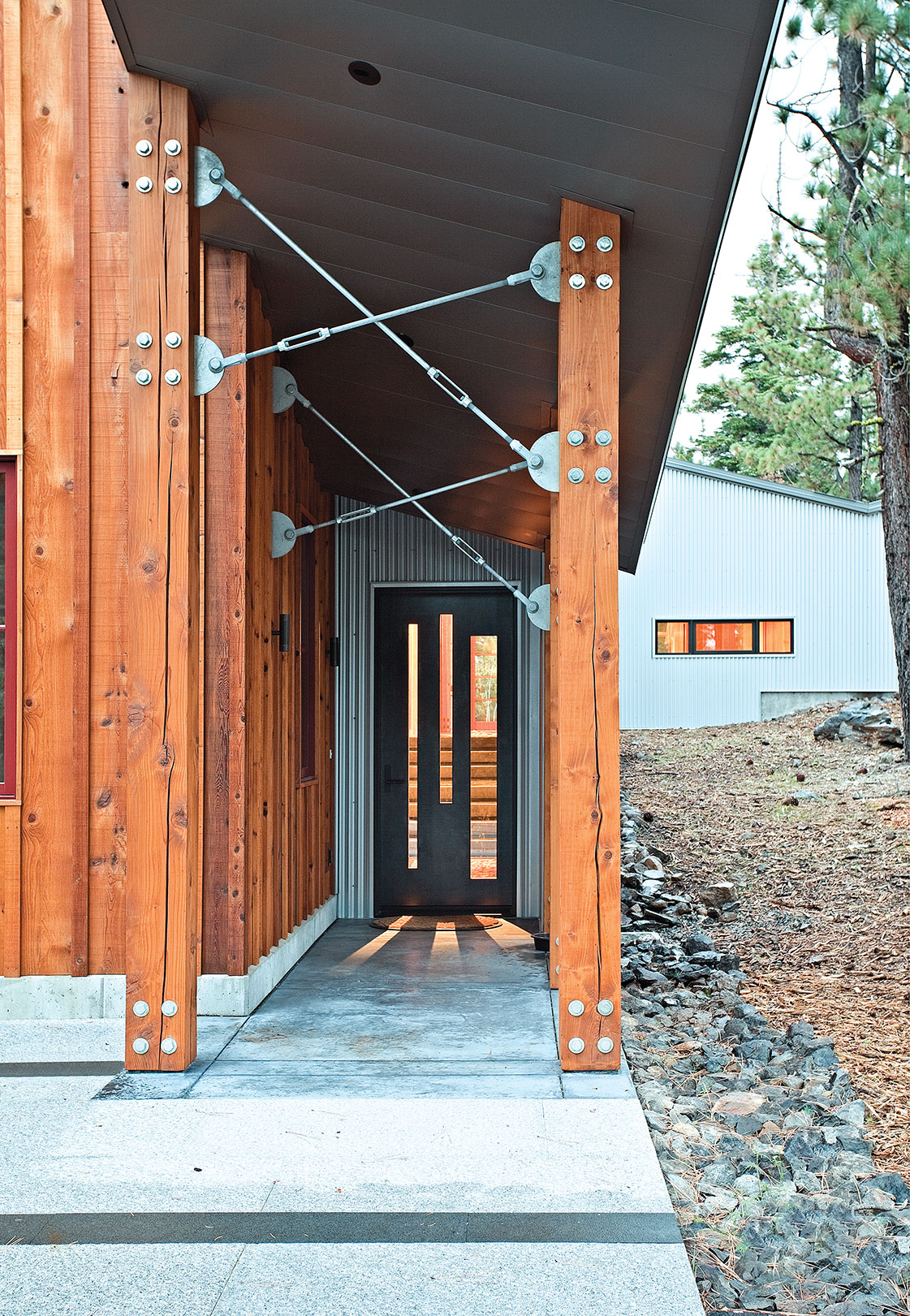
The home’s covered main entrance
An open stair, defined by meaty wood treads and soft, wavy metal mesh guardrails, leads to a multi-leveled loft, each level “working to give a sense of scale to the gable volume of the great room,” says Wilson. The two-tiered loft is one of the best surprises in the home. This virtual indoor tree house has huge visual access to the exterior; a childlike giddiness arises as one considers the pleasure of quietly hiding away in this cozy perch for an afternoon. Upstairs, three comfy guest bedrooms and two baths provide restful digs, each bedroom’s modest square footage augmented by generous window openings that allow the sky to completely fill the room.
Perpendicular to the entry axis, the (almost) north-south axis of the home is most clearly expressed in a singular link connecting the public spaces to the more secluded domain of the owners. This linear procession of stairs and landing platforms with randomly punched window openings on each side accentuates the gallery feeling of the passageway. At the top of the climb, an open office with a wrap-around desk and custom floor-to-ceiling bookshelves has the aura of a library’s peaceful hush clearly indicating that this is the portal to a private sanctuary. A door at the end of this axis opens to another terrace area, which sits just below the peak of the property and its topping of boulders. A black bear that has called this rocky jumble home for several years continues to peacefully reside with his new neighbors, occasionally sauntering down the driveway for ease of access.
Dividing the office and master bedroom suite, sculptural plaster masses are in-filled with translucent resin panels to create the glacier-referenced features that become two master closet spaces.
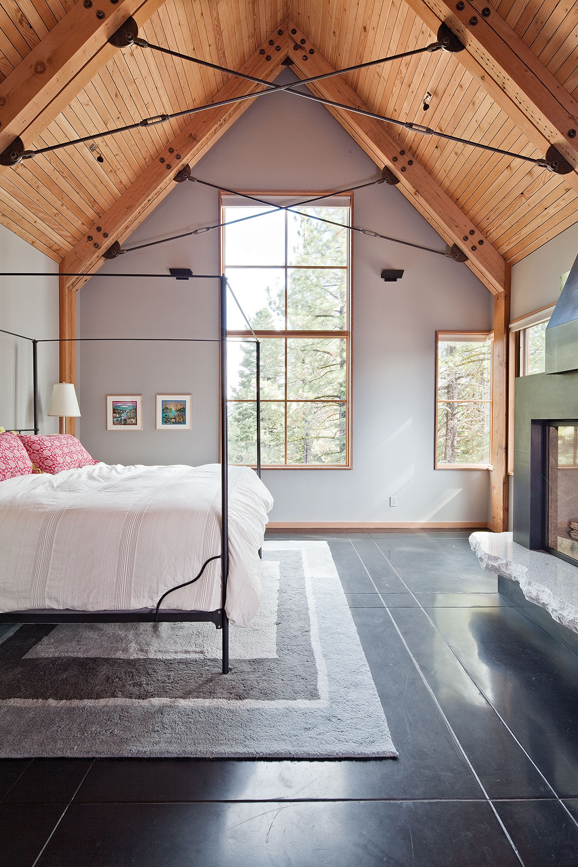
Generous windows bathe the guest bedrooms in light
“The cool colors and translucency of the closets becomes a counterpoint to all the wood and warm colors,” says Wilson. Pocketed far away from the potential bustle of the living area, the master bedroom and bath are a continuation of forms and materials found throughout the home, sealing the sense of material continuity and the holistic essence of the entire project. Welch labeled the master bedroom as her favorite spot in the house for the peaceful time she spends there, describing the stunning colors and light of the alpenglow hitting the Carson Range as “unbelievable.”
Throughout the entire home, the interior material palette maintains consistency within the same family of warm, subtle colors, tones and a range of materials. The importance of different textures—the rough feel of an organic granite edge, the cool, smooth touch of plate steel, the warmth of planks from an Ohio barn underfoot—make an invaluable sensory contribution to the home’s overall experience.
“You really feel like you are in a mountain home with all the very rich, deep colors and metals,” says Welch.
Spending about a third of the year in their Truckee home (and always in the company of Tucker, their sweet and ever-present goldendoodle), Welch and Adams remark that a major perk of the property (that seems deceptively isolated) is its locale: smack in the middle of Tahoe Donner. “We are right around the corner from the store and the gym and five minutes from town, but it feels like we are somewhere out in the wilderness,” says Welch.
Welch and Adams struck a mother lode of sorts when they walked onto the bouldered, lofty and awesomely discrete Tahoe Donner property. “The land itself is spectacular,” says Welch, “and the house takes advantage of the property and is integrated with it to such a degree that it becomes very successful.” Adams nods, adding, “My favorite spot in the house is actually outside, looking back at it. When I see the house in this beautiful environment, I get a strong sense of connectedness. There is great synergy here.”
Award: Outstanding Achievement
Architect: WA Design
Builder: Dana Welch and Scott Adams
Interior Design: Dana Welch and Scott Adams
Year Completed: 2010
Square Feet: 4,960


No Comments