
26 Feb Meeting Place
Los Angeles family finds its Martis mountain retreat
“We were not a Tahoe family,” says the female homeowner of this sprawling Martis Camp retreat, who elected to remain anonymous. Despite their time in college at Stanford, she and her husband had traveled to Tahoe maybe once, she notes. With their life and family firmly established in Los Angeles, they were looking to build a second home in Montecito, California, when the husband was invited on a Tahoe golf trip in 2009.
“He came here, and he fell in love with it,” she says.
“I said to her, ‘this is the most incredible place I’ve ever seen,’” her husband adds. “Martis Camp is just spectacular, the access to skiing, the golf, the community—the whole atmosphere is really about activities and nature and family, and a touch of luxury. That kind of mix was really appealing to us.”
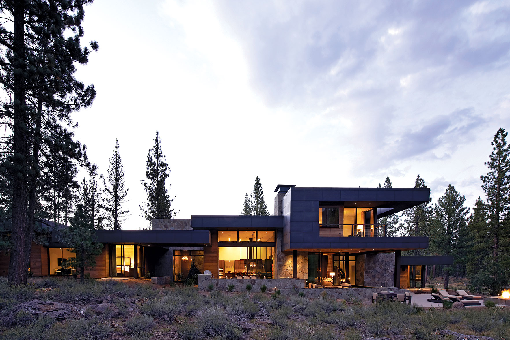
Interior masses are reflected in material changes on the exterior, photo by Richard Powers
One more trip with two of their three daughters, ages 7 and 16 at the time, clinched it and the family took a leap of faith, voting to build their second home in Tahoe with the idea that the wife would be able to design her vision for the house. After touring several smaller lots, the couple hit on the ideal site: A more expansive lot on Martis Camp’s Benvenuto Court, with incredible views of Northstar’s Lookout Mountain and the Carson Range.
After much deliberation over a Tahoe versus L.A. architect, the couple opted for a Southern California designer, which proved to be a good decision as they ended up meeting almost weekly during the planning process.
However, after multiple interviews, the couple still hadn’t found a perfect fit, but Ron Radziner of Los Angeles design-build practice Marmol Radziner sat on the board of their children’s school.
“One day I said to [my husband, who is also on the board], why don’t you call Ron and ask his opinion, see what he thinks,” says the wife, who admits that at first they thought Radziner’s incredible work was out of their league. “He is an Architectural Digest–Top 100 architect. We just didn’t know if we could really go that route, step up and do something like the kind of projects he typically does.”
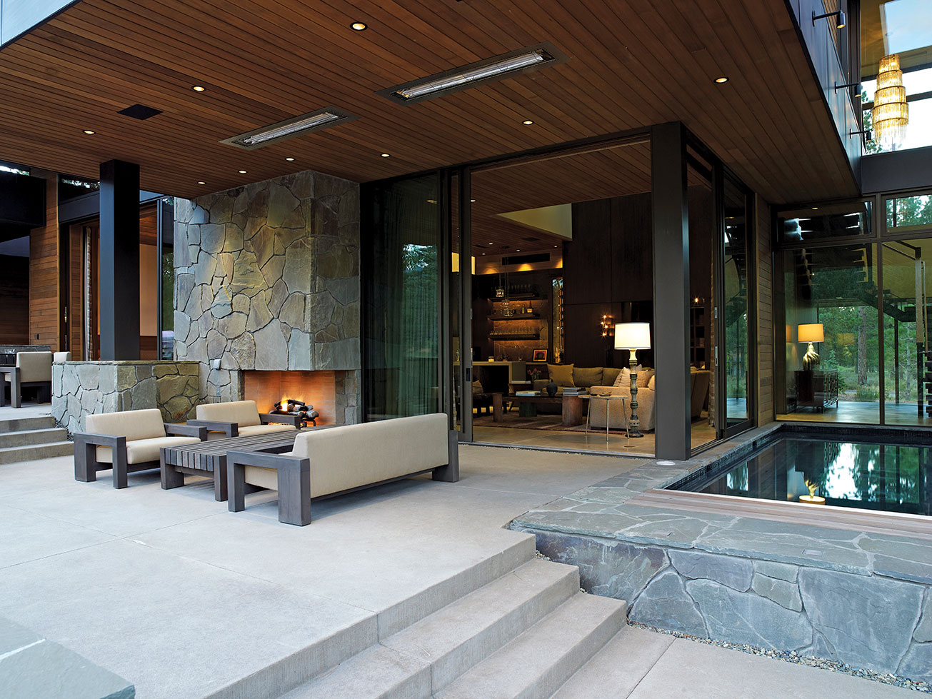
Folding doors to the back patio create a contemporary indoor-outdoor flow, photo by Dominique Vorillon
The couple liked not only Radziner’s clean lines and uncomplicated contemporary architecture, but also his team’s professionalism and the firm’s creative and comfortable atmosphere. Radziner was excited for the project, a ski house in Tahoe.
“We’re usually happiest when we do homes like this that are in this very natural setting, we try to bring the outside in. Really with the landscape as well, make the house feel like it could have almost been placed in its natural setting,” says Radziner. “There’s no reason to make it feel too foreign. It’s so beautiful up there, the natural landscape of Martis Camp. I think generally you just want to enhance what’s already there.”
The larger lot allowed Radziner to design the property with its largest entrances, private spaces and views facing south, away from the street and into the forest.
“You can have this great light coming into the house and you can open things up in a very private way,” he says. “Even though there’s a lot of glass you still have a lot of privacy, and through that glass you see this beautiful, quintessential Tahoe view of the pines and the ski mountain beyond.”
Radziner scouted the lot, critiquing it from every possible angle. “He’d come at different times of day to look at the light, and he was here before we ever drew one line on one piece of paper,” says the husband. “He made sure we had views in almost every room of the house.”
“Our challenge at the time was how to build a contemporary home in the mountains because we didn’t want it be kind of classic white wall contemporary, sleek, cold, austere,” says the wife. “We wanted it to be warm, mountain-y and cozy. Family-oriented for kids, not like a museum. We wanted a place where kids can have fun and enjoy themselves, which is why we have things like outdoor fabric on the sofa. It’s soft but really durable. All the materials are warm and inviting. As much as I love contemporary—I do—some of the best contemporary can be a little cold.”
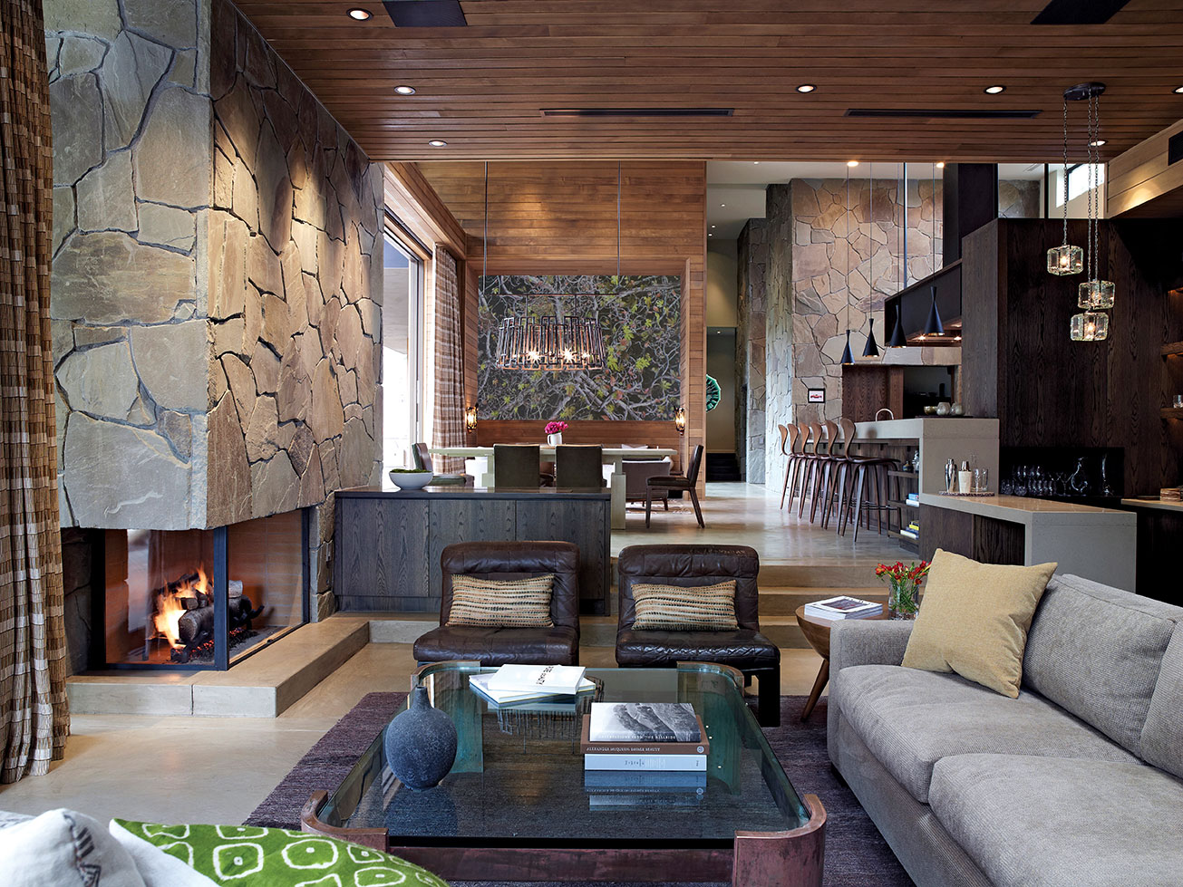
The living room is flanked by a large fireplace and wet bar, photo by Richard Powers
Not only did the building materials create that organic, mountain-meets-contemporary feeling the couple desired, but many of the unique vintage or unusual pieces the wife and designer Kim Alexandriuk found for the home created more warmth and character in each space. Soft, neutral-tone floor-to-ceiling draperies hang in the bedroom, living and dining rooms, creating more privacy and warmth. New and vintage light fixtures, artworks and unique furniture—some hand-crafted specifically for the home and some purchased at various antique shops, design stores, galleries or flea markets—appear throughout the house, creating charming and comfortable-yet-polished areas.
The design and use of unifying materials create consistency from room to room. Zinc and wood, matchstick paneling and Pennsylvania bluestone, hand-culled by the couple and the design firm, run from interior to exterior to create a feeling of uniformity and harmony. “Ron doesn’t overdo it on materials, and he has a great way of wrapping the materials indoors and outdoors,” says the husband. “You can see the zinc kind of comes in and outside of the house in certain places, so does the stone; even at the front door, the wood is inside and outside.” Another example is the living room’s wooden ceiling, which continues outdoors in one uninterrupted stretch.
At the home’s west end, behind a pop-out door that closes for sound and privacy, sits the kids’ wing. In the den area hang several whimsical pieces of chalk art, which bear funny messages or Facebook group names such as “Disney Gave Me Unrealistic Expectations About Love” and “Every Time I Watch Titanic I Hope It Doesn’t Sink This Time.”
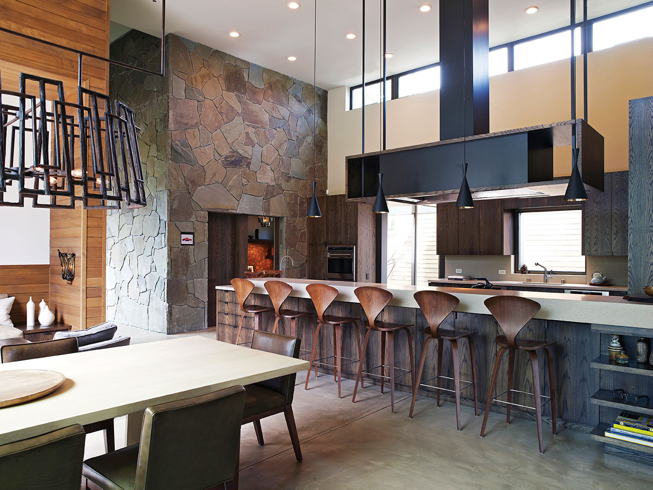
A large steel hood hangs above the kitchen bar, photo by Richard Powers
At the end of the hall is an incredibly functional bathroom featuring double showers with changing rooms, double toilets and double sinks. Rather than floor-to-ceiling doors, Radziner suggested shortened doors with open space at the bottom, in the style of camp stalls. The camp theme continues into the two mirroring bedrooms each on opposite sides of the hall: double bunk beds cantilevered out of the wall, matchbook paneling and a separate set of drawers, shelves and closet space for each bunk. Between the bunks in each room hangs a print by artist Tim Bavington, who is known for plotting music visually using a different color assigned to each note.
The couple wanted the home to be a place for family time and togetherness in common living areas. Thus, the three bedroom suites (designed with their three daughters in mind) are cozy rather than expansive. In each of the two smaller bedrooms, one gets incredible views of the mountains; each bath features floor-to-ceiling marble and a sunken tub (“almost like a Zen soaking tub,” notes the wife) looking out onto the same private landscape.
Near the front door, a beautiful powder room gives guests the royal treatment, with a tall skylight, all-over bronzite marble and a custom-treated mirror using repeating pinecone scales to create a textural frame. “We designed the shape of the mirror to be almost like Rococo,” says the wife. “Not your typical clean contemporary lines, it kind of evokes the old and the new.”
An open floor plan in the home’s main areas creates that sense of family and camaraderie the couple desired, while stepped spaces keep each area defined. Says Radziner, “The kids’ wing, in the far west, is up a few steps from the main level, and then the guest wing on the far end is down a few steps and the living room sinks down a few steps. Sometimes those few steps between spaces really help to define the space and help you transition from one place to another rather than just a hallway.”
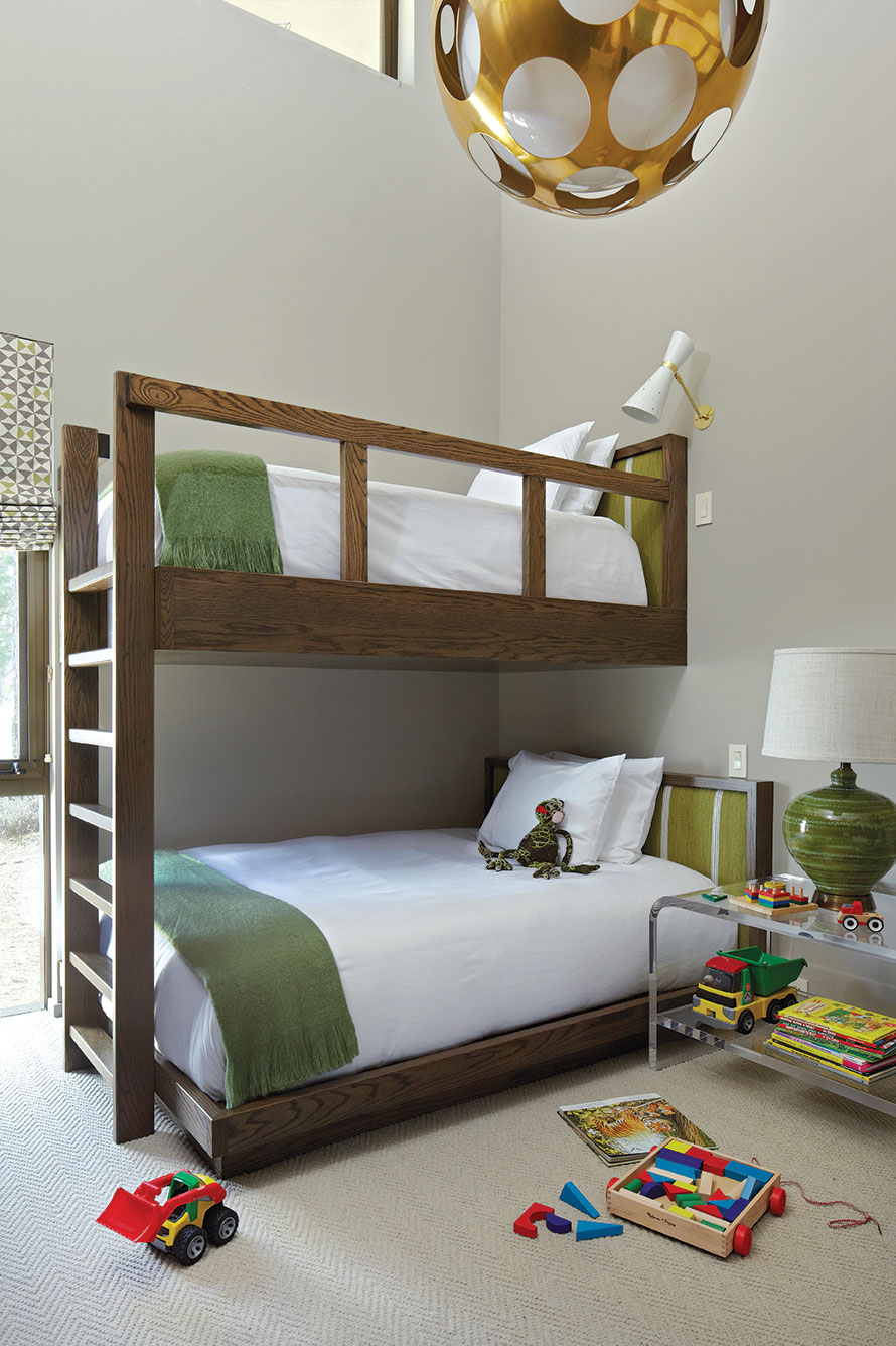
Scenes from the playful children’s rooms, complete with erasable chalkboards, photo by Dominique Vorillon
In the dining room, a video installation art piece plays on a loop behind a built-in couch, projected through the custom split chandelier hanging above the dining table. In the summertime, floor-to-ceiling sliders open up so the family can have an indoor/outdoor dining experience.
In the kitchen, poured concrete counters with small flecks of brown create a unified color palette with the concrete floors and a section of butcher-block countertop. Modern, iconic bar stools and light fixtures at the bar lend an aesthetically sleek appearance. Skylights, another feature appearing throughout, and radiant heat give light and warmth to these rooms, despite the tall ceilings meant to accommodate the spectacular view.
Through the kitchen, a glass hallway (with an unbeatable Carson Range view) leads to lockers and a mudroom, a laundry room, an extra bedroom and the garage. The all-white rooms are adorned with colorful original artworks drawn or painted by the couple’s 11-year-old daughter.
On the other side of the kitchen, down a few steps, is the living room. Double TVs, back to back for dining-and-living-room entertainment, are hidden from sight inside a cabinet but rise to viewing position at the touch of a button. But there’s something better than TV here, of course. Radziner’s firm uses 3D modeling—even modeling in the surrounding mountains and other landmarks—to take the guesswork out of the design process, so every view is exact. From the large, welcoming V-shaped couch in the living room, the perceptive observer will notice the roofline only extends to the space barely above the top of Lookout Mountain, framing it perfectly within the floor-to-ceiling glass sliders.
Just outside sits a tile-and-concrete sunken spa pool that holds 20 or so people, and beyond that are an outdoor shower and bathroom, plus a fire pit for summertime entertaining on the patio.
A wet bar and glass wine room, inspired by actress Jennifer Aniston’s own wine storage, showcase the couple’s collection of handmade iron bottle holders protruding from the stone wall, which in true Radziner fashion extends past the glass case to become the backsplash and wall behind the sink. Another eclectic find, the square glass fixtures over the bar evoke ice cubes.
In keeping with the theme of companionship, the husband’s office sits with its entrance to the living room, almost like a separate square box placed right in the middle of the action, with unique wood paneling used nowhere else in the home. Another tall skylight gives the feeling of spaciousness, while corkboard walls behind wooden shelves and a small bathroom with a stone basin and wallpaper made of tree bark with silver details lend a pleasant richness of tone and texture.
A small scale model of the home—a birthday gift from a friend—sits on one of the office shelves. Seeing it on a smaller scale emphasizes just how many different layers there are to the structure.
“It’s almost like a one-story house with the exception of the master, but we wanted to make it feel like it was on different levels,” explains the husband. The site is relatively flat, but it does have a slight drop from west to east along the length of the building. “It gives the house a bigger feel as it steps down the landscape. Ron does a great job making it look clean and not too busy.”
On the eastern end of the house, almost open to the elements but for the glass enclosing it, a staircase leads up to the master bedroom. This stairwell is one of the wife’s favorite spaces in the home. “I really love this space. Partly because it isn’t functional like a living room or a bedroom, I think it adds so much to the feel of the whole house,” she says. “It feels like you’re outside, like a treehouse.”
A sculpture of a deer made from a reconfigured loveseat is right at home next to the giant wall of glass; it looks almost as if it’s standing outside as reflections from the outdoor spa play through the windows and onto the wooden walls.
Like the other bedrooms, the upstairs master is not gargantuan. “Again, it’s not huge, it’s cozy,” says the wife. “We have our TV, our fireplace, our reading lights and our beautiful view. What’s better than that?”
Indeed, the room, its deck and the adjoining master bath all face that sun-soaked forest and ski hill. Mahogany travertine, more bluestone and rich wood paneling on the cupboards give the bathroom a luxurious feeling, as does the tub with its glorious outdoor view and the living roof sown with wild meadow grass.
The family has begun spending many weekends and weeks at a time on school vacations in their mountain getaway. Since the house’s completion in 2011, the wife has taken up golf and skiing, and their 11-year-old joined the Northstar ski team.
“I have a really stressful job in L.A. It has great food, great culture, it’s a really dynamic city but it’s great to get out into nature,” says the husband. “This is really like a retreat.”
On entering the house, the first thing a visitor sets eyes upon is a painting, hanging just inside the front door in the foyer. The first piece of art the couple purchased for their new home is possibly the most fitting thematic declaration: an oil and acrylic painting on wood by Kim Dorland, called Meeting Place.
“From day one [the wife] said, ‘It’s very much about the gathering spaces.’ I think that’s a really nice way to live. When you build a house in a community like [Martis Camp], it’s about family, about wanting to be in a place where we don’t have the distractions of the city; it’s a place to reconnect to nature and to family,” says Radziner. “Every family is different. One of the reasons I love designing homes more than anything else is there is something about the intimacy of working with a couple or an individual or a family to create this physical manifestation of what they believe their family’s life is about. For them, this house embodies how they see family life.”
Award: Modern
Building Design: Marmol Radziner
Builder: Jim Morrison Construction
Interior Design: Kim Alexandriux
Square Feet: 7,000
Year Completed: 2011


No Comments