24 Feb The Eagle’s Nest
A site-generated floor plan results in a stunning Reno residence with a dual private-public personality
Twenty-four years ago, Sharon and Steve Ing met at a Los Angeles art gallery. Sharon was working as an art dealer and helped Steve purchase a piece, one of a naked woman sitting in a chair, her face shadowed. The deal led to courtship and marriage, and the Ings settled in Reno, Steve’s hometown. Over the years, they continued adding to their growing art collection. In 2011, they made perhaps their most important acquisition: a hillside home in west Reno.

Sharon and Steven Ing with their dogs, photo by Marjorie Williams
“It’s like this house was just waiting for our art collection,” Sharon says.
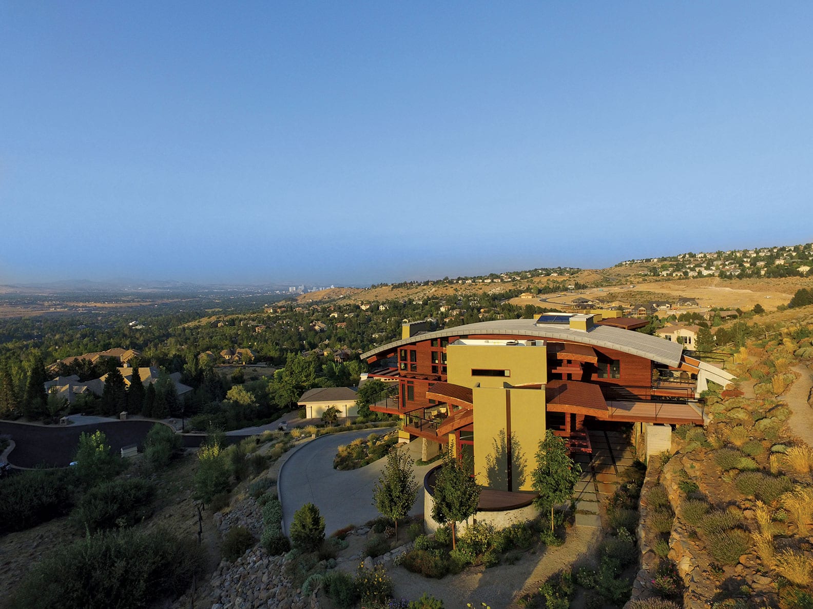
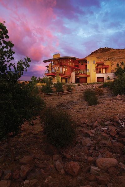
Designed by Truckee architect Joel Sherman, the house juts proudly from its hillside, the downtown city lights in one direction, the private and protected Toiyabe forestlands in the other.
“It’s got this dual personality,” Sherman says of the home’s front public presence versus the private back area. “It’s part ‘look at me’ and part intimate space.”
Sherman likens the home, which is known as the Aerie, to an eagle: Curving rooflines mimic arced wings, while the home’s two literal wings break with the land’s topography. The COR-TEN roof tiles even resemble scales and feathers.
The project began as a spec home in 2002, when Reno builder Dario Passalalpi of DMP Contractors approached Sherman to design the house. Set on a steep, 1.3-acre lot, the property was tricky. For many of the houses built since in the Reno neighborhood, the approach has been to level the land, allowing any floorplan to go in the space. But Sherman believes in site-generated architecture, allowing the surroundings to dictate the flow of the home. “The landscape is designing this house,” he says.
A winding driveway leads uphill, creating a meandering procession that allows the curves and lines of the home to unfold. Exterior materials were chosen to nestle the home into its desert location, while also maintaining its commanding presence: The base of the house is made of a stained board-formed concrete, similar to the site’s volcanic tuft, with sage-colored plaster towers and fiber cement lap siding that is stained a deep cedar.

The house nestles into the hillside, while also creating a commanding public presence, photo by Asa Gilmore
Going indoors, one is naturally drawn toward the “grotto,” where Burning Man artist Lu Brock transformed dead space under the stairwell into an imaginative koi pond. The seven multicolored LED-lit fish sculptures continually change color; their stands are made of scrap salvaged from the Union Pacific Railroad in Sparks, just north of Reno.
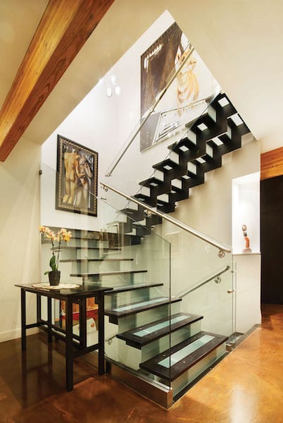
From the grotto, a translucent stairwell rises three stories. Laser-cut steel stringers support wood-framed glass treads. As the fish change color, the light travels up, so the colors can be seen even from the top level. A third-story skylight above the stairs allows natural light to filter down as well.
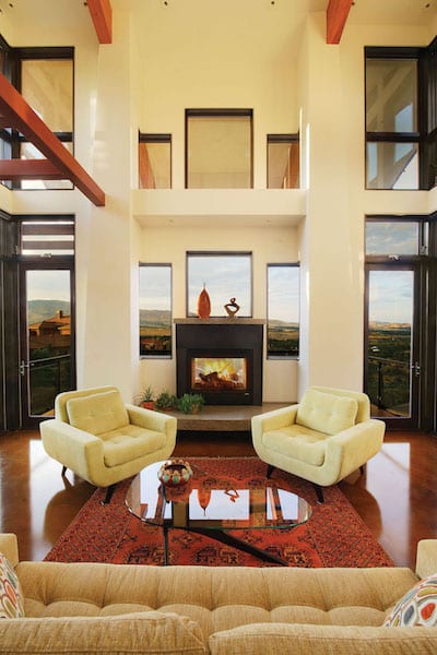
On the main living level, the home opens into the dining room, where the table is overhung with bubble lights of varying sizes and heights. To the right is the gourmet kitchen, sleek with black cabinetry and two marble-topped islands. Beyond the dining room is the stepped-down living room, where abundant windows provide huge views of Reno’s neon lights in the distance. Here, a two-sided fireplace opens onto the deck beyond, and offers even more opportunities for views.
“We have this embarrassment of riches of windows,” Steve says.
The nearby master suite is situated under one of the home’s arcs. A “breakfast” deck also faces downtown, while a separate back patio is accessible from the master.
“There are a couple thousand feet of decking and patios,” Steve says. “There’s always a view, always a place for shade or to get out of the wind.”
In the other direction, past the kitchen and butler’s pantry, a powder room boasts dramatic, out-slanting windows (“like being on the Starship Enterprise,” Steve says with a laugh). A guest suite also has its own patio, which connects with the larger back patio, all designed with “lily pad” square pavers, infilled with small rocks, which not only assist with drainage but also add a pleasing sense of geometry.
Set behind the main-story stairs is a trapezoid-shaped media room, each side aligning with a “wing” of the home. The room opens on either side to the patio beyond, allowing the Ings and their guests constant indoor-outdoor access.

Bridges run over the patio to connect the third floor with the landscape, photo by Asa Gilmore
On the third floor is a second master suite, which utilizes interior windows to look down into the living room, though are high enough to block any views into the bedroom. Set into one wing is Sharon’s office (she runs Steve’s psychotherapy practice), complete with a satellite kitchen and office setup for when the staff gathers at the home for board meetings. Her yoga studio and another guest bedroom are beyond. Steve’s office is the same trapezoid shape as the media room below, the back of the room tightening into an exterior door that leads to a middle bridge—one of three on this third level—that spans over the patio below to reach the back property, ensuring that most every room has access to the outdoors.
“The whole idea is to anchor it on site,” Sherman says.
Indeed, the land is just as essential to creating a sense of home as the house itself. Steve describes the hilly site, saying, “There’s roughly eight stories from the base of the property to the top of the property; you only see the three stories of house.”
On the site itself, “the urban and the wild interfaces integrated so beautifully,” Sharon says. She points in one direction, toward Reno and the city lights. On the other side of the house, she says, “it feels like the Milky Way; you can see all the stars.”
Because the Ings considered the entire property in their decision-making, Steve himself meticulously created the landscape, which includes a quarter-mile of trails that wind past sage, wildflowers and native plants.

The living room includes a built-in bar; steps lead up to the dining room and kitchen, photo by Asa Gilmore
“It’s almost like a botanical garden,” Sherman says. “He did a hell of job taming the whole hillside.”
He also created defensible space. When wildfires burned near the Ings’ home a couple years back, the fire marshal commended the couple for their fire-resistant landscape. Still, because of the close call, the couple joke that instead of the Aerie, they should have named the house the Phoenix.
In a way, though, the house did rearise. While Sherman drew the blueprints in 2002, and construction began around 2004 or 2005, the project stalled for years. When it was about 75 percent complete, the original builder decided to sell the property. The house sat on the market for two years—over which time, Steve adds, about 100 animals had moved in—before the Ings made an offer.
“We got into this house when no one else did because we could see it,” Steve says.
At that point, bathrooms were unfinished and appliances missing. The Ings got in touch with Sherman and began with a new contractor, Reno’s Jim McCaleb of McCaleb Construction. Sherman knew he could trust him when McCaleb pulled him aside and said he’d never done a house like that before.

Wood-and-glass treads allow light to travel both up and down the stairwell, photo by Asa Gilmore
“The houses I do, it’s the same parts, just put together in a different manner,” Sherman says.
Though the Ings stayed true to Sherman’s original design, they did make a few changes. On the bottom floor, which also houses a gym and a couple garages, the plans called for a wine room. As neither of the Ings are big wine drinkers, Steve decided to turn the space into a “curing room” instead, for making charcuterie. “Women like it, but men love it,” Steve says. “It’s something about meat and alcohol.”
Sharon handled most of the interior design, choosing doors, hardware and light fixtures, such as the brown glass pendant lights over the kitchen island—which complement the cognac swirls of the concrete flooring—and the clear bubble light fixtures by Brooklyn’s Shakuff lighting company suspended in both the dining room and in the stairwell. “With such a contemporary house, it’s easy to default to super modern choices,” she says. “But I love the integration of warmth.”
Sharon also put her former art gallery skills to use. Artwork covers the walls, which showcase both special pieces the couple bought over the years or commissioned works unique to the home. For example, on a recessed wall on the third floor is a collection of red ceramic poppies custom created by Kansas City artist Amy Meya. An abstract white, black and orange piece hangs in the living room. A multimedia painting of a pronghorn by a Los Angeles artist is a nod to the property’s street name. The piece that brought the couple together—of the seated woman—hangs in the stairwell.
“Many of our pieces feel like they were waiting for this house,” Sharon says. “We’ve been so thoughtful about every object.”
The couple have left their mark on this home, and in return, they say, the home has left its mark on them. “We feel like we are producing our best work living here,” Sharon says. “We feel really inspired.”
“It is them and it is their house; it’s hard to see it as a speculative house,” Sherman says. “It became theirs as if they had started it from scratch.”

The living room’s abundance of windows extend even to the see-through fireplace, photo by Asa Gilmore
“We put so much of ourselves into it,” Sharon agrees.
The home is large, at over 6,000 square feet, but the well-proportioned spaces and thoughtful design mean that the house feels cozy whether the Ings are alone or entertaining, as they often do. To date, the most they’ve hosted was 125 people for a human rights campaign, with more than enough space for both guests and caterers.
Because of the importance of art—in their home and in their lives—in 2015, the Ings hosted an art reception to celebrate two pieces: the koi pond and the pronghorn painting.
Sherman attended the reception, as did about 75 other guests. After the years of uncertainty and so many starts and stops with construction, Sherman recalls the event as the time when he felt like the house was complete. “For me, that’s when it’s architecture,” he says. “The heart is in it.”
Steve agrees. “It’s like a concert in that way,” he says. “We can rehearse, rehearse, rehearse, but it’s not the same until the audience is engaging.”
Like fine art, the home is meant to be appreciated from its many angles—from the organic beauty of the property to the panoramas from its many decks to the complexities of its architecture and forms.
“It’s a privilege to live here,” Sharon says. “I feel like a steward.”
Award: High Desert
Building Design: Joel Sherman of jls design
Builder: Jim McCaleb of McCaleb Construction (finished project); Dario Passalalpi of DMP Contractors (started project)
Interior Design: Owner
Square Feet: 6,105
Year Complete: 2017


No Comments