23 Feb A Slice of Life
Despite its distinctly modern style, this Incline Village home was meticulously designed to pass the test of time
American artist Gordon Matta-Clark studied architecture at Cornell University in the 1960s and went on to an unconventional practice that he referred to as “Anarchitecture,” existing somewhere between the world of art and deconstruction. Anarchitecture is described on his Wikipedia page as “a conflation of the words anarchy and architecture—suggesting an interest in voids, gaps and leftover spaces.”

Architect Greg Faulkner took inspiration from Gordon Matta-Clark, an American artist who would find abandoned buildings and saw them in half to allow the light in, courtesy ARS Estate of Gordon Matta-Clark
When architect Greg Faulkner introduced a narrow slice through an entire home overlooking Incline Village’s Burnt Cedar Beach, one of the architects in his office made a comparison to Matta-Clark’s work.
“When the Matta-Clark reference came up, we looked deeper and we found deeper reasoning behind his work with ‘splitting,’” says Faulkner, explaining how Matta-Clark would find abandoned houses and saw them in half and jack them apart to let the light in. “He understood the psychic power of buildings over people. He wrote that he wanted to ‘convert a place into a state of mind,’ and [about a home he had ‘split’], that it was ‘filled by a sliver of sunlight that passed the day throughout the rooms.’
“We liked that. It convinced us to follow it through,” adds Faulkner. “Here, the cut is built into the house, a deliberate move from one side to the other that measures the movement of light throughout the day—on the reflective floors as it would on the lake.”
Presented as long parallel saw cuts traveling the concrete floor, as the narrowest slit of uninterrupted glazing to ever divide sheetrock planes, and even as a frosted slot in a bathroom door (“can’t interrupt the flow of energy,” says Faulkner), the 3-inch-wide fracture through the house is a subtle but powerful motif that came about in response to a specific owner request.
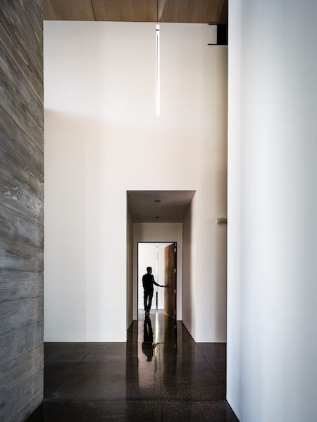
The 3-inch slice through the house, represented by saw cuts in the ebonized concrete floor, carries through to glazed openings in sheetrock and door panels, allowing a thin pillar of light to faithfully reflect along the cutline
“Early in the design process, they said, ‘When we arrive at this point in the entry and then turn into the room, we want something to happen,’” Faulkner says. “We went through many iterations—shelves, art, different things that moved—and in the end, we said, ‘We’ll cut the house in half and this opening will register us with the sun.’ It’s a reverse sundial.”
The intellectualized move easily achieved the architectural goal, but in a delightful twist, only recently did the family discover the home’s specific architectural solstice.
“I saw this weird light shining through the bathroom door, so I followed it out,” says the owner, “and sure enough, the sun had moved above the trees and was shining all the way through the house. If you stand on that line at 7:32 in the morning on October 27, it’s full-on Stonehenge. It’s really fun.”
The active family of four are full-time Incline residents, and the desire for their home to be a peaceful respite from busy days was at the forefront of their programming.
“There’s a type of symmetry and meticulousness that permeates everything I do,” says the owner, “so when I come home and the house has this minimalist ethic and lack of architectural clutter, I can rest. Where things are random and haphazard and there’s stuff everywhere, that’s less relaxing.”
Faulkner took this essence of minimalist musings “as a mission statement for project detailing and finish.” Breaks in soffit panels align with window mullions, while control joints in exterior plaster are part of an aligned sequence that organize windows and door openings, and even scuppers. Material limits and edges are located deliberately, creating a signature gestalt in the home, inside and out.
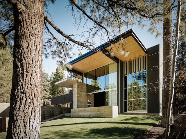
Wood soffit panels run uninterrupted between interior and exterior spaces, while a large roof overhang creates shade and shadow. The cantilevered concrete slab over the front door, appearing to rest asymmetrically on a concrete pier, was actually poured in place
“One of the things important to my wife was that the house should be this big space that emphasizes the people,” says the owner. “A lot of homes are really architectural and design-rich, but there is stuff everywhere. Having the very strict order on how the house is built and this minimalist ethic and the very high ceilings and open volume, the people become the focal point even though it’s an architecturally rich house. That was a very purposeful thing that I think Greg did really, really well. We designed and then we deleted. Then we designed and deleted and deleted and deleted.” Laughing, he adds, “I love the eraser.”
Before developing the more intellectual ambitions of the project, however, Faulkner had to solve the physical challenge of housing the owner’s car collection.
“The car collection kind of drove the design,” he says. “The garage is buried under ground and you don’t sense the garage as part of the house, which is great.” Smaller hints of car-centric influence are additionally found at the metal front door (sporting a high-gloss automotive finish) and in the selection of simple glass interior light fixtures, which Faulkner describes as “car-like.”
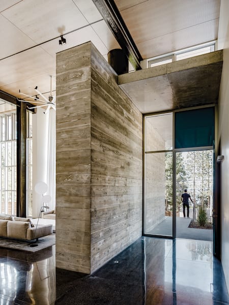
Ebonized concrete floors act as a reflection working to pull the exterior environment into the house while sand-blasted board-formed concrete surfaces are designed to express wood grain
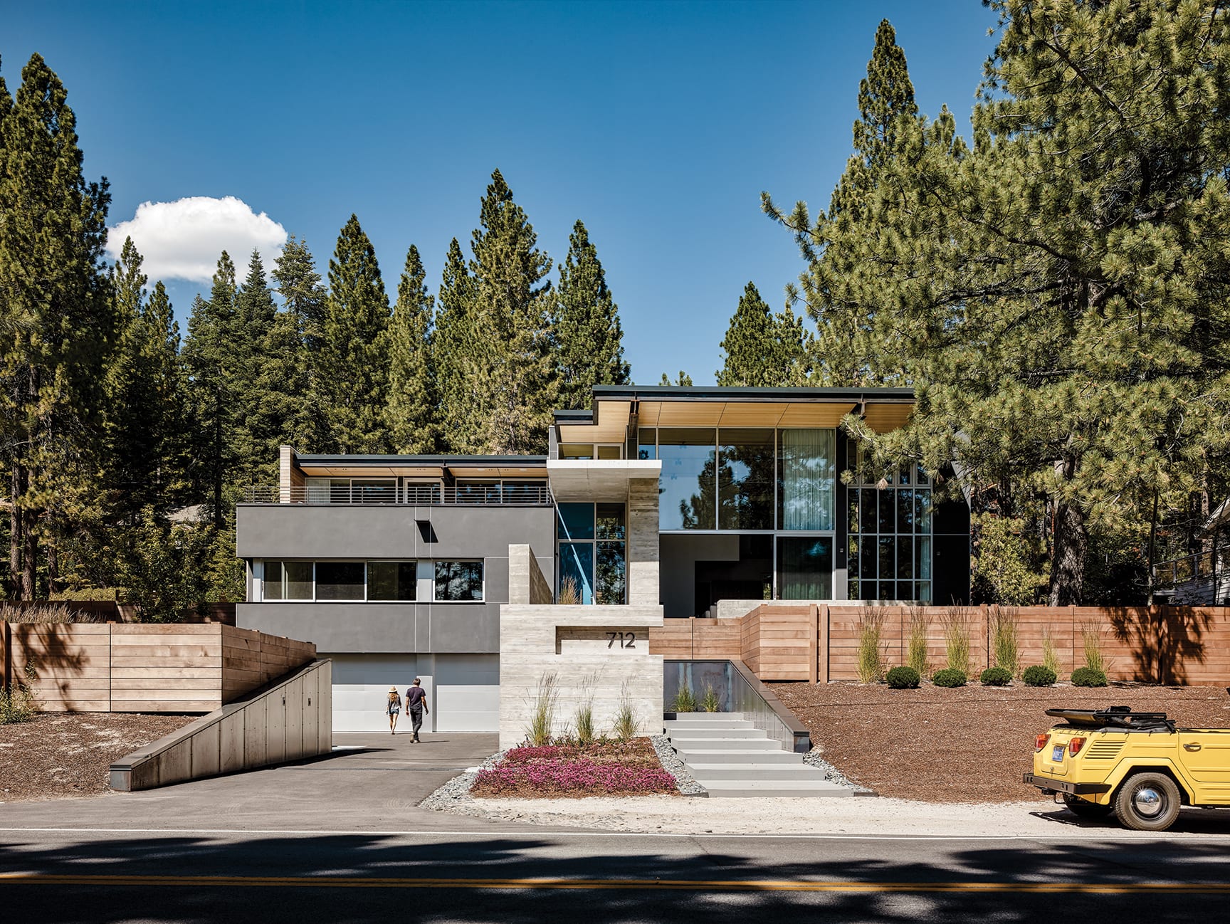
There is a clear and complete separation of automobiles and people; the driveway remains flat and at street level as it disappears into the auto court, where garage doors are recessed and camouflaged. The public entry is more akin to a theatrical experience: ascending lengthy, shallow stair treads (the kind made to show off trailing ball gowns) and disappearing and reappearing through the concrete and steel-clad curtains (walls), coming to eventually stand at the creamy sky blue front door. The layering of exterior planes at the entry sequence also creates privacy and visual screening relative to the busy roadway and pedestrian path fronting the house.
Exterior materials include charcoal-colored plaster (echoing the tones of granite boulders, a defining element of the Tahoe Basin), exposed structural steel, floor-to-ceiling glass and board-formed concrete sandblasted to express the wood grain as a gesture to the forested surroundings. The meticulous alignment of details connects the parts as a whole, calming and ordering the assembly.
“It articulates the craft of the built form,” Faulkner says.
The house is positioned on the almost half-acre parcel to spatially align the voluminous great room area with a major opening in the screen of shoreline trees, optimally framing vistas across Tahoe. The ebonized concrete floor is finished to become a visual extension of the lake’s reflectivity, essentially pulling the larger alpine environment directly into the room.
Addressing another owner directive, Faulkner worked with an acoustical engineer from Berkeley on a material assembly to quiet the open area of the interior. Robert Ellis, Crestwood Construction site superintendent, who managed the project from start to finish, explains the layering that went into modifying the acoustics. “For the ceiling, we had 4-by-8 sheets of maple plywood that were perforated with a CNC machine, and sound insulation [by Rockwool] is installed behind them. And the entire east wall of the room was finished with BASWA Phon, a sound absorbing plaster.” Evident the moment you set foot in the space, the room has the hush of a library, echoless and soft, providing a complete auditory betrayal of the volume and hard surfaces.
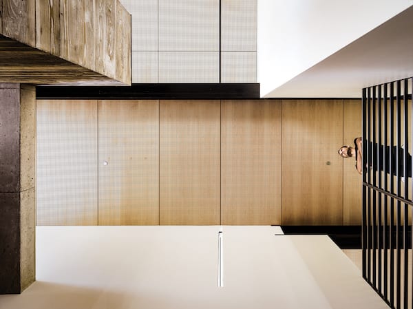
Perforated maple ceiling panels strategically align with other architectural and structural moves, while acoustical backing installed behind the panels keep the home’s main space quiet and free of echo
A straightforward open kitchen with a massive Corian island and a well-appointed butler’s pantry sit at the back of the space. The open balcony above the kitchen is composed from an inch-thick slab of steel that curves in a subtle swoop from floor to rail and is closed off with a plate of glass.
“The balcony and stair landing had to be craned in before the roof went on,” says Ellis. “It almost looked like a magic carpet as it was being flown into place.”
The upper-level spaces, including the children’s rooms, are intentionally open to the balcony and living area below, creating what the parents refer to as the “beehive concept,” promoting a greater level of interaction between the family members as they move around the house.
“The hive nature of the house builds community rather than hindering it,” says the owner. “This concept was a huge thing for us.”
The timeless modernity of the house will surely age well, and while it is a marker of its era, its stylistic anonymity will make it challenging to pin down exactly what that era is. Absent of fuss, the entire experience of the house is awash with serenity; the fastidious detailing and minimalist palette create an illusion of simplicity, but nothing could be further from the truth.
The house was built in 14 months, which is a punishing timeline for a home of this caliber, but nothing gives that away. The experience of the home feels flawless, the intension of the architecture obvious, and the execution of the design is impeccable. But according to Crestwood owner Marshall Williams, the road traveled to arrive at this place was complex.
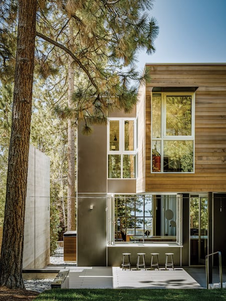
A folding glass window opens the kitchen to an outside bar and covered cooking terrace privately located at the back of the home
“When you walk through the house, you just think, ‘Of course, that’s the right choice or finish or material,’ but there were 14 other things that came first before we got to ‘it.’ There are a lot of moving parts to the project as a whole, but they don’t announce themselves.”
“Building this house was definitely a challenge,” says Ellis. “The fine lines are extremely difficult to create at times, but you fight through it and reap the rewards of completion afterwards. The way the project turned out, with such clean lines and a very straightforward result, it’s very classy.”
Award: Modern
Building Design: Faulkner Architects
Builder: Crestwood Construction
Interior Design: EKR Design Studio
Square Feet: 5,700
Year Complete: 2015


Jim Foley
Posted at 16:30h, 11 MarchBoth the owner and the architect had absolutely no concern for Tahoe or Incline Village or their neighbors. This monstrosity sticks out like a sore thumb It belongs in Malibu. It is an affront to everyone that drives on Lakeshore Boulevard. Since it has a flat roof maybe it will collapse in a heavy winter!
Valerie Dowdle
Posted at 08:14h, 12 MarchMy favorite home on Lake Shore. I always point it out to guests as we drive past. Thanks to the owners and designers for a peek inside!
New Home Builders Auckland
Posted at 05:41h, 08 OctoberThis is really appreciated that you have presented this data over here, I love all the information shared. It will be very helpful to understand about mountain home awards-2020. Great post to share, thanks for publishing this here!!
Plaster Repairs Auckland
Posted at 10:14h, 21 OctoberI really appreciate you for publishing this blog here basic pool chemistry 101; it’s really a helpful and very useful for us. This is really appreciated that you have presented this data over here, I love all the information shared. Great article!