23 Feb A Vacation for the Senses
Innovative design and impeccable detailing by architect and builder result in a stunning one-of-a-kind home
Everyone has been in a neighborhood like this—modestly sized houses, ranging in age from sometime around the Kennedy administration to only a few years old, kids’ toys and bikes resting in a delineated landscape, the familiar taste of suburbia found block after orthogonal block.
But tucked inside this particular South Lake Tahoe neighborhood, a 2,144-square-foot house brings a distinct departure of aesthetic, standing out like creamy suede platform shoes in a closet full of black Converse high-tops.
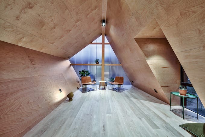
Angled walls clad in birch wood and an asymmetrical wall of opaque polycarbonate define the upper-level office/loft, photo by Bryce Tye
“I wanted to avoid any stylistic moves, which meant not doing a prototypical mountain house,” says William Liow, an architect newly based in Tahoe via the Bay Area.
Liow’s philosophy in designing the home—referenced as “Lighthus Retreat” on his website, peripherie.design—was to create a dedicated vacation house, eschewing the approach typically taken when designing a home intended for full-time occupancy.
“This is strictly a vacation home and I never intend to sell it, so I wanted to create a home unlike any that you see in this subdivision,” says Liow. “The typical house in this kind of subdivision is a very compact, efficient typology that is usually orthogonal like a box, whereas a vacation home should be antithetical to that. And we also wanted to build around the existing trees, which had a direct impact on the form. The house is shaped by its environment.”
Laying eyes on Lighthus Retreat for the first time, it is immediately clear that Liow’s intension was successfully realized.
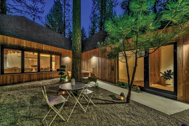
A landscaped courtyard and hot tub are among the highlights of the exterior, photo by Bryce Tye
A rain screen of vertically oriented Siberian larch capped by a layout of angled composition shingles crisply defines the pared-down asymmetrical gable forms. Unbroken, the familiar form extrudes into the site, folding itself around mature Jeffrey pines, and is occasionally punctuated by rectilinear cubes finished with contrasting black composite panels.
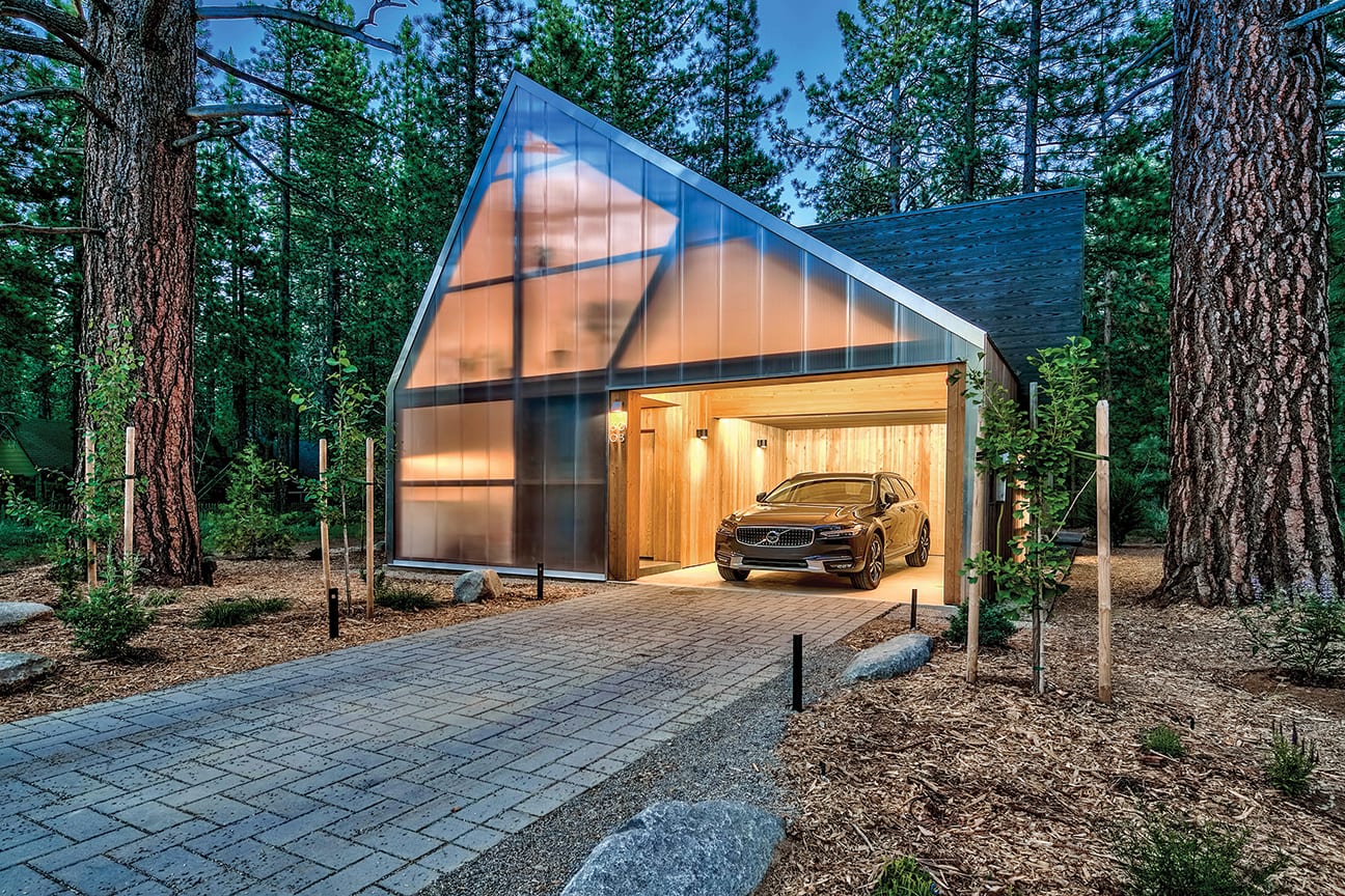
The street facade introduces the home’s arresting and one-of-a-kind character: an eave-less gable with a single-entry opening (for cars and people), filled entirely by almost 2-inch-thick vertical strips of opaque polycarbonate panels.
“It has seven baffles in it, so it’s not your typical greenhouse material. I’ve only seen it used in commercial applications,” says Brandon Caskey, project manager with Sierra Sustainable Builders. “The soft light that it creates on the inside is beautiful, but at night, viewed from the street, the glow coming from within creates a unique experience as well.”
The pairing of Liow with Sierra Sustainable Builders, and Caskey in particular, ended up being a collaboration of kindred spirits, as both seem to enjoy pushing limits and ideas. New to the area, Liow struggled to find a local builder, so he turned to the Internet.
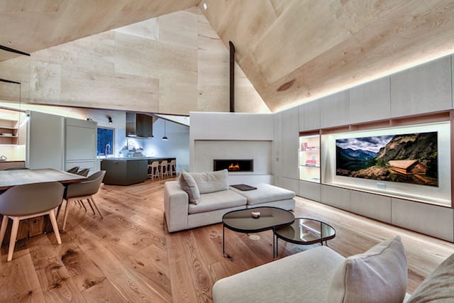
The living area includes a gallery space and a modern fireplace and hearth set in velvety Venetian plaster, photo by Bryce Tye
“I found Sierra Sustainable on Houzz.com; they had glowing reviews, so I looked more into their projects,” says Liow. “They are all about building sustainably and, frankly, just building really well. After the first minute of meeting them, I knew these guys were going to be my builders.”
“We share a kind of design sensibility, which is why we worked so well together,” says Caskey.
From the pavered driveway to the custom-designed boiler vent intentionally situated on the exterior wall to every plywood fold on the interior, Caskey was in lockstep with the intensity and challenge of the detailing.
“My kind of design is not fussy,” says Liow. “I want to make everything as simple as I can. However, achieving simplicity is paradoxically a complex issue.”
The front door is sheltered away at the interior edge of the carport, and once within, the unfolding of the volumetric experience is surprising. Sheets of birch plywood plane from wall to ceiling, emphasizing the form and elevating the volume to be a major defining feature. Engineered white oak flooring runs continuously, and the home’s functions are strung along the gable as it angles to the back of the property.
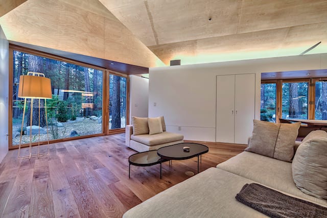
A glass wall off the living room adds to the indoor-outdoor connection and provides easy access to the courtyard, photo by Bryce Tye
The public realm is first experienced in the open kitchen, composed of IKEA casework paired with Semihandmade custom faces and doors, a quartz countertop along the wall and a Fenix acrylic resin island centered beneath a custom steel hood. Moving along, dining area window seating is carved out of a casework volume, with the accordion-style window wall fully opening to a landscaped spa courtyard. The slim, almost-not-even-a-light-fixture suspended above the table is a sleek and spatially defining element.
Built-in paneled casework continues to the living area, which is bound by a full glass wall on one end and a modern fireplace and hearth within a plane of velvety Venetian plaster on the other.
A dedicated gallery space makes the transition from public to private, culminating at a small sitting area that, through the magic of multiple pocketing doors (walls), morphs into an entirely private space, or an alcove of the master bedroom suite. The master bedroom gable provides the bookend to the entry gable, bracketing the organic run of main-level spaces.
Moving through the house, guests experience considerable spatial compression and release. Unexpected windows and vantage points offer exterior vignettes while the asymmetry throughout scales every space differently.
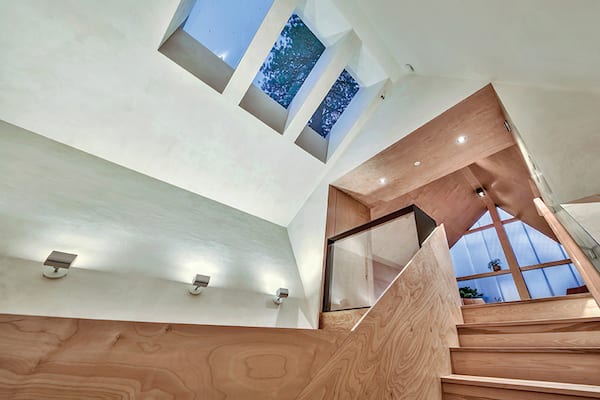
Skylights allow natural light to filter in above the staircase, photo by Bryce Tye
“When you look at the floor plans, you’d think, ‘Oh, the bedroom is a given size,’ but when you actually walk into the room, it’s surprising how much larger and interesting the space feels,” says Caskey.
A U-shaped, all-wood stair leads to a small office/loft and bedroom on the second floor, but intermediate spaces and places delight along the way, as the stairs are multi-layered in their spatial offerings. Careful carving out of the first landing to accommodate the surprise of a square window creates a cozy perch, unexpectedly bringing the outside landscape into the stair. Skylights fill the stair with ever-changing light and shadow, while the stair walls themselves fold and lean to manipulate the sense of space and openness.
Topping out at the upper level, the interior face of the opaque polycarbonate wall first experienced upon arrival defines the open office/loft, giving an ethereal quality to this space’s birch-clad, angled walls. A small bedroom is literally hidden away though a nearly invisible flush door panel, and Caskey, describing the room as “super compressed,” says the enchanting experience of this room still has his young son talking about it.
Standing in front of the bedroom’s full wall of glass with an option to sit at a reverse window seat created by a drop along the floor edge, Liow explains that this room was intended to provide a different perspective.
“Why have generic rooms? There’s already a proper bedroom suite in the house, so this room can be about the experience of atmosphere,” he says.
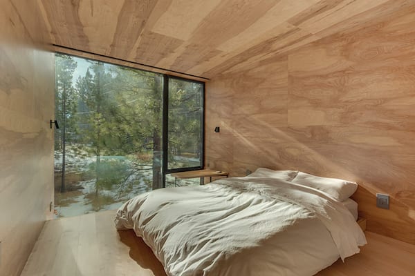
The home includes surprises throughout, including this small bedroom hidden behind a nearly invisible flush door panel, photo by Bryce Tye
Beyond the natural material palette and exercise in volumetric manipulation, a consistent datum runs 18 inches above the floor through the home’s main level, intentionally linking architectural elements. Window sills, built-in seating and a sheetrock baseboard are all are tied to, and become integrated with, this linear thread.
When asked what this provides beyond the obvious detailing challenge, Liow explains, “It was a matter of articulating all the things that a house has. By doing this datum, we tied everything together: the window seat to the bench to the fireplace to the shelf in the media center—everything is connected and related.”
“It was Will’s intention for the datum to bring order throughout the house, and that it does,” adds Caskey. “You might not know how to express it or how it’s making you feel, but when you enter, visually there is a calmness. And maybe you don’t notice it directly. This is a house you can spend a week in and be experiencing new things all the time.”
Other subtle but impactful moves include Liow’s use of American Clay plaster on select walls and the attention to lighting design throughout the house. Liow did an apprenticeship course to learn how to apply the plaster product and finished all the walls in the house himself. Laughing, he says there was a lot of trial and error, but he appreciates the process and better understands what goes into it.
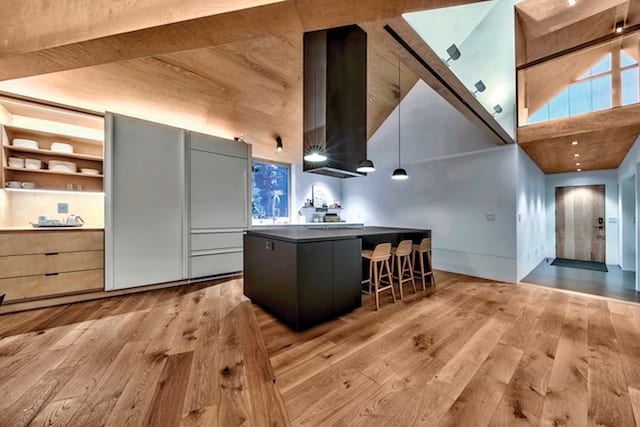
The open kitchen is outfitted with IKEA casework and includes a custom steel hood set above a Fenix acrylic resin island, photo by Bryce Tye
“The reason I wanted to introduce plaster walls is to provide contrast,” he says. “With level five gypsum walls, it feels very cold, so there needed to be feature walls to warm the spaces.”
The silken, organic essence of the American Clay is further heightened with the use of cove lighting, washing the walls with warmth, further enhancing the natural character of the material. Lighting, both natural and artificial, was given considerable attention and obviously not left to last-minute decisions or compromise.
“There were two really important design components that took an incredible amount of time: lighting and windows/doors,” says Liow. “Those were the most crucial.”
Caskey admittedly enjoyed the intense challenge of the project and is complimentary to the architect. “I think for Will to have pulled this off with his first project up here is beyond amazing.”
Liow’s extensive, and one may even say delightfully excruciating, detailing, along with the exceptional execution on the part of Sierra Sustainable Builders, is what makes this small, and still modest, house rise above just being an exercise in tree-house-ism. The serenity and finish quality of the environment was carefully cultivated by a project team that never lost focus.
Liow’s own words found on his website offer a perfect project summary:
“Vacationing beckons us to slow down and let go of our daily routines. By weaving through the forest and folding space, Lighthus Retreat prolongs our spatial awareness. In essence, nature shapes the cabin, the cabin shapes light, and the light, in turn, shapes us.”
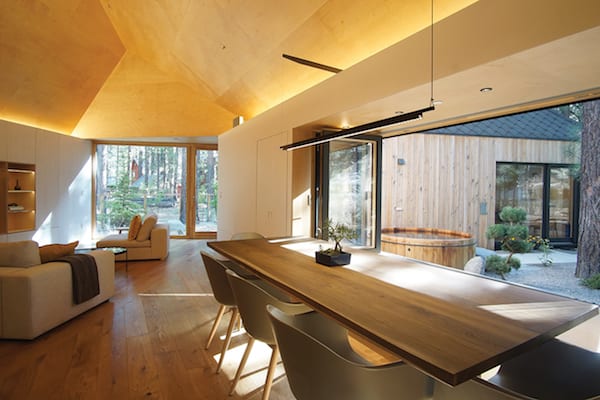
The dining area features an accordion-style window wall that opens to a landscaped courtyard, photo by William Liow
Award: Unique Vision
Building Design: Peripherie Design Studio
Builder: Sierra Sustainable Builders
Interior Design: Peripherie Design Studio
Square Feet: 2,144
Year Complete: 2019


Patricia Roux
Posted at 14:05h, 03 MarchIs this for sale?
Tahoe Quarterly
Posted at 19:34h, 03 MarchIt is not for sale.
David Ward
Posted at 11:57h, 07 AprilThis is an amazing art piece posing as a house! There is not even a box for this house to be out of. Great job!