


24 Feb Simple Pleasures
A straightforward design is based on a long, anchoring hallway and creating a hierarchy of spaces
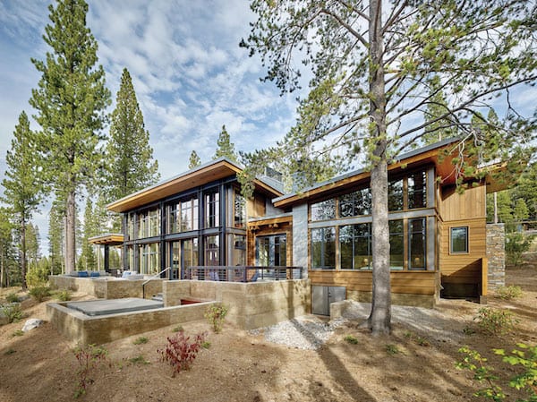
Simplicity isn’t necessarily easy. From the road, the home on Martis Camp’s Villandry Drive seems unassuming: clean lines with a modest material palette of steel, stone, glass and wood. Yet, creating a vision of simplicity is more complex than it seems. It requires perfectly proportioned architecture, a clean and uncluttered interior, and seamless craftsmanship.
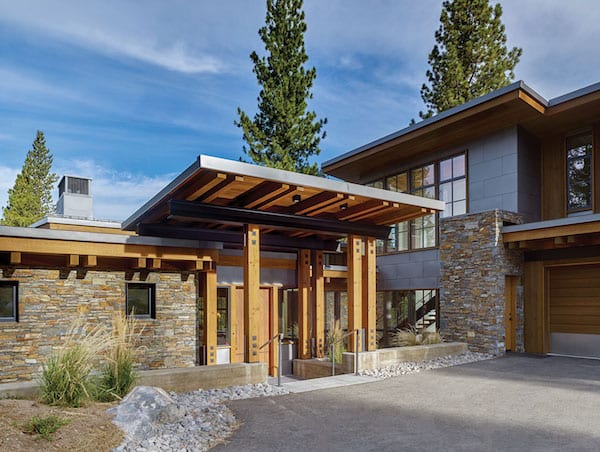
A detached porch roof sets off the main entrance, photo by Cesar Rubio
Fortunately for a San Rafael–based couple, they found a team that could deliver on every front: Ward Young Architecture & Planning’s Don Fulda, David Bourke and Aren Saltiel; interior designer Martine Paquin and project manager Stephanie Thompson of Martine Paquin Design; Doc Gelso Construction’s Doc Gelso; and project manager Andy Kuhnmuench.
“We feel the home is simple in form and rich in detail but with a nice but understated presence from the street,” Fulda says. “The owners wanted an open plan that was clearly organized and easy to understand.”
Ward-Young used the concept of creating a “hierarchy of spaces,” according to Fulda, who says the main spaces, like the great room, master suite and upstairs rec room, are taller, with independent shed forms that are linked with connecting spaces, which are distinguished by their low roof pitch.
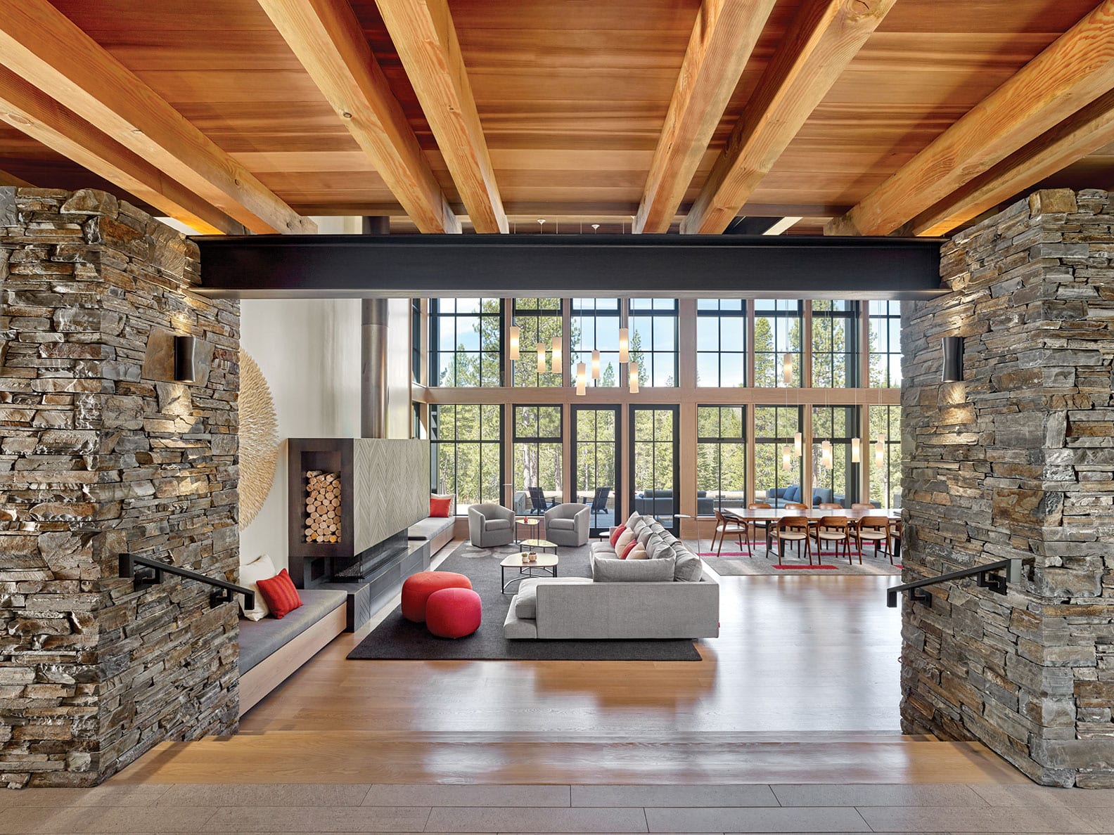
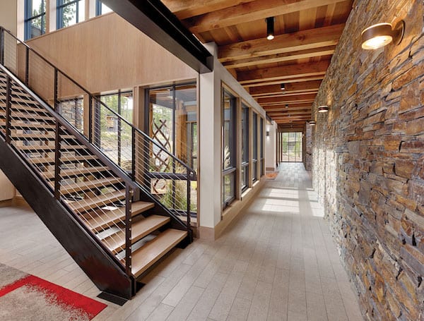
The spaces are organized around a central “anchoring” 80-foot hall, composed of layered stone on one side, glass windows on the other, and floored by a durable porcelain tile. Each end culminates in fully glazed, floor-to-ceiling glass windows.
The anchoring hallway is 80 feet long and includes a floor-to-ceiling window on each end, photo by Cesar Rubio
Rooms are set off this main space. On one end is the master suite. In the middle, just in front of the entry, is the great room. On the other end are two en-suite bedrooms for the homeowners’ adult children, plus the locker room, laundry room, and the dramatic stairwell that rises to a fourth bedroom and the rec room.
“The majority of the time, it’s just my husband and me,” the owner says. The layout, she says, means that the home doesn’t feel cavernous, nor does it feel empty. There’s also no wasted space. “We thought about how we wanted to use the house, literally going room to room and deciding how we wanted people to use the space,” she says.
In keeping with the idea of a hierarchy of spaces, one passes through the low-pitched hallway and enters the great room, where stairs step down while giant steel beams emphasize the ceiling’s upward slant. A tall wall of windows and doors on the far end of the room connects this space to the forest beyond, with clerestory windows set above the hallway opening to capture even more natural light and enhance natural ventilation.
“The hierarchy is strengthened through the transition of these spaces,” Saltiel says. “The floor steps down, the ceiling steps up, and the exposed overlapping structure shifts from wood to steel.”
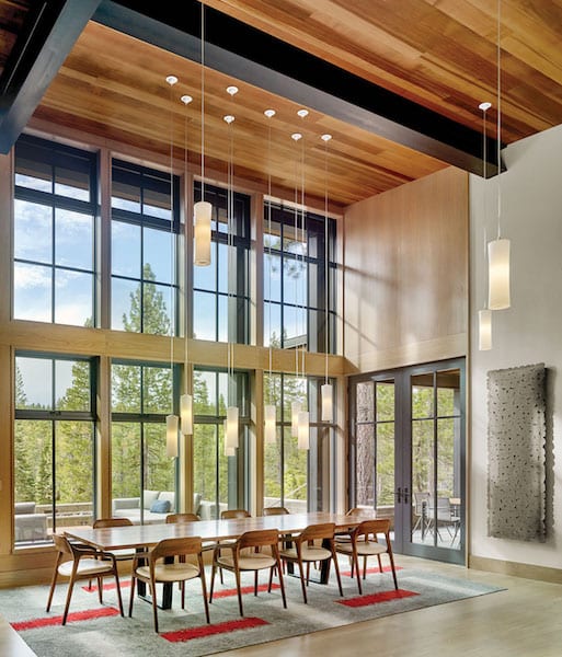
Hanging lanterns add a sense of magic to the dining table, photo by Cesar Rubio
This open kitchen-dining-living space is punctuated by two dozen lanterns—a nod to the owners’ love of camping—which are hung at varying heights like floating candles over the kitchen island, the 12-seat dining table and the seating area. “They create a sense of joy in the room,” Paquin says. “I love the playfulness; it looks a little magical.”
Pops of color punctuate the great room space, with the same reddish-oranges used in the island bar chairs repeated in the carpet tiles under the long table and again in the seating area’s throw pillows and ottomans.
“We are incredibly practical people, but we were willing to do one or two special things,” the owner says, listing the entry rug and the carpet tiles as examples. “Martine translated that into a space that’s really spare; we don’t have a lot of extra things.”
“My philosophy is we provide interior design that is very architecturally synced,” says Paquin, whose San Francisco–based firm is celebrating its 10-year anniversary. “We try to respond to the design of the client by providing things they would never think of. We look at it holistically—look at their habits, activities, what they love.”
For these owners, that also translated into creating a durable home. “One key point was that everything have a flow and everything be low maintenance,” Paquin says. “Even the art on the wall can be vacuumed.”
She’s referring to the circular felt piece, named The Tulip, by London artist Anne Kyyro Quinn, which hangs near the herringbone-patterned fireplace.

Pops of color punctuate the entryway, photo by Cesar Rubio
The way the great room contains pops of reddish-oranges, much like California poppies, each room is influenced by a color palette brought in from nature. The master suite, which contains a yoga area and a three-sided fireplace with the same herringbone pattern as the great room, offers a touch of the greenery found in the trees just outdoors. “There’s a color theme that is happening in each room,” Paquin says. “But we also tried to treat the entire house as one big room, as well. That way it feels cohesive overall.”
One of the downstairs bedrooms features a blue accent wall while—up the modern, steel-and-cable stairwell—the upstairs bedroom is an aubergine. Also, upstairs is the media room (there is consciously no television in the great room), complete with a puzzle table.
The design process on the almost 5,000-square-foot home began in fall of 2015, with construction beginning the following July and lasting about a year and a half. Fulda calls this home a “truly collaborative effort” between the three Ward-Young designers; also helpful, he says, was having Paquin and Gelso chosen early in the process, allowing input and advice from all sides. “The materials, details, color palette and furnishings were developed in parallel with the overall design seamlessly,” Fulda says.
Gelso says that from his side, it’s nice to be a part of the early design process. “We always give our input,” he says. “Our changes are, ‘How is it going to last longer? How is it going to be less maintenance?’”
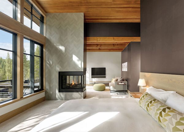
The master bedroom includes a three-sided fireplace, photo by Cesar Rubio
On this home, for example, his team requested two layers of underlayment on the roof rather than the partial layer that’s required, as well as 6-inch pipes for drainage rather than the standard 4-inch size. “A lot of these homes are being given to families,” Gelso says. “We’re trying to solve problems generationally, so they don’t ever have a roof problem.”
The exterior, like the interior, reflects the idea of a simple but refined palette. “The overlapping layers of stone, wood and steel give the home a sense of richness and detail,” Bourke says.
“When we come here, it just feels relaxing,” the owner says. “It enables us to slow down.”
Both the owners and the build team enjoyed the design and construction process.
“The best part of that house are the owners,” Gelso says. “They believe you, they trust you, and that makes you want to perform for them on the highest level.”
“The clients were amazing,” Paquin agrees. “Not only by their choices, but their way of interacting, of being so accepting of what we were proposing. This project had so many good vibes.”
Massive windows and sliding doors blur the lines between indoor and outdoor spaces, photo by Cesar Rubio
Now, the owners appreciate the simple pleasure of being in their mountain home: “We feel so blessed and fortunate to be able to spend time up here in this beautiful house in this beautiful place.”
Award: Mountain Modern
Building Design: Ward Young Architecture & Planning
Builder: Doc Gelso Construction
Interior Design: Martine Paquin Design
Square Feet: 4,827
Year Complete: 2018
No Comments