04 May Off the Shelf
There is a presumption that high-end custom homes, particularly those that are more architecturally evolved, are built and finished strictly with top-shelf materials and systems. However, inexpensive, utilitarian materials handled in unexpected ways not only can save money, they can introduce a fresh and interesting take on preconceived architectural details.
Sitting in Joel and Jennifer Sherman’s Donner Lake living room—basic concrete floor underfoot, plenty of IKEA products (some hacked, some intact) and a ceiling finished with 3/8-inch rough-sawn Breckenridge plywood panels (the most feasible stuff you can get, according to Sherman)-the essence is not bargain basement with the patina of Home Depot sacrifice, but rather a lofty, light-filled modern pavilion where the architecture transcends the finishes, allowing the space itself to define the experience.
“The finished project looks so unique yet the materials to get there are, for the most part, right off the shelf,” says Steve Lamerdin, owner of Lamerdin Custom Woodwork. Lamerdin provided finish framing and interior finish work on the 2,400-square-foot home and has worked on previous smaller projects with the Shermans.
In 2002, Joel Sherman, architect and owner of Truckee’s JLS Design, and his wife Jennifer, a speech pathologist with the Washoe County School District, purchased a dynamic piece of property on a south-facing slope above Donner Lake. The steep, largely treeless parcel commands a greater than 180 degree unobstructed view of the lake and surrounds. There are clear shots of everything from Mt. Rose to China Cove to Donner Peak, with a respectable slice of the Pacific Crest thrown in for good measure.

As a young architectural intern, Sherman bought his first house in 1993 just down the street from where the new house now sits. Twenty-two years later, with a wife and two children added to the story, Sherman moved exactly seven doors to the west and into the house that had been brewing in his imagination the entire time.
The form, function and spirit of the new house benefitted immeasurably by the experience of living in the neighborhood for so many years. The view to Mt. Rose is so perfectly framed from the entry window, it seems almost an accident, but clearly, it isn’t. “When you’ve walked past a site for 20 years, you know where the views are,” says Sherman. Asked how many versions of this house he designed in the years between property purchase and starting construction, he smiles and says, “About 12 trees worth of tracing paper.”
Given that the north side of the property must contend with nearby interstate noise and the south side is blessed with huge views, the house appropriately responds by largely closing itself off from Interstate 80 and grabs every available shot of lake, mountain and sky in the other directions.
Sherman nudged the house out into the property to ensure the stellar view corridors would be maintained. “There is a bit of a shelf down the hill to land the structure,” says Sherman, “and the towers step with the site and span across to get the house out there.”
From specific vantage points, the home may appear as a complex cubist exercise, but in reality, it is a few simple glazing-riddled boxes nested among a series of stucco- and sheet metal–finished vertical towers. A single shed roof caps the entire house. Metal panel–finished pop-outs break free of the prescribed grid to expand interior spaces and reach even further toward the lake.
“The whole house is on my neurotic module,” says Sherman. “It alternates between a 12- and 8-foot grid with 3-foot pop-outs.” These specific dimensions are based strictly on building material standards and maintaining moderate spans that wouldn’t require beefier (costly) structure.
“You can pick out a JLS Design house anywhere,” says Jude Gavigan, owner of In House Builders and contractor on the project through the rough framing stage. “Because Joel is so methodical with his detailing, his structures are all really unique.”
Gavigan started In House Builders in 2006 with an emphasis on sustainable building, evidenced on the Sherman residence by the use of durable exterior materials, exploiting passive solar gain opportunities and solar panel installation.
Walking from driveway to front door, the processional experience is heightened by the sense of the home’s scale and the amplification of exposure as the hillside falls away below the entry bridge via glass rail panels.
The transition from exterior environment through the front door into an elegant yet compact foyer and then finally into the home’s voluminous public space delivers the modernist version of Star Trek’s transporter (without being momentarily reduced to molecular matter). Sherman references Frank Lloyd Wright’s technique of volumetric manipulation through compression and expansion, which is simple in concept and very effective in creating powerful spatial markers.
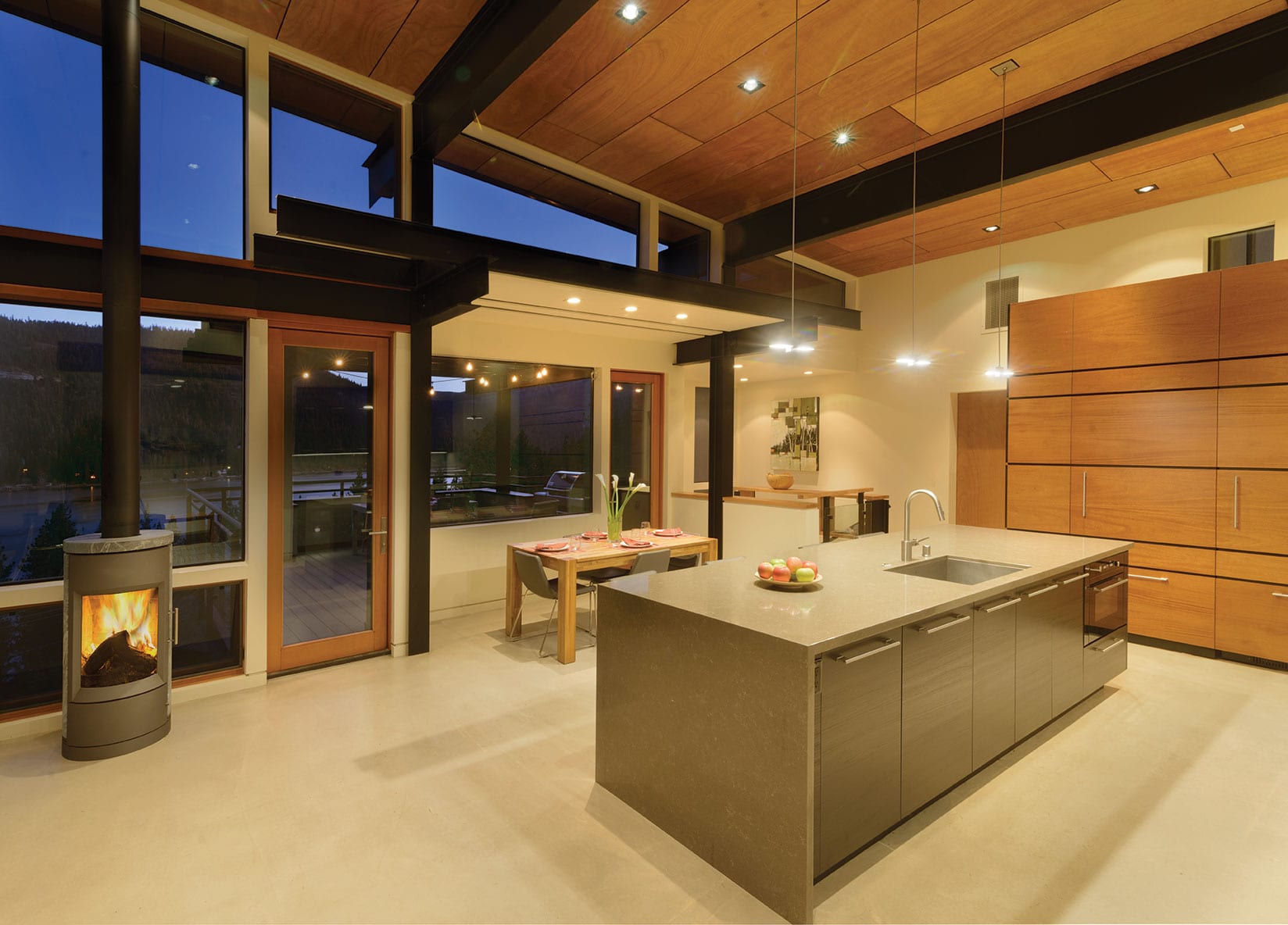
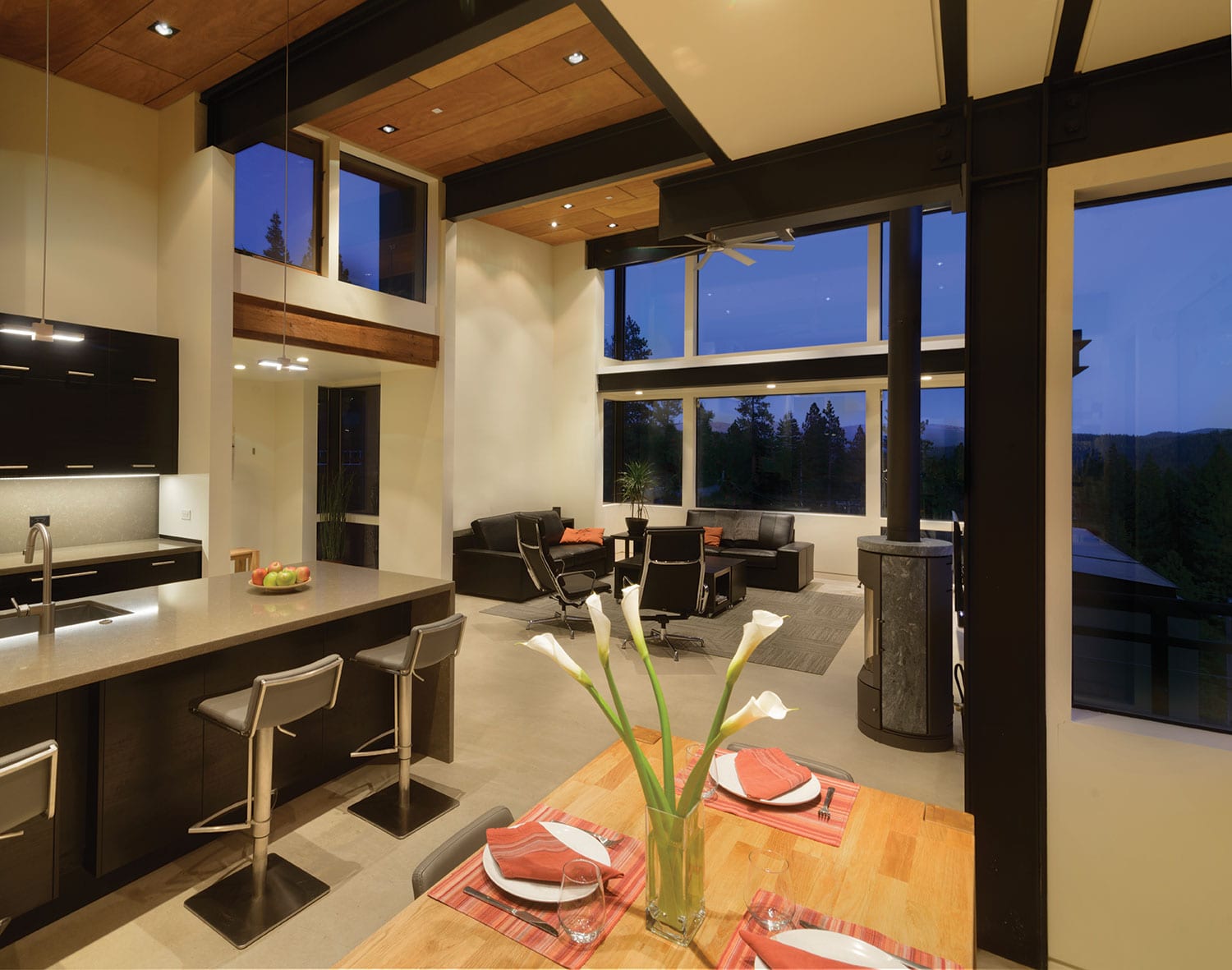
The living/dining/kitchen space soaks in an unblemished panoramic view of Donner Lake. Exposed steel structure gives a framework to crisp white panels of sheetrock and planes of glazing. Windowsill heights and built-in pockets of casework along the exterior walls are intentionally placed to achieve a feeling of privacy in the open volume while blocking sightlines to rooftops and power lines below without compromising views.
“For something that is so open, the 42-inch high casework on the south wall makes the space put its arms around you,” says Sherman. “You feel comfortable in the room as opposed to feeling like you’re hanging off the side of a hill.”
Conventional thinking would dictate the addition of a huge outdoor deck given such views, but with the corner windows in the living room running floor to ceiling, sightlines of the lake are pulled deep into the space. This allows the living room to function in the same way as a deck all year round regardless of weather, maintaining a connection with the great outdoors in every season.
A Bari gas stove discretely stands between the living and dining area, the perfect touch harkening with nostalgic sophistication to an alpine home tradition. It is also an ideal roost for the family’s tortoiseshell tabby cat to survey her kingdom while basking in full sun throughout the day.
IKEA casework with a mixture of black and veneered plywood faces and planes of gray quartz countertop comprise the L-shaped kitchen, which unquestionably is the command center and heart of the house. “I wanted to be able to see what was going on while I’m in the kitchen,” says Jennifer. “Standing at the sink, I can take in the full view outside and still see everyone coming and going through the house.”
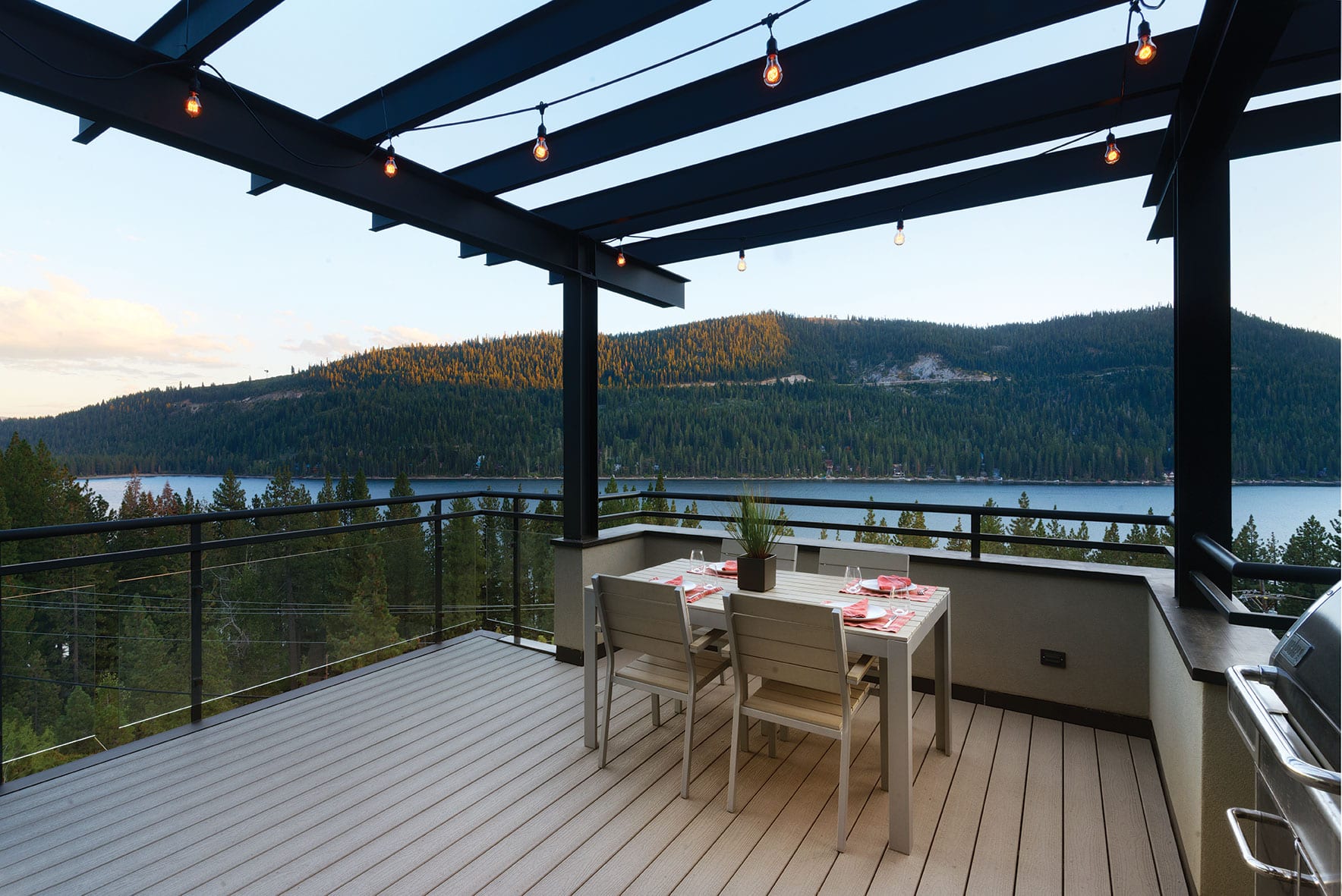
A dining niche sits opposite the kitchen island with one of Sherman’s trademark “blade” roof slabs transferring in from the exterior to define and scale the space. Just beyond the dining windows, a conveniently located deck with glass rail and stucco half-wall perimeter is partially topped with a steel trellis that can be woven with a sunshade to control solar gain.
A modest but supremely planned service area/mudroom between the kitchen and garage has positively every nook, cranny, bench and cupboard necessary to efficiently consume an unwieldy Costco trip in one gulp and deftly wrangle the daily explosion of kids/backpacks/coats as well as the occasional post road trip purge.
Beyond her husband’s rigorous design aesthetic, consideration of function and day-to-day livability ruled supreme for Jennifer throughout the design process. “Function and flow was the most important thing to me and because the layout ended up being so efficient, there isn’t one space that goes unused,” she says.
While the spaces throughout the house aren’t massive, they are consistently scaled and feel comfortable and spacious. Exhaustively considered functionality and efficiencies makes the house live large and run like a well-oiled machine.
An open stair of steel stringers with economical 3½-by-12-inch glulam treads (material typically used only in structural applications) wraps around a screen of open shelving created by spanning IKEA butcher block slabs between exposed steel columns. Defined by generous amounts of glazing, fresh white walls and glass panels, the stairwell is both a circulatory display and sculptural centerpiece.
All of the home’s bedrooms and full bathrooms are found on the lower level. At the base of the stairs, an expanse of what could have just remained hallway and/or storage was creatively manipulated to include a TV lounge and homework/art station. The cozy TV room, which opens out to terracing lawn and landscape zones, vanishes behind pocketing sliding doors for the occasional Star Wars marathon binge. When opened up, the entire space expands to become something of an activity hub for the couple’s two young children.
Another example of transplanted building materials affordably reassigned to accomplish new tasks hangs on the wall adjacent the kids’ work space. A $6 sheet of sound attenuation board (typically used for acoustic buffering) attaches to the wall with slick, stainless steel connections to become instant art gallery.
For all the clean lines and pristine minimalism, Sherman lauds the home’s livability. “People see the magazine pictures and ask, ‘How can you live there?’ But the mess and reality of day-to-day life fits here just as well as it does in any other house,” he says, laughing.
The off-the-shelf approach tends to have the intended success if the core of the architectural form is sufficiently commanding in and of itself. “The materials don’t make the architecture,” Sherman asserts. “The architecture should be in the skeleton, in how the building gets put together.” Sherman’s architecture loosely follows the modernist conviction of “form follows function,” and the function for Sherman is defined by the structure.
It is next to impossible to have a conversation with him about any of his projects of the last 20-plus years without the discussion veering into the basics of structure. He has an honest enjoyment and, frankly, an exceptional ability to understand and manipulate the engineering, and in doing so, manages a beautiful dance with gravity and lateral forces. All of his designs ultimately begin and end with structure.
“In Joel’s houses, the framing is the finish,” says Lamerdin. “Once you understand that that’s what he’s doing, you can then benefit from the economy of the materials.”
“We didn’t use a bunch of smoke and mirrors to get here, just used a creative path that not many people would take,” says Sherman. “And at the end of the day, it’s not just about the materials but how they and the house are tailored to the way we live and to this site. It’s what I’m the proudest of.”
Award: Modern Family
Building Design: Joel L. Sherman, JLS Design, with Audrey Harris and Casey Sibley
Builder: Rough Framing: In House Builders; Finish Framing and Finish: Steve Lamerdin, Lamerdin Custom Woodwork; Orest Prodaniuk
Interior Design: Joel L. Sherman, JLS Design
Square Feet: 2,400
Year Complete: 2015


No Comments