18 Feb At Home in the Trees
Santa Cruz designer capitalizes on homesite’s mature Jeffrey pines and cascading creek
Architectural procession can be as elaborate as ceremonious proceedings in a Gothic cathedral or as simple as walking through a lovely garden, up a step or two and into a sheltered entryway. It is the impact of physical markers and spatial queues along the way that determines the success of the experience.
Starting with a grove of mature Jeffrey pines parked in the middle of a Martis Camp lot, Santa Cruz architect and general contractor Fred Lattanzio designed a house steeped in basic modernism while showcasing the cluster of trees in such a way that the resulting entry is rivaled by few.
“When I first looked at the site, I saw that grove of pines and I thought they were beautiful, so I didn’t want to take them out,” Lattanzio says. “I saw them as a valuable site feature and decided to do a meandering entry with a courtyard to capture the trees and then turn the experience toward the creek. We ended up taking out only one tree in the whole project.”
The 4,136-square-foot home is so thoughtfully integrated with the site that it seems as though it’s been there for decades, while the combined effect of mature trees with a seasonal creek on the eastern edge of the property lends a feeling of lush Rivendell to this Sierra retreat.
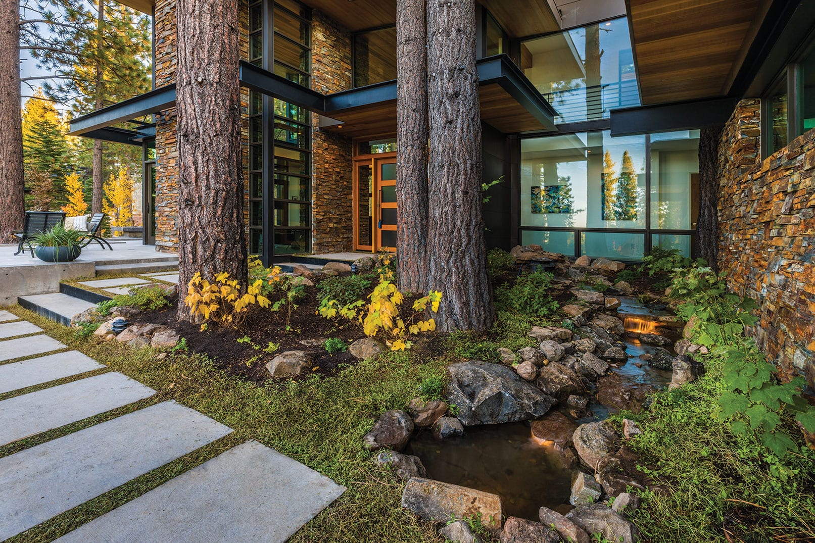
 A cluster of Jeffrey pines greet guests outside the front entry, along with native landscaping and a cascading water feature, photo by Paul Hamill/Martis Camp Realty
With a distance of maybe 100 feet from parked car to front door, a series of concrete pads meander between the ledgestone wall of the garage mass and the retained edge of the path; verdant ground cover fills the open seams between steps. The path swings slightly out from the house around the grove of four trees, enshrined not only by the architecture but with a palette of native landscaping and a small cascading water feature.
“When you come around the corner from the garage to the water feature incorporated into the natural courtyard, it foreshadows the experience of the main creek on the east side of the site,” explains Lattanzio. “The notion of the meandering entry is an old Frank Lloyd Wright trick—a long, circuitous entry that sets up a sequence of experiences.”
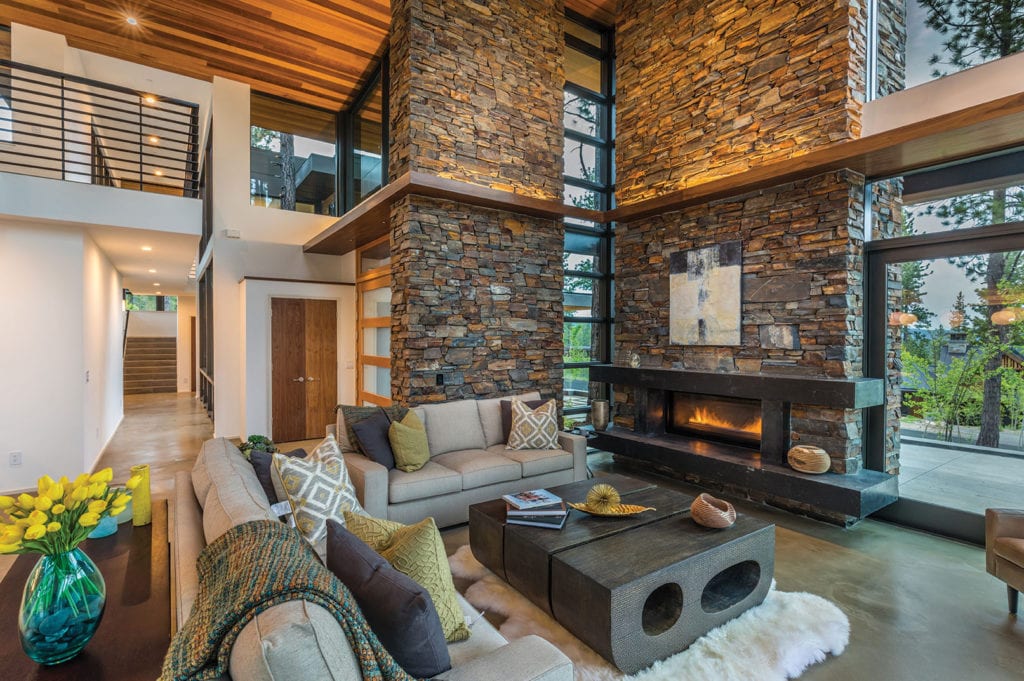
The procession continues to the interior through a hefty 6-by-8-foot front door that swings open to a glowing two-story volume. Continuous concrete flooring, ground down to expose a velvety sand texture with just a touch of integral color, appears finely finished and is completely absent a rough industrial character. The 1-by-6-inch cedar decking some 20-plus feet above finishes the signature curved roof, rising up and out to the creek and forest, its warm tonal variation bringing contrasting surfaces (concrete and crisp white walls) into perfect visual balance.
 A two-story ledgestone chimney anchors the living area while blocking less desirable views to the street below, photo by Paul Hamill/Martis Camp Realty
Filtered sunlight casts a golden glow through the forest and glass walls, creating an ethereal atmosphere in the home’s public space. Walnut-wrapped soffits 4½ inches thick extend through the living/dining/kitchen area and travel at various heights around the perimeter, creating scale and defining space. This particular element is one Lattanzio has deliberately employed in his work for years.
“The soffits are scaling elements,” says Lattanzio. “They lead your eye throughout the house, enticing you to see what’s around the next corner. They also help unify the spaces, band the windows together and help carry the interior plane to the outside.”
A two-story ledgestone chimney on the north wall anchors the living area, blocks less desirable views to the street and rooftops below, and houses a sleek Montego gas fireplace. Corner windows create a long vertical slice of sky and air on one side of the fireplace (also a very Wright-ian maneuver) and an expanse of Sierra Pacific glazed walls launches from the other.
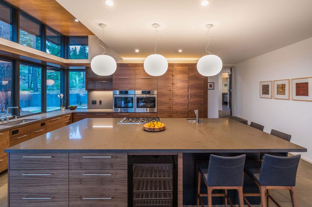
The open “L” kitchen opposite the dining room is organized around a generous island with a Viking cook-top. Walls of glazing bracket the sink and turn the corner to transition into full-height casework housing double Bosch ovens and slide-out pantries. The book-matched black walnut cabinetry is topped with glossy Caesarstone slabs.
 The open kitchen is organized around a generous island with a Viking cook top, photo by Paul Hamill/Martis Camp Realty
Tucked behind the public spaces and stepping upward with the topography to nestle into the site, the master bedroom suite’s cozy footprint feels voluminous courtesy of the curving roof peeling upward. Continuous Eleganza Voge floor tile, with the look of warm wood planks, runs between bed and bath. The charcoal-colored board-formed concrete fireplace surround anchors the perfect proportions of the bedroom, and the spa-like bathroom includes a glass shower surround and Kohler egg-shell soaking tub.
Stairs to the second level are largely enclosed in glass that, at night, glow lantern-like with stacked horizontal panes of glass emphasizing lines of sight. Two guest rooms are located on one side of the upper level while on the opposite side, the guest master suite is ultimately the culmination of the home’s procession, the roof plane curving up and out to Martis Valley beyond.
Given the distance between Lattanzio’s home in Santa Cruz and Truckee, Lattanzio hired Truckee native Josh Ruppert to function as the general contractor on the project. Having grown up in a small community in Pennsylvania, Lattanzio appreciated Ruppert’s similar small-town sensibility and feels they worked well together.
“Josh is easygoing, respects the project vision and is willing to do whatever it takes to see that vision realized,” says Lattanzio. “It’s also refreshing to work with someone younger than yourself, and I hope we’ll work on something again in the future.”
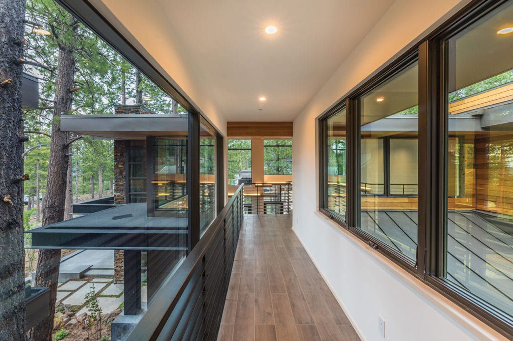
 A corridor along the second level is enclosed in glass, photo by Paul Hamill/Martis Camp Realty
As one moves through the house, the grove of pines ultimately maintains center stage. Encased by three two-story walls of glass, the landscaped courtyard virtually erases any division between interior and exterior, especially from the second-floor catwalk, where guests find themselves essentially walking through tree tops.
“I was educated in the basic tenants of modern architecture,” says Lattanzio. “It’s all about space, light, air and how the spaces relate to the site. Pleasing proportions, scale, massing and an unrelenting attention to detail are all necessary components of a good design. The site is a huge generator of the design. Bringing the elements of the site into this house was absolutely the right solution.”
Award: Site Integration
Building Design: Fred Lattanzio of Lattanzio, Inc.
Builder: Josh Ruppert Construction
Interior Design: Cayton Design
Square Feet: 4,136
Year Complete: 2017


No Comments