26 Apr Relaxed Fit
Mission accomplished for team building Zen-like space
For more than 100 years writers, painters and world-weary souls have made pilgrimages to Lake Tahoe for the peace and quiet it provides. It seems fitting, then, that when Kim and Zach Hyman were looking to design their relaxing dream home they chose Martis Camp.
“We knew we wanted to create a spa-like environment from the get-go, so we used words like Zen, calm and spa-like with our architect, builder and interior designer,” says Kim. “Floor-to-ceiling windows, flowing water, neutrals, varying textures and materials (wood, onyx, steel, copper) were key to making it feel both spa-like and mountain contemporary. We wanted it to feel clean, calm and comfortable.”
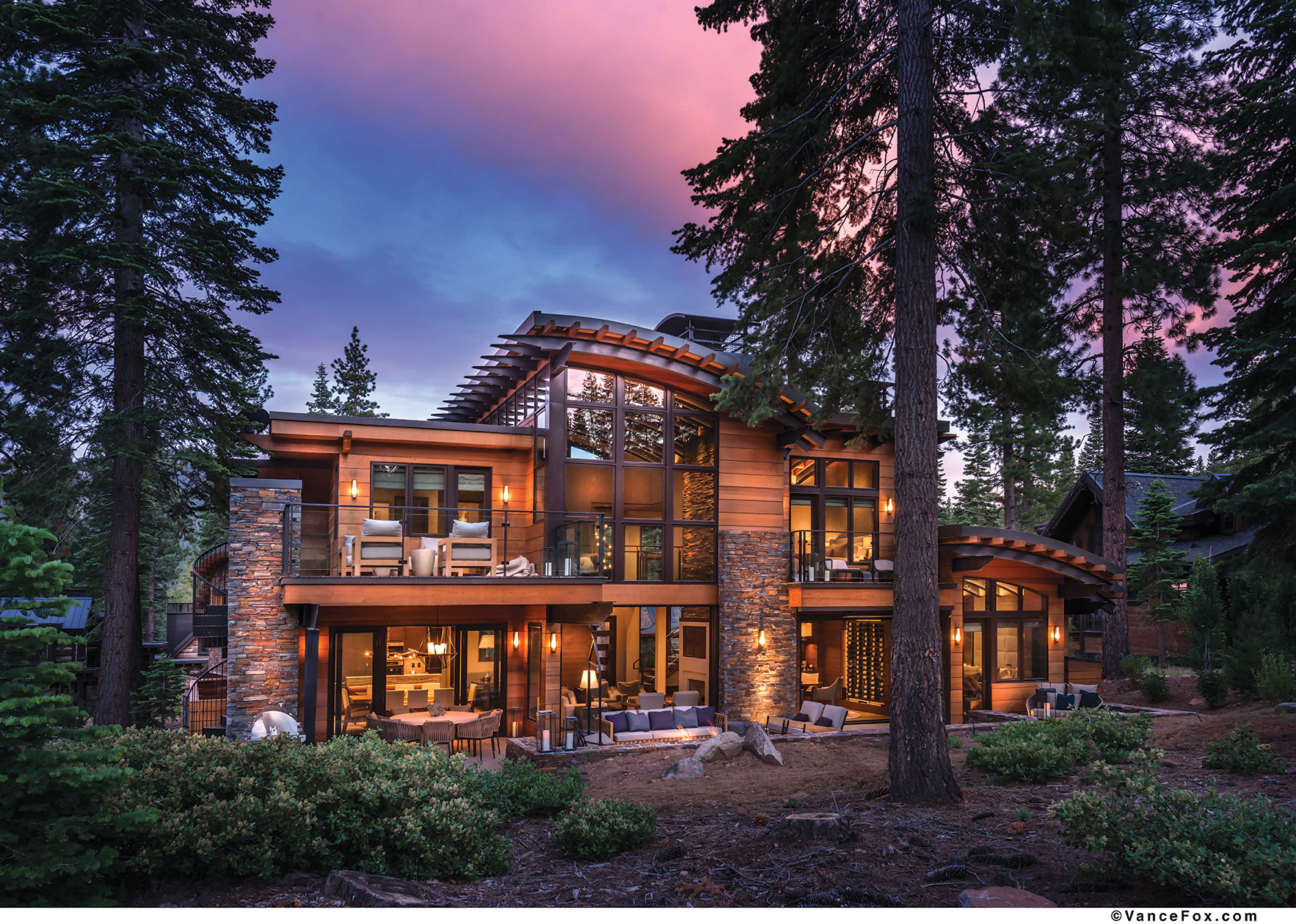
Built on a cabin lot restricted to 3,250 square feet, the five-bedroom home is spacious and welcoming.
“The trick to these cabin lots is, how do you make it live bigger than 3,250?” says Scott Gillespie, Principal of Truckee’s SANDBOX. “We added a lot of glass throughout the home [which is south facing] to make it feel bigger.”
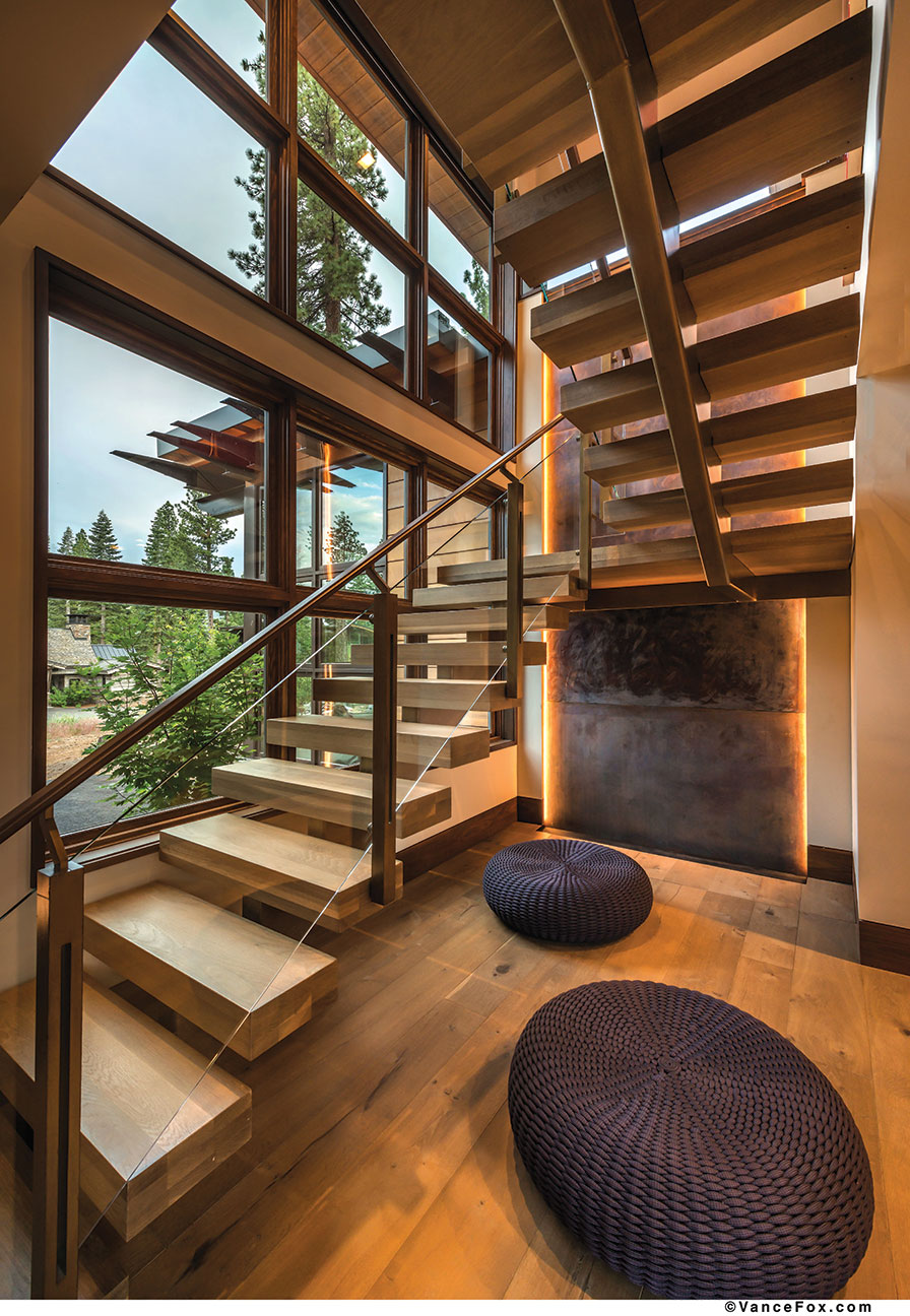
A water feature creates a calming effect upon entry
On the outside, curved roofs, clear cedar, Cisco Grove stone and a mix of angles create a dynamic aesthetic. “The inside is what really makes the house,” says builder Mark Tanner of Truckee’s Mark Tanner Construction. Tight, seamless design, countless built-ins, integrated appliances and furniture, and an economic use of space that accounts for every square inch ensured the home would have the luxurious feel of a much larger footprint.
Attention to detail is apparent the moment a guest steps through the threshold of a large combination steel and wood door. “I believe details define a home,” says Los Angeles-based designer Emily Hsieh. “In the foyer, rich walnut panels line the walls. Hidden behind is a stunning powder room like a small, precious bronze jewel box. Beautiful textures were used on all six surfaces from floor to ceiling. I used various natural materials to design the room from raw limestone, Paulownia wood, braided hemp, onyx stone, walnut and French oak. We also used strip lighting along the narrow floor-to-ceiling mirror, illuminating the room and the integrated onyx sink.”
Beyond the foyer an open-floor plan reveals the living room, dining room and kitchen as one fluid space. An indoor-outdoor feeling encompasses the large, airy room.
“Walls can be overrated,” Kim says. “Keeping with the open theme, we wanted to marry the inside to the outside…doors that pocket into the walls make it possible to enjoy the clean Tahoe summer air, and in a way also extends our square footage.”
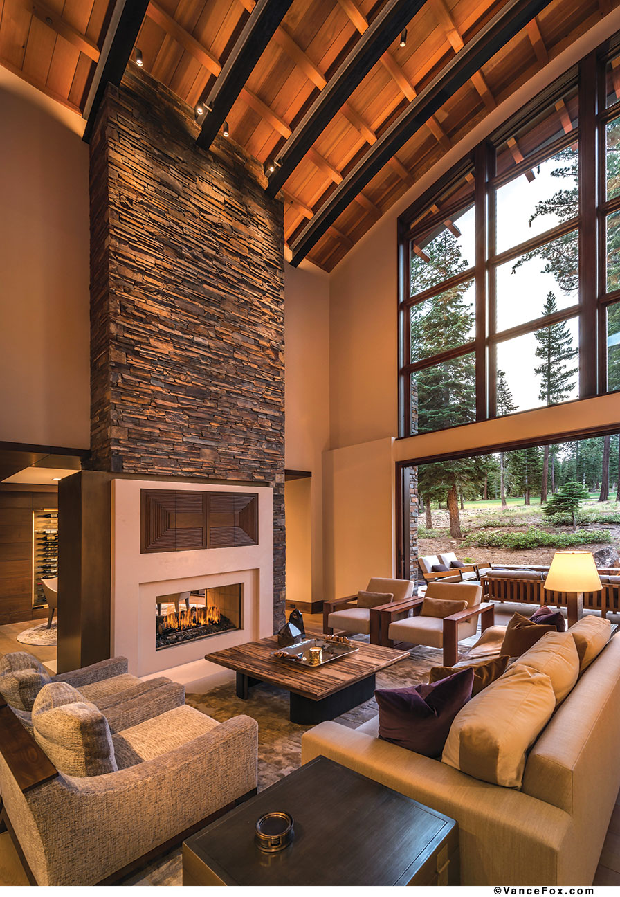
Pocketing doors open the home totally to the outdoors
On the second floor sits a small ‘cigar deck.’ The generous outdoor space was a treat to design, Gillespie says. “The cabin lots in Martis can be somewhat land-constrained by the time you get a 3,250 square foot home on the lot, so the challenge is to find area for outdoor living,” says Gillespie. “With this home, we were able to get in a lot of outdoor entertaining space.”
One of the main challenges in designing any home is space planning, Hsieh says. “In the Hymans’ home, we wanted to implement a 25-foot two-sided stone fireplace with stone cladding in the great room without taking square footage away. Every inch was accounted for the furniture and walking space around and between to ensure everything fit perfectly.”
The eyes naturally follow the home’s modern, clean lines to the outdoor patio, where guests can relax on a 360-degree swiveling Cornice 2 chair from Squaw Valley’s past, enjoy the built-in TV, or grill up something tasty on the custom barbecue. A heated gunite in-ground spa with retractable cover sits serenely to one side of the patio.
One of several slight adjustments made in the building process was that of the roof, says Tanner, which originally was meant to be sheet-rocked on the inside. Instead, the exposed curved steel beams carry from inside to outside, with warm clear cedar interspersed.
Another key redesign was figuring out how to create a space for the Hymans’ wine collection.
“The Hymans are wine connoisseurs so I wanted to highlight their passion in the home,” says Hsieh. Because no wine cellar existed in the original plans, she designed a six-foot-wide, 80-bottle, temperature-controlled wine wall with an illuminating bronze metal background in the game room. “I envisioned the wine wall as a focal point, an ‘art piece’ to showcase their collection.”
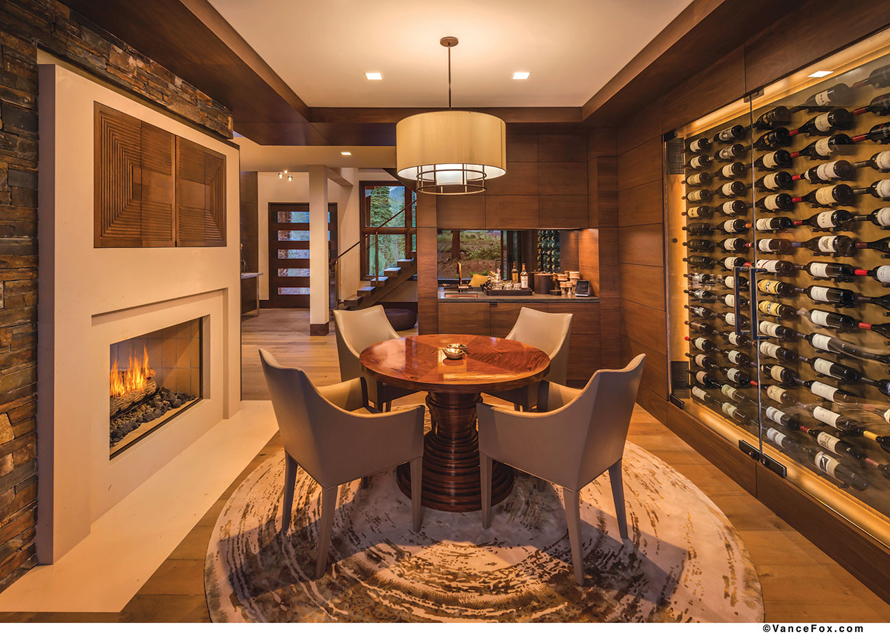
The home—owned by a professional poker player—includes a nook for friendly games astride a beautiful wine display
Throughout the home, walnut paneling and oak floors create a consistency tying the interior together and creating a unified aesthetic throughout. Solid-core engineered doors with eight-inch horizontal styling matching the baseboard walnut trim exactly illustrate that no detail was too small for the team. Custom cabinetry with integral pulls, all walnut or prefinished maple, provide plenty of storage space and allowed Tanner and Hsieh to maximize space and keep the clean, polished lines of a contemporary home.
“Texture continuity and a relaxing energy flow are essential to making a home feel balanced. I integrated materials that complemented each other,” says Hsieh. “For instance, in the upstairs guest bedroom, I installed full-length wool drapes along the entire wall behind a contemporary distressed leather bed and glass-blown pendants over organic wood stump side tables. And, in the master bedroom, I designed an eight-foot-high, suede-paneled headboard with a beautiful beveled oak frame flanked by a pair of fluted-front walnut nightstands. I never repeat a fabric or wall covering twice to ensure a unique experience.”
Hsieh focused on bringing nature inside the home with different shades of rich earth tones, textures and organic shapes and patterns. Natural textured materials such as grasscloth wallpapers, wools and mohair fabrics, raw natural stones and various species of wood create a warm atmosphere.
“As a running thread throughout the home, I used details of bronze metal to give a warm polished touch to the design,” she says. Indeed, each bedroom is unified in color palette and a warm, calm atmosphere, while differing slightly in personality. Each is, in and of itself, a perfect and complete space for quiet repose.
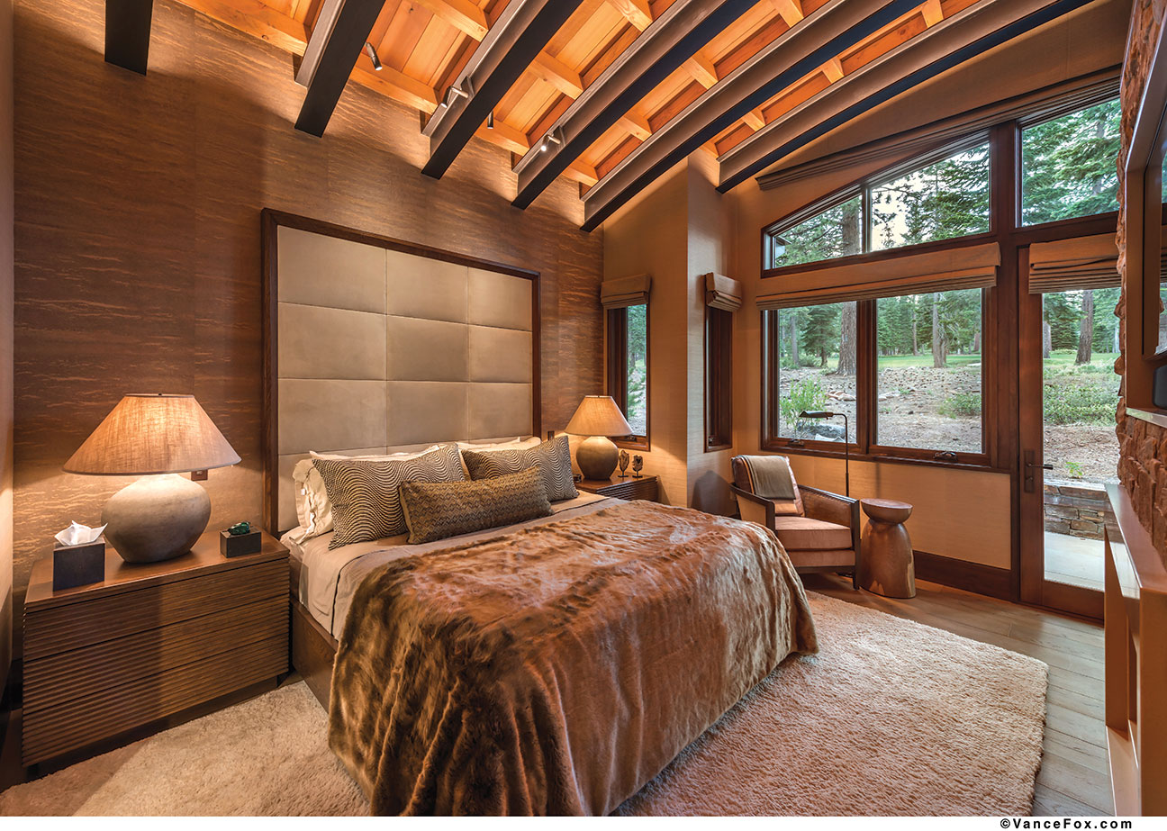
Lighting plays an important role in creating a relaxing ambiance, as well. “We highlighted textures and space through wall washing, wall grazing and accent lighting techniques,” says Hsieh. Up lighting that accentuates the lines of the home with a soft glow adds to the peaceful ambiance, which is underscored by Tanner’s team’s clever engineering to hide every hint of electrical system, heating or cooling, A/V and the like. Everything is integrated or hidden away to maintain the home’s polished, sleek character.
In the paradoxical manner of many homes, the more simple a design looks, the more complicated its execution may be. A water feature designed by Tanner’s field superintendent, Stephen Reitter, looks straightforward enough, falling gently down a copper wall behind the staircase, but with it came a structural puzzle the team solved with a floating staircase steel structure finished to look like bronze. The effort paid off.
“Our copper water wall behind the stairs is one of our favorite features. It adds an extra layer of serenity and it’s so peaceful to listen to,” says Kim.
Perhaps the most lighthearted and unique space, though, is the upstairs bunkroom.
“[It] brings another element to the home—a whimsical, happy place for both children and adults alike,” says Hsieh. “The overly large windows and high curved ceiling bring a tree-house effect. I accented the room with a rope chandelier, playful accessories and an array of over 20 different fabrics to bring color and life to the room. I wanted to create a fun, nostalgic atmosphere.”
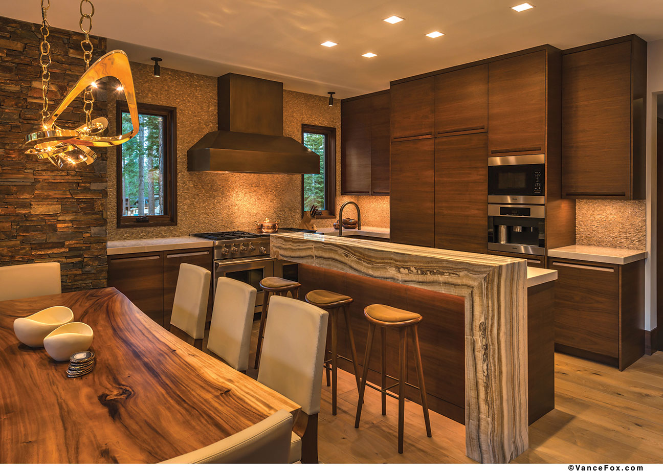
Whether it’s the home’s smart engineering, with windows, lights, temperature, humidity and more controlled with one touch of an iPad, or the incredible craftsmanship and meticulous attention to detail, the creative minds behind this masterpiece truly built a dream.
“I remember walking into our home for the first time (jaw dropped, tear in eye) completely stunned at how our vision came to life—perfectly,” says Kim. “So many little details contribute to the peacefulness—from our onyx kitchen bar top with waterfall pattern, to the shell wall in the master shower, to the shimmery wood wallpaper in the powder room. Each material complements the next.
“We worked closely with our builder, architect and designer, who were also in constant communication with each other. Emily really understood what we were trying to achieve and she was able to take our key words and neutral desired color palette and bring to us some amazing materials. She brought it to life.”
Award:Craftsmanship
Building Design: Scott Gillespie and Cobus van den Berg, SANDBOX Studio
Builder: Mark Tanner Construction
Interior Design: Emily Hsieh
Square Feet: 3,243
Year Completed: 2014


No Comments