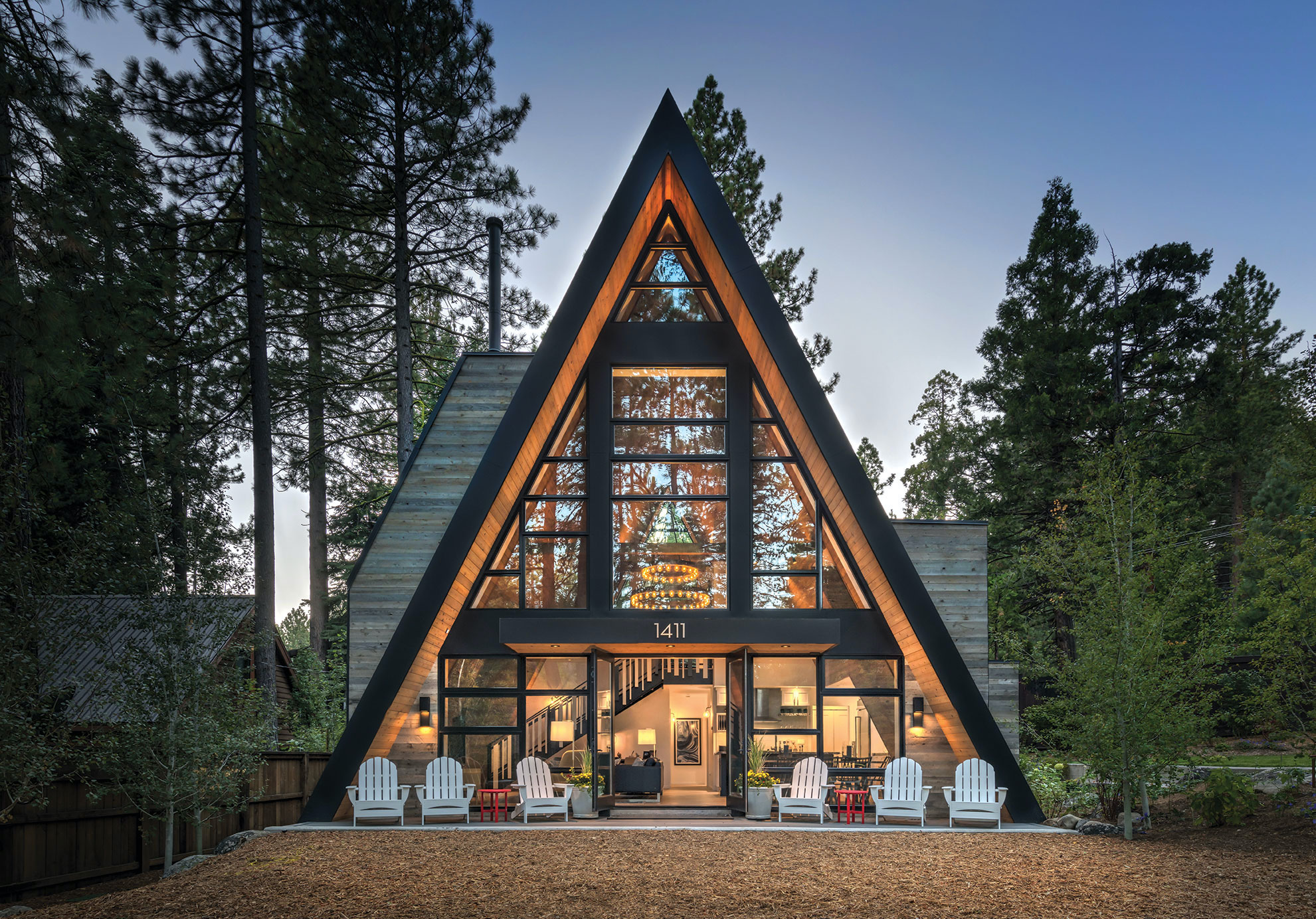
19 Feb An A-frame for the Ages
When their West Shore cottage burned to the ground, the owners tapped a talented Tahoe architect to create a classic mountain structure with innovative twists
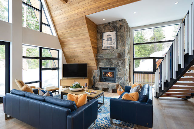
The lofty yet cozy living area includes a wood-burning granite fireplace and ample glass thanks to thoughtfully designed rectangular dormers, photo by Sinead Hastings
Backing up to Tahoe’s busy, wooded West Shore highway and fronted by one of the loveliest bike paths to ever grace a community, an icon of twentieth-century ski-town architecture is not only making a childhood dream come true, but also finding a whole new fan base.
“I don’t know how many tours I gave when this was under construction,” says Tahoe City architect Todd Mather. “There were always people stopping and checking out the house as they went by.”
Google “A-frame house,” and this striking Tahoe residence is indeed among the first images offered.
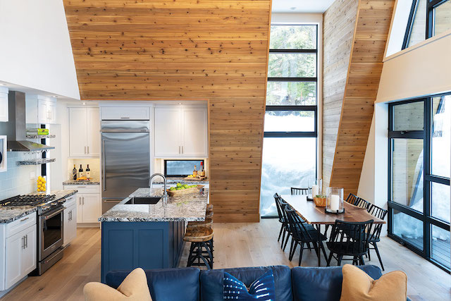
A dormer filled with floor-to-ceiling glass aligns perfectly with the dining table in the open great room
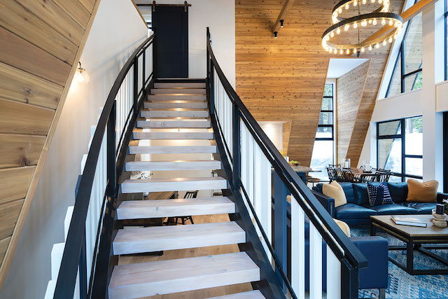
A curving open stair connects the lower and upper level while providing visual contrast against the straight lines of the structure, photo by Sinead Hastings

Designed with help from Brady McClintock and Shannon Barter of Tahoe City firm id.3, the interior of the home features European oak flooring, knotty cedar decking, shaker-style painted casework and granite countertops, photos by Sinead Hastings
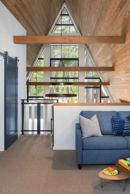
The upper level houses an airy lounge area with views out both ends of the home
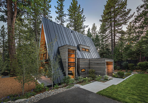
Among the unique aspects of the home, architect Todd Mather created an online barcode for a nearby ski resort and applied the pattern to the roof, photo by Vance Fox
Mather was hired in 2017 by a multi-generational family with East Coast roots to renovate the exterior living areas of their quintessential West Shore cottage. Sadly, the house burned to the ground the Sunday after Thanksgiving that year.
The notion of replacing the cabin with an A-frame was born from a family member’s fond memories of little A-frames dotting the hillsides near the family’s ski house in the Catskill Mountains, proclaiming them his childhood “dream house” at the time. After the fire, the chance to make this dream come true was an opportunity the family just couldn’t pass up.
However, Mather has done work in many notable resort towns and is familiar with what the A-frame has to offer—and what it does not. Knowing the inherent inefficiencies these simple structures possess, Mather was not shy in expressing his concerns. But he also had ideas about how to successfully mitigate them.
“A-frames are typically dark and really inefficient with space and general livability, and they have head height issues,” says Mather, who is 6-foot-3. “To bring light into the middle of the structure and make efficient, comfortable spaces, we created dormers.”
The rectangular, Trestlewood-clad dormers maintain the same strict geometric simplicity of the home’s triangular form. They are strikingly juxtaposed with the angled, metal mass, but positively reinforce the main form rather than dilute it. The triangular ends are filled with a Mondrian-like layout of Andersen windows and doors, adding a playful note to the basic silhouette.
“There are only two exterior finish materials because I wanted the forms to remain super clean and simple,” says Mather.
Another of Mather’s concerns with the typical A-frame aesthetic is the usually uninterrupted stretch of sloping roof planes, making for a dull and unremarkable exterior presentation. As a means to combat drab expanses of metal, Mather set out to elevate the function of the roof and give it some visual snap. Taking a cue from the owner’s fondness for a particular ski resort, Mather created an online barcode and applied the pattern over the roof plan, creating a totally unique signature for the metal panel layout. Were a massive barcode scanner to hover above the house, the readout from the random 6-, 12-, 18- and 24-inch spacings of the roof panels would say “Squaw Valley, USA.”
“We definitely ended up with something special,” says Mather.
General contractors Brett Spadi and Dan Kane of Blackwood Construction, with a team of talented subcontractors and carpenters, brought the flawless execution of the crisp and often challenging exterior detailing to the very tidy interior with the same level of precision, resulting in a home the owner describes as “cozy yet grand.”
The open kitchen, dining and living space is bright, lofty and instantly comfortable. All structural framing, including four steel moment frames, are hidden within the roof assembly, which is a departure from the usually exposed structure of traditional A-frame cabins. “It gives the illusion that the space is larger and cleaner,” says Mather.
Two dormers on one side of the space allow for a well-appointed, efficient kitchen (a rare find in most A-frames) as well as a story-and-a-half, floor-to-ceiling window intended for perfect alignment with the dining table. A larger window-filled dormer on the opposite side of the room houses a granite wood-burning fireplace and creates a noteworthy pause point for the stairs to culminate.
The curving open stair connecting the main and upper levels represents the owner’s singular request for “a bit of whimsy to contrast against the fine straight lines of the home.” Borrowing the pattern of the roof plane barcode, variable-length painted stair pickets introduce unexpected visual texture to the peaceful space. Combined with the subtle arc of the stair stringers, the journey between living level and loft becomes less utilitarian circulation and more of an enhanced spatial experience.
Clean interior finishes further amplify the light, luminous spaces. Brady McClintock and Shannon Barter of the Tahoe City firm id.3 maintained a somewhat classic palette of time-honored materials that are both cabin-esque and modern: knotty cedar decking, European oak flooring, shaker-style painted casework and granite countertops. The use of color beyond snowy white and all the neutral, natural finishes was strategically limited to a single deep space blue titled “Hale Blue.”
“Using that color on the island, the doors and the sofas was just something that bound everything together,” says the owner. Of the interior design results, Mather says that id.3 “put the finest icing on this cake. The details they brought to the project made it sing.”
Mather admits that his previous beliefs about the limitations of an A-frame were positively altered through the course of the project. A beautiful, livable outcome was accomplished by creatively manipulating an established set of standards without dismantling the core identity. In other words, Mather kept the “A” in A-frame fully intact.
“All my experiences renovating A-frames for the last 20 years helped me to reimagine what this could be. I set out to achieve a specific set of goals—creating efficient, comfortable spaces, getting a lot of natural light into the interiors—and all those things were achieved. What’s a better success than that?”
Award: A-Frame
Building Design: Todd Gordon Mather Architect
Builder: Blackwood Construction
Interior Design: id.3 Interior Design
Square Feet: 1,753
Year Complete: 2019


No Comments