01 Mar Sweet Simplicity
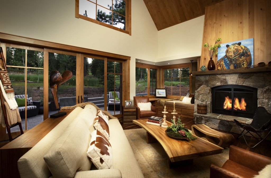
“Comfort was paramount,” says Vogelsong. “We wanted a neutral color palette accented with fun pieces but nothing that screamed mountain home, like a headboard made of twigs. We were very against twigs and stumps.”
The couple purchased the 2,709 square foot home site, which was already under construction, near the Martis Camp putting course.
“It’s a lighter, brighter, fresher approach to a cabin,” says architect Scott Gillespie. “We took the typical cabin and opened it to the outdoors. It includes more contemporary details-steel and board-formed concrete, lots of light, sliders out from dining room to the rear terrace.”
The couple began adding their own input to the process, to include-after getting a recommendation from a friend contacting Cathy Nason of Truckee’s Spirit Interior Design to create a fun, contemporary interior that would match both the home’s architecture and the couple’s lighthearted lifestyle.
“They are beautiful people,” says Nason. “Always laughing and cracking jokes. They wanted it to be a home not just to create their family, but to have their extended families come and stay.”
The resulting home is simple and stylish.
“Exterior steel and other detailing elements play on the traditional cabin vernacular, but help to make it feel fresh,” says Nason. “A strong connection to the outdoors was created with a mix of covered and uncovered terrace areas, and a view deck looking down on the creek from above.”
Indoors, Nason developed a casual retreat with a modern mountain style that uses a tone-on-tone palette with variations in textures and patterns. “The materials are kind of plain, but there’s a playfulness to them,” she says. “There are a lot of funky, restyled pieces.” Those include a headboard made from an old door, a reclaimed American flag, light fixtures made of recycled bottles and metals and woods repurposed into furniture. Unique finds, such as a Tufenkian rug and wood pieces from Thailand, add a global flavor to the mountain home, while durable fabrics and materials were chosen to protect against the couple’s new puppy.
Some of the more interesting features of the house include the reading nook in the great room and the lofted media room upstairs. “Rather than dedicating the entire upstairs to bedrooms, with the help of Marshall Williams at Crestwood Construction, we came up with the idea for a home theater,” says Vogelsong. “Igor Reoutt designed an incredible sound and viewing experience. We’ve had 20 kids up there watching Harry Potter while the adults are downstairs socializing.”
Beyond comfort, cost was big factor. “They are a successful couple but they are still budget minded,” says Nason. “They gave us a very specific budget that they needed us to work within; we came in pretty much dead-on.”
As the wedding approached, the project kicked into full gear, hastening the speed at which the couple made decisions and that rest of the team executed them. Without compromising quality, the home was completed just before the nuptials. For Vogelsong and Lurie, it was the perfect way to say “I do”—and to begin their happily ever after together.
Architect: SANDBOX, Builder: Crestwood Construction, interior: Spirit Interior Design, Inc., Square Feet: 2,709 ft


No Comments