26 May Eat, Play, Love
A sleek design helps a Martis Camp family function at its best
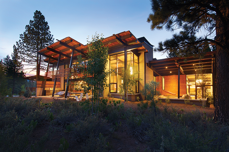
Three years in the making from design to move-in, Nick and Amy Bancroft’s sleek, smooth and spacious modern Martis Camp residence was designed to be a place where the entire six-person family (including six-year old triplets) can live, learn, work and play. It blends low-maintenance materials, state-of-the-art technologies and a modern aesthetic into a home that still fits into its natural setting, says the project’s architect Jack Hawkins of Reno’s Hawkins & Associates, who describes his work with the couple as a highly collaborative partnership.
“Nick and Amy have exceptional taste and vision,” he says. “The project is a success because of them.”
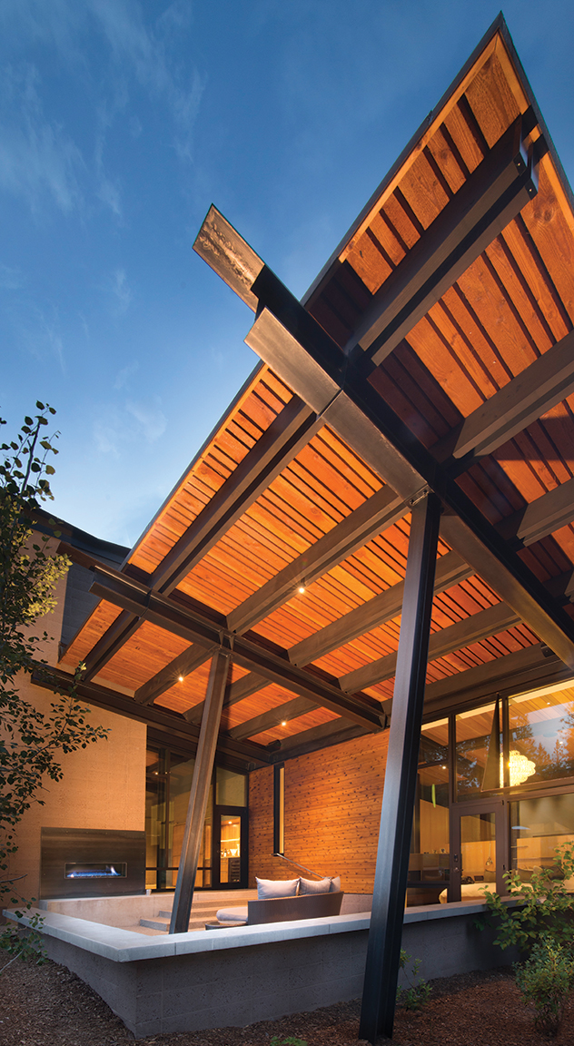
The home’s exterior, wrapped in western red cedar, “provides a juxtaposition of the rough and the refined,” says Hawkins. Custom cinderblock (or concrete masonry units) with integral color and a custom mix of aggregate is set in a stack bond layout—where the joints align vertically and horizontally—and sandblasted in place. Exposed structural steel beams sealed with a black Permalac finish cantilever out from the house, doing real support work while setting the modern tone.
A ten-foot fall on the three-acre lot allowed Hawkins to scale down the home’s perceived size.
“People are surprised at the vastness of the house,” says Darin Murphy of Reno’s Murphy Built Construction, the builder on the project. “It nestles into the trees and natural landscape. Until you walk past the big steel beams at the entrance, you don’t get an appreciation for what the architect did to site the house on the that lot.”
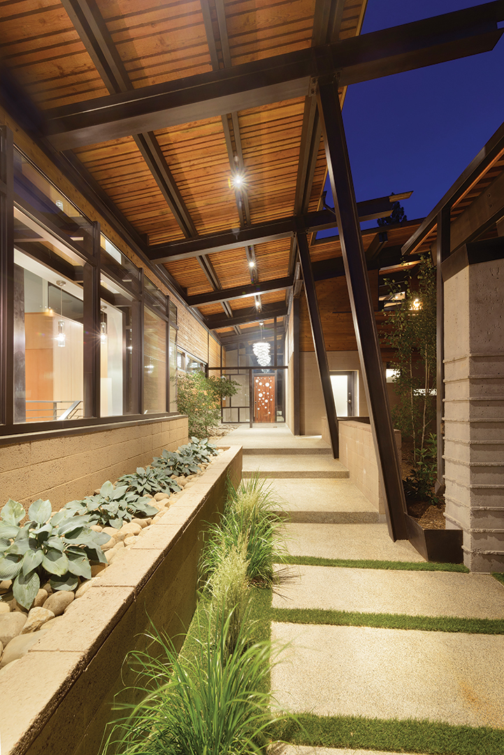
The home divides into three distinct zones. The main entrance to the house is via an oversized whimsical front door, designed by Hawkins & Associates and constructed by Tom Birch of Birch Woodworks near Pollack Pines, and leads to a soaring great room. Overhead in the entry hangs a bold, multi-faceted light fixture:the “Artichoke” designed by Poul Henningsen in 1958 for Louis Poulsen Lighting. This, along with a number of unique lighting choices, came from Reno-based interior designer Cheryl Chenault.
“The light fixtures are elegant, yet playful,” Chenault says. “I wanted the home, and all the materials in it, to represent the Bancroft family’s personality.”
Exposed steel beams support a sloping shed roof ceiling that reaches upward from 15 to 21 feet at its highest point. Martin Iron Works of Reno completed the structural steel work while Reno’s Tutto Ferro did the ornamental details.
Getting the steel onto the site was a feat itself, Murphy says. A specialized truck hauled the beams—three were 88 feet in length—from Reno to Martis Camp.
Nearly full height windows are secured with steel in a series of rectangles in the great room, framing the pines outside in a linear fashion. Large sliding glass doors leading to a roomy outdoor patio can be pulled open.
The cinderblock hearth, constructed with the same masonry treatment used on the exterior, acts as the structural shear wall for the great room space and diminishes the boundaries between inside and out. “Structure, beauty, texture and an interior/exterior relationship all emanate from one element,” says Hawkins. A widescreen-style fireplace’s rectangular shape echoes that linear pattern. Concrete, ground smooth then polished, forms the ledge that extends the length of the corner run, providing elegant but simple seating and storage underneath. A beautiful bar is cleverly tucked behind a sliding walnut barn door that pops off a solid blue hued wall.
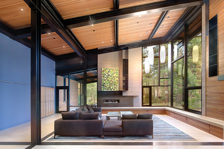
With an emphasis on commercial-grade durability and consistency of materials to calm what can be a hectic space, the Bancrofts chose a palette of materials that is both limited and simple: Concrete and quarter-sawn oak provide sturdiness underfoot while extensive built-in seating, counter space and storage (the latter nearly all in Anigre, an African hardwood) enclose and contain every last loose item.
“Together, we selected selected materials, fixtures, textiles and furnishings that met our criteria and mirrored their personalities,” says Chenault of the interior choices. “To complement the architecture, we layered a restrained amount of vibrant color, texture and patterns. The result: Modern, timeless materials that would withstand the test of time—and triplets.”
The living room flows past a long solid walnut dining table into the kitchen, where the counter bar and cabinetry is also made from walnut. A dining nook is surrounded by mirrors, one of which actually doubles as a television. Fun, donut-shaped Dos lighting pendants designed by Roberto Maci overhang the kitchen and nook that “instantly make you smile,” says Chenault.
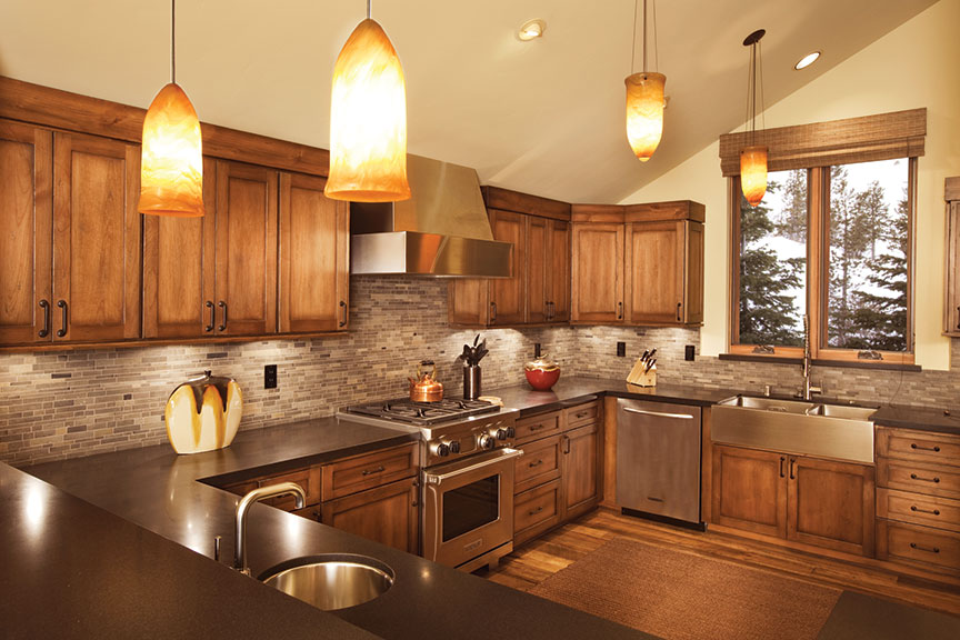
The hard-working heart of the kitchen lies just beyond a frosted sliding glass door, where a large pantry boasts an extra fridge, oven, microwave and food storage as well as a neatnik’s dream coatroom area with benches, cubbies, hooks, drawers and drop zone for coats, gear and personal items. It’s all accessible directly via its own exterior door.
Perched above the kitchen is a loft with views of the living and dining rooms, as well as Northstar California’s mountains beyond, that serves as Amy and Nick’s home office. It has its own door to an outside deck with table and chairs.
Toward the back of the house is an L-shaped kid zone. A narrow cabinet-lined hallway leads to two sets of bedrooms, joined by colorfully tiled Jack-and-Jill bathrooms: one shared by the girls, one by the boys. Some of the kid-friendly features include ladder-accessed lofts with built-in bed and TV, ample built-in desks as well as under-window seating and storage.
At the corner of the L is a heavy duty laundry room, with two sets of washers and dryers, and a multipurpose learning area with counter/desk space, chairs, multiple computer and television screens, and a chalkboard artistically enhanced with each of the kids’ names. A separate entrance to the area allows the crew of teachers and tutors to come and go without disturbing or disrupting the rest of the household. From here, an industrial-grade staircase descends to the playroom.
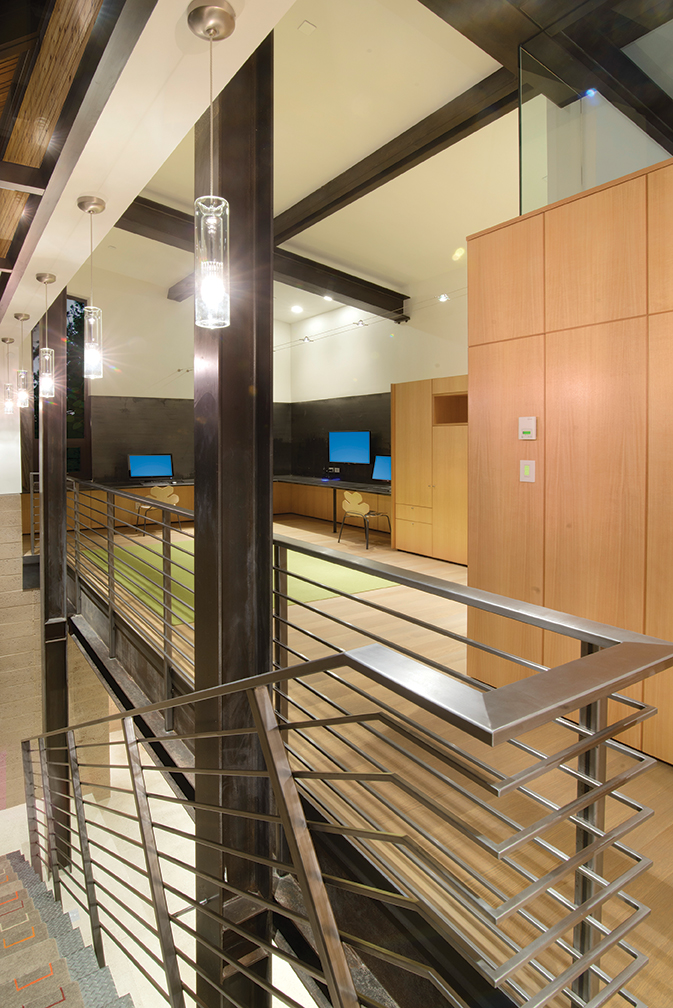
While the children have their space, a cabinet-lined corridor off the great room provides access via sliding glass doors to a partially protected deck with hot tub and lounge furniture; steps descend to a grassy backyard patch perfect for play.
“Nearly every hallway in the home opens up to a view of the forest,” Murphy says.
Further afield is the master suite, which, tucked on the far side of the house, serves as a spa-like retreat, meeting Amy and Nick’s need for relief at the end of what can be hectic days. Set on an angle, the master suite steps down the sloping site with views oriented toward the forest outside. There’s access to the great room’s covered patio and hearth as well as a pop-out corner window with a comfy chair and Tahoe-shaped table for quiet moments. A few steps lead down to an expansive closet, dressing room and laundry area. The last run of stairs land in an ultra-modern bathroom “which was designed to provide a luxurious, personal spa experience,” Chenault says. The room features a freestanding tub (with views) and separate glass-walled shower. The terrazzo floor contains crushed marble, tumbled seaglass and mirror.
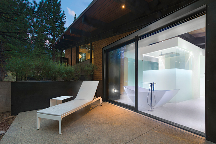
It’s Chenault’s favorite room and part of the reason the designer won a 2014 national design award from Hansgrohe + Axor (a German firm specializing in bath fixtures and sink basins) for her work on the project.
A detached 410 square foot guest suite for visiting family and friends is accessible from the main house via covered walkway. It is a simple yet lofty spot that captures forest views with corner windows and makes the most of its space by utilizing a walk-through bathroom, fold-out couch, built-in cabinetry and loft.
“It’s well-designed in the sense that it connects you to the house while offering a lot of privacy,” says Murphy of the unit. “It’s like being in a 5-star tree house in the back of the main house.”
Hawkins designed the home with abundant south-facing windows, capturing mountain views, light and warmth. Large overhangs keep the sun off the glazing in the summer months and let the sun permeate deep inside the home in winter. A thickened, insulated concrete slab acts as a heat sink in the winter months. Only two trees were removed to site the residence on the forested property.
In-floor radiant heating and a high-efficiency boiler keep the home warm, and are supplemented by five four-foot-by-ten-foot roof-mounted solar thermal panels, which also provide most of the family’s hot water.
Building materials, like the concrete masonry units, were locally sourced and much of the materials were recycled, Murphy says. The steel beams and columns are composed of 70 percent recycled steel. All of the lumber was sourced to be FSC rated and simple glu-laminated beams were used instead of dimensional, solid wood beams that are normally used in Tahoe homes.
Stepping back and looking at the total house concept, it is easy to lose sight of how much thought and planning goes into making something look so simple and spare.
“This was the most precision and multi-layered structure that I’ve tackled. It was exciting and challenging, “Murphy says, “and the great synergy between homeowners, architect and builder made the process very rewarding.”
Award: Craftsmanship
Building Design: Jack Hawkins, Hawkins and Associates
Builder: Darin Murphy, Murphy Built Construction
Interior Design: Cheryl Chenault Interiors, Inc.
Landscape Design: Betty Anderson Fulda, Landscape Design
Square Feet: 7,667
Year Completed: 2014


No Comments