29 Apr Off the Hizzle
A unique lakeside estate channels its owner’s playful, modern nature
Tahizzle. You can’t say it without smiling. A conflation of the words “Tahoe” and “fo shizzle,” which, according to Urban Dictionary, means “for sure,” Tahizzle is the handle for a lakefront stunner tucked into a quiet corner of Stateline’s Marla Bay.
“We wanted a name for the project that was playful, a conversation starter,” says Kristi Thompson, architect and principal at Truckee’s MWA, Inc., of the home she designed for client Ray Sidney, a South Shore resident for the past 12 years. “It’s modern and high tech with an unmistakable Tahoe twist.”
Sidney, 46, knows something about high tech—he was one of Google’s first software engineers. Now a real estate investor and a generous donor of community and environmental causes, Sidney hand-picked his dream design-build team and kicked off the process for his new crib with a 30-page document of ideas. It had to be Tahoe-ish and appropriate for the location and The Lake, but not of the bear-moose-trout cabin ilk. Durable, low maintenance and as eco-minded as possible were also high on the list.
“I toured a few houses that local green-tilted architects had designed and decided that I liked the style and attitude and values of MWA Architecture, so that was the first big choice I made,” says Sidney. “For construction, after talking with a few builders, I chose to work with Gardner Enterprises. That way I would be working with a good friend who had built a lot of beautiful houses in the area and whom I knew I could trust to work hard on getting it right. For design, I reached out through the connections of my project manager, Sloan Gordon, and found that Bona Prehoda of Ironhorse Interior Design had the vision and personality and creativity to pull together the house I wanted to live in.”
“Ray is a fabulous client; he brings big ideas to the table,” says Prehoda, who is based in Minden, Nevada. “He is playful and likes to entertain a lot, but is simple in his living style. He lives here full time so he wanted it to feel like home, but also welcoming for all his guests.”
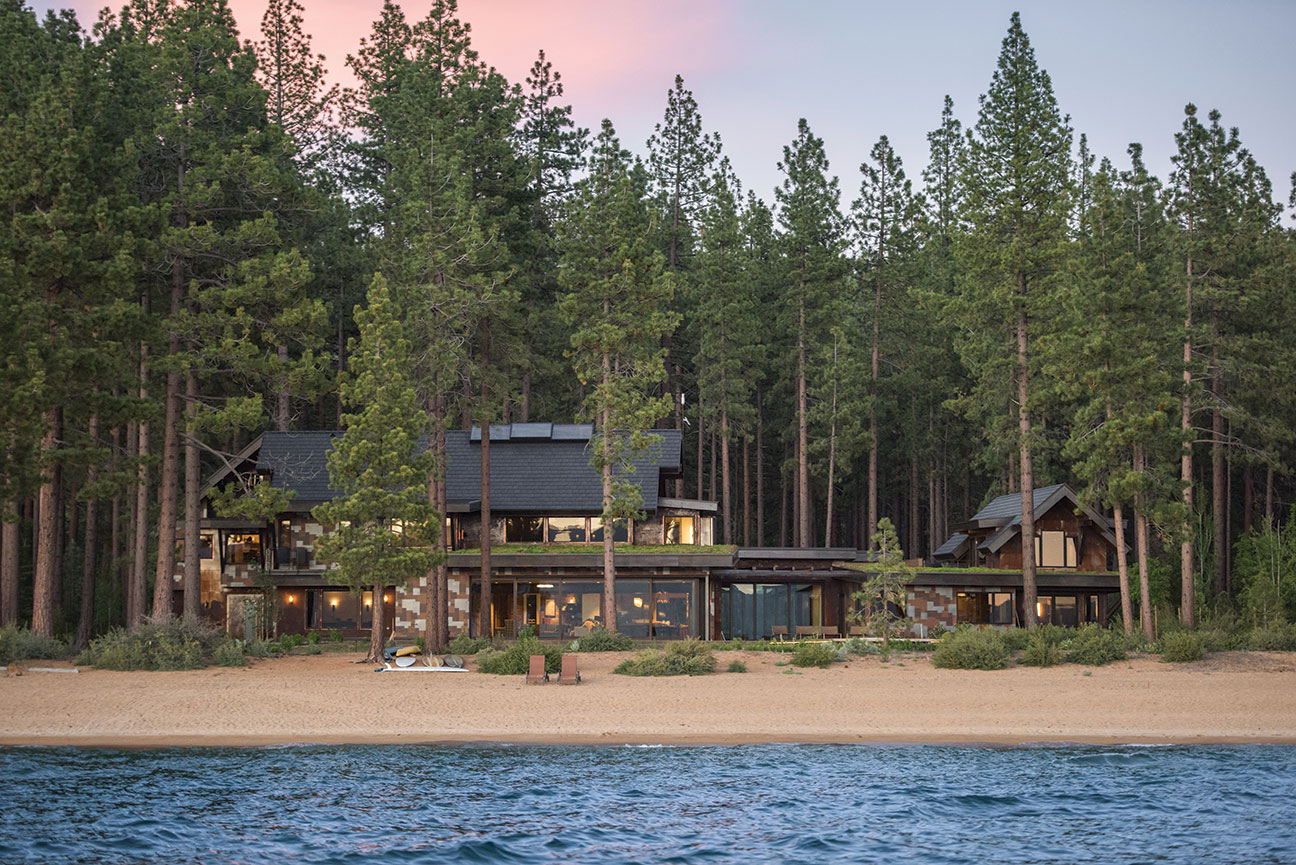
The resulting 7,400 square foot rustic contemporary house took a year to design and 16 months to build. With six bedrooms, six full and two half bathrooms, it can comfortably accommodate all comers.
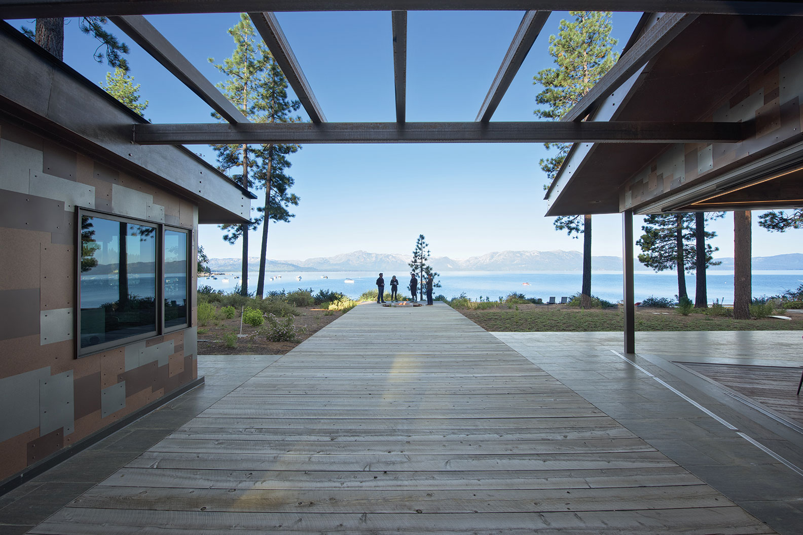
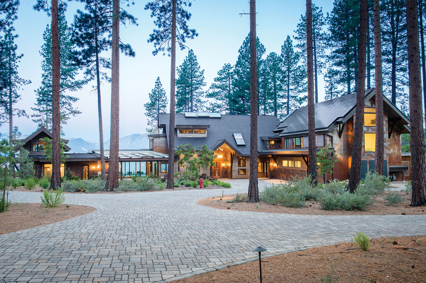
Sidney challenged the team to eschew the typical Tahoe wood and stone exterior, which led to some creative uses of metal for siding: flat large shingles of rusted COR-TEN steel and a “steampunk” mix of pre-finished silver, rust and mottled brown–hued sheet metals cut into various rectilinear sizes and shapes in a random pattern intended to mimic stone. The earth-tone palette blends into the surrounding mountains, lake and trees, creating layers of texture and bursts of color. The effect also breaks the large structure from appearing as a single flat plane. It appears pixilated, appropriate for the computer scientist. The repetitive stonework on the long drive and walkways echoes with another pattern, this one tessellated.
“The outside came first,” says Teya Cantwell, also of Ironhorse, of the look. “There is so much going on but it is so simple.”
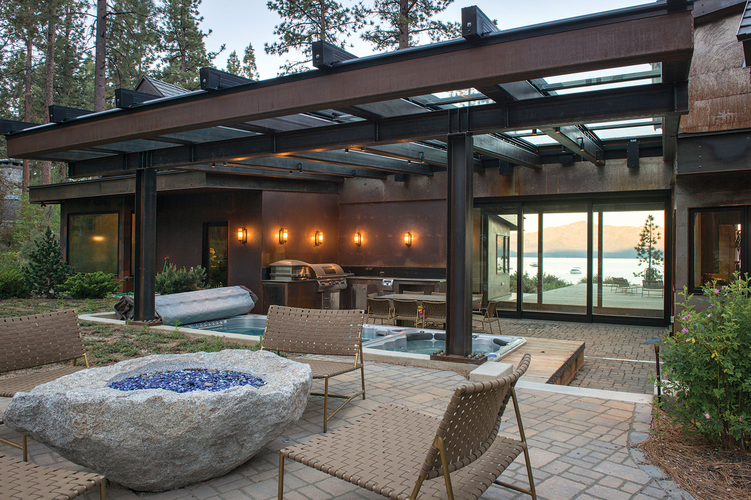
Indeed, the outdoors and lakefront setting define the house. A sloped retractable trellis-like glass and steel roof at the front of the house delineates and protects a swimming pool, spa and dining area outfitted with built-in barbecue and pizza oven, with a geode-shaped fire pit nearby. The spot is shielded from the winds off The Lake for year-round use, but is visually connected to the water via a see-through glass breezeway that can be opened up in fair weather. The corridor also serves to both break the house into smaller masses from the outside and create a separation of spaces inside.
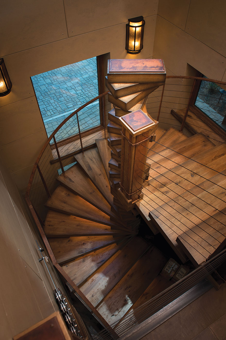
The front door’s vertical windows peek into a foyer lined with large-scale porcelain tiles. The metallic brown, black and bronze hues of the flooring tie in with one of Tahizzle’s most distinctive and eye-catching—and the single most challenging—features to engineer, according to Thompson: a Jenga-like stacked and twisting stairwell constructed of a single curved piece of steel supporting 16 rectangle and pie-shaped treads, originally specified as glass but ultimately fashioned from wood by Chico-based Westgate Hardwoods, which did the home’s custom carpentry finishes. When lit and viewed from below, the stairway’s curving geometry resembles a cutaway of a chambered nautilus.
Nearby, a hefty sliding barn door uses gapped planking to create a simple and large-scale means of concealing clutter yet inviting guests into the space, which in this case is the prerequisite Tahoe gear room, outfitted with ceiling-height cubbies, shelves, drawers, hooks and benches to don and stow all manner of outdoor attire and accoutrement.
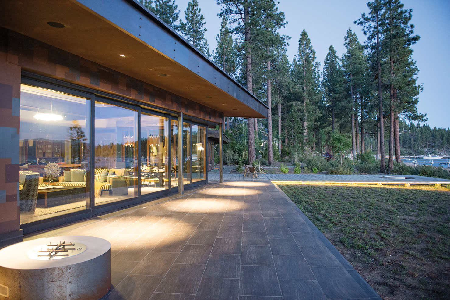
Stepping into the linear and spacious great room affirms that, yes, this is indeed a lakefront property. The water is right there, thanks in part to a pair of glass walls, 18 and 35 feet long, providing unobstructed views of the 200 feet of sandy beach and across The Lake to 9,738-foot-high Mt. Tallac. Performing a brilliant disappearing act, when the 11-foot lift-and-slide doors (there are five of them) are pulled aside, the effect is indeed magical. Not only are the boundaries between inside and outside blurred, they cease to exist.
“The whole wall slides into a pocket when open; you are not experiencing it as a wall at all,” says Thompson. She adds, “The roofline here is like a baseball cap visor. It protects against the sun but does not distract from the view, which is horizontal rather than vertical.” Should the sunlit scenery become too much to bear, electronically operated Lutron shades may be lowered with the push of a button.
Flooring here and through most of the house is distressed English walnut salvaged from one of Chico’s last groves and provided by Old Durham Floors. The floors are an added interesting and unique design element in that the stocks were grafted so they show a natural line of demarcation between the sub-species of wood. The eight- and ten-inch planks mirror the dock-like deck that extends from house to beach—and at whose terminus a submerged fire pit cutout invites folks to sit down and dangle their feet.
Additional barn wood paneling in the great room is set vertically to mimic the feel of a freestanding living tree; in the desk nook the wood—in this case former fencing—runs horizontally to mirror the exterior metal siding, so that when viewed from the lakeside, the exterior and interior materials almost completely sync.
The expansive and open kitchen features wire-brushed, stained solid oak ceiling-height cabinets, also used throughout the rest of the house. “We went through ten styles of finish on the cabinetry before we found what we wanted,” says Prehoda. The textured glass door panels resembling flowing water enable Sidney and friends to see what’s behind doors number one, two and three, facilitating meal prep; rectangular rust-colored steel hardware pulls reflect the exposed structural and decorative steel found elsewhere in the house.
“Details in interior are based in the steel,” says Prehoda. Beyond just decorative that includes elements that would normally be made from wood: backsplashes, door and window jambs, beams and valances.
Countertops are a clean and light Sonoma Cast Stone custom concrete. Two dishwashers and two sinks, one of which has a double-headed faucet facing out to The Lake, facilitate side-by-side clean-up and conversation. A glass door fridge, pasta arm, additional farmhouse-style sink and open pantry shelves help keep the food flowing freely.
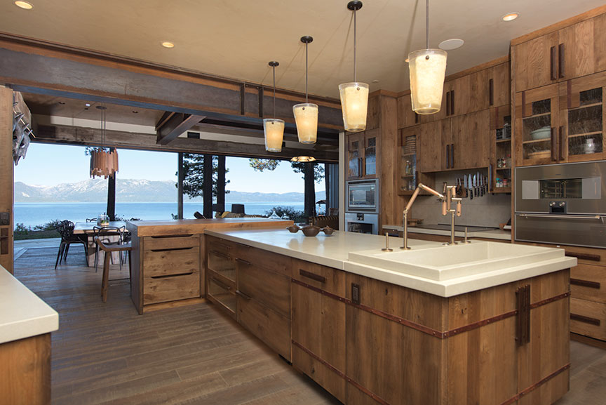
Circular pendant lights, walnut above the concrete-topped dining table and clear blown glass above the kitchen island come from Lee Harris at Reno’s Light + Space and provide some round relief in an otherwise angular house.
The connecting glass corridor offsetting the public spaces from Sidney’s private domain leads to a pair of offices with a corner desk to gaze at the water and door to get out to it. There’s a large laundry room, also with exterior access, where ceiling-height cabinets are layered with rust-colored metal panels. The whole room can be closed off with another sliding barn door (not wishing to air the dirty laundry, this one offers no peekaboo gaps).
At the end of this corridor and farthest away from communal spaces is a two-story master suite, where a spacious bathroom features concrete countertops and a wood-trimmed tub bordered by frosted windows. The sleeping area itself is, by design, compact, with a built-in headboard and storage above and below the bed, the orientation of which makes the most of the views.
An almost Escher-esque flight of steps ascends to a loft, where Sidney’s requested “fainting couch” (a Victorian-inspired sofa whose back is raised at one end) offers yet another glimpse of the water. Vertical barn wood lines the lower level, horizontally placed concrete panels up above. Sidney dislikes drywall, thus its sparing use.
A small private terrace accessed via the loft provides a peaceful place to contemplate Lake Tahoe—and the living roofs, which, depending on time of year, will bloom with bursts of cold-climate seasonal succulents of varied colors that are planted in turf-like rolls. Besides offering a tranquility factor, the roofs, which provide habitat and possess greater insulation value and noise reduction properties, actually help keep Tahoe blue by filtering rain and snowmelt before it enters The Lake.
Back on the other side of the house, an elevator provides access to the second-floor bedrooms and guest living area. Sidney’s mother, a frequent visitor, uses a wheelchair, so she has her own fully ADA-compliant bedroom and bath. Here and elsewhere across the house, smooth level floors make transitioning from room to room, and even outside, seamless. Baseboards, some in heavy rustic steel, stand 18 to 30 inches or higher to provide extra protection against the errant wheelchair—or suitcase.
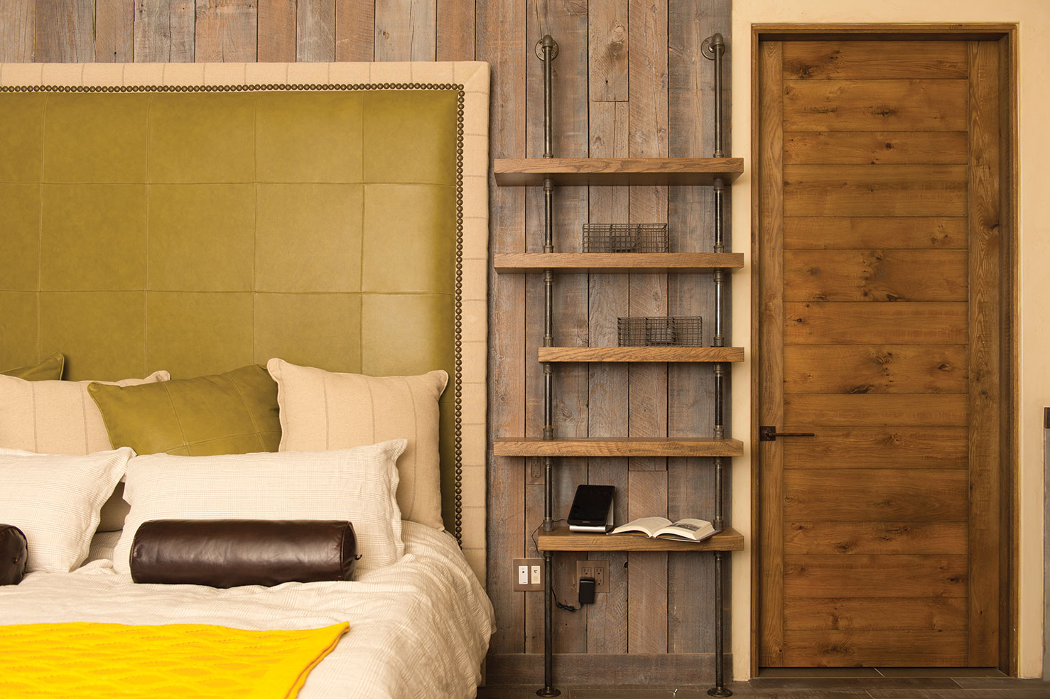
A second-floor loft illuminated via high windows provides a common living space for the guest bedrooms, which are decorated with fabric headboards (coordinated, of course, with cushions and valances), built-in storage, window seating and bay-view bathrooms. A laundry area, built-in desk, computers and plenty of places to plug in all those portable devices, as well as a shuffleboard table and concealed speakers, covers visitors for work and play.
Speaking of play, a cork-floored kids’ zone boasts two sets of solid oak bunks, bathroom and den with large television screen for cartoons, movies and games. A ladder climbs to another loft and bonus game room.
All the bedrooms, as well as the home theater, are outfitted with blackout shades and window casings with edge channeling for true darkness, for when that pervasive natural light might mess with much-needed sleep.
They say that women buy or a build a house for the kitchen, a man for the garage. While Sidney certainly can brag about his culinary setup, his 2,000 square foot industrial-strength, four-car man space is something to behold, right down to the 25-foot climbing wall on the exterior. Sidney, who has his private pilot’s license, wanted a hangar-like domain, accessed via a pair of large bi-fold garage doors. Equipped with electric vehicle chargers and hydraulic boat lift, the spot stores several kayaks and paddleboards and a dozen bikes (Sidney is also a triathlete). An exterior access bathroom and locker room enables visitors and friends to grab gear and come and go from the beach at will.
The home is built to LEED standards, though not-as-visible sustainable details include extra-closed-cell spray foam insulation in the roof and walls, a ground source heat pump system and copper solar thermal panels, and an array of 63 photovoltaic panels providing plenty of power to the house as well as to the pair of Teslas charging in the garage.
So how did Sidney’s initial multipage design manifesto ultimately play out?
“The floor plan and finishes are almost universally fabulous,” says Sidney. “At heart, I’m an engineer, and so I love how well the house’s overall functionality meets my personal needs. What we’re still working on is the hyper-modern home automation side of things; that turns out to be tricky and time consuming to get right.”
We’re pretty confident he will figure that one out. Fo shizzle.
Award: Lakefront
Building Design: Kristi Thompson, MWA, Inc.
Builder: Gardner Construction
Interior Design: Bona Prehoda, Ironhorse Interior Design
Square Feet: 7,400
Year Completed: 2014


No Comments