
02 May Rugged and Refined
It was late 2014 when Clare Walton, principal architect at Tahoe City’s Walton Architecture + Engineering, first walked the Martis Camp property. The snow glistened as she charted the trees and view lines across the length of the site.
“I immediately had a sense of this amazing place, and something special,” Walton says. “I felt like it was just growing out of the ground. You could tell that it was this really rugged site where you just felt a connection to the mountains.”
 Walton knew right away she wanted a long structure to capture the amazing views. She began designing a home that would honor the special energy and power imbued in the land, and would speak to the ruggedness of the lot while maintaining a clean, modern aesthetic.
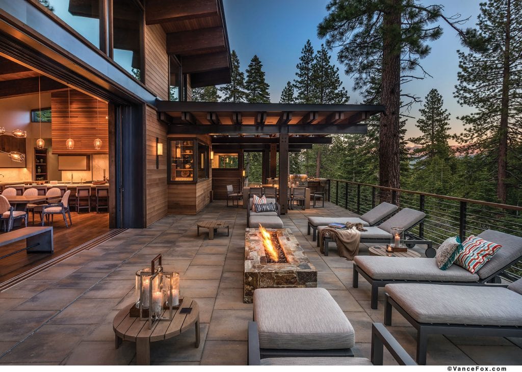
The finished product—which came together with the help of interior designer Scott Corridan, Jim Morrison Construction and Walton AE’s Heidi Sanderson—is a striking home with soaring rooflines and expanses of floor-to-ceiling glass, its footprint gently following the downward slope of the earth, simultaneously strong and supple in the landscape. It is the perfect vehicle for experiencing sweeping views of the Carson Range and Northstar.
Boulders line the driveway, introducing the viewer down into an entrance where abundant stonework anchors the home to the landscape. Although the lines of the architecture are fresh and modern, the structural rhythm pays tribute to the natural elements of the surrounding lot.
“You’re seeing these rhythms of lines, of trees, and you look up at the ceiling and you’re seeing that [in the beams],” Walton says.
Because the owner recently retired from his CEO position at an international steel company, Walton wanted to incorporate steel sourced from his company with wood and stone. The result is sophisticated and cohesive, with elegant lines of metalwork interspersed throughout the exterior and interior of the home. “Overall, you feel the softness of wood; [the steel] is not a harsh feeling at all,” says Walton.
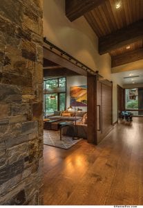
Entering the home, guests find themselves elevated slightly, looking down a few steps into the great room and beyond to a broad expanse of mountain landscape. To the right, a cozy media room welcomes guests and an oversized barn door can be closed to give the room just enough privacy while still maintaining a connection to the public space. “I think it really lets the home live big and creates different social areas,” says Walton.
Part of what makes the home so cohesive was Corridan’s early involvement in the project. “Scott came in right before we started construction so we were able to coordinate in a really efficient way on all of the finish details,” says Walton.
She gives the example of the great room’s window coverings. The first time Corridan visited the site, the great room was only partially constructed, leaving open views to the outside. “We brainstormed together and figured out ways to pad in walls so the drapes in this room pocket away into the walls,” says Walton.
“The last thing I was going to do was cover up her windows and mask all of this. That would be an absolute shame on the design,” Corridan says. “So it became the question of, how do we get privacy and UV protection?”
Across the hall from the media room is a guest bedroom, which, like the entry and great room, features a high ceiling. Walton and Corridan worked together to scale the space appropriately and create a cozy room, using a picture rail and over-scaled light fixture to bring down the volume of the space. Sleek built-ins in lieu of a closet maximize efficiency while an elevated window provides light and privacy.
Down the elongated glass hall, Walton used a similar strategy in the guest master, where a band of clerestory windows bring in light from multiple angles. A fireplace with steel bands at seam locations between limestone slabs and a perfectly framed view of Northstar add a sense of luxury.
Corridan flew to Los Angeles early on to get a feel for the owners’ tastes, walking around the Pacific Design Center and noting which pieces the wife enjoyed. He sourced from more traditional mainline furniture companies and looked for reclaimed or restored midcentury modern pieces that were still consistent with the house and the owners’ tastes, which ended up bringing some unique and stylish items into the home. “In our world, I think there’s always a way to show clients this is what happens when you spend strategically and thoughtfully,” he says. “You can still look elegant, be mountain, be specific, and not be totally out of control.”
Corridan also helped select extensive artwork, including many pieces by artist James Shay. The team invested in gallery lighting in order to deliver more impact with the warm, textural and evocative canvases that conjure the Eastern Sierra.
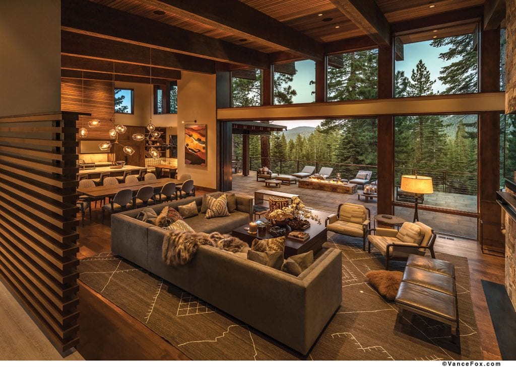
Steel handrails guide visitors back down into the great room. A floor-to-ceiling stone fireplace surround includes vertical inlaid steel as well as a steel beam serving as the mantle. In keeping with the warm, comfortable feeling of the upper wing, an A. Rudin sectional sofa anchors the space, along with a custom rug with tribal and mountain-inspired geometric patterns, honoring the area’s environment and history. A reading nook is tucked into the corner next to the fireplace, making use of another opportunity for a view as the windows frame a picturesque piece of the golf course. Outside, terraces tuck back into the earth and embrace the home.
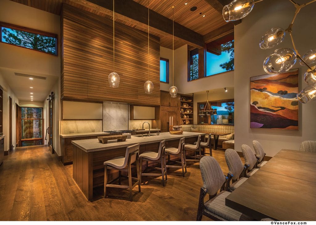
A Randolph & Hein dining table with steel accents has a presence that is undeniably powerful, its base an angular but sturdy design that echoes the lines of the peaks in the distance. Upholstered chairs, the frames of which had been pickled and sanded down for more texture and contrast, line each side of the table. Above the table hangs the true showstopper—a one-of-a-kind chandelier inspired by the work of Lindsey Adelman. The fixture, with hand-blown glass bulbs arranged in an organic yet structural pattern, provides light and scale to the great room.
The kitchen, Walton says, was designed to be a comfortable and casual extension of the living space. They selected a steel hood and paneling that matched the exterior siding. To balance out the reading corner on the opposite side of the room, an informal dining nook is positioned adjacent to the outdoor barbecue space. Built-in cabinetry and shelving displays Native American basketry and Chinese ceramics, an homage to the history of the Truckee area. The kitchen spills over into a pantry, where quartzite countertops mirror the kitchen’s with hints of green and earthy caramel.
For the bathrooms, Walton selected a consistent, clean color palette. Plumbing fixtures with stunning, delicate lines play nicely off the home’s steel finishes, while limestone countertops and floors, porcelain wall tile and intricate stone backsplashes all work together to create bright, timeless and peaceful spaces.
The home office, located between the kitchen and master bedroom, serves as a transition from public spaces to private, and enjoys a distant mountain view with a bridged landscape feature in the foreground. Above the bridge, an opening in the roof welcomes natural light in an unexpected way.
“There is an interesting moment in the roof where the covering is cut back to expose an area of open rafters. This lets light into the landscape feature from above while still maintaining the clean continuity of the roof form,” Walton says.
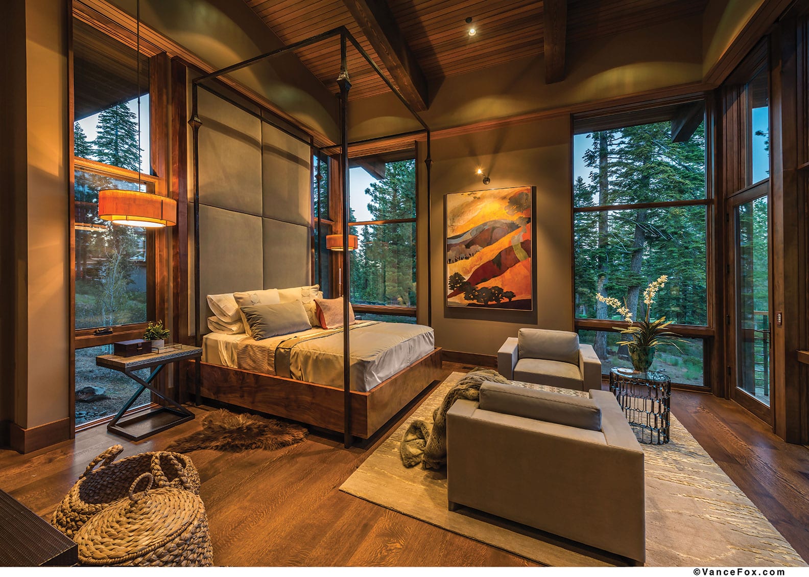
Never one to miss a detail, Walton incorporated steel into the risers of the stairs going down toward the master bedroom. Soffits hiding the window coverings run around the room, creating a nice detail that caps the windows. More stonework accents the fireplace, and a personal deck connects to the private spa area. A custom steel bed frame reaches to the heights of the elevated ceiling with thin, fine posts.
“We were able to achieve a space that is as grand as it is cozy,” Walton says. “The view is a knockout and this space really brings it inside.”
The master bath captures the magic of indoor-outdoor living, with floor-to-ceiling windows and tile work throughout, asymmetrical windows and an upper window above the bathroom mirror that provides more light to the entire room. A bathtub sits in a corner surrounded by glass.
Near the kitchen and mudroom, a stream flows alongside and under the home, continuing under the master hallway and wrapping underneath the last window. Floor-to-ceiling windows that open at the bottom connect the home to the land, grounding it and engaging visitors in the music of the water playing across the rocks.
Upstairs, the same structural rhythm present in the rest of the home provides consistency and helps capture more stunning vistas, with every window carefully placed.
In the bunk room, fanciful, tribal-inspired patterns mix with angled, chevron-patterned wall paneling that recalls a1970s ski chalet in a retro yet tasteful way.
The clients wanted a home that could grow with their family, and whimsical touches throughout delight their 2-year-old grandson and highlight the playfulness of life in the mountains. One finishing touch in particular is a leather bear that resides at the end of the guest wing hallway, placed specifically to feel as if he were coming in from the outside. The bear has surprised several visitors, and the grandson loves it.
Corridan also planted small bronze sculptures of frogs and ducks throughout the home to capture the grandson’s attention.
“I know how important he is to his grandparents. That’s what this house is about: the next generation and those Martis memories,” Corridan says.
Although the house itself is filled with lovely furniture and art, the owners know the best part is having a new place to gather family and experience the beauty of the Sierra together. After all, as the owners point out, Mother Nature is the best artist.
“[My wife] was the one who said, ‘This is really nice,’ and I know when she says [that], there’s no turning back,” says the owner. “Martis Camp is so family-oriented, we thought this will be a good place for all of us to gather… we just love it.”
Award: Tahoe Style
Building Design: Walton AE, Clare Walton, AIA
Builder: Jim Morrison, Jim Morrison Construction
Interior Design: Scott Corridan, Scott Corridan Design
Interior Architecture: Walton AE, Heidi Sanderson
Square Feet: 5,531
Year Complete: 2016


No Comments