20 Feb Brockway Blues
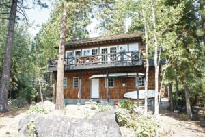
Before the remodel, courtesy photo
Former caretaker’s home receives an attractive makeover
The trophy lot abutting Lake Tahoe’s intoxicating blue expanse was a coveted find for a Bay Area family of five. But the existing structure—a three-car garage with an outdated living space above—needed an extensive facelift. Fortunately for the homeowners, they found an architect who thrives on such challenges.
“I take pride in remodels,” says Incline Village architect Elise Fett. “I enjoy working with the original structure and coming up with a design that’s reasonable and meets the goals of the clients.”
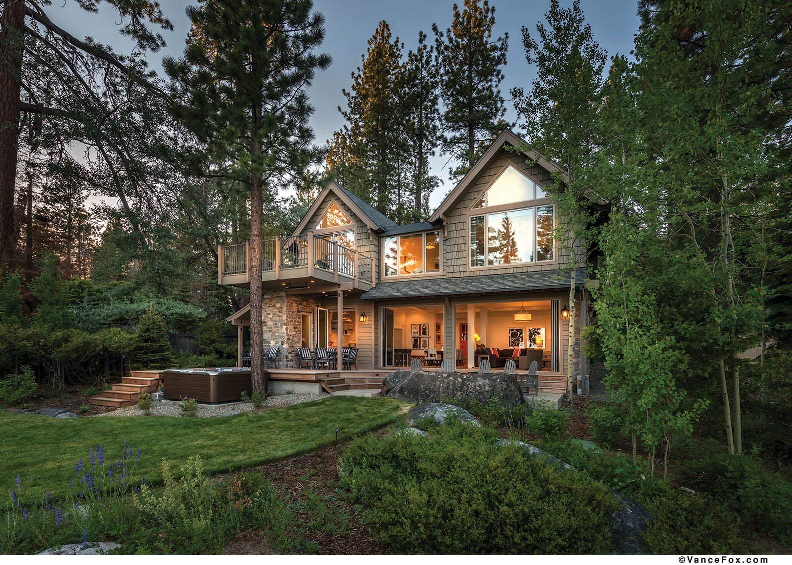
Formerly part of a joint estate owned by Hills Bros. Coffee, the building served as a secondary garage near the main home, with modest living quarters above for a caretaker. It overlooks The Lake on the back end on a long, narrow property in Brockway, featuring a large backyard highlighted by a sculpted lawn, ample natural vegetation and granite boulders that lend a crucial element of privacy.
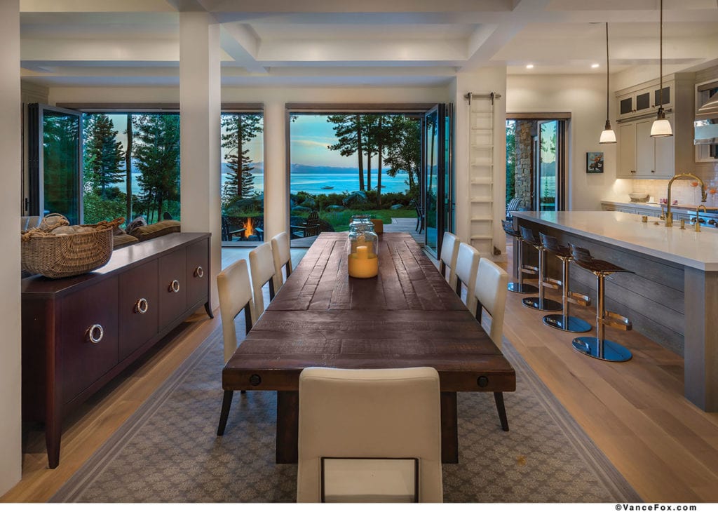 Two large glass Panoramic doors were installed on the lower-floor addition, enabling a vast swath of wall to open to the outdoors, photo by Vance Fox
“It’s an incredible spot in nature, and we wanted to put that natural beauty on stage,” says the owner, who wishes to remain anonymous. “We were not trying to do anything heroic with the home other than tee up nature. We just wanted to blend in with the community and The Lake and the space.”
Fett’s design added 1,965 square feet of living space while transforming the caretaker’s home into an efficient and functional, five-bedroom, three-and-a-half bath lakefront abode with a bright, modern feel and indoor-outdoor flow. Project manager Aaron Brown of Truckee’s Glennwood Mountain Homes and Phoenix-based interior designer Kim Anderson of Arcadia Design Group were brought on board after Fett drew up her design.
The addition was limited to the back of the home, which pulled the living spaces closer to The Lake while allowing the front scale to remain unchanged.
Fett did spruce up the curb appeal, however. She added wood curves on the existing front dormers with gable windows, which were then dressed in heavy wood shakes. She extended the front roof eave to provide protection from the elements, and created a charming archway over the entry. One of the three garage doors was removed to make room for a wider entry, which is adorned with an oversized door between vertical stacks of windows that bring in natural light. The front of the home is covered in an attractive stone veneer installed by Reno’s Eric Schwedt Stone & Masonry.
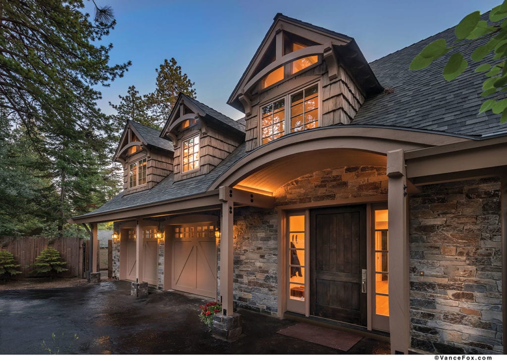 Fett spruced up the curb appeal by adding wood curves on the existing front dormers and creating a charming archway over the entry, photo by Vance Fox
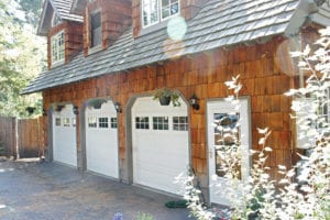
The original front entry, courtesy photo
“One feature I enjoy is the modification of the existing front façade so it’s more attractive and functional,” says Fett. “It added character and also satisfied the needs of our clients, including blending with the original estate and the neighborhood.”
The garage, which originally comprised nearly all the first floor, was reduced in depth and width. This opened space for the widened entry and new living areas, to include a locker-lined mudroom accessed by a bright orange Dutch door. The door provides an element of contrast against the clean, white interior of Kim Anderson’s design. Pillows, area rugs and furniture pieces add additional pops of color.
“We just love the aesthetic. We wanted it to feel fresh, open and light, which is why we have a lot of the selection of materials and colors that we have,” the owner says. “We also wanted to be environmentally friendly, and so we had a lot of original furniture from a prior home that we repurposed and refabricated for this.”
Anderson, who is best known locally for designing the public spaces in Martis Camp, says it’s not uncommon for her Tahoe-area clients to mix in their existing furnishings with new items. But with this couple in particular, both Anderson and Fett agree that the project shines in part due to the owners’ sense of fashion.
“They have great taste and they know what they like. They’re very easy and fun to work with,” Anderson says. “They’re also very aligned in what they like, so we didn’t have the struggle of them both wanting a different outcome, which can be a challenge with some projects.”
Nevertheless, the remodel was not without its difficulties.
As all major structural changes were made on the back of the home, which sits on a narrow lot flanked on both sides by trees, the construction crew had to be creative in maneuvering their equipment. It was a “tricky” endeavor that tested their problem-solving skills, says Chris Abel, president of Glennwood Mountain Homes.
“We had to use small pieces of equipment to do the excavation, as we only had an 8-foot area to drive through,” Abel says. “We also had to use a crane from the driveway to lift heavy product over the building to the [back] to install. And all of the high work had to be completed with scaffolding tight to the building because we had little room and could not utilize a sky track.
“And with any remodel,” Abel adds, “as you get into the project, you discover stuff that you weren’t expecting—something that was built in a way that we didn’t anticipate. So we had to make modifications on the fly to make it work. But working with Elise on that was fantastic. She was right back at us with whatever challenges came up.”
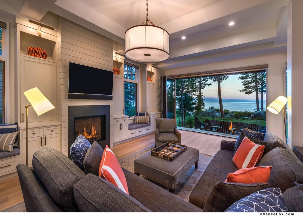 The remodel pulled the living space toward The Lake. A portion of the foundation was also removed to lower the new living-area floor, photo by Vance Fox
The crew removed the original back wall of the home and extended the first-floor living space toward The Lake. Simpson Wood Strong-Wall shearwalls in the new lakeside walls eliminated the need for steel moment frames and allowed for copious amounts of glass.
A portion of the original foundation was removed to lower the new living-area floor 2 feet from the entry and garage level. As such, the great room—encompassing the living, dining and kitchen areas—boasts 10-foot-plus ceilings.
Two large glass doors by Panoramic, each with independent panels that slide and fold, were installed on the lower-floor addition, enabling a vast swath of wall to open to the outdoors. An Andersen E-Series French door off the kitchen achieves the same indoor-outdoor effect.
The wall of glass spills out to a Thermory ash deck with a dining area nestled under heat lamps, which were placed on the underside of a spacious balcony that juts off the upstairs addition. To avoid blocking views to The Lake from the living and dining areas, the deck steps down to a patio that includes one of the niftier features of the entire project—a gas fire pit partially enclosed by a natural granite outcropping.
“The fire ring around that boulder was a challenge, but it was just such a cool idea from day one that Elise came up with,” says Abel.
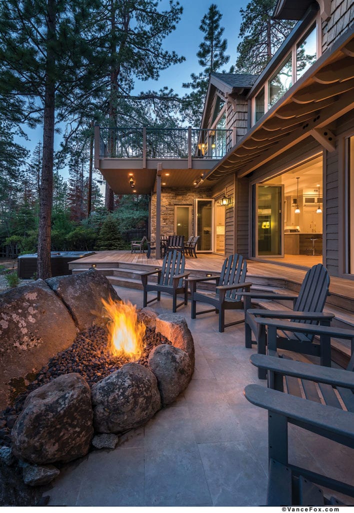
A natural granite outcropping was used for a gas fire pit off the great room, photo by Vance Fox
A hot tub located off the edge of the deck, an outdoor shower tucked around the corner and a powder room accessed from the deck add to the amenities in the back of the home, which includes the same complementary mixture of stone veneer and wood shake siding as the front.
The remodel completely transformed the upstairs as well. While the original staircase immediately inside the entry was retained, Fett managed to efficiently fit all five bedrooms on the second floor, along with a media/play room at the top of the stairs. In the master suite, Fett turned the former kitchen into the bathroom, while the bedroom features a cozy sitting area in front of a fireplace, built-in cabinets, a soaring gabled roof and large gable windows that frame the lush yard and Lake Tahoe beyond.
“The views are everywhere,” says the owner, counting the home’s scenic qualities among his favorite features. “We’re really happy with how everything turned out—the great room, the slide-open doors, the interacting with nature, the deck coming off the upstairs, the fire pit, just everything that calls you outside.”
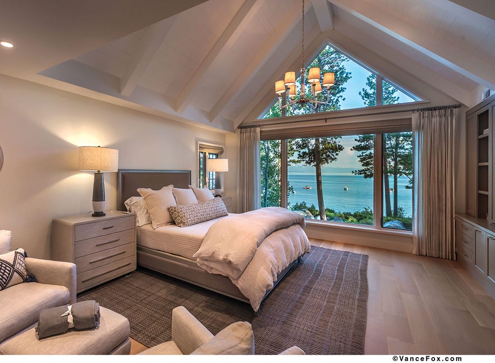 The gabled master bedroom features large windows that frame the lush yard and lake beyond, photo by Vance Fox
Award: Remodel
Building Design: Elise Fett & Associates
Builder: Glennwood Mountain Homes
Interior Design: Kim Anderson of Arcadia Design Group
Square Feet: 3,363
Year Complete: 2017


No Comments